How Media brands do relational campaign emails




1. Taste of the South: Don’t miss out on the reprint of The Cajun Ninja!
Objective
This email aims to drive immediate pre-orders for the fourth printing of The Cajun Ninja’s cookbook by leveraging urgency and personal connection to Jason Derouen’s family-tested recipes, positioning it as both a kitchen essential and a holiday gift.
Why this works
The email brilliantly uses sensory-rich imagery and regional slang like 'Pi-Yahhh!!!' to instantly evoke the Cajun experience, making the cookbook feel like an authentic cultural invitation rather than just a product.
How to implement
By highlighting the fourth printing and positioning early orders as a gift-giving advantage, the campaign taps into both scarcity and seasonal gifting psychology, turning a simple product launch into a time-sensitive cultural event.
Pro Tip
Add a subtle countdown timer near the CTA to reinforce urgency for the fourth printing, especially since the email mentions being 'first to receive your copy as soon as it’s off the press.' • Include a short customer testimonial or quote from someone who used the cookbook to make a holiday meal, strengthening social proof and connecting the product to real-life gifting success.
2. Southern Living: Easy Slow-Cooker Recipes We Love
Objective
This email aims to engage readers with curated Southern Living content that blends recipes, home goods, travel, and lifestyle tips, encouraging clicks to articles and product pages while inviting audience feedback through a survey to refine future content.
Why this works
The email masterfully blends culinary inspiration with lifestyle content, making each article feel personally curated and culturally relevant to Southern Living’s audience while subtly driving traffic across multiple verticals.
How to implement
By featuring a reader survey early in the flow, the campaign strategically positions audience feedback as a valued part of the brand’s editorial process, fostering loyalty and encouraging deeper engagement beyond passive reading.
Pro Tip
Add a visual hierarchy to the CTA buttons, using size, color, or placement to differentiate between content consumption (Read More) and commercial actions (Shop Now, Enter Now) to guide user intent more effectively. • Integrate a subtle countdown or urgency indicator near the giveaway section (e.g., 'Enter by Friday!') to increase conversion rates by leveraging time-sensitive psychological triggers without disrupting the editorial flow.
3. Condé Nast Traveler: Refined Luxury Sits on Lake Como’s Eastern Shore
Objective
This email aims to showcase Il Sereno as a premier luxury hotel on Lake Como’s eastern shore, enticing readers to book a stay by highlighting its design, service, and exclusive ambiance. It also promotes Condé Nast Traveler’s editorial authority and drives engagement through affiliate links and subscription offers.
Why this works
The email masterfully blends editorial storytelling with commercial intent, using rich sensory details and designer credits to elevate the hotel’s appeal beyond mere accommodation into a curated lifestyle experience worth investing in.
How to implement
By anchoring the hotel’s value in its architectural pedigree and regional context, like referencing Urquiola’s design and the ‘golden triangle’ location, it transforms a travel feature into a compelling cultural argument for why this stay matters now.
Pro Tip
Add a subtle countdown or limited-availability indicator near the CTA to create urgency without undermining the luxury tone, e.g., ‘Only 3 suites available this week’, to nudge hesitant readers toward booking. • Include a mini map or visual iconography in the ‘neighborhood/area’ section to quickly orient readers geographically, reducing cognitive load and reinforcing proximity to Como and Milan for time-sensitive travelers.
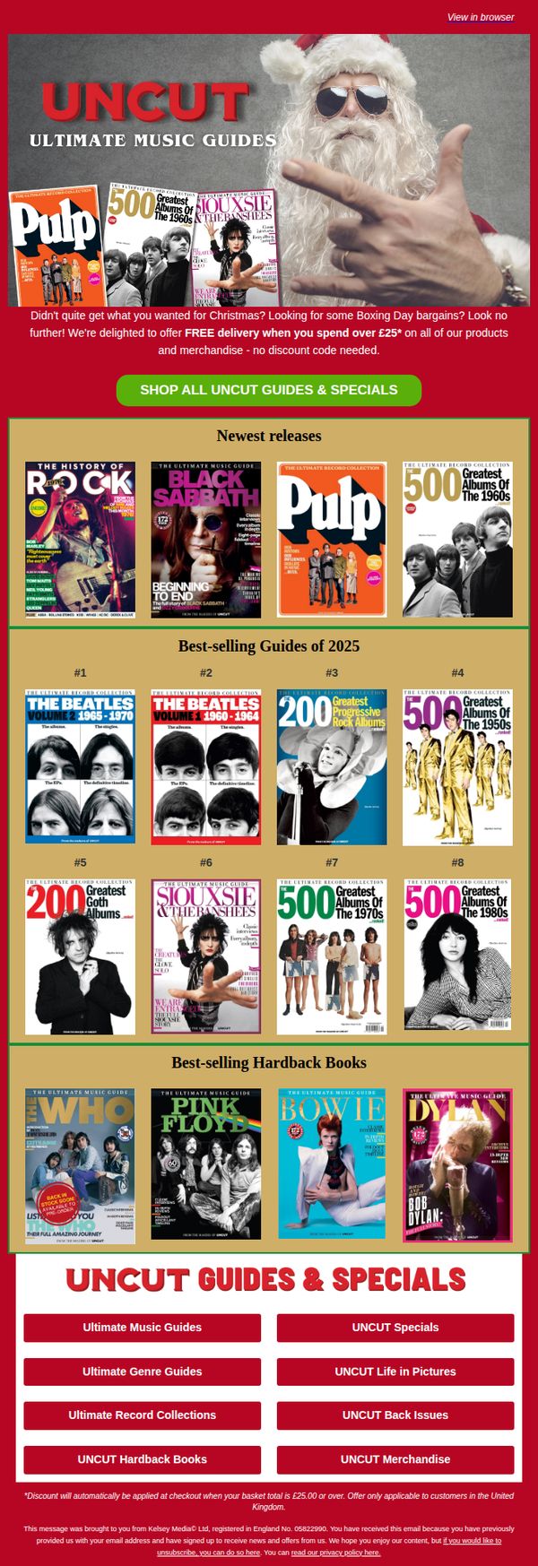
4. Uncut: Didn't quite get what you wanted?...
Objective
This email aims to re-engage customers who may have missed out on Christmas gifts by positioning Uncut’s music guides as ideal Boxing Day bargains, while incentivizing immediate purchases with free delivery on orders over £25.
Why this works
The email brilliantly reframes post-holiday disappointment into opportunity by suggesting customers didn’t get what they wanted for Christmas, a clever emotional hook that makes the offer feel personally relevant and timely.
How to implement
By prominently featuring both newest releases and best-selling guides, the email caters to both trend-chasers and nostalgic fans, widening its appeal without diluting its core music enthusiast audience or confusing the product hierarchy.
Pro Tip
Add a subtle countdown timer near the CTA to create urgency around the free delivery offer, especially since the email references Boxing Day, a time-sensitive shopping window that benefits from temporal pressure. • Include a short customer testimonial or review snippet under one of the best-selling guides to build social proof, as the current layout relies solely on product visuals and rankings without emotional validation from other buyers.
5. Vanity Fair: The Story of Madonna’s Most “Shocking” Music Video; the Trump Boys on Trial; Victoria Beckham’s “Nightmare”
Objective
To engage readers with a curated daily digest of provocative, culturally relevant stories while subtly driving subscriptions through a compelling fall sale offer at the end.
Why this works
The email opens with a bold, high-contrast black-and-white hero image of Madonna that immediately signals cultural weight and visual drama, drawing readers in before they even read the headline.
How to implement
Each article preview is framed as a juicy, conversational talking point, perfect for social settings, making the content feel less like journalism and more like insider gossip you’d share over cocktails.
Pro Tip
Add a secondary CTA button above the footer, perhaps labeled 'Get the Full Story', that links directly to the most viral article (Madonna’s video) to capture attention earlier and reduce scroll abandonment. • Include a small visual indicator or badge next to each article title (e.g., 'Trending,' 'Editor’s Pick') to create perceived urgency or authority and help readers prioritize what to click first.
6. Food Network: 50 Back-to-School Recipe Ideas That Will Earn You an A+

Objective
This email aims to engage parents and caregivers preparing for the school year by offering a curated collection of 50 practical, time-saving recipes while also promoting a sweepstakes to drive traffic and participation. It blends editorial value with promotional incentives to strengthen brand loyalty and site engagement.
Why this works
The email masterfully positions recipes as academic performance tools, framing meal prep as a way to ‘earn an A+’, which emotionally resonates with overwhelmed parents seeking to feel competent and in control during the chaotic back-to-school season.
How to implement
By bundling diverse meal categories like weeknight dinners, make-ahead breakfasts, and sweet treats, the campaign acknowledges the full spectrum of parental pain points, making the content feel comprehensive and deeply relevant rather than just a list of recipes.
Pro Tip
The sweepstakes CTA is visually buried below multiple recipe blocks; repositioning it immediately after the hero section or using a sticky banner would increase visibility and conversions without disrupting content flow. • The email mixes editorial content with third-party financial ads that feel off-brand and disrupt the culinary narrative; replacing them with Food Network-branded recipe videos or user-generated meal photos would maintain thematic cohesion and trust.
7. Scientific American : Today in Science: EPA slapped with a lawsuit

Objective
To inform subscribers of timely science news and curated stories while subtly encouraging engagement through event sign-ups and subscription renewals. The email positions Scientific American as a trusted source for digestible, impactful science coverage.
Why this works
The email masterfully blends breaking news with evergreen science storytelling, creating a sense of urgency while also inviting deeper exploration, perfect for retaining curious readers who crave both timeliness and depth.
How to implement
By embedding a compelling event promotion within the newsletter’s natural flow, Scientific American turns passive readers into active participants without disrupting the editorial tone, making the CTA feel like a natural extension of the content.
Pro Tip
The event CTA is visually buried beneath the infographic; relocating it to above the fold or adding a sticky banner would increase visibility and conversion without disrupting the editorial experience. • The 'What We’re Reading' section lacks visual hierarchy, adding icons or small thumbnails for each linked article would improve scannability and encourage more click-throughs from casual readers.
8. Delaware Today: 15 NYE Parties You Won't Want to Miss 🥂➡️

Objective
This email aims to drive local engagement by highlighting top New Year’s Eve parties in Delaware, encouraging readers to explore local venues while subtly promoting Delaware Today’s brand authority and subscription value through curated event content and partner features.
Why this works
The email opens with a visually festive hero image and a bold, benefit-driven headline that immediately taps into the reader’s desire for memorable holiday experiences, making the content feel timely and emotionally resonant.
How to implement
By blending editorial content with partner features and a subscription CTA, the email positions Delaware Today as both a trusted local guide and a valuable ongoing resource, subtly converting casual readers into subscribers without aggressive sales pressure.
Pro Tip
Add a clear, secondary CTA button like 'See All 15 Parties' directly under the hero section to guide readers deeper into the content, reducing friction and increasing engagement with the core offer. • Include a short countdown timer or 'Limited Availability' note near the party listings to create urgency, since New Year’s Eve events are time-sensitive and benefit from FOMO-driven decision-making.
9. Kiplinger Personal Finance: $20 Billion Social Security Mess, Cheapest California Retirement Spots, How to Buy Life Insurance

Objective
This email aims to engage retirees and pre-retirees by delivering timely, actionable financial advice across key retirement topics, Social Security, Medicare, cost of living, insurance, and estate planning, while subtly promoting Kiplinger’s paid advisory services and publications.
Why this works
The email masterfully segments content by life-stage pain points, like Social Security overpayments or California property taxes, to immediately resonate with readers’ real-world financial anxieties and position Kiplinger as the trusted guide they need.
How to implement
By embedding clear CTAs within each article preview, such as 'Order Your Plan' or 'Learn More', the campaign turns informational content into conversion opportunities without sacrificing editorial integrity or reader trust.
Pro Tip
Add a visual progress bar or checklist next to the 'Seven Steps to Prepare for Medicare Open Enrollment' section to increase perceived value and encourage completion, especially since Medicare decisions are time-sensitive and high-stakes for retirees. • Replace the generic 'LEARN MORE' CTA under the $300 bonus card offer with benefit-driven text like 'Claim Your $300 Bonus Before It Expires' to create urgency and clarify what action leads to reward, boosting click-through rates.
10. Honolulu: 🏮 Happy Lunar New Year!

Objective
This email aims to engage readers with culturally relevant Lunar New Year content while promoting local events, food, and experiences across O’ahu. It also seeks to drive community participation through voting and magazine subscriptions.
Why this works
The email masterfully blends cultural celebration with local discovery, turning a global holiday into a hyperlocal experience that invites readers to explore O’ahu’s unique offerings through food, art, and family activities.
How to implement
By featuring authentic personal stories like Melissa Chang’s gau recipe and highlighting niche culinary gems like Guizhou-style noodles, the email builds emotional resonance and positions Honolulu as a destination for culturally rich, off-the-beaten-path experiences.
Pro Tip
The primary CTA ‘READ MORE’ is overused and lacks urgency or specificity, tailor CTAs per section (e.g., ‘Get the Recipe,’ ‘Vote Now,’ ‘Book Your Tour’) to better guide user intent and increase click-through rates. • The email lacks a visual hierarchy that prioritizes the most valuable content, consider adding a countdown timer for the voting contest or a bold banner for the Lunar New Year celebration to draw immediate attention and drive action.