Medical relational campaign ideas that work
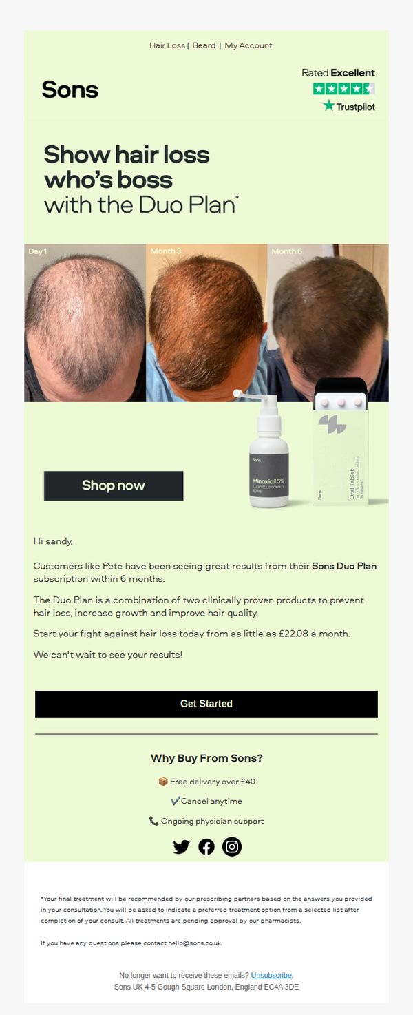


1. Sons: Start your hair loss plan from just £22.08 a month
Objective
This email aims to convert subscribers into customers by promoting Sons’ Duo Plan as an affordable, clinically proven solution for hair loss, using social proof and a personalized greeting to build trust and urgency.
Why this works
The email opens with a bold, empowering headline that reframes hair loss as a challenge to conquer, not a condition to endure, which emotionally resonates with men seeking control over their appearance.
How to implement
Including a real customer’s 6-month transformation timeline with labeled milestones builds credibility and manages expectations, making the results feel tangible and achievable rather than aspirational or exaggerated.
Pro Tip
Add a countdown timer or limited-availability badge near the CTA to create urgency, since the offer is priced as a monthly subscription, emphasizing scarcity or time-sensitive access could boost conversion rates. • Include a short FAQ or ‘How It Works’ section between the testimonial and CTA to preemptively address common concerns about prescriptions, side effects, or delivery, reducing friction for hesitant first-time buyers.
2. Marek Health: Registration closes March 1st — are you in?
Objective
This email aims to drive last-minute registrations for the Marek Health $20,000 Transformation Challenge by emphasizing urgency and the high-value reward, while showcasing a compelling before-and-after transformation to motivate action before the March 1st deadline.
Why this works
The email masterfully uses a high-stakes financial incentive, framing 12 weeks as potentially worth $10,000, to transform a fitness challenge into a life-altering investment, making hesitation feel like a missed financial opportunity rather than just a skipped workout.
How to implement
By featuring a real participant’s dramatic before-and-after photo paired with a personal quote about mental and physical transformation, the campaign humanizes results and builds emotional credibility far more effectively than generic stats or stock imagery ever could.
Pro Tip
Add a visible countdown timer near the top CTA to visually reinforce the March 1st deadline, creating real-time urgency that leverages psychological scarcity more effectively than static text alone. • Include a brief FAQ or 'What’s Included' section after the 'How It Works' grid to preemptively address common objections like time commitment, cost, or medical requirements, reducing friction for hesitant prospects.
3. Marek Health: The Single Biggest Threat to Your Performance This Winter. (Answer Inside)
Objective
This email aims to position Marek Health’s Immunity Protocol as the essential, science-backed solution for high-performers to avoid winter illness and maintain peak output. It seeks to convert readers into leads by prompting them to begin personalized lab work and claim a financial incentive via HSA/FSA cards.
Why this works
The email opens with a high-stakes, performance-oriented hook that immediately frames immune health as a competitive advantage, not just wellness, making it irresistible to driven, results-focused audiences who see sickness as a career threat.
How to implement
Each protocol component is presented as a precision-engineered solution to a specific biological bottleneck, using clinical language and numbered structure to convey authority, eliminate guesswork, and justify the premium positioning of the service.
Pro Tip
Add a short testimonial or performance metric (e.g., '92% of clients report fewer sick days') near the CTA to reinforce social proof and reduce perceived risk before the user commits to lab work. • Include a visual progress bar or countdown timer near the HSA/FSA offer to heighten urgency and make the 3-week expiration more visceral, increasing conversion before the fiscal year-end deadline.
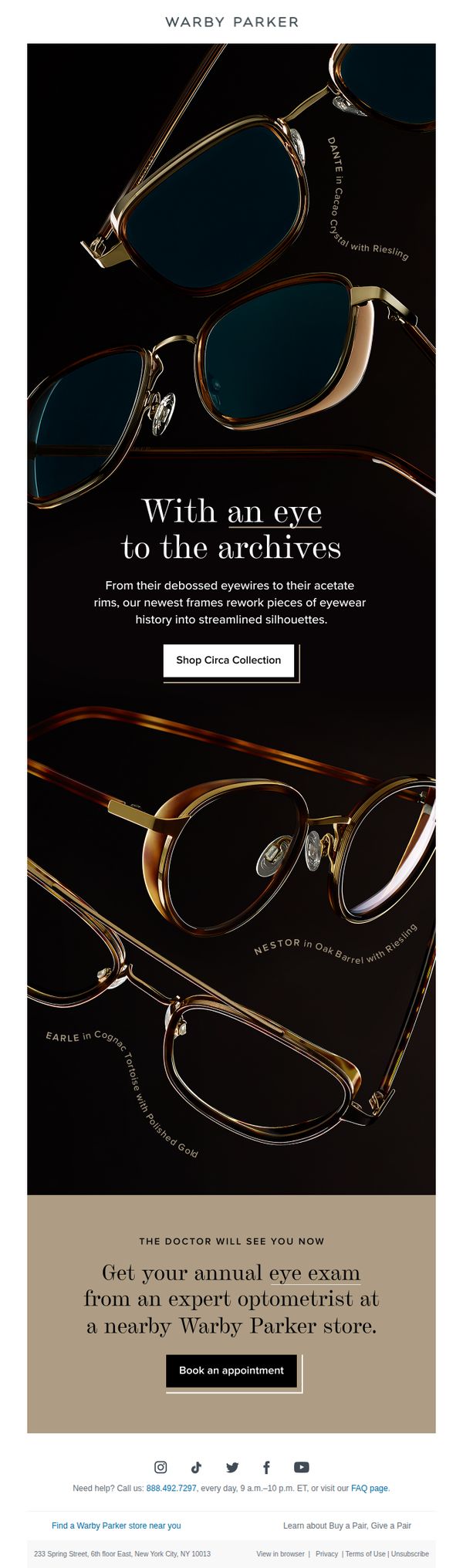
4. Warby Parker: Accents from another era
Objective
To drive engagement and sales by showcasing the Circa Collection, vintage-inspired eyewear frames that reinterpret classic designs with modern silhouettes, while also encouraging in-store eye exams to support overall brand experience and conversion.
Why this works
The email brilliantly frames new products as a revival of heritage design, using phrases like 'With an eye to the archives' to evoke nostalgia while positioning the collection as fresh and modern, which deepens emotional connection without sacrificing contemporary appeal.
How to implement
By pairing each frame with its material and lens pairing, such as 'DANTE in Cacao Crystal with Riesling', the email transforms product specs into storytelling elements, making technical details feel luxurious and intentional rather than clinical or overwhelming.
Pro Tip
Add a subtle countdown timer or limited-edition badge near the 'Shop Circa Collection' CTA to create urgency and highlight exclusivity, since the vintage-inspired theme implies scarcity and time-sensitive appeal. • Integrate a short testimonial or customer quote near the product grid to reinforce social proof, especially since the collection is positioned as a curated revival, real user validation would strengthen perceived authenticity and desirability.
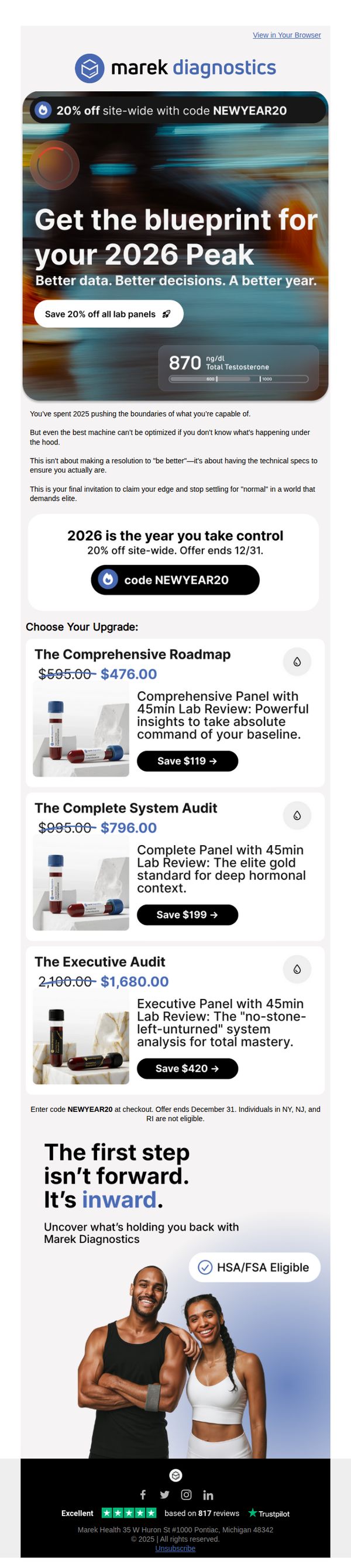
5. Marek Health: Upgrade your health before the clock resets ⏱️
Objective
This email aims to drive last-minute purchases of diagnostic lab panels by framing health optimization as a strategic, data-driven upgrade for 2026, leveraging urgency with a year-end discount and positioning the brand as essential for elite performance.
Why this works
By reframing health not as a resolution but as a technical upgrade, the campaign speaks directly to high-performers who value data-backed decisions over vague self-improvement promises, making the offer feel like a strategic investment rather than a wellness whim.
How to implement
The use of bold, aspirational language like '2026 Peak' and 'take control' taps into the audience’s desire for mastery and precision, transforming a medical service into a competitive advantage that aligns with their identity as elite performers pushing boundaries.
Pro Tip
Add a countdown timer near the CTA to reinforce urgency beyond the December 31 end date, especially since the email references ‘the clock resets’, visual scarcity would boost immediate action without relying solely on text. • Include a short testimonial or quote from a verified customer who used one of the panels to achieve a measurable result, placed just above the product grid to build social proof and reduce perceived risk before the price point is revealed.
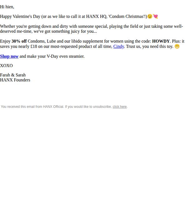
6. Hanx: Hien, Your Gift Awaits... 🌹
Objective
The email aims to drive immediate purchases by offering a time-sensitive Valentine’s Day discount on intimate wellness products, while reinforcing brand personality through playful, conversational copy that resonates with the recipient’s personal lifestyle.
Why this works
The email brilliantly reframes Valentine’s Day as 'Condom Christmas' to disarm the recipient with humor, making a potentially awkward product category feel approachable, fun, and aligned with real-life intimacy rather than romantic clichés.
How to implement
By personalizing the offer with the recipient’s name and tying the discount to a specific, high-demand product (Cindy), the campaign creates urgency and relevance, making the recipient feel seen and the deal too good to ignore.
Pro Tip
Add a visual hero section with lifestyle imagery or product shots of the 'Cindy' toy and condoms to break up text-heavy content and reinforce desire through visual appeal, especially since the offer hinges on product desirability. • Include a subtle countdown timer or urgency indicator (e.g., 'Offer expires in 48 hours') near the CTA to amplify FOMO, since the current copy implies urgency without a clear time-bound trigger to act now.
7. Cool Crutches: A Note from Amelia 💌
Objective
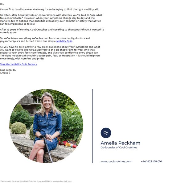
To build trust and guide users toward a personalized mobility aid solution by sharing a founder’s empathetic message and directing them to a tailored quiz that matches their needs with the right product.
Why this works
The email opens with a deeply personal, founder-led narrative that immediately humanizes the brand and validates the reader’s emotional struggle, making the subsequent product recommendation feel like trusted advice rather than a sales pitch.
How to implement
By framing the quiz as a solution born from 19 years of real-world feedback from doctors and patients, the email positions the brand as an authority while reducing decision fatigue, a powerful psychological nudge that turns overwhelm into action.
Pro Tip
Add a brief testimonial or stat near the CTA (e.g., '92% of users found their perfect fit in under 3 minutes') to reduce friction and reinforce the quiz’s value before the user clicks. • Include a small visual cue or icon next to the CTA link, such as a right-pointing arrow or checkmark, to subtly guide the eye and increase click-through by making the action more intuitive.
8. Stem Cell Institute : Questions About Stem Cells? We've Got Answers.
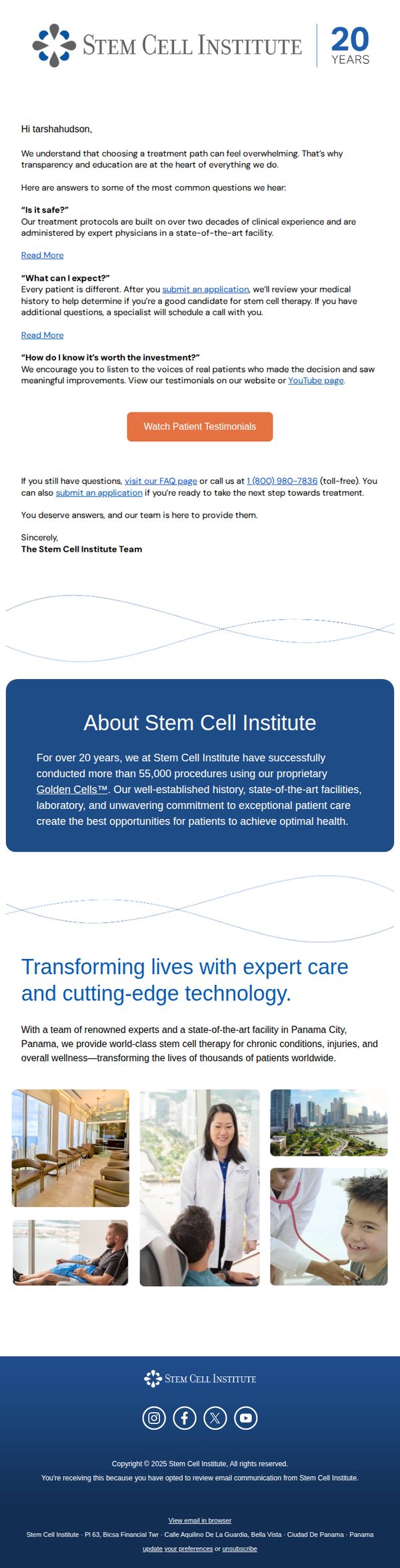
Objective
This email aims to build trust and reduce hesitation by directly addressing common patient concerns about stem cell therapy, guiding the reader toward taking the next step, submitting an application or watching testimonials, with the ultimate goal of converting curious prospects into qualified leads.
Why this works
The email brilliantly preempts buyer anxiety by front-loading answers to the top three patient objections, safety, personal outcomes, and ROI, making the reader feel heard and reducing friction before they even consider booking a consultation.
How to implement
Instead of pushing a hard sell, the campaign positions the brand as a trusted educator by using a conversational Q&A format that mirrors real patient conversations, which builds credibility and invites deeper engagement without triggering sales resistance.
Pro Tip
The primary CTA 'Watch Patient Testimonials' is visually prominent but lacks urgency or personalization; adding a dynamic element like 'See how patients like you improved in 30 days' would strengthen emotional pull and conversion intent. • The email lacks a secondary CTA or directional nudge after the testimonial section, adding a subtle 'Still unsure? Schedule a free 15-minute consult with our specialist' button would capture mid-funnel readers who need more hand-holding.
9. Warby Parker: Get the lenses you’re looking for
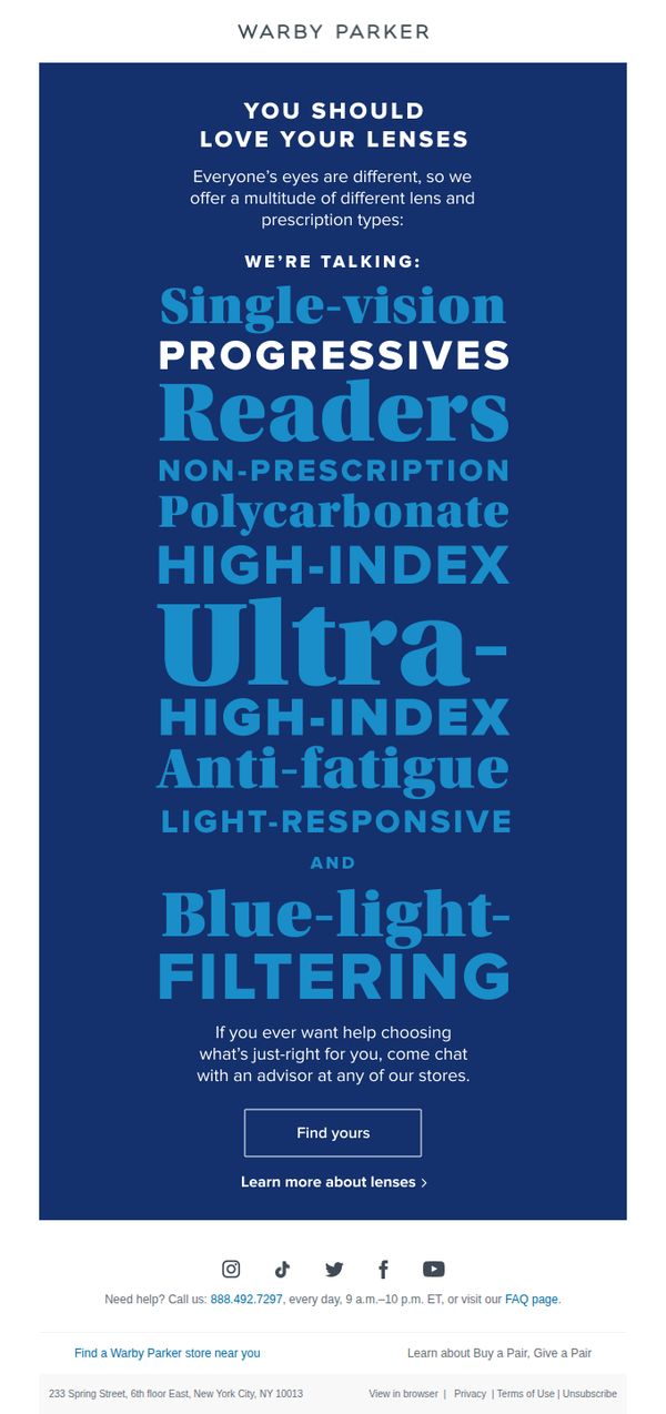
Objective
This email aims to guide customers toward selecting the right lens type by highlighting Warby Parker’s wide range of optical options, while encouraging in-store or chat-based consultation to reduce decision fatigue and drive conversions through personalized support.
Why this works
Warby Parker smartly frames lens selection as a personal journey by acknowledging that everyone’s eyes are different, which builds trust and positions their wide lens variety as a thoughtful solution rather than just a product list.
How to implement
The email uses bold, staggered typography to visually prioritize lens types like ‘Progressives’ and ‘Blue-light-filtering,’ making complex optical options feel approachable and scannable for overwhelmed shoppers without sacrificing clarity.
Pro Tip
Add a brief visual comparison or iconography next to each lens type (e.g., a sun for blue-light filtering, a gradient for progressives) to help users quickly grasp benefits without reading dense text, improving scanability and reducing cognitive load. • Include a micro-testimonial or customer quote near the CTA, such as ‘92% of customers found their perfect lenses with our advisors’, to reinforce social proof and reduce hesitation before clicking ‘Find yours.’
10. Visiting Angels : Give Your Loved One the Care They Deserve
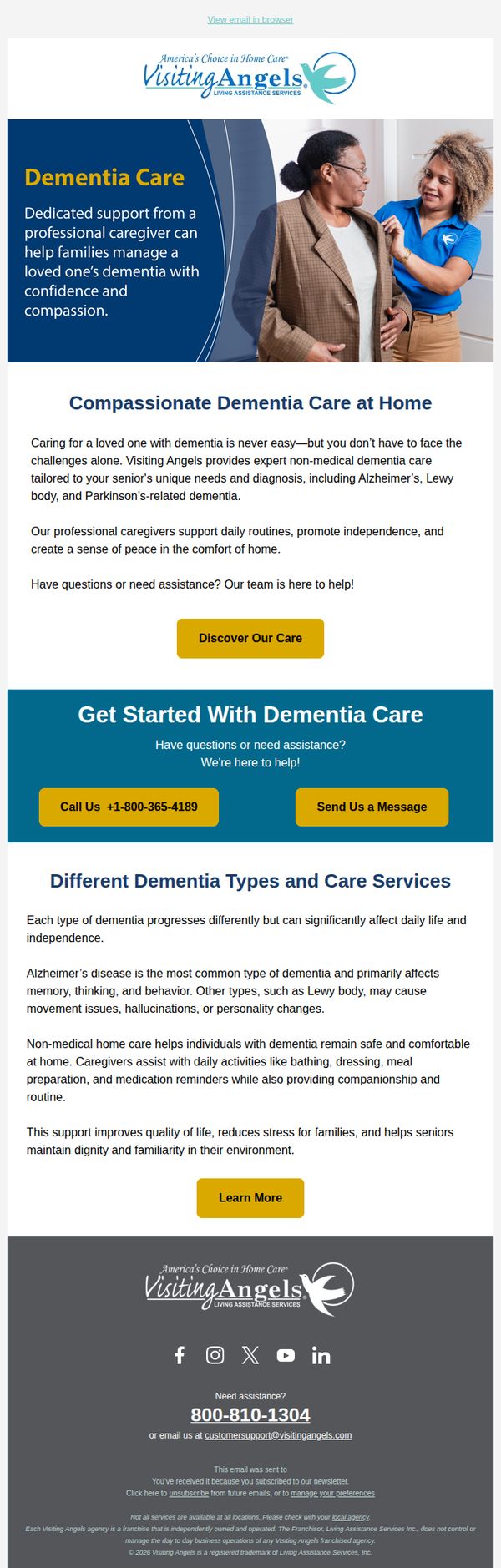
Objective
This email aims to reassure families caring for loved ones with dementia by highlighting Visiting Angels’ compassionate, expert-led home care services while encouraging immediate contact through clear CTAs. It positions the brand as a trusted partner in managing dementia-related challenges with dignity and support.
Why this works
The email opens with an emotionally resonant hero section that pairs a warm caregiver-patient image with empathetic copy, immediately validating the reader’s emotional burden and positioning the brand as a compassionate ally rather than just a service provider.
How to implement
By clearly segmenting dementia types and explaining how non-medical care addresses each one’s unique symptoms, the email educates without overwhelming, turning complex medical concerns into relatable, manageable solutions that reinforce trust and authority.
Pro Tip
Add a brief testimonial or quote from a real family near the top to humanize the offer and build social proof before diving into educational content, which currently feels slightly clinical without emotional anchoring. • Include a subtle visual cue like a progress bar or checklist under 'Get Started With Dementia Care' to guide users through next steps, this would reduce hesitation by making the onboarding feel structured and manageable.