Medicine relational campaign emails worth copying
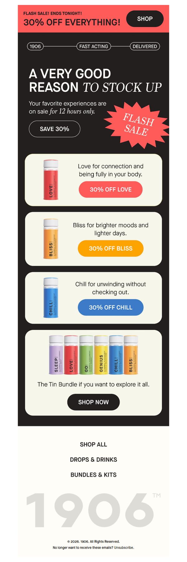
1. 1906: Today only: Everything is 30% off.
Objective
This email aims to drive immediate sales by creating urgency around a limited-time 30% off flash sale across all products, encouraging subscribers to stock up before the offer expires tonight.
Why this works
The email brilliantly leverages time-sensitive urgency with a bold 'FLASH SALE! ENDS TONIGHT!' headline paired with a 12-hour countdown, compelling readers to act now rather than delay their purchase decision.
How to implement
Each product is emotionally framed with benefit-driven micro-copy like 'Love for connection' and 'Chill for unwinding,' transforming functional items into experiential solutions that resonate with users’ daily emotional needs.
Pro Tip
Add a visual countdown timer near the top of the email to reinforce urgency beyond text, making the time constraint more visceral and harder to ignore as users scroll. • Include a brief customer testimonial or social proof under the hero section to build trust and validate the value of the 30% discount, especially since it’s applied sitewide and may raise skepticism.
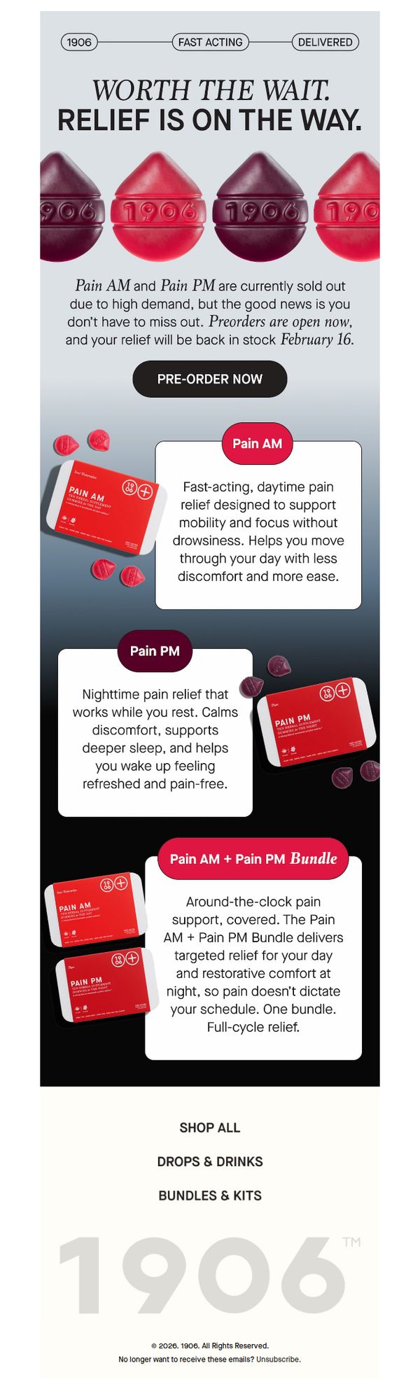
2. 1906: Pain AM + Pain PM are coming back on February 16
Objective
The email aims to re-engage customers by announcing the return of sold-out Pain AM and Pain PM products on February 16, encouraging immediate pre-orders to secure relief before stock runs out again.
Why this works
The email brilliantly turns scarcity into urgency by announcing sold-out products are returning, not just hinting at restock, but giving a firm date and opening pre-orders immediately to convert anticipation into action.
How to implement
By clearly separating Pain AM and Pain PM into distinct benefit-driven sections, the email educates users on day-versus-night use cases, making it easy for customers to self-select the right product or bundle based on their lifestyle needs.
Pro Tip
Add a countdown timer near the CTA to visually reinforce urgency around the February 16 restock date, increasing conversion by tapping into real-time scarcity psychology. • Include a short testimonial or user quote under each product description to build social proof and validate the claimed benefits, especially since these products are returning after high demand.
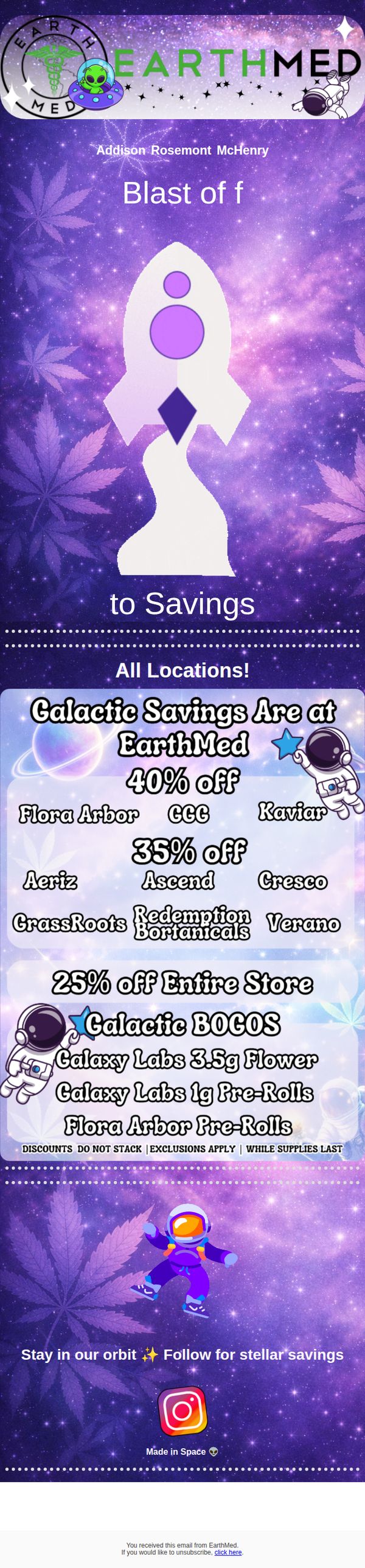
3. EarthMed: Galactic Savings Have Landed 🚀
Objective
This email aims to drive immediate in-store and online purchases by promoting limited-time, tiered discounts under a fun, space-themed campaign that creates urgency and excitement around EarthMed’s product offerings.
Why this works
The email brilliantly uses a cohesive space theme to transform a routine discount promotion into a memorable, immersive experience that aligns with the brand’s playful personality while making savings feel like a cosmic event.
How to implement
By tiering discounts into clear, visually separated blocks with brand names and percentages, the email reduces cognitive load and helps customers instantly identify which products offer the best value, increasing decision speed.
Pro Tip
Add a visible countdown timer or 'while supplies last' urgency indicator near the top of the offer section to reinforce scarcity and drive faster conversions, especially since the discounts are time-sensitive. • Include a direct link to the product pages for the featured brands (e.g., Galaxy Labs, Flora Arbor) instead of just listing them, this reduces friction and turns browsing into immediate buying.
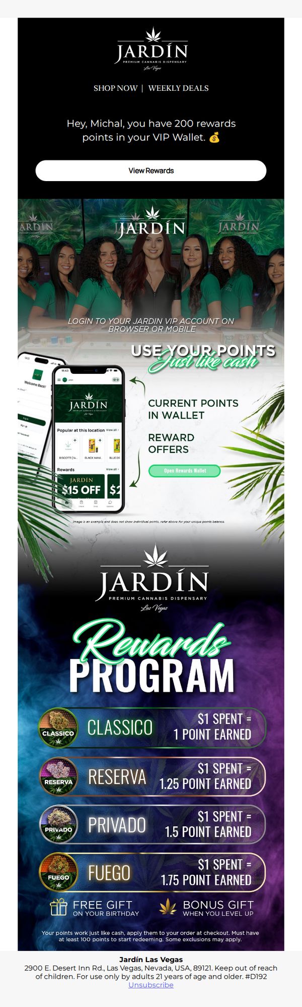
4. Jardín Premium Cannabis: You’ve got points to spend🎉
Objective
This email aims to re-engage a VIP customer by highlighting their accumulated rewards points and encouraging immediate redemption through a personalized, visually rich reminder that positions points as spendable currency. It also seeks to reinforce brand loyalty by showcasing tiered earning potential and exclusive perks.
Why this works
The email brilliantly personalizes the experience by addressing the recipient by name and displaying their exact point balance, creating an immediate sense of ownership and urgency that drives action without feeling pushy or generic.
How to implement
By visually equating rewards points to cash through mobile app screenshots and bold text like 'Use Your Points Just Like Cash,' the campaign removes psychological friction and transforms abstract loyalty points into tangible, spendable value that customers instantly understand.
Pro Tip
Add a countdown timer or expiration notice near the 'View Rewards' CTA to create urgency, since points may expire or offers may be time-sensitive, this would significantly boost immediate click-through rates. • Include a small testimonial or social proof snippet near the rewards tiers (e.g., '92% of VIPs redeem within 7 days') to reduce hesitation and reinforce that others are actively using and benefiting from the program.
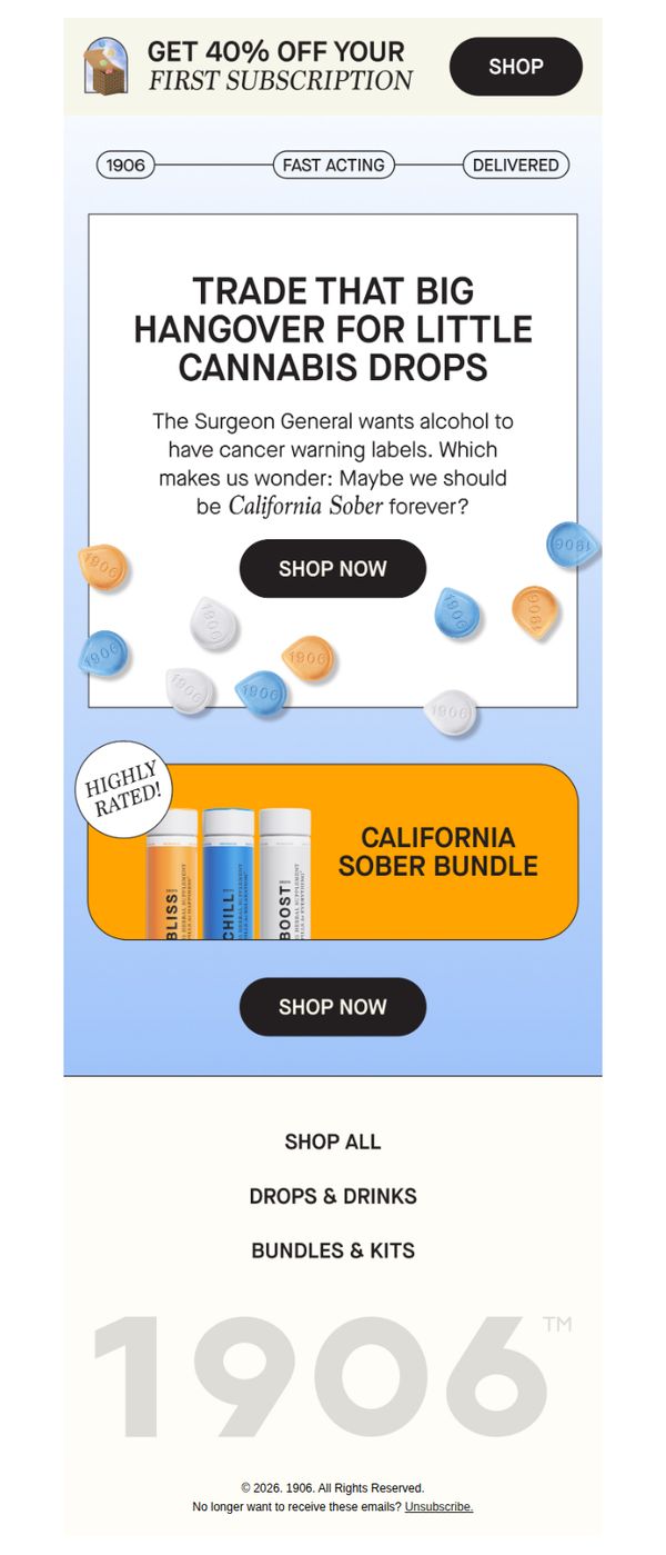
5. 1906: Maybe we should be California Sober forever?
Objective
The email aims to reframe cannabis as a healthier alternative to alcohol by leveraging cultural commentary and a Surgeon General reference, encouraging recipients to try 1906’s products through a compelling discount and curated bundle offer.
Why this works
The email brilliantly uses cultural commentary, referencing the Surgeon General’s stance on alcohol, to position cannabis not as a vice, but as a conscious, modern lifestyle upgrade that feels both rebellious and responsible.
How to implement
By packaging products into a ‘California Sober Bundle,’ the campaign taps into trending wellness narratives while simplifying the decision-making process for new users, reducing friction and increasing perceived value through curated curation.
Pro Tip
Add a micro-testimonial or star rating directly under the ‘California Sober Bundle’ to reinforce social proof at the moment of decision, since the ‘Highly Rated!’ badge is visually disconnected from the product imagery. • Include a brief, one-line explanation of what ‘California Sober’ means for newcomers, even if it’s trendy, not all recipients will understand the term, which could dilute the message’s persuasive power.
6. Country Grown Cannabis: ❄️ WINTER STORM ❄️ CLOSED SUNDAY

Objective
This email aims to inform customers of a temporary store closure due to a winter storm while encouraging continued engagement through app downloads, push notifications, and rewards program participation. It also promotes location awareness and referral incentives to maintain customer loyalty during the disruption.
Why this works
The email smartly turns a service disruption into an engagement opportunity by guiding users to download the app and enable push notifications, ensuring they stay informed and connected even when physical stores are closed.
How to implement
By embedding a clear, step-by-step visual tutorial for enabling notifications, the brand reduces friction and increases adoption, turning a technical task into a simple, confidence-building user experience that boosts long-term retention.
Pro Tip
Add a countdown timer or dynamic message near the top indicating when the store will reopen to reduce customer uncertainty and encourage return visits once operations resume. • Include a brief FAQ or 'What to Do Now' section under the closure announcement to address common customer concerns like online ordering availability, delivery options, or curbside pickup during the storm.
7. RISE Dispensaries: Have you Tried RYTHM Remix Infused Pre-Rolls?

Objective
This email aims to drive immediate product trials and conversions for RYTHM Remix Infused Pre-Rolls by highlighting their high potency, premium ingredients, and flavor variety, while directing customers to shop online or check local RISE dispensary stock.
Why this works
The email masterfully positions the RYTHM Remix as a premium, high-potency experience by leading with bold claims like 'Nothing Hits Harder Than The Remix' and backing it with specific THC percentages, which builds instant credibility and desire among experienced users.
How to implement
By visually organizing each strain into color-coded, labeled tiles with clear indica/sativa/hybrid indicators, the email transforms a complex product line into an intuitive, browsable grid that reduces decision fatigue and encourages exploration of multiple options.
Pro Tip
Add a limited-time offer or urgency trigger (e.g., 'First 50 orders get free delivery') near the first CTA to reduce hesitation and boost immediate conversion from curious readers. • Include a small testimonial or user rating snippet under the product grid to reinforce social proof, especially since potency claims are bold and could benefit from third-party validation to build trust.
8. Cannabis Dispensary: 🚨 Important Information About Your Loyalty Tier
Objective
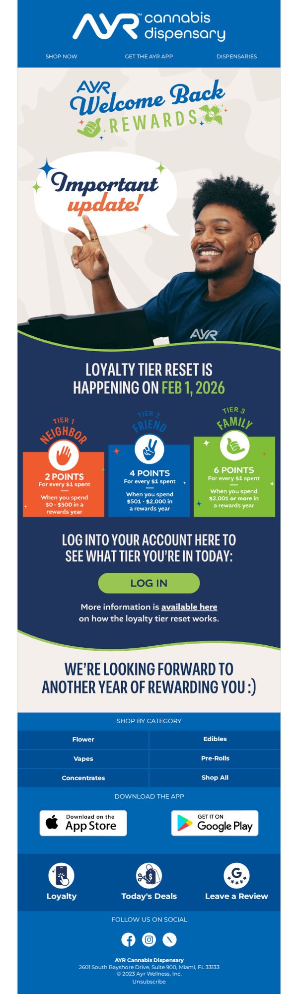
This email aims to inform loyalty program members about an upcoming reset of their tier status on February 1, 2026, while encouraging them to log in and check their current tier to maintain or upgrade benefits. It also reinforces brand engagement through app downloads and category browsing.
Why this works
The email opens with a friendly yet urgent tone using emojis and bold typography to signal importance without alarming the customer, striking the perfect balance between excitement and clarity for loyalty updates.
How to implement
By visually segmenting the three loyalty tiers with distinct colors, icons, and point structures, the campaign makes complex reward logic instantly digestible, helping customers self-identify where they stand and what they need to do next.
Pro Tip
Add a countdown timer above the 'LOG IN' button to create urgency around checking tier status before the Feb 1 reset, increasing immediate click-through rates by leveraging time-sensitive motivation. • Include a brief testimonial or quote from a Tier 3 member near the bottom to emotionally reinforce the value of reaching higher tiers, subtly nudging mid-tier customers to increase spending to unlock better rewards.
9. 1906: Order by tomorrow and you’re set for February 14.
Objective
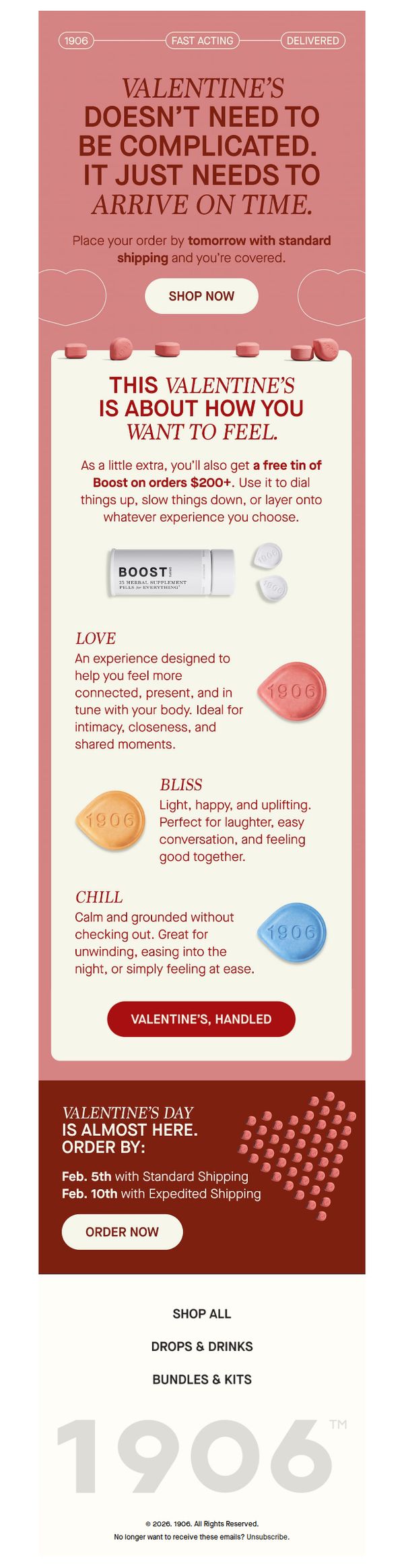
This email aims to drive Valentine’s Day orders by emphasizing timely delivery and emotional alignment with the recipient’s desired experience, while incentivizing larger purchases with a free product offer.
Why this works
The email brilliantly reframes Valentine’s Day not as a gift-giving obligation but as a personalized emotional experience, aligning product benefits with how the recipient wants to feel, intimate, joyful, or calm, making the offer deeply resonant and emotionally driven.
How to implement
By offering a free tin of Boost on orders over $200, the campaign creates a compelling threshold that encourages higher average order value while positioning the bonus as a flexible enhancer of any experience, not just a transactional add-on.
Pro Tip
Add a visual countdown timer near the 'Order by tomorrow' message to heighten urgency and reduce cognitive load, users should instantly grasp how much time remains without scanning dates. • Include a short testimonial or social proof near the product grid (e.g., '92% of couples say 1906 helped them feel more connected') to reinforce emotional claims with real-user validation and reduce perceived risk.
10. 1906: 35% off sitewide.12 hours only. Today only.
Objective
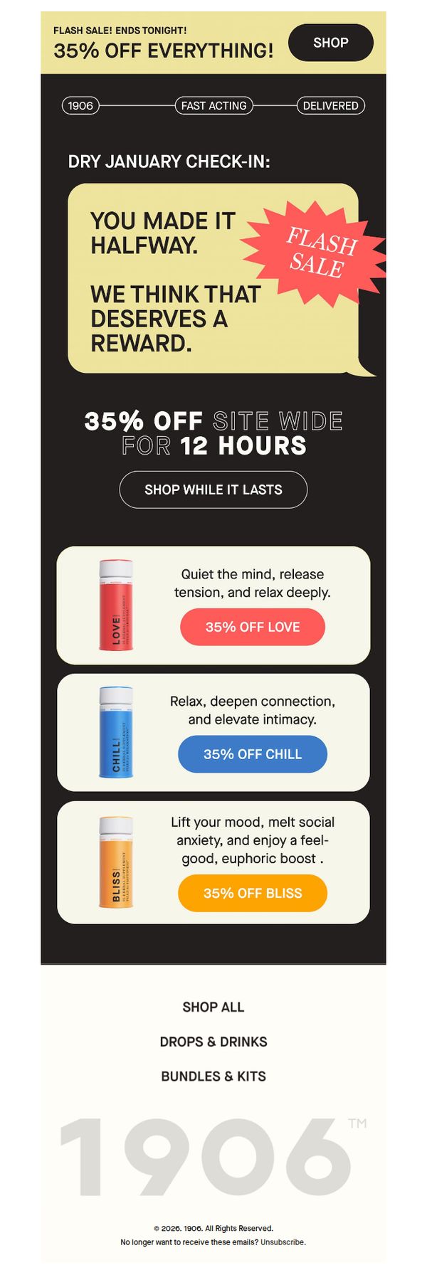
This email aims to drive immediate purchases by leveraging urgency and personalization, rewarding subscribers for partial engagement with a limited-time 35% sitewide discount that expires in 12 hours. It encourages quick action by framing the offer as a deserved reward for making it halfway through a journey.
Why this works
The email brilliantly personalizes urgency by acknowledging the recipient’s partial progress with 'You made it halfway,' transforming a generic flash sale into a tailored reward that feels earned, not pushed, which increases emotional resonance and conversion likelihood.
How to implement
Each product is paired with a benefit-driven micro-copy and a color-coded CTA button that matches the product’s vibe, like '35% OFF LOVE' in coral, creating visual harmony and psychological alignment that guides the eye and reinforces emotional intent without overwhelming the user.
Pro Tip
Add a countdown timer beneath the 'SHOP WHILE IT LASTS' CTA to visually reinforce urgency and reduce cognitive load, users shouldn’t have to mentally calculate how much time remains when the goal is instant conversion. • Include a brief testimonial or social proof snippet near the product grid (e.g., 'Over 10,000 customers used LOVE to unwind this week') to build trust and validate the emotional benefits claimed, especially since the products are experience-based.