Proven relational campaign email designs you can use for NFT



1. BFF: 🩷 BFF joins the Boss Beauties family
Objective
This email announces BFF’s acquisition by Boss Beauties, aiming to reassure subscribers of continued value while exciting them about future collaborations and community growth. It invites readers to join a celebratory Twitter Space and reinforces brand loyalty through founder spotlights and curated content.
Why this works
The email brilliantly frames acquisition as a celebration rather than a corporate shift, using warm language and a surprise bracelet teaser to emotionally anchor readers to the brand’s evolving identity while preserving community trust.
How to implement
By spotlighting founder voices and cross-promoting high-profile media features, the email leverages social proof and authority to validate the merger’s strategic value, making readers feel they’re part of an elite, forward-thinking movement.
Pro Tip
The primary CTA 'Read More On BFF Discover' is vague and doesn’t clearly signal what users will gain; rephrasing to 'Discover What’s Next for BFF + Boss Beauties' would better align with the acquisition announcement and drive curiosity. • The 'Catch Up Quick' section, while informative, lacks visual hierarchy, adding icons or bold headers for each bullet point would improve scannability and help readers quickly identify topics most relevant to their interests.
2. Global Coin Research: 🔵 GCR Events: Week of 18 Sep
Objective
This email aims to inform the Global Coin Research community about upcoming events, partnerships, and opportunities for engagement, including town halls, deal calls, fellowship programs, and hiring, to drive participation, community growth, and investor involvement.
Why this works
The email strategically bundles multiple high-value community events into a single digest, reducing inbox fatigue while increasing the perceived density of opportunities, a smart way to keep engaged users coming back for more without overwhelming them.
How to implement
By embedding direct calendar links and a unified 'Add All to Your Calendar' button, the campaign removes friction from event attendance, turning passive readers into active participants with minimal effort, a subtle but powerful conversion lever for time-sensitive events.
Pro Tip
The 'Deal-A-Thon' section lacks visual hierarchy, adding a bold headline, icon, or colored background would help it stand out from surrounding text and increase click-through to the Discord participation steps. • The hiring banner, while visually distinct, doesn’t include a direct CTA button, adding a 'Apply Now' or 'Learn More' button would improve conversion by guiding users to the application page without requiring them to click a small text link.
3. onlyone: Help small islands cope with the impacts of climate change
Objective
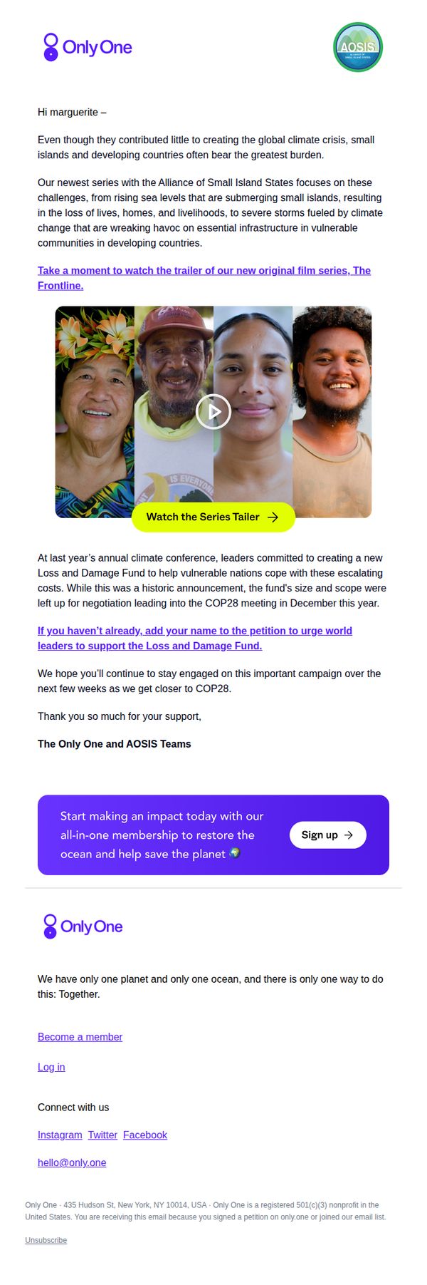
This email aims to raise awareness about the disproportionate climate impacts on small island nations and mobilize support through petition signing and membership sign-ups ahead of COP28. It seeks to deepen engagement by connecting emotional storytelling with actionable advocacy.
Why this works
The email powerfully frames climate justice as a moral imperative by highlighting how small island nations, despite minimal emissions, suffer the worst consequences, a narrative that builds empathy and urgency in the reader.
How to implement
By embedding a video trailer within the body, the campaign transforms passive reading into an immersive experience, using human faces and emotional storytelling to deepen connection before prompting action.
Pro Tip
The primary CTA button is visually strong but buried below two paragraphs of text; moving it immediately after the video trailer would capitalize on emotional momentum and increase conversion likelihood. • Adding a short testimonial or quote from a small island community member above the petition CTA would humanize the issue further and reinforce the urgency with authentic, first-person voice.
4. Covalent: Covalent Unified Newsletter #18
Objective
This email aims to inform and excite Web3 developers about Covalent’s latest product updates, particularly the launch of the Covalent SDK, while reinforcing brand authority by showcasing ecosystem growth and technical integrations. It also seeks to drive engagement through educational content and community participation.
Why this works
The email brilliantly positions a technical product launch, the Covalent SDK, as an invitation to co-create the future of Web3, transforming a feature drop into a community movement that fuels developer loyalty and excitement.
How to implement
By spotlighting real-time ecosystem milestones like indexing 177 chains with a visual progress bar, the campaign turns abstract scale into tangible proof of reliability, making enterprise-grade infrastructure feel accessible and trustworthy to indie developers.
Pro Tip
Add a secondary CTA beneath each major section (e.g., after the SDK intro or chain indexing stat) to guide users toward immediate next steps like watching the video or downloading docs, reducing friction for high-intent readers. • Integrate a subtle countdown or ‘limited-time access’ cue for the Hidden Gems episode or SDK early adopter perks to create urgency without being pushy, leveraging FOMO to boost click-through on key conversion points.
5. The Sandbox Game: Discover SHIBUYA109 and Tsubasa Cup Adventures! 🌸🎋
Objective
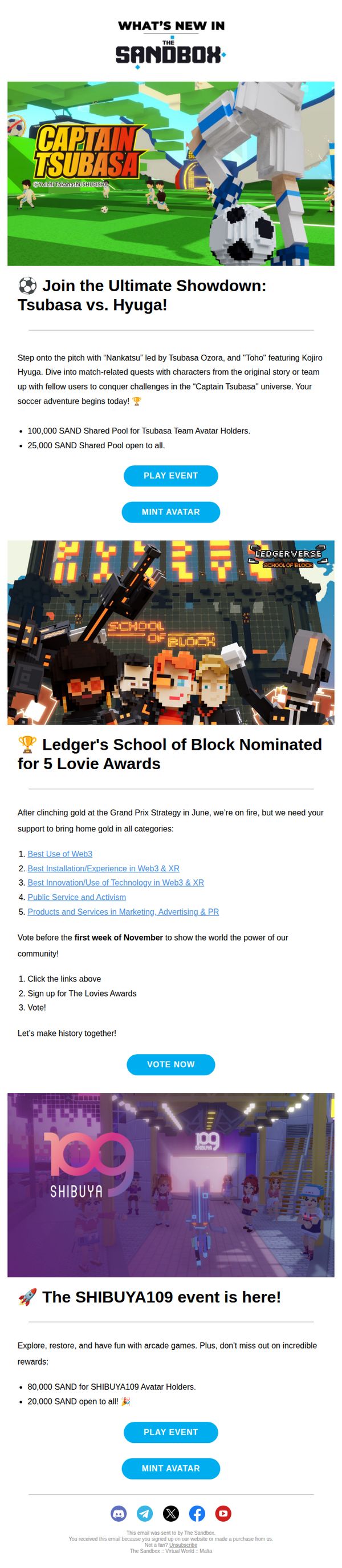
This email aims to drive engagement and participation in two major in-game events, Captain Tsubasa and SHIBUYA109, by highlighting exclusive rewards, community voting opportunities, and avatar minting incentives to deepen player investment and excitement.
Why this works
The email brilliantly leverages nostalgia and IP collaboration by featuring Captain Tsubasa, instantly resonating with fans while offering tangible rewards that incentivize both solo play and team-based social interaction within the game.
How to implement
By clearly separating event sections with bold headers and vibrant visuals, the campaign ensures each promotion stands out without overwhelming the reader, making it easy for users to identify what matters most to them personally.
Pro Tip
Add a countdown timer next to the 'VOTE NOW' CTA to emphasize the deadline and create urgency, as the current text only mentions 'first week of November' without visual reinforcement. • Include a small icon or badge near each reward amount (e.g., 100,000 SAND) to visually differentiate between avatar-holder-exclusive and open-to-all rewards, reducing cognitive load and increasing clarity.
6. Betaworks: Bytes: Beta the first no-code AR creation tool, Arc is maxed out

Objective
This email aims to inform subscribers about the latest developments in tech, art, and entrepreneurship while highlighting Betaworks’ portfolio companies and upcoming events. It also seeks to drive engagement through event RSVPs, social media interaction, and content discovery.
Why this works
The email brilliantly blends breaking tech news with curated cultural moments, making it feel less like a newsletter and more like a conversation with a well-connected insider who knows what actually matters in the ecosystem.
How to implement
By embedding real-time social content like Twitter threads and YouTube highlights, the campaign turns passive readers into active participants, subtly encouraging them to click, watch, and engage beyond the email without feeling pushed.
Pro Tip
The primary CTA 'RSVP' appears multiple times but lacks visual hierarchy or urgency, adding a countdown timer or color contrast near event listings would significantly boost conversion by signaling scarcity and directing attention. • The 'Scrolling Picks' section includes a YouTube video thumbnail without a clear play indicator or hover state in static email format, replacing it with a static preview image and a 'Watch Now' button would improve usability and reduce confusion.
7. Lore Machine (formerly Pentagraph): Lore Machine v1

Objective
This email introduces Lore Machine v1, a new AI-powered story visualization system, to early adopters and potential users. It aims to onboard interested writers by explaining the platform’s unique value proposition and inviting them to join the waitlist or explore the user manual.
Why this works
The email brilliantly frames Lore Machine not just as a tool, but as a storytelling revolution, positioning it as the first system that transforms entire narratives into visual sequences, not just single outputs, which immediately differentiates it from competitors like MidJourney or Stable Diffusion.
How to implement
By introducing Carl, the alien spokesperson, the brand injects personality and whimsy into a tech-heavy announcement, making complex AI features feel approachable and memorable while subtly reinforcing the 'otherworldly' creative power users can expect from the platform.
Pro Tip
The primary CTA 'Lore Machine Dot World' is visually prominent but lacks urgency or benefit-driven language; replacing it with something like 'Join the Waitlist, Visualize Your Story First' would better align with the onboarding goal and increase conversion. • The email lacks a clear visual hierarchy between sections, especially between 'What is Lore Machine?' and 'Why Lore Machine?', which could confuse readers; adding subtle dividers or section headers with icons would improve scannability and flow.
8. onlyone: The climate underdog
Objective
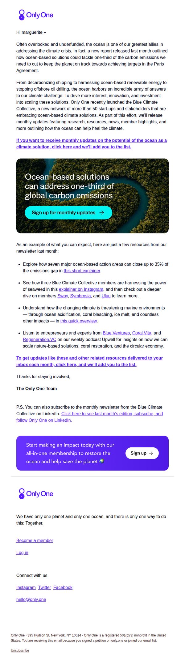
This email aims to educate subscribers on the ocean’s critical yet underappreciated role in climate solutions while driving sign-ups for the Blue Climate Collective’s monthly updates and membership. It positions Only One as a thought leader mobilizing innovation around ocean-based climate action.
Why this works
The email brilliantly reframes the ocean not as a victim of climate change but as a powerful, actionable ally, a narrative shift that empowers readers and invites them into solution-oriented engagement rather than guilt-driven activism.
How to implement
By spotlighting real members like Sway, Symbrosia, and UlUU alongside digestible explainers and podcast features, the campaign builds credibility through social proof while making complex climate topics feel accessible and human-centered.
Pro Tip
Add a subtle countdown or progress bar near the CTA to create urgency around joining the collective before the next monthly update drops, reinforcing the value of timely participation. • Include a short testimonial or quote from a Blue Climate Collective member directly beneath the hero image to humanize the initiative and strengthen emotional resonance before diving into resources.
9. BoysClub: the $14,500 group chat

Objective
This email aims to engage subscribers with a mix of cultural commentary, crypto news, and community-driven product picks while reinforcing Boys Club’s brand voice as irreverent, insider-y, and community-first. It also subtly drives app downloads and referrals through embedded CTAs.
Why this works
The email masterfully blends high-stakes crypto drama with absurd cultural moments to create a tone that feels like an insider group chat, making complex topics digestible and entertaining without sacrificing credibility or edge.
How to implement
By featuring real-time tweet screenshots and unfiltered product reviews with zero affiliate bias, the campaign builds authentic trust with readers who crave unfiltered opinions over polished marketing, turning subscribers into loyal community participants.
Pro Tip
The 'Blessed by the Boys' product section lacks visual hierarchy, adding a small badge or icon next to the featured RNW cleanser would draw the eye and reinforce its 'staff pick' status without adding clutter. • The footer’s 'Get the app' and 'Start writing' buttons compete for attention with no clear priority; repositioning 'Get the app' as the primary CTA with a bolder color or larger size would better align with the campaign’s growth objective.
10. The Sandbox Game: Welcome to The Sandbox!

Objective
This email aims to welcome new users to The Sandbox by showcasing its immersive, multi-experience virtual world and motivating immediate engagement through compelling visuals and clear calls to action. It seeks to convert curiosity into active participation by highlighting social, creative, and reward-driven opportunities.
Why this works
The email brilliantly opens with a high-energy visual and bold headline that instantly communicates the platform’s futuristic, boundary-pushing identity, making the user feel they’re stepping into something revolutionary, not just another game.
How to implement
By spotlighting recognizable brand collaborations like Snoop Dogg and Hell’s Kitchen in a dynamic product grid, the email leverages social proof and pop culture relevance to build instant credibility and excitement for users unfamiliar with the platform’s ecosystem.
Pro Tip
Add a subtle countdown timer or 'New User Bonus' badge near the first CTA to create urgency and incentivize immediate action, since the current design lacks time-sensitive motivation for new signups. • Include a short testimonial or user stat (e.g., '500K+ creators already building') in the 'Be Rewarded' section to reinforce social proof and validate the reward claims with real-world traction.