Personal Care relational campaign email designs from top brands
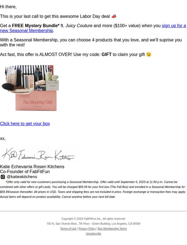


1. FabFitFun: Last chance to get a JUICY surprise this Labor Day 🍉
Objective
This email aims to drive last-minute sign-ups for FabFitFun’s Seasonal Membership by emphasizing urgency and exclusivity around a limited-time Labor Day offer that includes a free high-value mystery bundle. It leverages personal endorsement from a co-founder to build trust and encourage immediate action.
Why this works
The email brilliantly combines urgency with exclusivity by framing the offer as a 'last call' tied to a holiday, making subscribers feel they’re accessing a special, time-sensitive privilege rather than just another promotion.
How to implement
Including a personal signature and social handle from a co-founder adds authenticity and emotional connection, transforming a transactional pitch into a trusted recommendation that feels more like a gift from a friend than a sales tactic.
Pro Tip
Add a visual countdown timer near the CTA to reinforce urgency, since the offer’s expiration date is mentioned but not visually emphasized, this would increase perceived scarcity and drive faster conversions. • Include a small product grid or teaser image of 1–2 items from the 'Juicy Couture' bundle to spark curiosity and reduce perceived risk, helping subscribers visualize the value they’re about to receive.
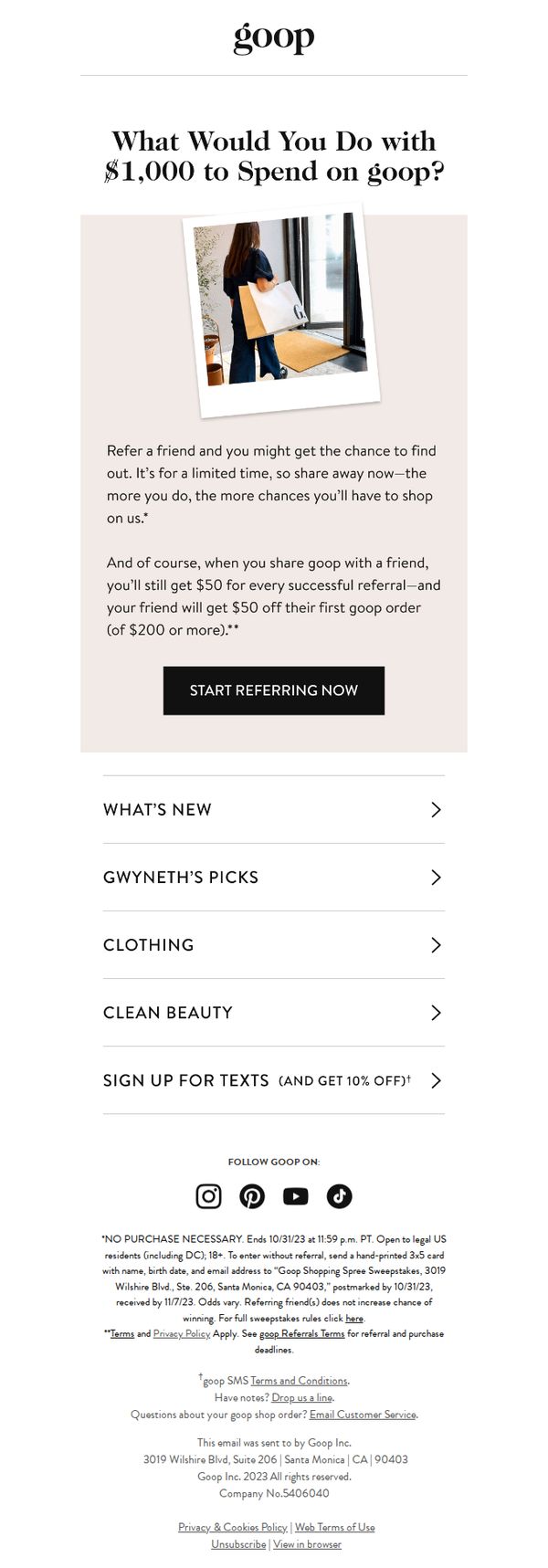
2. Goop: $1,000 to spend on goop…
Objective
This email aims to drive customer referrals by offering a high-value incentive, a chance to win $1,000 to spend on Goop, while also reinforcing the existing $50 referral bonus to encourage immediate sharing. It leverages FOMO and social proof to boost engagement and acquisition.
Why this works
The email opens with a provocative, emotionally resonant question, 'What Would You Do with $1,000 to Spend on goop?', which instantly personalizes the offer and invites the reader to visualize luxury, making the incentive feel tangible and desirable rather than abstract.
How to implement
By layering the sweepstakes on top of the existing $50 referral bonus, Goop creates a dual-motivation engine: immediate reward for sharing plus aspirational upside, which increases perceived value and reduces friction for users who might otherwise ignore a standard referral program.
Pro Tip
Add a subtle countdown timer or 'Limited Time' badge near the CTA to amplify urgency, since the sweepstakes ends 10/31/23, this visual cue would reinforce the time-sensitive nature of the offer without adding clutter. • Include a micro-testimonial or social proof element (e.g., 'Over 12,000 people referred a friend this week') near the CTA to reduce perceived risk and increase trust, especially for users unfamiliar with Goop’s referral program.
3. Made By Sunday: £34 off (the right link!)
Objective
The email aims to re-engage subscribers by humorously acknowledging a broken link error and turning it into a promotional opportunity, encouraging immediate action to claim a £34 discount on best-selling products before the sale ends.
Why this works
The brand brilliantly transforms a technical mishap into a relatable, personality-driven moment by referencing Britney Spears and morning hair, making the customer feel like they’re in on the joke rather than being inconvenienced.
How to implement
By repeating the correct link twice, once in the body and again in the PS, the email strategically reduces friction and reassures the reader they won’t miss out, which boosts conversion confidence without sounding pushy.
Pro Tip
Add a countdown timer or urgency indicator near the CTA to reinforce the 'weekend exclusive' claim and motivate faster action, since the current design relies solely on text to convey time sensitivity. • Include a small visual preview or icon of the best-selling products being discounted to give context to the offer, right now, the email lacks any product imagery, which may reduce perceived value or relevance.
4. Harrys: It’s time to face facts…
Objective
This email aims to encourage subscribers to upgrade their daily skincare routine by switching from soap to Harry’s face wash, emphasizing improved cleanliness, freshness, and sensory experience without requiring lifestyle changes.
Why this works
The email brilliantly reframes face wash as a low-effort upgrade rather than a lifestyle overhaul, making the switch feel accessible and non-disruptive to the reader’s existing routine.
How to implement
By visually annotating product benefits directly on the hero image, the email creates instant clarity and reinforces key selling points without overwhelming the reader with text.
Pro Tip
Add a subtle urgency element like a limited-time discount or stock indicator near the CTA to nudge immediate action, since the current design lacks any time-based motivation. • Reposition the secondary 'SHOP NOW' CTA under the shower gel section to match the visual hierarchy of the primary CTA, ensuring consistent behavioral cues across product categories.
5. Bite: Just so you know.
Objective
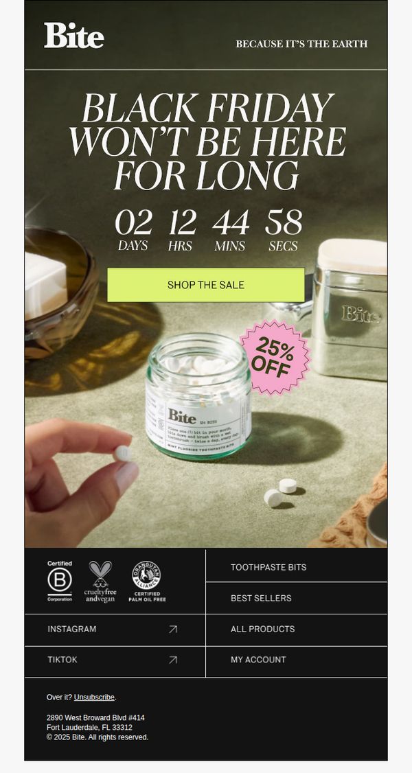
This email aims to create urgency around Bite’s Black Friday sale by highlighting its limited-time nature and encouraging immediate purchases through a prominent countdown and discount offer. It also reinforces brand values like sustainability and ethical sourcing to align with eco-conscious consumers.
Why this works
The email masterfully combines urgency with brand ethos by pairing a ticking Black Friday countdown with the tagline 'BECAUSE IT’S THE EARTH,' making the sale feel like a values-driven opportunity rather than just a discount event.
How to implement
Placing a bright, contrasting CTA button directly beneath the countdown timer creates an intuitive visual path that guides the eye from scarcity signal to action, reducing friction and increasing conversion likelihood for time-sensitive shoppers.
Pro Tip
Add a micro-copy line under the countdown timer clarifying what the timer is counting down to, e.g., 'Sale ends at midnight', to eliminate ambiguity and strengthen urgency for users who may not immediately infer the deadline. • Include a small visual indicator or icon next to the '25% OFF' badge showing whether the discount applies sitewide or only to select items, to prevent cart abandonment from mismatched expectations at checkout.
6. Nuud: Just checking in.

Objective
This email aims to gently re-engage a potential customer who showed interest but didn’t complete a purchase, using humor and a low-pressure tone to remind them of saved rewards and encourage conversion without feeling pushy.
Why this works
The email brilliantly disarms hesitation by acknowledging real-life distractions, like a mother panda giving birth to triplets, making the brand feel human, relatable, and empathetic rather than sales-driven.
How to implement
By framing the saved points as a personal reward rather than a marketing incentive, the email transforms a transactional reminder into a warm, customer-centric gesture that strengthens emotional loyalty and nudges action.
Pro Tip
Add a subtle countdown timer or urgency indicator near the CTA to gently nudge action without compromising the friendly tone, for example, 'Use your 50 Happy Points before they expire in 48 hours.' • Include a micro-testimonial or social proof badge near the Starter Pack, such as 'Loved by 10,000+ customers', to reinforce trust and reduce perceived risk for first-time buyers.
7. Noie: Seasons change, does your skincare too?
Objective
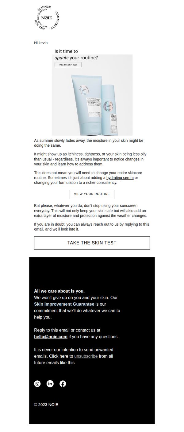
The email aims to prompt the recipient to reassess their skincare routine as seasons change, encouraging them to take a personalized skin test to identify needed adjustments while reinforcing brand trust through a skin improvement guarantee.
Why this works
The email smartly ties seasonal shifts to tangible skin concerns like itchiness or oiliness, making the need for routine updates feel personal and timely rather than sales-driven, which builds trust before asking for action.
How to implement
By reassuring users they don’t need to overhaul their entire routine, just tweak it with a hydrating serum or richer consistency, the message reduces friction and positions the brand as a helpful guide, not a pushy seller.
Pro Tip
Add a visual progress indicator or mini-skincare quiz preview near the 'TAKE THE SKIN TEST' CTA to reduce perceived effort and increase conversion by showing users exactly what to expect before clicking. • Include a brief testimonial or user result snippet (e.g., '87% saw improved hydration in 2 weeks') near the education section to strengthen social proof and validate the need for seasonal adjustments with real outcomes.
8. Re'equil: Apnon ko jhijhakne nahi, jeetne do!💙

Objective
This email aims to emotionally resonate with the audience by challenging societal stereotypes around masculinity and encouraging acceptance of men who don’t conform to traditional norms, while subtly positioning Re’equil as a brand that supports emotional and physical well-being.
Why this works
The email brilliantly reframes men’s skincare as an act of emotional support, connecting product purpose with societal acceptance, making the brand feel like a compassionate ally rather than just a seller of solutions.
How to implement
By opening with a provocative, introspective question about labeling men, the copy immediately engages the reader’s empathy and invites them to reflect on their own biases, creating a powerful emotional hook before any product mention.
Pro Tip
Add a secondary CTA below the video button that links to a curated product bundle for men’s skin concerns, tying the emotional message directly to a tangible, actionable solution without breaking the tone. • Include a short testimonial or quote from a real user who felt accepted or transformed after using Re’equil, to reinforce the message with social proof and bridge emotional resonance with product credibility.
9. Drunk Elephant - US: Future you

Objective
This email aims to educate subscribers on proper sunscreen application habits while subtly promoting Drunk Elephant’s sunscreen product as the ideal solution for daily skin protection. It positions the brand as a trusted skincare authority to drive product consideration and purchase.
Why this works
The email cleverly personifies the skin with the phrase 'thank you for protecting me!' to create emotional resonance, making sunscreen feel like an act of self-care rather than a chore, which increases engagement and brand affinity.
How to implement
By breaking down sunscreen rules into five bold, colorful, numbered tips, the campaign transforms complex skincare advice into digestible, shareable takeaways that feel empowering and easy to remember, boosting educational value and retention.
Pro Tip
Add a secondary CTA like 'See How It Works' or 'Watch Tutorial' near the product image to guide users who need more convincing before clicking 'SHOP', reducing friction for hesitant buyers. • Include a short customer testimonial or UGC snippet under tip #1 or #5 to reinforce credibility, for example, '92% of users saw smoother skin in 2 weeks', making the educational content feel more socially validated.
10. Kiehl's - EN: Correct✔️Brighten🔆Boost⚡

Objective
This email aims to drive sales by guiding customers through a targeted 4-step skincare routine designed to correct dark spots and brighten skin, while also promoting a high-value giveaway to increase engagement and brand loyalty.
Why this works
The email brilliantly structures the customer journey around a problem-solution framework, using a 4-step routine to transform abstract skincare goals into actionable, product-driven steps that feel personalized and clinically grounded.
How to implement
By pairing each product with a clear visual 'before and after' and a concise benefit statement, the campaign builds trust and reduces decision fatigue, making it easy for customers to understand exactly how each item contributes to their desired outcome.
Pro Tip
Add a progress bar or visual checklist under the 4-step routine to help users mentally track their journey, increasing perceived value and encouraging completion of the full regimen. • Reposition the giveaway CTA to appear after the routine explanation, this leverages the built-up desire for results before offering a bonus, making the incentive feel like a reward rather than a distraction.