Services relational campaign emails worth copying
1. Varo: It literally pays to shop with Varo.
Objective
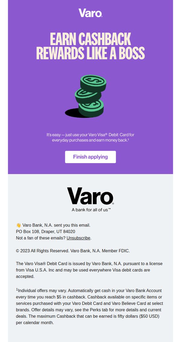
This email aims to convert prospects into Varo Visa® Debit Card users by highlighting the cashback rewards program as a powerful financial perk that turns everyday spending into passive income. It simplifies the value proposition to drive immediate application completion.
Why this works
The headline 'EARN CASHBACK REWARDS LIKE A BOSS' instantly reframes cashback as a status symbol rather than a discount, tapping into aspirational identity and making financial rewards feel empowering and exclusive to the cardholder.
How to implement
By pairing a bold, benefit-driven headline with a simple visual of stacked coins, the email creates instant cognitive alignment, viewers immediately grasp the core offer without reading a single sentence, reducing friction and boosting conversion potential.
Pro Tip
Add a progress bar or countdown timer near the CTA to create urgency, for example, 'Complete your application in 2 minutes to unlock your first $5 cashback reward this month', to reduce drop-off and reinforce time-sensitive value. • Include a mini testimonial or social proof snippet under the CTA, such as '92% of new cardholders earned cashback in their first week,' to build trust and reduce perceived risk for hesitant applicants.
2. Motorway : How to maximise your Audi's value?
Objective
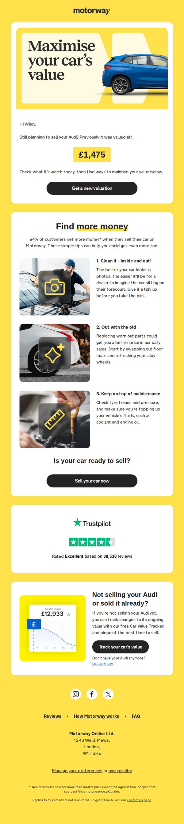
This email aims to re-engage a user who previously valued their Audi with Motorway, encouraging them to get a new, potentially higher valuation by following simple car preparation tips. It also offers value-tracking tools for users not yet ready to sell.
Why this works
The email personalizes the message by referencing the user’s past valuation, creating a sense of continuity and urgency to act before the car’s value declines further.
How to implement
It transforms a simple valuation tool into a value-maximizing experience by offering three practical, visual tips that empower the user to take immediate action before listing their car.
Pro Tip
Add a countdown timer or urgency cue near the CTA to encourage immediate action, since the email implies the car’s value may decrease over time, reinforcing the need to act now. • Include a short video or animated GIF in the education section showing one of the tips in action, such as cleaning the car or checking tire pressure, to increase engagement and perceived value.
3. Jenna Kutcher: I've been writing again
Objective
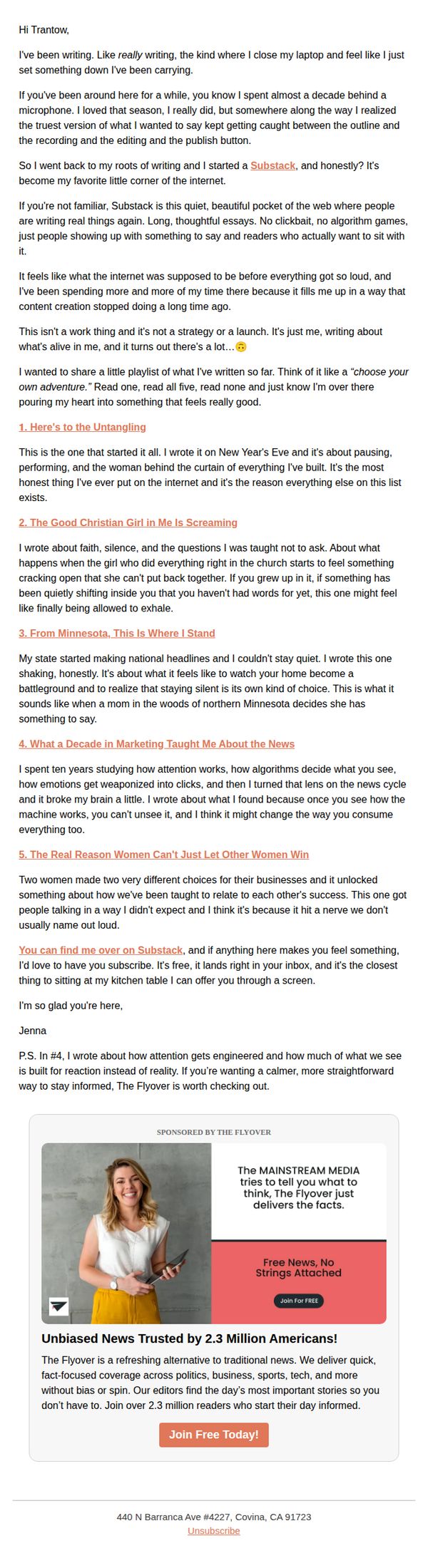
This email aims to reconnect with subscribers by sharing personal, reflective writing from Jenna Kutcher, inviting them to engage with her Substack as a space for authentic, unhurried storytelling. It also subtly promotes The Flyover as a complementary source of calm, fact-based news.
Why this works
Jenna’s email succeeds by leading with vulnerability and personal evolution, framing her Substack not as a product but as a return to her creative roots, a narrative that invites readers into her journey rather than pushing them to consume.
How to implement
The curated list of essays functions as a ‘choose your own adventure,’ giving readers autonomy while subtly guiding them toward emotionally resonant topics, a brilliant way to deepen engagement without overwhelming or pressuring the audience.
Pro Tip
The CTA ‘Join Free Today!’ is visually buried at the bottom of a long, text-heavy email; relocating it above the fold or repeating it after the essay list would better capture attention from readers who skim. • The sponsorship section lacks a clear visual hierarchy, adding a subtle border or background tint to separate it from Jenna’s personal message would help readers distinguish content from promotion without disrupting the tone.
4. ClearEstate: You booked a meeting with: John Farrell
Objective
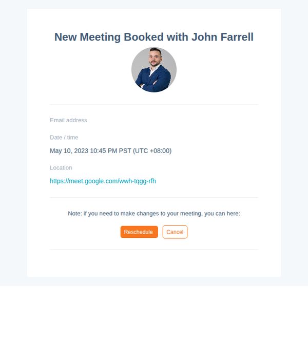
This email confirms a scheduled meeting with a representative and provides essential details including date, time, and virtual location, while empowering the recipient to reschedule or cancel if needed to reduce friction and no-shows.
Why this works
The email immediately establishes trust by featuring a professional headshot of the meeting host, which humanizes the interaction and reinforces accountability before the call even happens.
How to implement
Including a direct, clickable Google Meet link removes friction and reduces the chance of missed connections by eliminating the need for the recipient to search or copy-paste the URL manually.
Pro Tip
Add a brief agenda or prep note under the meeting details to set expectations and increase attendance quality, for example, 'Bring your property address and questions about local market trends.' • Include a subtle countdown or reminder badge near the top (e.g., 'Your meeting is in 2 days') to create gentle urgency and reduce no-shows without being pushy.
5. Dream Car Giveaways : BOOSTED ODDS!🤯
Objective
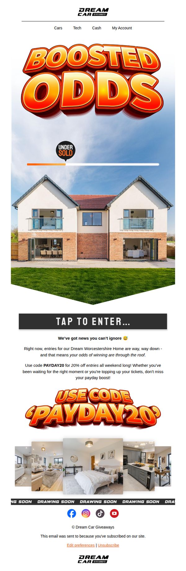
This email aims to drive immediate entry into the Dream Worcestershire Home giveaway by highlighting a limited-time discount code that boosts winning odds, leveraging urgency and perceived value to convert subscribers into active participants.
Why this works
The email brilliantly ties a time-sensitive discount code to increased winning odds, transforming a simple promo into a high-stakes emotional trigger that makes subscribers feel they’re gaining a strategic advantage, not just saving money.
How to implement
Using bold, 3D-style typography for 'BOOSTED ODDS' and 'PAYDAY20' creates instant visual hierarchy and excitement, ensuring the core message cuts through inbox clutter and lands with the energy of a live event announcement.
Pro Tip
Add a visible countdown timer near the CTA to reinforce urgency around the 'weekend long' discount, making the time-sensitive nature of the offer more visceral and reducing the chance of procrastination. • Include a brief testimonial or social proof snippet (e.g., 'Over 12,000 entries already!') near the 'UNDER SOLD' indicator to amplify scarcity and social validation, strengthening the psychological push to act now.
6. Ankorstore UK: EZE, discover your curated brand selection
Objective
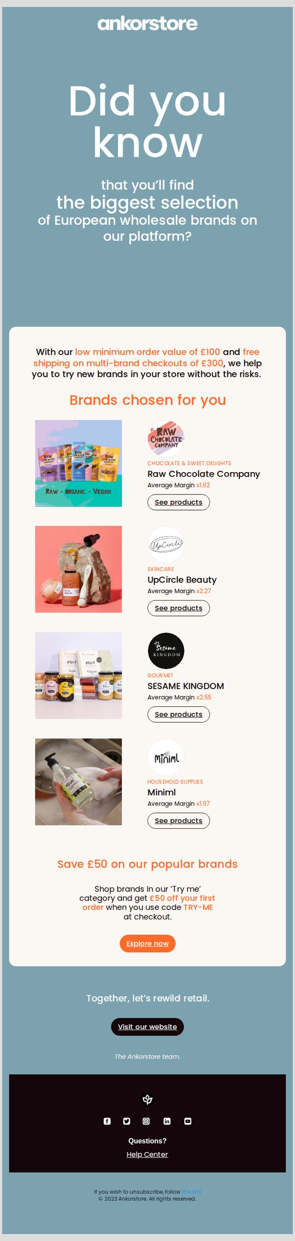
This email aims to introduce new or inactive retailers to Ankorstore UK’s curated selection of European wholesale brands, encouraging them to explore and place their first order by highlighting low-risk entry points and a £50 discount incentive.
Why this works
The email smartly reduces perceived risk for new buyers by emphasizing a low £100 minimum order and free shipping on multi-brand orders over £300, making experimentation feel safe and financially sensible.
How to implement
Curating brands by category with clear visuals, margin multipliers, and direct 'See products' CTAs transforms a generic list into a personalized, shoppable experience that speaks directly to retail buyers’ profit motives.
Pro Tip
Add a subtle countdown timer or 'Limited Time Offer' badge near the £50 discount section to increase urgency and prevent the incentive from feeling evergreen or low-priority. • Include a short testimonial or social proof snippet from a UK retailer who successfully used the 'Try me' category to source profitable brands, adding credibility to the offer.
7. Modular Closets: Confirm Your Subscription
Objective
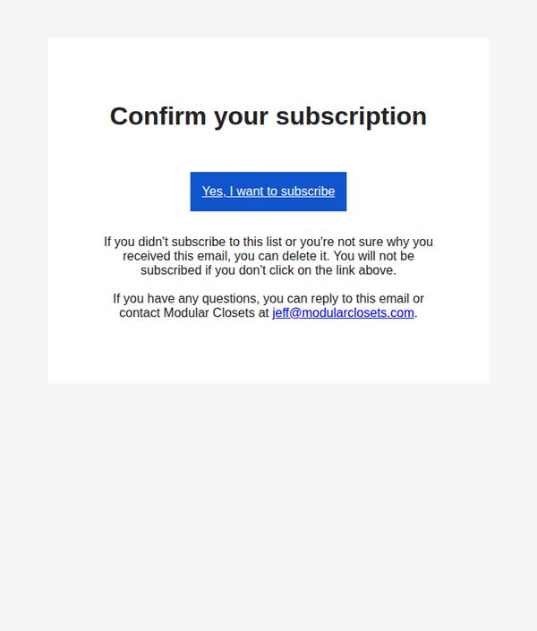
This email aims to verify new subscribers by prompting them to confirm their interest in receiving communications from Modular Closets, ensuring list accuracy and compliance with email marketing standards.
Why this works
The email clearly states the purpose upfront with a bold, centered headline that eliminates confusion and sets immediate expectations for the recipient’s next action.
How to implement
It reassures hesitant subscribers by explicitly stating they won’t be added unless they click, reducing anxiety and increasing trust in the brand’s permission-based approach.
Pro Tip
Add a brief value proposition beneath the headline, such as 'Get exclusive closet organization tips and early access to sales', to motivate confirmation by clarifying what subscribers gain. • Replace the generic blue CTA button with a branded color that matches Modular Closets’ visual identity to strengthen brand recognition and visual cohesion.
8. BOXFOX: Customer account activation
Objective
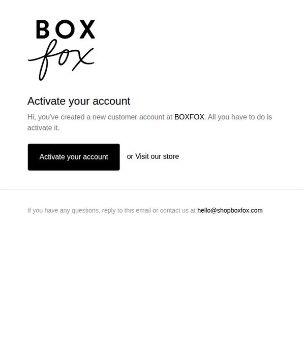
This email aims to guide new customers through the final step of activating their BOXFOX account, encouraging immediate action while offering a secondary path to explore the store. It reinforces brand identity and provides clear support channels to reduce friction.
Why this works
The email opens with a warm, personalized greeting that immediately confirms the user’s action, creating an account, which builds trust and reduces uncertainty about the next step.
How to implement
By placing the primary CTA as a bold, high-contrast button next to a low-friction alternative link, the design respects user intent while gently nudging toward the desired conversion without pressure.
Pro Tip
Add a brief explanation of what happens after activation, such as access to order history or exclusive offers, to increase perceived value and motivate immediate action. • Include a subtle visual cue like a checkmark icon or progress bar near the CTA to reinforce that activation is the final, simple step in a seamless onboarding journey.
9. Modular Closets: Customer account activation
Objective
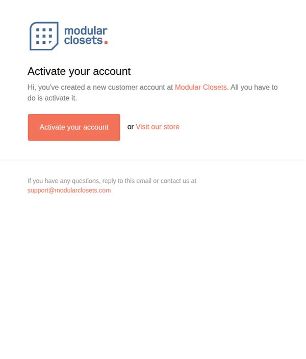
This email aims to guide new customers through the final step of activating their account with Modular Closets, ensuring they can access their personalized dashboard and begin exploring custom closet solutions. It also gently encourages immediate engagement by offering an alternative path to browse the store.
Why this works
The email opens with a warm, personal tone that acknowledges the user’s action, creating an account, which builds immediate rapport and reduces friction in the onboarding process.
How to implement
By offering a secondary option to 'Visit our store' alongside the primary CTA, the email accommodates users who may not be ready to activate but still want to explore, reducing drop-off and nurturing interest.
Pro Tip
Add a brief benefit statement under the CTA, such as 'Activate to save your designs and get personalized recommendations,' to clarify the value of completing the step and increase conversion. • Include a small visual cue, like a checkmark icon or progress bar, next to the activation prompt to visually reinforce that this is a simple, one-step process, reducing perceived effort.
10. BOXFOX: Secret (sale?!?) enclosed 🤫
Objective
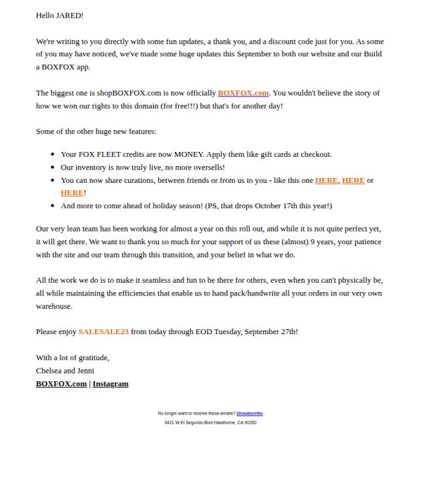
This email aims to celebrate a major brand milestone, the domain change to BOXFOX.com, while rewarding loyal customers with an exclusive discount code as a thank-you for their patience during the platform transition. It also teases upcoming holiday features to build anticipation.
Why this works
The email brilliantly turns a technical update, the domain change, into a celebratory moment by framing it as a win for customers, making them feel included in the brand’s growth story rather than just notified of a change.
How to implement
By embedding the discount code within a personal, conversational tone, complete with playful secrecy and gratitude, the campaign transforms a transactional offer into an emotional reward, deepening customer loyalty through appreciation rather than just promotion.
Pro Tip
Add a visual hero section with the new BOXFOX.com logo and a bold banner announcing the domain change, this would reinforce brand identity and make the milestone feel more celebratory and memorable than plain text alone. • Include a countdown timer or calendar icon next to the discount code expiration date to visually emphasize urgency, since the current text-only deadline may not register as strongly with time-sensitive shoppers.