Skincare relational campaign emails worth copying



1. Etsy: Inspired by you!
Objective
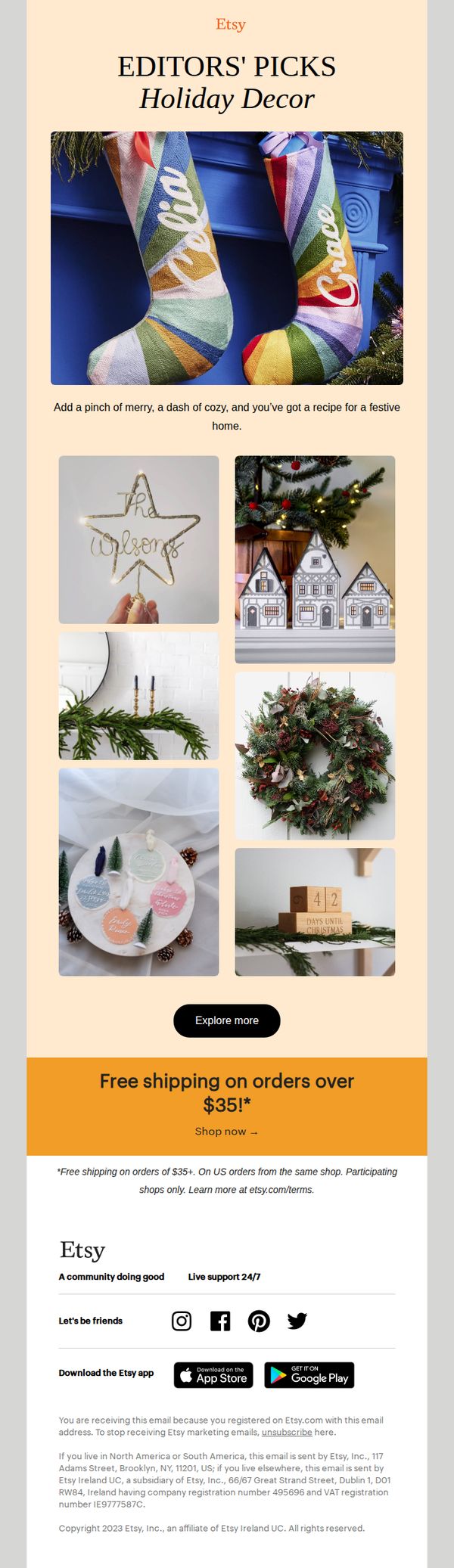
This email aims to inspire holiday shopping by showcasing handpicked, personalized decor items that evoke warmth and festive cheer, while encouraging immediate purchases through a compelling free shipping offer on orders over $35.
Why this works
The email opens with a warm, emotionally resonant headline, 'Inspired by you!', that personalizes the experience and positions Etsy as a curator of meaningful, individualized holiday decor rather than just a marketplace.
How to implement
Each product image is styled in a real-life, cozy setting that tells a mini-story, helping shoppers visualize the item in their own home and triggering emotional buying triggers tied to holiday nostalgia and family traditions.
Pro Tip
Add a subtle countdown timer or 'limited stock' indicator near the CTA to create urgency, since holiday shoppers often delay purchases without a clear reason to act now. • Include a short testimonial or social proof snippet under the hero image, like 'Loved by 10K+ shoppers this season', to reinforce trust and validate the 'Editors’ Picks' claim with real user sentiment.
2. Glossier: Into The Gloss: Foundation Upgrades
Objective
This email aims to educate subscribers on expert foundation application techniques while subtly promoting Glossier’s own foundation products by aligning them with trusted beauty insiders’ routines. It positions Glossier as a curator of professional-grade beauty wisdom.
Why this works
By featuring real beauty insiders with specific, actionable routines, the email builds credibility and trust while making product recommendations feel organic rather than salesy, which enhances subscriber engagement and brand loyalty.
How to implement
The visual storytelling through close-up product shots and skin texture imagery creates an intimate, tactile experience that mirrors the personal nature of makeup application, drawing readers deeper into the content and subtly reinforcing product desirability.
Pro Tip
Add a subtle product highlight or 'Shop This Tip' CTA beneath each expert quote to bridge educational content with commerce without disrupting the editorial tone. • Include a mini visual guide or icon next to each tip (e.g., a brush for 'The Speedy', a droplet for 'The Lock') to enhance scannability and reinforce the unique technique visually.
3. Kiehl's - UK: Procrastinators, this one's for you 😉
Objective
This email targets last-minute gift shoppers by positioning Kiehl’s as the solution for urgent gifting needs, encouraging in-store visits with festive gift sets and double loyalty points to drive immediate action and reward membership engagement.
Why this works
The email brilliantly reframes procrastination as an opportunity by speaking directly to last-minute shoppers with urgency and empathy, turning a common consumer pain point into a compelling reason to act now with Kiehl’s curated gift solutions.
How to implement
By integrating in-store services like Derma Reader and Healthy Skin Assessment, the campaign elevates the gifting experience beyond products, offering personalized, tech-enhanced consultations that build trust and position Kiehl’s as a skincare authority worth visiting in person.
Pro Tip
The hero section’s CTA 'FIND A STORE' is visually underwhelming and buried beneath text; it should be larger, more prominent, and paired with a map pin icon or store locator preview to reduce friction for users ready to act. • The product grid lacks pricing or value comparison, adding a 'Save £X' or 'Worth £Y' tag to each gift set would strengthen perceived value and reduce hesitation for price-sensitive last-minute shoppers.
4. Etsy: Get festive with John Legend!
Objective
This email aims to drive holiday shopping by promoting John Legend’s limited-edition Creator Collab, highlighting co-designed festive products while emphasizing Etsy’s mission to support women, Black, and underrepresented sellers. It seeks to convert interest into immediate purchases through curated product categories and a compelling celebrity endorsement.
Why this works
Leveraging a celebrity’s personal brand to co-design a holiday collection creates instant emotional resonance and social proof, making shoppers feel they’re buying into a story, not just a product, which elevates perceived value and urgency.
How to implement
Organizing products into intuitive, visually rich categories like ‘Cufflinks,’ ‘Stockings,’ and ‘Coasters’ reduces decision fatigue and guides the shopper through a curated gifting journey, increasing the likelihood of multiple purchases per session.
Pro Tip
Add a subtle countdown timer near the ‘Shop now’ CTA to emphasize the limited-edition nature of the collab, creating urgency without disrupting the festive tone or cluttering the layout. • Include a small ‘Best Sellers’ or ‘Most Gifted’ badge on 2–3 top-performing product tiles in the grid to guide indecisive shoppers and reinforce social proof within the visual flow.
5. Loops: Repair Your Skin Barrier
Objective
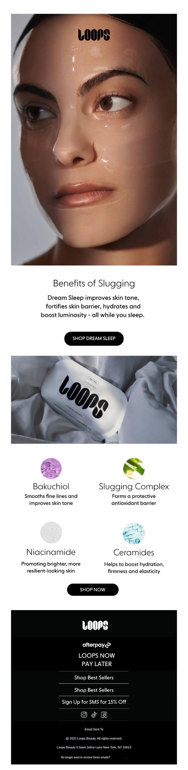
This email aims to educate subscribers on the skin barrier benefits of Loops’ 'Dream Sleep' product while driving immediate purchases through clear CTAs and ingredient transparency. It positions the product as a nighttime skincare solution that delivers visible results without active effort.
Why this works
The email brilliantly frames nighttime skincare as passive self-care by emphasizing that results happen 'while you sleep,' tapping into consumer desire for effortless beauty routines without compromising efficacy or scientific credibility.
How to implement
By spotlighting four key ingredients with simple icons and benefit-driven micro-copy, the email transforms complex formulations into digestible, trust-building proof points that empower shoppers to feel confident in their purchase decision.
Pro Tip
Add a subtle countdown timer or urgency cue near the 'SHOP DREAM SLEEP' CTA to nudge hesitant buyers, since the product is positioned as a nightly ritual, implying limited availability or time-sensitive benefits could boost conversion. • Include a mini testimonial or user result snippet (e.g., '92% saw softer skin in 3 nights') beneath the ingredient grid to reinforce social proof without disrupting the clean layout, bridging the gap between science and real-world results.
6. Etsy: 😮 $15 gifts 😮
Objective
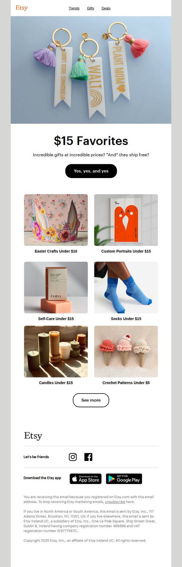
To drive immediate engagement and sales by showcasing affordable, giftable items under $15 while emphasizing free shipping to reduce purchase hesitation. The email targets gift shoppers seeking budget-friendly, unique options with emotional appeal and visual inspiration.
Why this works
The email brilliantly uses emotional punctuation and emoji in the subject line to create instant curiosity and urgency, making recipients feel they’ve stumbled upon a secret deal they can’t ignore.
How to implement
By anchoring the campaign around a specific price point, $15, Etsy creates a clear mental filter for shoppers, reducing decision fatigue and making the offer feel exclusive, achievable, and perfectly timed for gifting occasions.
Pro Tip
Add a subtle countdown timer or limited-time badge near the CTA to amplify urgency, since the current 'Yes, yes, and yes' button lacks temporal pressure that could boost conversion rates for time-sensitive shoppers. • Include one short customer testimonial or star rating beneath a high-performing product tile to build social proof, especially since the email relies heavily on visual appeal without reinforcing trust through user validation.
7. Lancôme - US: We Have a Surprise to Share!
Objective
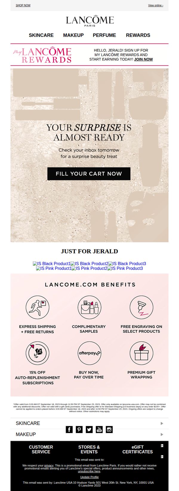
This email aims to build anticipation for a personalized beauty surprise while encouraging immediate cart engagement, leveraging exclusivity and rewards to drive conversion from a known customer.
Why this works
The email brilliantly leverages personalization by addressing the recipient by name and teasing a surprise, creating emotional urgency without revealing the offer, which boosts open-to-action conversion.
How to implement
By embedding exclusive product recommendations labeled 'Just for Jerald,' the campaign transforms generic promotion into a tailored, VIP experience that strengthens brand loyalty and perceived value.
Pro Tip
Add a subtle countdown timer beneath the hero CTA to heighten urgency around the 'surprise' reveal, aligning temporal pressure with the 'almost ready' messaging to reduce cart abandonment. • Reposition the 'JOIN NOW' rewards prompt from the header to just below the hero CTA, making loyalty enrollment a secondary but frictionless next step after cart engagement.
8. Haeckels: A special offer on our innovation subscription.

Objective
This email aims to convert both new and existing customers into yearly subscribers of the Haeckels Innovation Box by offering three months free, emphasizing value, exclusivity, and the joy of monthly discovery. It positions the subscription as a celebratory, gift-like experience to drive urgency and emotional connection.
Why this works
The email brilliantly frames the subscription as a celebratory gift experience, using emotional language like 'like Christmas' and 'joy each month' to tap into anticipation and delight, making the offer feel personal rather than transactional.
How to implement
By highlighting the tangible value, £604 worth of products for £224, the campaign builds trust through transparency, turning perceived risk into a no-brainer decision by proving the subscriber gets more than their money’s worth every single month.
Pro Tip
Add a visual countdown timer near the CTA to reinforce urgency, since the offer is limited-time and time-sensitive, this would nudge hesitant users to act before missing out on three free months. • Reposition the 'how to' section earlier in the flow, right after the offer explanation, to reduce friction for existing subscribers who may not realize they can switch without losing their current box, this removes a hidden barrier to conversion.
9. Made By Sunday: oil vs face cream
Objective
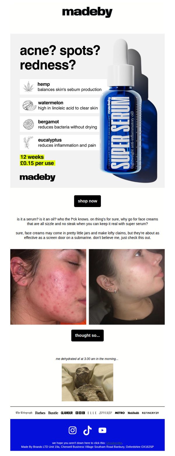
To position Made By Sunday’s Super Serum as a superior, no-nonsense alternative to traditional face creams by highlighting its acne-fighting ingredients and cost efficiency, while using humor and real results to drive conversions.
Why this works
The email brilliantly reframes the product not as a serum or oil but as a rebellious, no-BS solution, using irreverent humor to disarm skepticism and position the brand as refreshingly honest in a saturated skincare market.
How to implement
By juxtaposing a raw before-and-after photo with a meme about dehydration, the campaign leverages emotional contrast and cultural references to make the transformation feel relatable, authentic, and memorable rather than overly polished or salesy.
Pro Tip
Add a subtle countdown timer or limited-quantity indicator near the CTA to create urgency, since the current design lacks any time-sensitive incentive despite the product’s strong value proposition. • Include a short bullet-point FAQ or myth-buster section beneath the hero image to preemptively answer ‘Is this really an oil?’ and ‘Will it break me out?’, reducing friction for skeptical first-time buyers.
10. 4.5.6 Skin: We've Made Some Changes.💫
Objective
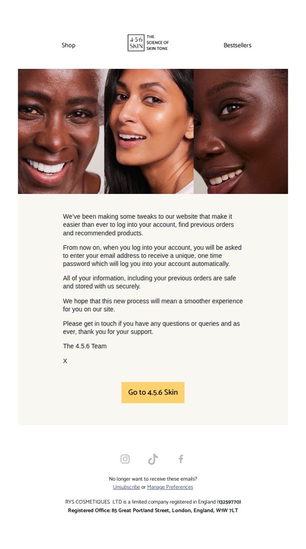
This email aims to inform customers about recent website updates that simplify account access and order history retrieval, while reassuring them of data security and encouraging continued engagement with the brand.
Why this works
The email opens with a warm, human tone that frames technical changes as customer-centric improvements, making users feel valued rather than inconvenienced by platform updates.
How to implement
By emphasizing security and seamless access in the same breath, the message builds trust while reducing friction, a smart balance for users wary of login changes or data handling.
Pro Tip
Add a brief visual cue or icon next to the CTA button, such as a lock or arrow, to reinforce security and direction, helping users feel confident clicking through after reading about login changes. • Include a short FAQ or link to a help article directly below the message to preempt common questions about the new login process, reducing support inquiries and increasing user confidence.