Relational Campaign email designs from top software brands


1. EstateExec: Your EstateExec Account
Objective
This email aims to warmly welcome new users to EstateExec and reinforce trust by personally thanking them for signing up, while also inviting them to reach out with questions to foster early engagement and support.
Why this works
The personal sign-off from the founder creates immediate emotional resonance and positions the brand as human-centered, which is especially powerful in sensitive domains like estate execution where trust is paramount.
How to implement
By explicitly wishing the user success in simplifying their executor process, the message aligns with the user’s emotional and practical goals, making the brand feel like a supportive partner rather than just a tool.
Pro Tip
Add a visual element like the EstateExec logo or a simple divider line to break up the text-heavy layout and reinforce brand identity, which is currently missing and reduces perceived professionalism. • Include a secondary CTA such as 'Watch a 2-minute tour' or 'Start your first task' to guide users toward immediate action, since the current email relies solely on passive outreach and misses an onboarding momentum opportunity.
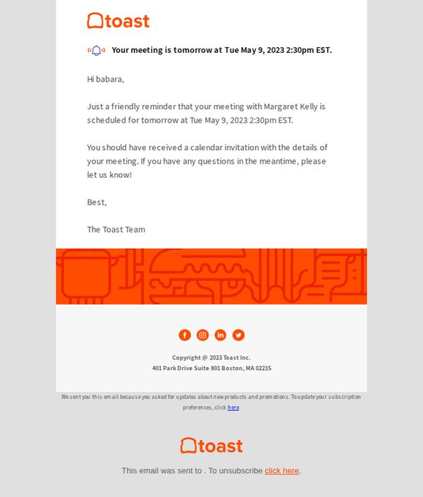
2. Toast: Reminder: meeting tomorrow!
Objective
This email serves as a polite, last-minute reminder to ensure the recipient is aware of an upcoming meeting scheduled for the next day, reinforcing attendance and offering support for any questions.
Why this works
The email opens with a clear, time-sensitive subject line and visual alert icon to immediately signal urgency without sounding pushy, which helps recipients prioritize the message in a busy inbox.
How to implement
By personalizing the greeting and referencing the recipient’s specific meeting details, the email builds trust and reduces friction, making the recipient feel individually acknowledged rather than mass-emailed.
Pro Tip
Add a direct calendar add-to-calendar button or link beneath the meeting time to reduce friction and increase the likelihood of the recipient saving the event immediately. • Include a brief bullet-point summary of meeting agenda or goals to help the recipient prepare, increasing perceived value and reducing last-minute cancellations or no-shows.
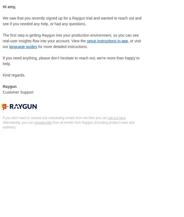
3. RAYGUN: Let's get you set up for success ⚡️
Objective
This email aims to guide new trial users through the initial setup process and encourage successful onboarding by offering direct support and clear next steps to integrate Raygun into their production environment.
Why this works
The email opens with a personalized greeting and references the user’s recent trial sign-up, immediately establishing relevance and reducing cognitive load by confirming the recipient’s context before offering help.
How to implement
By framing the first step as ‘getting Raygun into your production environment,’ the message aligns technical setup with business value, showing users they’re not just installing software, but unlocking real-user insights to drive better decisions.
Pro Tip
Add a visual cue or button-style CTA for 'View the setup instructions in-app' to increase click-through by making the primary action more prominent and scannable within the text-heavy layout. • Include a brief testimonial or success metric (e.g., '90% of users complete setup in under 5 minutes') near the CTA to reduce perceived complexity and boost confidence in the onboarding process.
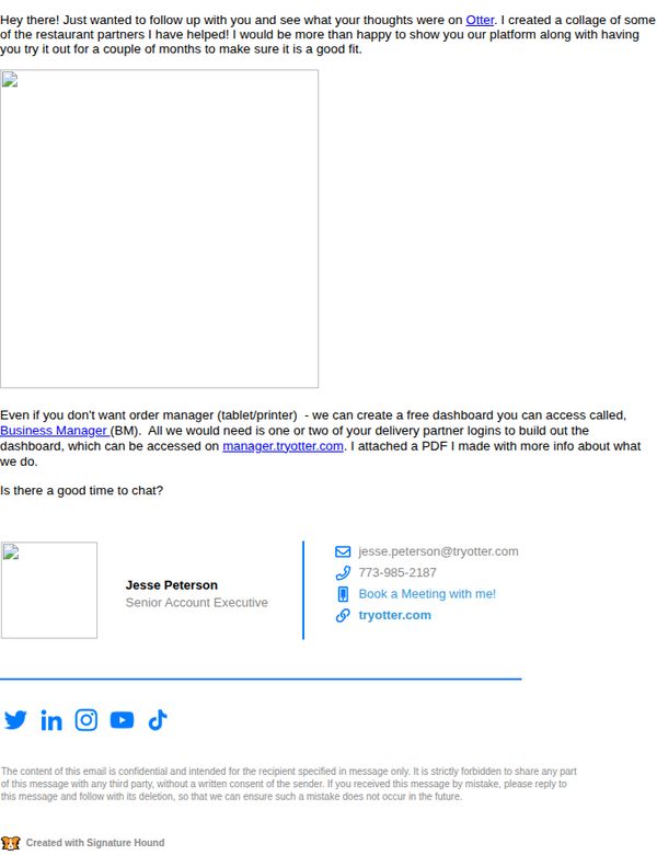
4. Otter: RE: Happy customers included!
Objective
To re-engage a prospect by showcasing social proof through happy customer examples and offering a personalized demo or dashboard access, reinforcing trust and encouraging a follow-up conversation to close the sale.
Why this works
The email opens with a warm, personal follow-up tone that feels conversational rather than salesy, making the recipient feel valued and not pressured, which increases the likelihood of engagement.
How to implement
Including a tangible offer, a free customizable dashboard, turns abstract value into a concrete, low-risk next step, appealing to practical decision-makers who want to test before committing.
Pro Tip
Add a small visual collage or thumbnail grid of the 'happy customers' mentioned, even placeholder icons with restaurant names, to make social proof more immediate and visually compelling. • Reposition the 'Book a Meeting with me!' CTA higher in the email or repeat it after the offer description to reduce friction and ensure the primary action is never more than a glance away.
5. Kit: Which of these 3 money skills are you missing?
Objective
This email aims to engage readers by diagnosing their financial skill gaps across earning, managing, and spending money, then guiding them toward the Money Coaching program as the solution to master all three. It also promotes an upcoming expert event to deepen urgency and perceived value.
Why this works
The email brilliantly frames financial mastery as a three-part skill set, earning, managing, and spending, which transforms abstract money advice into a measurable, achievable journey that readers can self-assess and feel motivated to complete.
How to implement
By using a relatable anecdote about a man in his 70s and his Paris fantasy, the email humanizes financial advice, making the emotional cost of poor spending habits tangible and prompting readers to reflect on their own relationship with money beyond spreadsheets and savings goals.
Pro Tip
Add a visual progress bar or checklist next to the three money skills to help readers instantly self-diagnose which skill they’re missing, this would increase engagement and make the educational content more interactive and scannable. • Reposition the event promotion above the signature, not as a PS, to give it equal visual weight with the main CTA, this would better align with the campaign’s dual goal of driving both coaching signups and event registrations.
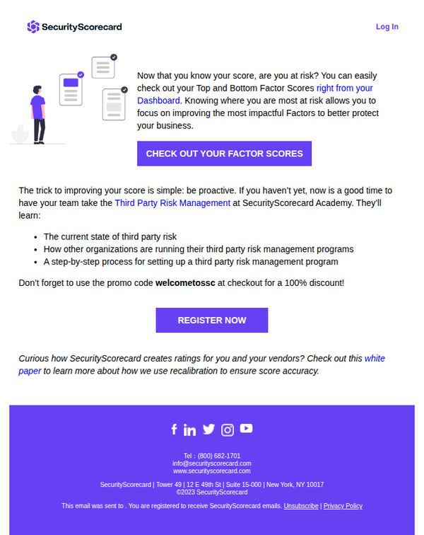
6. SecurityScorecard: Here’s the first step to improving your score
Objective
The email aims to guide users toward improving their security score by encouraging them to explore their risk factors and enroll in a free educational course on third-party risk management, using a promotional discount to incentivize immediate action.
Why this works
The email smartly bridges awareness with action by first validating the user’s current score and then immediately directing them to the most relevant improvement levers, their Top and Bottom Factor Scores, making the next step feel personalized and urgent.
How to implement
By offering a 100% discount on a relevant educational course, the campaign transforms a passive awareness moment into a high-value conversion opportunity, aligning the user’s desire to improve with a frictionless, time-sensitive incentive.
Pro Tip
Add a visual progress indicator or mini-scorecard graphic near the CTA to show users how close they are to improvement, making the abstract concept of ‘improving your score’ feel more tangible and motivating. • Reposition the promo code closer to the CTA button or embed it directly into the button text (e.g., 'REGISTER NOW, Use Code WELCOMETOSSC for 100% Off') to reduce friction and prevent users from missing the discount.
7. SimaPro : From a chocolate case study to real-world impact this spring
Objective
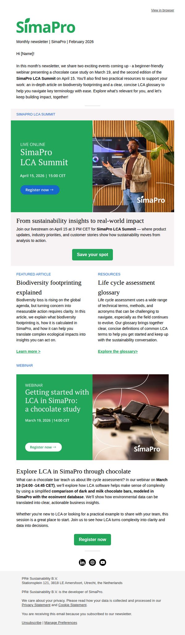
This email aims to drive engagement with SimaPro’s upcoming educational events, particularly the LCA Summit and a beginner-friendly chocolate case study webinar, while positioning the brand as a thought leader in sustainability and life cycle assessment. It also seeks to deepen user understanding of complex topics through accessible resources.
Why this works
The email brilliantly uses a relatable, tangible example, chocolate, to demystify complex sustainability concepts, making LCA feel accessible and relevant to both newcomers and seasoned professionals seeking practical applications.
How to implement
By framing the summit as a bridge from 'sustainability insights to real-world impact,' the campaign taps into the audience’s desire for actionable outcomes, positioning SimaPro not just as a software provider but as a partner in driving measurable change.
Pro Tip
The CTA buttons are visually similar in size and color across sections, which dilutes urgency, consider differentiating the primary event CTA (LCA Summit) with a bolder color or animation to guide users toward the highest-value action. • The email lacks a clear visual hierarchy between the two events, adding a subtle badge like 'Most Popular' or 'New for 2026' to the LCA Summit section would help prioritize the flagship event and reduce decision fatigue.
8. Trusted Tech Team: Missed it? You can now watch on demand 📺
Objective
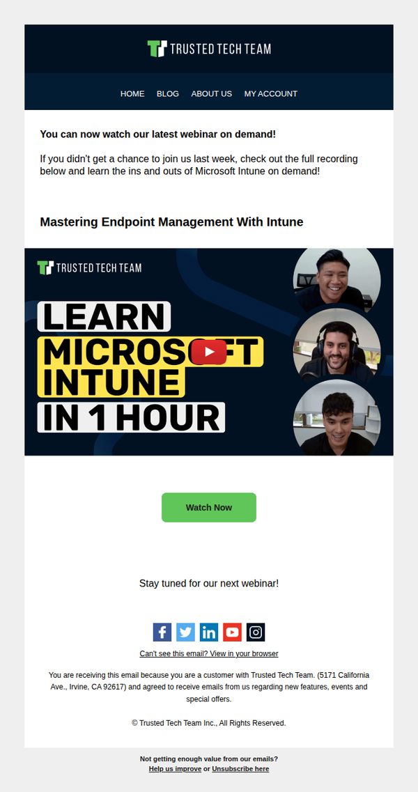
This email aims to re-engage subscribers who missed the live webinar by offering immediate access to the on-demand recording, while reinforcing brand authority around Microsoft Intune expertise and encouraging future event attendance.
Why this works
The email brilliantly repurposes missed live event FOMO into a low-friction on-demand opportunity, turning potential disengagement into immediate value with a bold, benefit-driven headline that promises mastery in just one hour.
How to implement
By featuring real presenter headshots alongside the webinar title, the design humanizes the technical content, building trust and relatability while subtly signaling that the session is led by approachable, knowledgeable experts, not faceless corporate trainers.
Pro Tip
Add a short bullet-point list under the headline summarizing 2–3 key takeaways from the webinar to clarify immediate value and reduce hesitation before clicking 'Watch Now'. • Include a subtle countdown or 'limited-time access' note near the CTA to create urgency, since on-demand content often lacks the natural time-bound motivation of live events.
9. Webroot: 🛒 Still need assistance with completing your order?
Objective
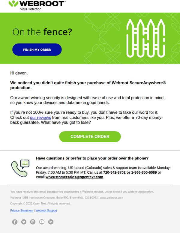
This email aims to recover an abandoned cart by reminding the recipient they haven’t completed their purchase of Webroot SecureAnywhere® protection, while reassuring them with social proof and a risk-free guarantee to encourage conversion.
Why this works
The email opens with a conversational, low-pressure question, 'On the fence?', which disarms hesitation and invites engagement rather than guilt-tripping the user, making it more likely they’ll continue reading.
How to implement
By highlighting real customer reviews and a 70-day money-back guarantee, the email reduces perceived risk and builds trust, turning uncertainty into confidence without overwhelming the reader with technical jargon.
Pro Tip
Add a visual progress indicator or mini-cart preview near the CTA to remind the user what they’re about to complete, reducing friction by reinforcing context and reducing the chance they’ll abandon again. • Reposition the 'COMPLETE ORDER' CTA higher in the email or duplicate it below the support contact info, since the current placement may be missed by users who scroll past the initial section without engaging.
10. Webroot: 🛒 Oops! Need assistance with completing your order?
Objective
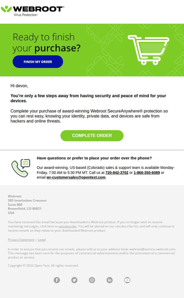
This email aims to recover an abandoned cart by reminding the recipient they’re close to securing Webroot’s security software, while offering direct support to remove friction and encourage immediate completion of the purchase.
Why this works
The email opens with a friendly, low-pressure question that assumes intent rather than guilt, making the recipient feel supported rather than chased, a subtle but powerful psychological nudge toward conversion.
How to implement
By emphasizing 'award-winning' protection and linking security to emotional outcomes like 'peace of mind,' the copy frames the product as essential for personal safety, not just technical utility, which deepens perceived value.
Pro Tip
Add a countdown timer or urgency indicator near the CTA to reinforce the 'few steps away' message and create gentle time-based pressure without being pushy. • Include a brief testimonial or trust badge near the 'Complete Order' button to reduce hesitation by validating the product’s reliability through social proof.