Proven sportswear relational campaign email designs you can use




1. Fjällräven: Join the adventure of a lifetime
Objective
This email aims to inspire newsletter subscribers to apply for the exclusive Fjällräven Polar 2026 Arctic expedition by emphasizing its once-in-a-lifetime nature and accessibility to everyday adventurers, while also driving product interest in the Expedition Series jackets through emotional storytelling and visual immersion.
Why this works
The email brilliantly frames an elite Arctic expedition as accessible to ordinary people by focusing on empowerment through gear and guidance, not prior experience, a powerful emotional hook that lowers psychological barriers to participation.
How to implement
By embedding a cinematic video preview and real participant testimonials, the campaign transforms abstract adventure into visceral, relatable moments, making the dream feel attainable and immediate rather than distant or exclusive.
Pro Tip
Add a visible countdown timer or application deadline badge near the ‘Learn more’ CTA to create urgency, since the email mentions ‘limited subscriber-only spots’ but doesn’t visually reinforce time sensitivity. • Include a brief testimonial quote or photo from a past participant directly under the ‘When everyday people become Arctic explorers’ section to strengthen social proof before the video, making the transformation feel more tangible and immediate.
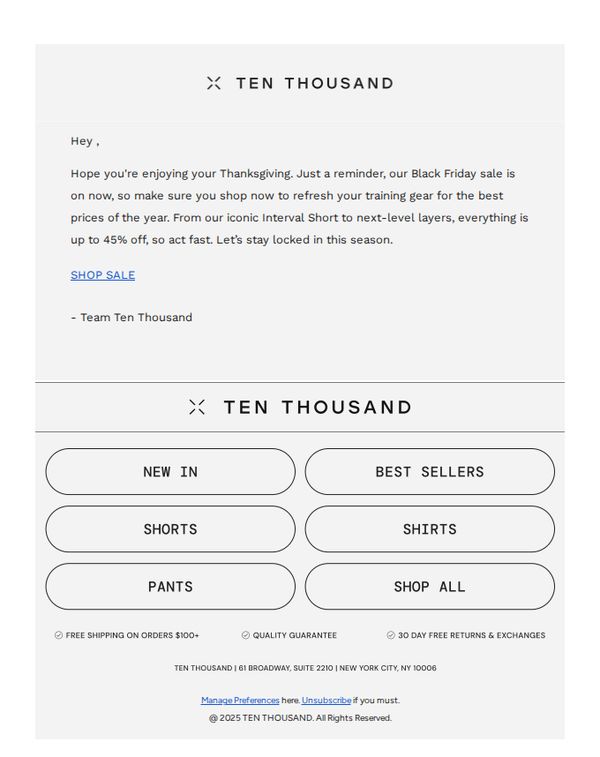
2. Ten Thousand: Your Upgrade: Up to 45% OFF Sitewide
Objective
The email aims to drive immediate Black Friday sales by reminding subscribers of the limited-time sitewide discount of up to 45% off, encouraging them to refresh their training gear while the sale lasts.
Why this works
The email leverages seasonal urgency by tying the Black Friday sale to Thanksgiving, creating emotional resonance and prompting immediate action without sounding pushy or salesy.
How to implement
It strategically highlights product categories like 'Interval Short' and 'next-level layers' to guide customers toward high-margin or hero items while still offering broad appeal through the sitewide discount.
Pro Tip
Add a visual hero banner or product image above the 'SHOP SALE' CTA to increase emotional engagement and give context to the discount, rather than relying solely on text to convey value. • Include a countdown timer or 'limited stock' indicator near the CTA to amplify urgency, since the current message relies on implied time pressure without visual reinforcement.
3. Fjällräven: Fleece or flannel?
Objective
This email aims to educate customers on the importance of mid-layering for winter warmth and guide them toward purchasing versatile, high-performance fleece and flannel pieces from Fjällräven’s collection. It positions the brand as an authority on functional outdoor wear while driving traffic to gender-specific product pages.
Why this works
The email brilliantly reframes a technical outdoor concept, mid-layering, into an accessible, lifestyle-relevant decision point, making customers feel informed rather than sold to, which builds trust before the click.
How to implement
By showcasing both fleece and flannel as equally valid mid-layer options with distinct benefits, the campaign avoids alienating style or function-focused shoppers, widening its appeal without diluting the core message of performance-driven warmth.
Pro Tip
Add a visual comparison chart or toggle between fleece vs. flannel under the 'Master winter mid-layering' header to help indecisive shoppers quickly self-select based on warmth, packability, or activity type. • Include a micro-testimonial or user-generated photo beneath each 'Shop now' button, e.g., 'Worn on 30+ hikes in Norway', to reinforce real-world credibility and reduce perceived risk for first-time buyers.
4. Fjällräven: Buy trousers that last
Objective
This email aims to drive sales of durable, high-performance trousers by positioning them as long-term investments for outdoor enthusiasts, while reinforcing Fjällräven’s brand values of quality, functionality, and thoughtful design tailored to both men and women.
Why this works
Fjällräven brilliantly reframes the purchase of trousers not as a seasonal fashion decision but as a long-term investment in durability and performance, appealing directly to outdoor lovers who value gear that endures real-world conditions.
How to implement
By featuring both men’s and women’s models in authentic outdoor settings and then explicitly calling out gender-specific design philosophy, the brand builds trust with audiences who care about thoughtful, body-conscious engineering rather than just scaled-down versions of men’s styles.
Pro Tip
Add a subtle countdown timer or limited-edition badge near the 'New Colour' product (Vidda Pro Lite Trousers M) to create urgency and highlight novelty, encouraging faster decision-making without disrupting the email’s calm, premium tone. • Reposition the 'Explore' CTA button under the 'Trekking trousers for life' section to be more visually prominent, perhaps with a contrasting color or larger size, to better guide users from emotional storytelling to immediate action, reducing friction in the conversion path.
5. Columbia Sportswear: Get ready for hoodie season.
Objective
This email aims to drive seasonal sales by positioning Columbia’s hoodies as essential, versatile outerwear for changing weather, while also promoting a bundled graphic tee deal to increase average order value and cross-category engagement.
Why this works
The campaign brilliantly ties product utility to seasonal transition by framing hoodies as reliable companions for 'chilly mornings to cool evenings,' making the purchase feel timely and emotionally resonant rather than purely transactional.
How to implement
By showcasing distinct hoodie styles for men, women, and kids with dedicated CTAs, the email personalizes the experience without requiring user segmentation, subtly guiding each shopper to their relevant category while reinforcing family-friendly brand positioning.
Pro Tip
Add a subtle countdown timer or urgency indicator near the '2 for $30 Graphic Tees' offer to nudge immediate action, since the current static presentation lacks time-sensitive motivation despite the promotional nature of the deal. • Reposition the 'Shop All Hoodies' CTA slightly higher or duplicate it below the hero image’s descriptive text to reduce scroll friction, some users may miss the primary action after reading the headline but before reaching the button.
6. Ten Thousand: Layer ⬆️
Objective
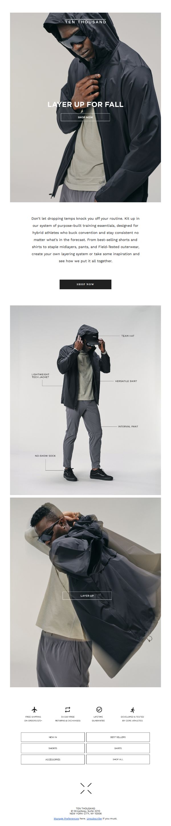
This email aims to drive fall apparel sales by encouraging hybrid athletes to layer up with Ten Thousand’s purpose-built training essentials, positioning the brand as a solution for maintaining consistency despite changing weather.
Why this works
The email brilliantly frames layering not as a seasonal chore but as a performance strategy, aligning apparel choices with athletic identity and consistency, a powerful emotional hook for goal-driven customers.
How to implement
By visually deconstructing a complete outfit with labeled components, the email transforms product browsing into an educational experience, helping customers understand how pieces work together to solve real-world training challenges.
Pro Tip
Add a subtle countdown timer or seasonal urgency cue near the CTA to nudge immediate action, since fall layering is time-sensitive and the current design lacks temporal motivation. • Include a short testimonial or athlete quote near the product grid to humanize the layering system and reinforce social proof, especially since the brand emphasizes 'core athletes' as developers.
7. Kuiu: Inner Circle Member Appreciation Giveaway
Objective
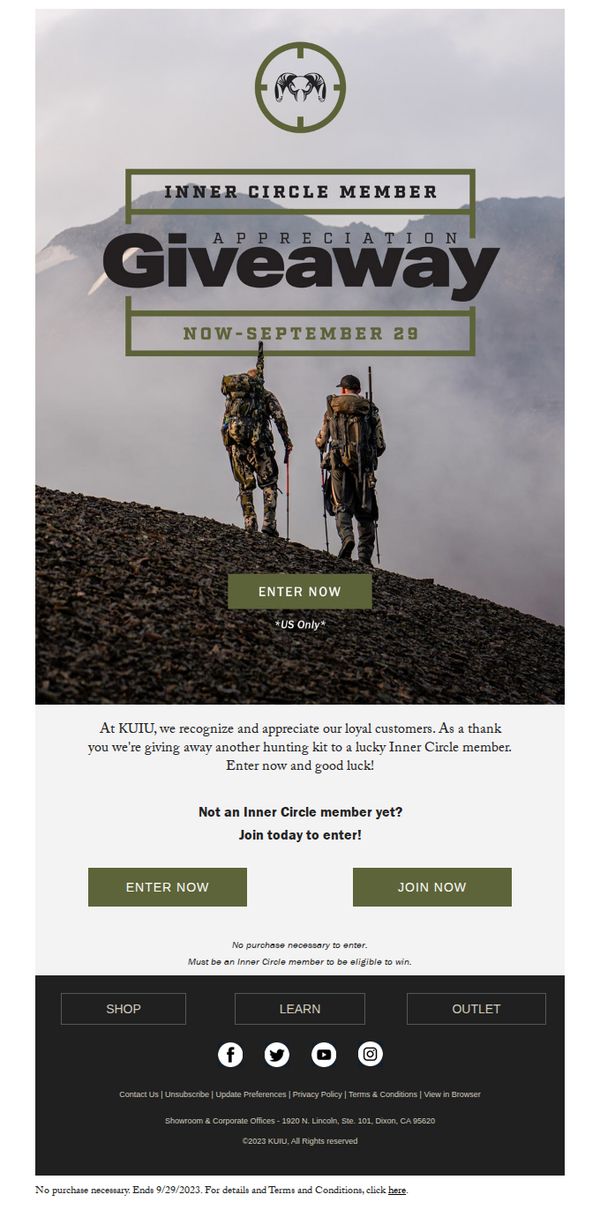
This email aims to reward loyal Kuiu Inner Circle members by offering them an exclusive chance to win a hunting kit, while also encouraging non-members to join the program to become eligible for future giveaways and benefits.
Why this works
The email leverages exclusivity by framing the giveaway as a members-only perk, which strengthens loyalty and makes non-members feel they’re missing out on insider benefits they can only access by joining.
How to implement
By placing the primary CTA directly beneath the hero image and repeating it with a secondary 'Join Now' button, the email creates a clear dual-path conversion strategy that respects both existing and potential members’ intent.
Pro Tip
Add a countdown timer or urgency indicator near the CTA to emphasize the September 29 deadline, which would increase conversion by creating time-sensitive FOMO for members who might otherwise delay entering. • Include a brief testimonial or photo from a past giveaway winner in the offer section to build social proof and credibility, helping hesitant members believe the prize is real and worth entering for.
8. Fjällräven: Start Fjällräven Polar early
Objective
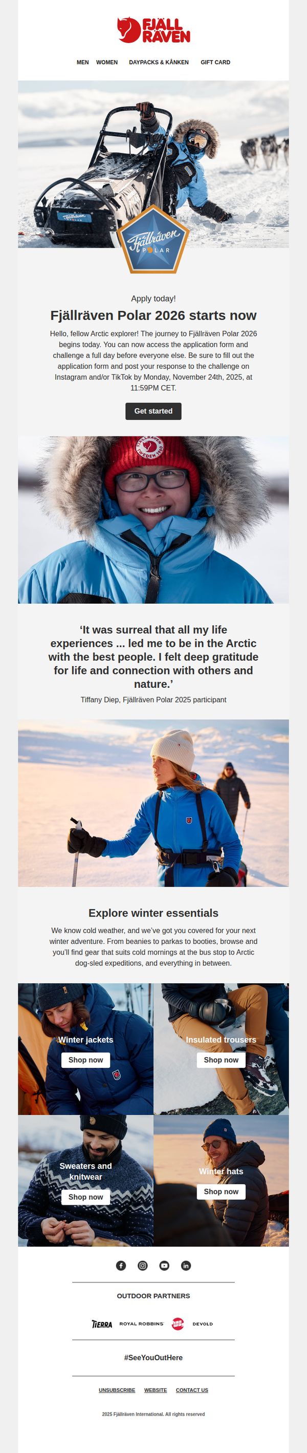
This email aims to drive early applications for the Fjällräven Polar 2026 expedition by creating urgency and emotional connection through participant testimonials and visual storytelling, while also cross-promoting winter gear to support the adventure theme.
Why this works
The email masterfully blends adventure storytelling with product relevance by anchoring the campaign in a real, emotionally resonant participant quote that validates the experience and subtly positions the brand as a gateway to meaningful human-nature connection.
How to implement
By featuring a visually immersive hero image of a dog-sledding expedition paired with a time-sensitive application deadline, the campaign creates both aspirational pull and behavioral urgency without relying on discounts or artificial scarcity tactics.
Pro Tip
Add a countdown timer beneath the 'Get started' CTA to visually reinforce the November 24 deadline, increasing urgency without requiring users to mentally calculate time remaining. • Include a brief FAQ or 'What to Expect' section after the testimonial to preemptively address common applicant concerns (e.g., fitness level, gear provided, travel logistics), reducing drop-off before the application form.
9. Fjällräven: Let nature light the way
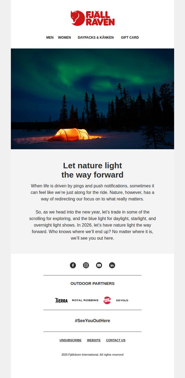
Objective
This email aims to inspire recipients to reconnect with nature in the new year by shifting focus away from digital distractions and toward authentic outdoor experiences, while subtly reinforcing Fjällräven’s brand identity as a companion for meaningful exploration.
Why this works
The email masterfully reframes the new year not as a time for resolutions but as an invitation to rediscover presence through nature, aligning brand values with emotional human needs in a way that feels poetic, not promotional.
How to implement
By contrasting the fatigue of digital overload with the quiet wonder of auroras and glowing tents, the message creates a visceral emotional pivot that positions outdoor gear not as equipment, but as a gateway to reconnection and renewal.
Pro Tip
Add a subtle CTA button beneath the hero image, such as 'Explore Our Gear for 2026', to guide inspired readers toward action without disrupting the contemplative tone, bridging emotion to commerce more intentionally. • Include a micro-testimonial or user-generated photo beneath the main copy (e.g., 'Last winter, Sarah pitched her tent under the auroras, here’s what she saw') to ground the poetic message in real customer stories and boost relatability.
10. Ten Thousand: The World’s Best-Fitting Training Shirts
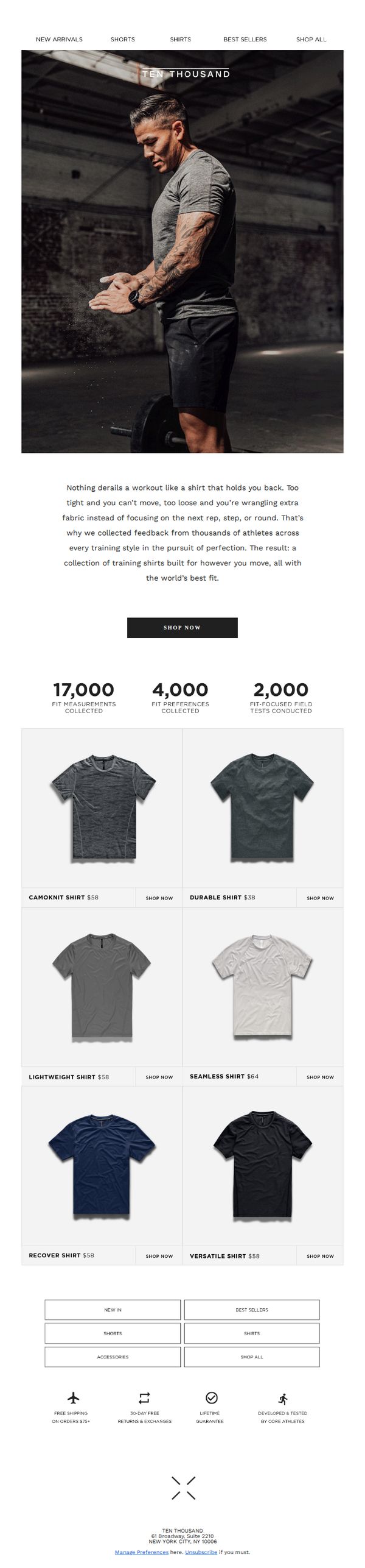
Objective
This email aims to position Ten Thousand’s training shirts as the ultimate performance apparel by emphasizing their scientifically optimized fit, built from athlete feedback and field testing. It drives immediate purchases by showcasing product variety and social proof through fit data and testimonials.
Why this works
The email opens with a powerful pain point, ill-fitting workout shirts derailing performance, then immediately positions the brand as the solution through data-backed design, making the value proposition instantly relatable to fitness-focused readers.
How to implement
By highlighting 17,000 fit measurements and 2,000 field tests, the campaign transforms abstract claims of ‘best fit’ into tangible, credible proof, leveraging social proof and scientific authority to reduce purchase hesitation and build trust.
Pro Tip
Add a short testimonial or athlete quote near the hero section to humanize the data and reinforce credibility, e.g., ‘I’ve tried dozens of shirts, but this one moves with me, not against me’, to strengthen emotional connection before the product grid. • Include a subtle visual cue or icon next to each shirt indicating its best use case (e.g., ‘High Sweat’, ‘Heavy Lift’, ‘Cardio’) to help customers quickly match products to their training style, reducing decision fatigue.