St. Patrick's Day relational campaign emails worth copying


1. Body Candy Body Jewelry: Wait, what? 🤯 50% Off Absolutely Everything?!
Objective
This email aims to drive immediate sales by creating urgency around a limited-time 50% off sitewide discount, while also showcasing new collections and educational content to engage both new and returning customers.
Why this works
The email opens with a bold, emotionally charged subject line and hero section that immediately grabs attention by framing the discount as a shocking, last-chance event, a psychological trigger that converts curiosity into clicks.
How to implement
By weaving seasonal collections like St. Patrick’s Day and Spring Break themes into the promotion, the brand makes the sale feel timely and relevant, encouraging impulse buys tied to real-life moments customers are already planning for.
Pro Tip
Add a visible countdown timer under the '50% OFF' headline to reinforce urgency and prevent the discount from feeling like a perpetual offer, which could reduce conversion pressure. • Reposition the 'Shop Now' CTA button to appear both above and below the fold, currently, it’s buried after the hero image on mobile, risking missed clicks from users who don’t scroll.
2. Rustic Marlin: For you, Valentine ❤️
Objective
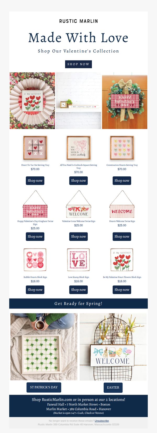
This email aims to drive sales of Rustic Marlin’s Valentine’s Day collection by showcasing themed home decor items with clear pricing and direct purchase links, while also subtly transitioning customers toward upcoming seasonal collections like St. Patrick’s Day and Easter.
Why this works
The email masterfully blends romantic aesthetics with practical product presentation, using heart motifs and soft color palettes to evoke emotion while keeping prices and CTAs front and center to reduce friction in the buying journey.
How to implement
By featuring a clean, grid-based product layout with consistent pricing and identical CTA buttons, the design removes decision fatigue and encourages impulse browsing, making it easy for shoppers to click through multiple items without hesitation.
Pro Tip
Add a limited-time discount or free shipping offer in the hero section to create urgency and incentivize immediate purchases, since the current design relies solely on product appeal without a compelling time-sensitive hook. • Include customer testimonials or social proof near the product grid to build trust, especially for first-time buyers, since the current layout lacks social validation despite showcasing multiple similar-priced items.
3. HTSI Financial Times : alejandrina, here are some midweek recommendations for you
Objective
This email aims to re-engage the subscriber by offering curated, high-value long-form content to reset their week, while subtly promoting a paid subscription trial to unlock full access to world-class journalism and personalized features.
Why this works
The email opens with a personalized, midweek reset framing that positions the content as a mental refresh rather than just another newsletter, making the reader feel seen and strategically timing the offer for maximum receptivity.
How to implement
By grouping content into thematic sections like 'US Presidential Election 2024' and 'Food & Drink,' the email creates digestible, interest-based pathways that cater to diverse reader preferences while subtly showcasing the breadth of the subscription’s value.
Pro Tip
The primary CTA is buried in the hero section and lacks visual hierarchy; it should be repeated above the fold with stronger contrast and a more action-oriented verb like 'Unlock Your Trial' to reduce friction for hesitant readers. • The 'Explore Food & Drink' section, while engaging, doesn’t link back to the subscription value, adding a micro-CTA like 'Subscribe to get more curated lifestyle insights like this weekly' would reinforce conversion intent within content blocks.
4. Wana Brands : March @ Wana: Our Month In Edibles
Objective
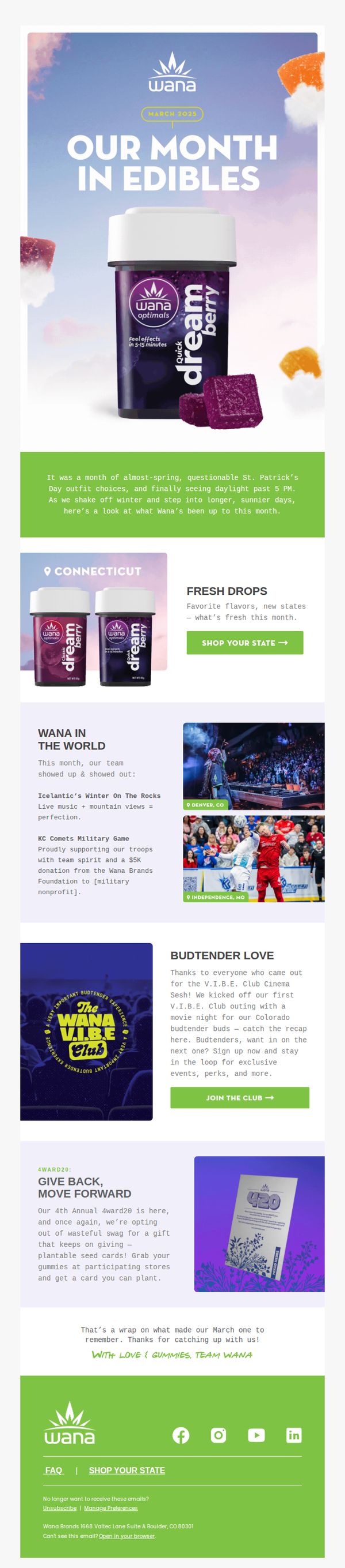
This email aims to engage subscribers by recapping Wana Brands’ March highlights, product launches, community events, and brand activations, while subtly driving traffic to state-specific product pages and encouraging V.I.B.E. Club signups through storytelling and visual momentum.
Why this works
The email brilliantly blends brand storytelling with product promotion by framing new drops as part of a seasonal journey, making the launch feel like a natural, celebratory milestone rather than a hard sell.
How to implement
By spotlighting real-world events and community impact, like the military game donation and cinema night, the brand humanizes its presence, building emotional equity that goes beyond transactions and fosters long-term loyalty among budtenders and consumers alike.
Pro Tip
The 'Budtender Love' section includes a strong CTA but lacks a visual cue or icon to draw the eye, adding a small badge or arrow graphic next to 'JOIN THE CLUB →' would increase click-through by reinforcing actionability. • The '4ward20' section mentions plantable seed cards but doesn’t show them in use or include a photo of the card being planted, adding a small lifestyle image would strengthen the eco-friendly message and make the gift feel more tangible and desirable.
5. Carpe: Feeling Lucky? 🍀
Objective
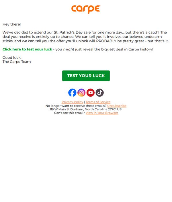
The email aims to create urgency and excitement by extending a St. Patrick’s Day sale for one more day, encouraging recipients to click and discover a randomized, potentially historic discount on underarm products. It leverages curiosity and luck to drive immediate engagement.
Why this works
The email brilliantly uses playful mystery by teasing a randomized deal tied to luck, making the recipient feel like they’re participating in a game rather than just receiving a discount, which boosts emotional engagement and click-through rates.
How to implement
By hinting that the unlocked offer might be the biggest in brand history, the campaign taps into FOMO and perceived exclusivity, turning a simple sale extension into a high-stakes, must-try moment that feels personal and urgent.
Pro Tip
Add a subtle visual cue or icon near the CTA button, like a spinning wheel or clover, to reinforce the ‘luck’ theme and make the interactive element feel more immersive and playful, increasing perceived value of the action. • Include a micro-copy line beneath the CTA such as ‘Only 24 hours left, your lucky deal disappears at midnight!’ to heighten urgency and clarify the time-sensitive nature of the offer, which is currently implied but not explicitly stated.
6. Organixx: Spring is in the air with The Best of Organixx

Objective
This email aims to engage subscribers with seasonal, health-focused content while subtly promoting Organixx products through education, testimonials, and recipe highlights. It also encourages long-term loyalty by introducing a subscription model for savings.
Why this works
By tying seasonal themes like spring to product relevance, such as reviving popular Organic Greens, the email creates timely urgency while honoring customer feedback, making the promotion feel organic rather than salesy.
How to implement
The 'Ask the Doc' and 'In the News' sections position Organixx as a trusted health authority by delivering clinically relevant, gender-specific insights that educate before they sell, building credibility without overt product placement.
Pro Tip
Add a visible, high-contrast CTA button above the fold, perhaps next to the hero headline, to immediately capture attention and drive action, since the current primary CTA is buried in the testimonial section. • Integrate a subtle countdown or limited-availability indicator near the Organic Greens mention, since the email references near-selling-out status but doesn’t leverage urgency visually to motivate immediate purchase.
7. Little Rad Things: Lucky No. 7 or as my kids say... 6/7
Objective
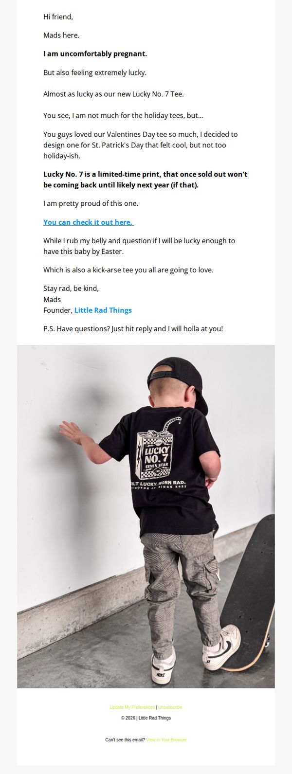
This email aims to introduce and drive urgency around the limited-edition Lucky No. 7 tee by tying it to the founder’s personal pregnancy announcement, creating emotional resonance while encouraging immediate purchase before the item sells out.
Why this works
The founder’s authentic, vulnerable storytelling, tying her pregnancy to the product launch, creates a powerful emotional hook that transforms a simple tee drop into a shared moment of celebration and community.
How to implement
Positioning the tee as a limited-time print with a clear ‘won’t return until next year’ message leverages scarcity without sounding pushy, making the purchase feel like joining an exclusive, meaningful moment.
Pro Tip
Add a visual countdown timer or 'Only X left' indicator near the CTA to amplify urgency, since the email mentions limited availability but doesn’t visually reinforce scarcity in the moment of decision. • Include a small product grid or size/color swatches directly in the email to reduce friction, subscribers shouldn’t have to click through just to see available options, especially when the CTA is the only interactive element.
8. Los Angeles Magazine: This Weekend in Politics, Bulletin 279.

Objective
This email aims to inform subscribers about urgent political developments, particularly a fictional military intervention in Venezuela, while driving engagement through provocative quotes and encouraging paid subscription upgrades. It blends breaking news with opinion to position Los Angeles Magazine as a must-read source for politically aware readers.
Why this works
The email masterfully uses a fictional but plausible geopolitical crisis to immediately capture attention, leveraging urgency and controversy to compel readers to keep scrolling and engage with the full narrative, which is a powerful hook for politically engaged audiences.
How to implement
By weaving together direct quotes from real political figures and media outlets with fictional events, the campaign creates a sense of insider access and journalistic authority, making readers feel they’re getting exclusive, behind-the-scenes analysis that can’t be found elsewhere.
Pro Tip
Add a brief visual timeline or infographic summarizing key fictional events (e.g., 'Trump orders invasion → Maduro captured → Oil companies mobilize') to help readers quickly grasp the narrative arc without scrolling through dense text. • Include a short, bolded 'Why This Matters' summary after the main story to explicitly connect the fictional scenario to real-world political trends, increasing perceived relevance and urgency for subscription.
9. Vanity Fair: Inside the Alexander Brothers Jury Pool

Objective
This email aims to drive subscriptions by leveraging high-profile, culturally relevant stories, particularly the Alexander Brothers trial and Ye’s interview, to position Vanity Fair as an essential source for in-depth, exclusive journalism. It also seeks to convert casual readers into paying subscribers through a limited-time offer.
Why this works
The email brilliantly anchors its subscription pitch within timely, emotionally charged cultural narratives, like the Alexander Brothers trial and Ye’s public reckoning, making the value of premium access feel urgent and indispensable rather than purely transactional.
How to implement
By embedding the subscription CTA inside a visually distinct dark panel that contrasts with the editorial content, the campaign creates a natural pause point where reader curiosity meets commercial intent without disrupting the narrative flow or feeling intrusive.
Pro Tip
The CTA placement after Ye’s story is strong, but adding a secondary sticky CTA button near the bottom, just before the footer, would capture scrolling users who’ve consumed all content but haven’t yet converted. • The 'More Great Reads' section could be enhanced by including a short teaser quote or emotional hook under each headline to increase click-through rates, especially for stories like 'How “Woke 2” Went From a Joke to a Reality,' which benefits from contextual framing.
10. Huel: ☘️Will you have the luck of the Irish?☘️

Objective
This email aims to drive immediate purchases by incentivizing customers with a St. Patrick’s Day-themed sweepstakes where one lucky buyer gets their order refunded. It leverages holiday excitement to boost conversion while reinforcing brand engagement through a time-sensitive, email-exclusive offer.
Why this works
The email brilliantly ties a cultural holiday to a high-value incentive, a full refund, creating emotional urgency without discounting the product, which preserves brand value while still driving action.
How to implement
By framing the promotion as a sweepstakes rather than a sale, Huel positions the offer as playful and exclusive, making customers feel like they’re participating in a fun event rather than just chasing a deal.
Pro Tip
Add a countdown timer near the CTA to visually reinforce the urgency of the 3/17 deadline, increasing FOMO and encouraging immediate action instead of delayed consideration. • Include a small testimonial or social proof snippet near the offer section, such as 'Over 5,000 customers entered last year!', to build trust and demonstrate popularity without cluttering the layout.