Relational testimonial campaign ideas that work
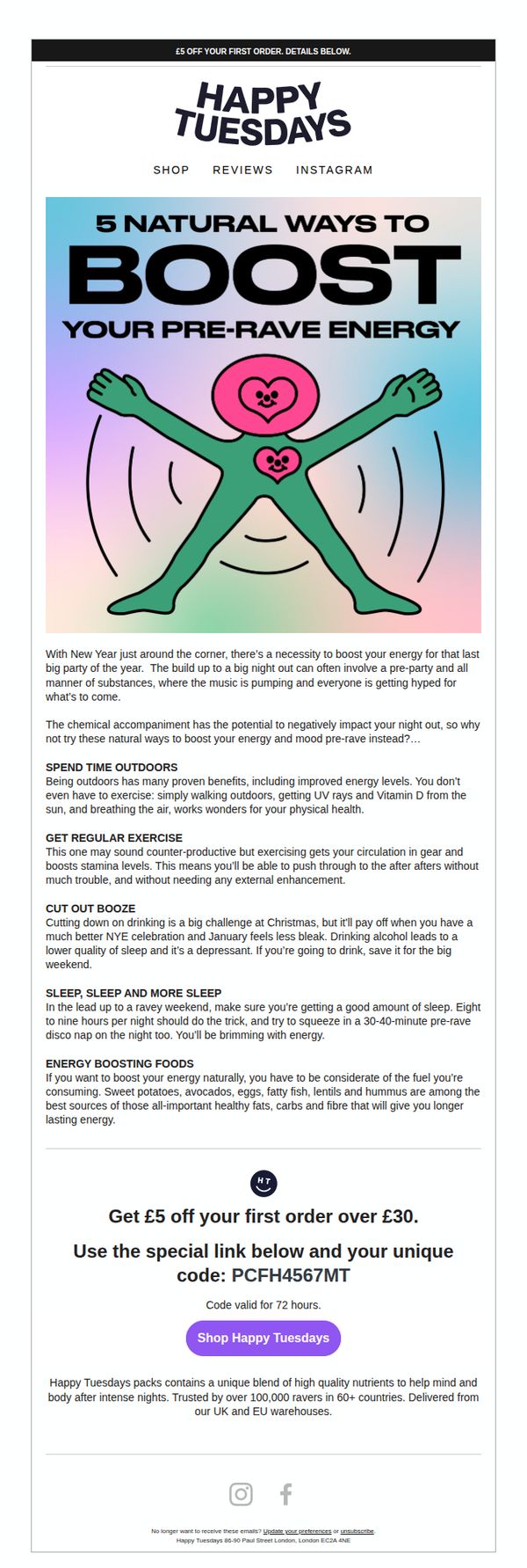


1. Happy Tuesdays: 5 natural ways to boost your pre-rave energy
Objective
The email aims to position Happy Tuesdays as a trusted, wellness-conscious brand for ravers by offering natural energy-boosting tips while subtly promoting their nutrient-packed products as the ideal solution for pre-rave preparation. It also drives first-time purchases through a time-sensitive discount.
Why this works
The email brilliantly reframes product promotion as wellness advice, making the brand feel like a helpful friend rather than a salesperson, this builds trust and positions the product as a natural extension of the reader’s lifestyle, not an interruption.
How to implement
By tying the content to a cultural moment, the pre-New Year’s rave, the email creates urgency and relevance, making the advice feel timely and the offer more compelling because it’s framed as essential preparation for a specific, high-energy event.
Pro Tip
Add a small visual icon or badge next to the discount code to draw the eye and reinforce its value, currently, the code blends into the text, reducing its perceived urgency and making it easy to overlook. • Include a brief testimonial or user quote after the education section to bridge the gap between advice and product, this would strengthen social proof and make the transition to the CTA feel more natural and persuasive.
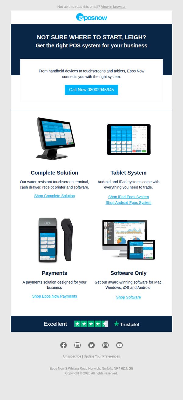
2. Epos Now: Discover the POS helping companies grow
Objective
This email aims to guide a prospect named Leigh toward selecting the right POS system by showcasing Epos Now’s tailored solutions, while encouraging immediate contact through a prominent phone CTA to accelerate sales conversion.
Why this works
Personalizing the subject line and opening with the recipient’s name immediately creates relevance, making the prospect feel seen and more likely to engage with the tailored POS solutions presented.
How to implement
Breaking down complex offerings into four clearly labeled product categories with supporting visuals and direct CTAs reduces decision fatigue and guides users effortlessly toward their ideal system configuration.
Pro Tip
Add a short, benefit-driven subheading under each product tile (e.g., 'Boost efficiency with all-in-one hardware') to clarify value faster and reduce reliance on users clicking through to understand the offering. • Replace the generic 'Call Now' CTA with a benefit-oriented version like 'Get Your Free POS Consultation' to better align with the email’s educational tone and reduce perceived pressure while increasing conversion intent.
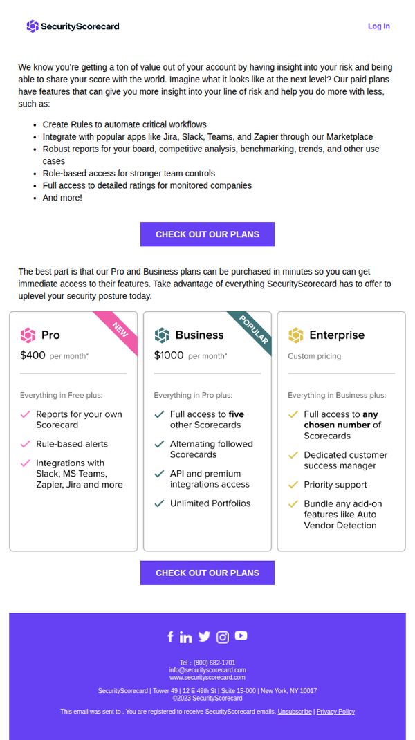
3. SecurityScorecard: There’s so much more to SecurityScorecard
Objective
This email aims to upsell existing SecurityScorecard users by highlighting the advanced features available in paid plans, encouraging them to upgrade for deeper risk insights and workflow automation. It positions paid tiers as essential for scaling security operations efficiently.
Why this works
The email opens by validating the user’s current value while subtly hinting at untapped potential, creating a natural bridge to premium features without sounding pushy or dismissive of their existing usage.
How to implement
Each pricing tier is clearly differentiated with checkmarks and benefit-focused language, helping users self-identify which plan aligns with their operational scale and team needs without overwhelming them with jargon.
Pro Tip
Add a brief testimonial or customer quote near the pricing grid to reinforce trust and social proof, especially for users hesitant to upgrade from Free to Pro or Business tiers. • Include a short FAQ or 'What’s the difference?' toggle beneath the pricing cards to reduce friction for users comparing plans, especially around API access, portfolio limits, and support levels.
4. Yuup: Discover what's on this September 🙌
Objective
This email aims to inspire subscribers to explore and book unique local experiences for September, highlighting seasonal, cozy, and creative activities across UK cities while driving engagement through personalized recommendations and clear CTAs.
Why this works
The email brilliantly segments experiences by mood and season, from ‘Hit refresh this September’ to ‘Cosy season is calling’, making it easy for users to self-select based on emotional intent rather than just location or category.
How to implement
Each experience is paired with a vivid, human-centered photo and a short, benefit-driven tagline like ‘Good vibes’ or ‘One night only,’ which builds emotional resonance and urgency without overwhelming the reader with details.
Pro Tip
Add a subtle countdown or ‘limited spots’ indicator next to high-demand experiences like ‘Yoga with Adorable Puppies’ to create urgency without disrupting the calm, inspirational tone of the email. • Include a short testimonial or star rating snippet directly under each experience title in the grid to reinforce social proof and reduce decision friction for first-time users.
5. New York Magazine: Here's a Preview of 'The Year I Ate New York'
Objective
This email aims to engage readers with a personal, narrative-driven preview of the 'The Year I Ate New York' series, encouraging them to subscribe for ongoing access to food and restaurant content while subtly promoting the Grub Street newsletter as a complementary offering.
Why this works
The email masterfully blends personal storytelling with restaurant discovery, turning dining into an emotional journey that readers can relate to, not just a list of places, but a lived experience that builds trust and anticipation for future installments.
How to implement
By framing home-base restaurants as emotional sanctuaries rather than just convenient spots, the writer elevates the content beyond food criticism into cultural commentary, making readers feel seen and understood in their own dining habits and emotional needs.
Pro Tip
Add a visual CTA button labeled 'Subscribe now' above the fold, currently, the CTA is buried in text at the bottom, reducing conversion potential by failing to leverage immediate reader interest after the emotional hook. • Include a short, bold pull-quote from the article (e.g., 'I had indigestion the next day, and I’d do it again') near the top to reinforce the voice and humor, helping readers instantly connect with the writer’s personality and tone.
6. monday.com: Making mid-year reviews count

Objective
This email aims to position monday.com as a strategic partner for mid-year performance reviews by offering actionable leadership frameworks, while subtly promoting its platform as the tool to execute those strategies effectively through a free trial CTA.
Why this works
By framing mid-year reviews not as evaluations but as collaborative brainstorms, the email reframes a typically stressful process into a strategic opportunity, making monday.com’s platform feel like an enabler of growth rather than a performance tracker.
How to implement
The inclusion of Harvard Business Review data and real-world leadership questions transforms generic advice into credible, actionable guidance, subtly positioning monday.com as a thought leader that understands the emotional and operational realities of modern management.
Pro Tip
The CTA 'Start a free trial' appears only once, buried after a long educational section; it should be repeated above the fold and after each key strategy point to capture intent at multiple decision moments. • The 'Help team member bring their full selves to work' section feels disconnected from the mid-year review theme; it should be rephrased to explicitly link empowerment tools to review outcomes, such as 'Use monday.com to turn review insights into personalized growth plans.'
7. BioTRUST: 4500% Better Absorbed Than Typical Turmeric

Objective
This email aims to educate readers on the poor absorption of standard turmeric supplements and position BioTRUST’s Ageless Body as a scientifically superior, highly bioavailable alternative that delivers real anti-aging and vitality benefits. It seeks to convert informed readers into buyers by highlighting clinical research, unique formulation, and time-sensitive offers.
Why this works
The email brilliantly frames a common supplement, turmeric, as fundamentally broken in its typical form, then positions the product as the only scientifically validated solution that overcomes decades-old absorption flaws, making the purchase feel like a necessary upgrade rather than an optional add-on.
How to implement
By anchoring every claim in peer-reviewed journals and comparative studies, including direct absorption metrics against black pepper combos and liposomal forms, the campaign builds unshakable credibility, turning skeptical readers into confident buyers who trust the data more than flashy marketing promises.
Pro Tip
Add a visual comparison chart or infographic between standard turmeric, curcumin + black pepper, and CurcuWIN to reinforce the 46x absorption claim, this would make the science instantly digestible and reduce cognitive load for skimmers. • Place the primary CTA button above the fold or immediately after the first major benefit section instead of burying it at the bottom, this reduces friction for high-intent readers who are convinced early and may not scroll through the entire scientific deep dive.
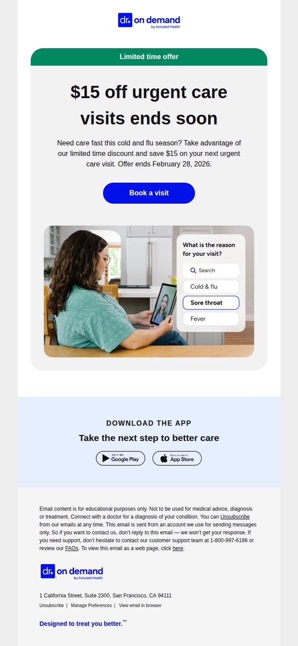
8. Doctor On Demand : Last reminder: Get $15 off urgent care
Objective
This email aims to drive immediate action by reminding recipients of a time-sensitive $15 discount on urgent care visits, encouraging them to book before the offer expires on February 28, 2026, while reinforcing the convenience of virtual care during cold and flu season.
Why this works
The email smartly ties the discount to seasonal urgency, cold and flu season, making the offer feel timely and personally relevant rather than just a generic promotion, which increases perceived value and motivates faster action.
How to implement
By placing the primary CTA button directly beneath the offer headline and expiration date, the design creates a clear visual path to conversion, reducing friction and guiding users instinctively toward booking without needing to scroll or search.
Pro Tip
Add a countdown timer beneath the offer expiration date to visually reinforce urgency and create psychological pressure to act before the discount disappears, which can significantly boost last-minute conversions. • Include a short testimonial or patient success story near the CTA to build social proof, especially for users unfamiliar with telehealth, by showing real people who benefited from urgent care visits, increasing trust and reducing perceived risk.
9. Virgin Voyages: Last day for up to $300 USD onboard credit
Objective
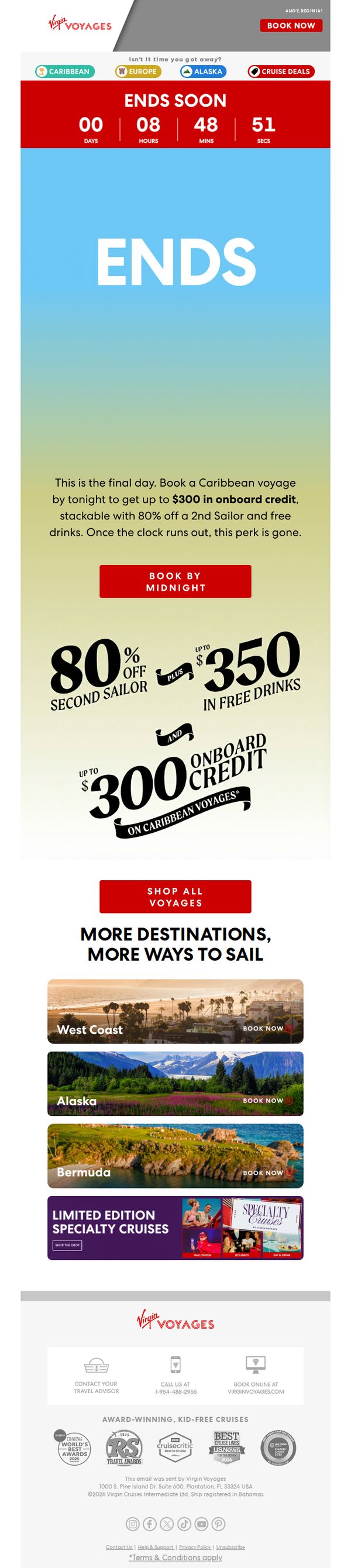
This email aims to drive immediate bookings for Caribbean voyages by emphasizing a time-sensitive offer of up to $300 in onboard credit, paired with 80% off a second sailor and free drinks, all expiring at midnight to create urgency and FOMO.
Why this works
The email masterfully combines a countdown timer with bold, benefit-driven copy to create urgency without feeling pushy, turning ‘ends soon’ into a compelling reason to act now rather than later.
How to implement
Stacking multiple high-value perks, onboard credit, second sailor discount, and free drinks, into one visual hierarchy makes the offer feel irresistible and justifies the urgency, increasing perceived value without complicating the message.
Pro Tip
Add a small visual indicator (like a red badge or pulsing border) around the ‘BOOK BY MIDNIGHT’ CTA to draw the eye more forcefully, since the current red button blends into the red header and risks being overlooked in a skim. • Include a micro-testimonial or social proof near the offer section, such as ‘92% of guests used their onboard credit on spa or dining’, to reduce perceived risk and reinforce the value of the credit beyond just the dollar amount.
10. Audubon: We’re Loving These Wins for Birds 💚

Objective
This email aims to celebrate recent conservation wins for birds while inspiring continued support through education, emotional connection, and a clear donation prompt. It reinforces Audubon’s mission by showcasing tangible outcomes and inviting readers to participate in bird-friendly actions.
Why this works
The email masterfully blends storytelling with science by spotlighting real birds and projects, like GPS-tracked oystercatchers and solar farms helping prairie chickens, to make conservation feel personal, urgent, and achievable for every reader.
How to implement
Instead of generic appeals, it offers specific, emotionally resonant actions, like gifting a Northern Cardinal plush or pledging a bird-friendly home, that turn passive readers into active participants without overwhelming them with options.
Pro Tip
Add a subtle countdown or progress bar near the donation CTA to create urgency or social proof, such as 'Join 12,487 supporters who’ve pledged this month' to nudge hesitant donors toward action. • Include a short testimonial or quote from a scientist or donor after the GPS tracking section to humanize the data and reinforce credibility, making the tech-driven story feel more relatable and trustworthy.