Relational Campaign campaign ideas that work from The Sill
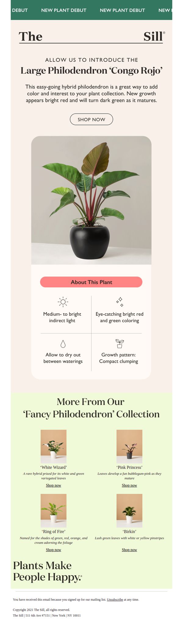

1. ✨JUST ARRIVED!✨ This large plant adds color & size
Objective
To introduce and drive immediate sales of the new Large Philodendron ‘Congo Rojo’ by highlighting its visual appeal and low-maintenance traits, while cross-promoting related plants to increase average order value.
Why this works
The email masterfully combines aesthetic appeal with practical care info, making the plant feel both desirable and achievable for novice plant owners by emphasizing its easy-going nature and striking color transformation.
How to implement
By featuring the new plant as a 'debut' with bold visual hierarchy and a clear CTA, the campaign creates urgency and exclusivity without relying on discounts, which preserves brand value while driving conversion.
Pro Tip
Add a subtle countdown timer or 'Limited Stock' indicator near the CTA to heighten urgency, since the 'JUST ARRIVED' subject implies scarcity that isn’t visually reinforced in the body. • Include a customer testimonial or social proof snippet near the hero image to build trust, especially since this is a debut product, social validation can reduce perceived risk for first-time buyers.
2. The Valentine's gifts we're actually excited about
Objective
This email aims to inspire Valentine’s Day gifting by showcasing curated, emotionally resonant plants that double as meaningful presents, while also driving traffic to the brand’s shop and promoting educational and bulk-gifting offerings.
Why this works
The email brilliantly reframes plants as emotional gifts by pairing each with a witty, personality-driven caption that speaks directly to relationship dynamics, making the products feel personal and story-driven rather than just decorative.
How to implement
By integrating a free plant care workshop and bulk gifting options, the brand expands its value proposition beyond retail, positioning itself as a lifestyle partner that supports both personal and professional gifting moments with educational and scalable solutions.
Pro Tip
Add a subtle countdown timer near the 'Shop Valentine’s Day' CTA to create urgency, since the email’s Valentine’s theme implies a time-sensitive gifting window that’s currently under-leveraged. • Reposition the 'Shop All' button higher in the flow, perhaps after the first 3–4 plant highlights, to reduce scroll fatigue and capture early interest before users lose momentum or get distracted by secondary content.
3. Eric, these Valentines are ready to ship!
Objective
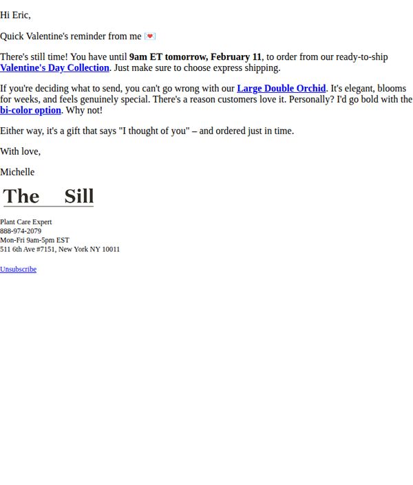
This email aims to create urgency for Valentine’s Day gifting by reminding the recipient of the approaching deadline to order from The Sill’s ready-to-ship collection, while positioning the Large Double Orchid as an emotionally resonant, elegant gift choice.
Why this works
The email leverages personalization by addressing the recipient by name and using a warm, conversational tone that feels like a friendly reminder rather than a sales pitch, which builds trust and lowers resistance to the offer.
How to implement
It creates urgency with a specific cutoff time, '9am ET tomorrow, February 11', paired with a clear action path, making the decision to act feel timely and low-friction for last-minute gift shoppers.
Pro Tip
Add a visual of the Large Double Orchid with the bi-color option to reinforce the recommendation and help the recipient visualize the gift, reducing cognitive load and increasing conversion likelihood. • Include a secondary CTA button or link labeled 'Shop Now, Last Chance!' near the product mention to create a stronger visual hierarchy and reduce friction for users who want to act immediately.
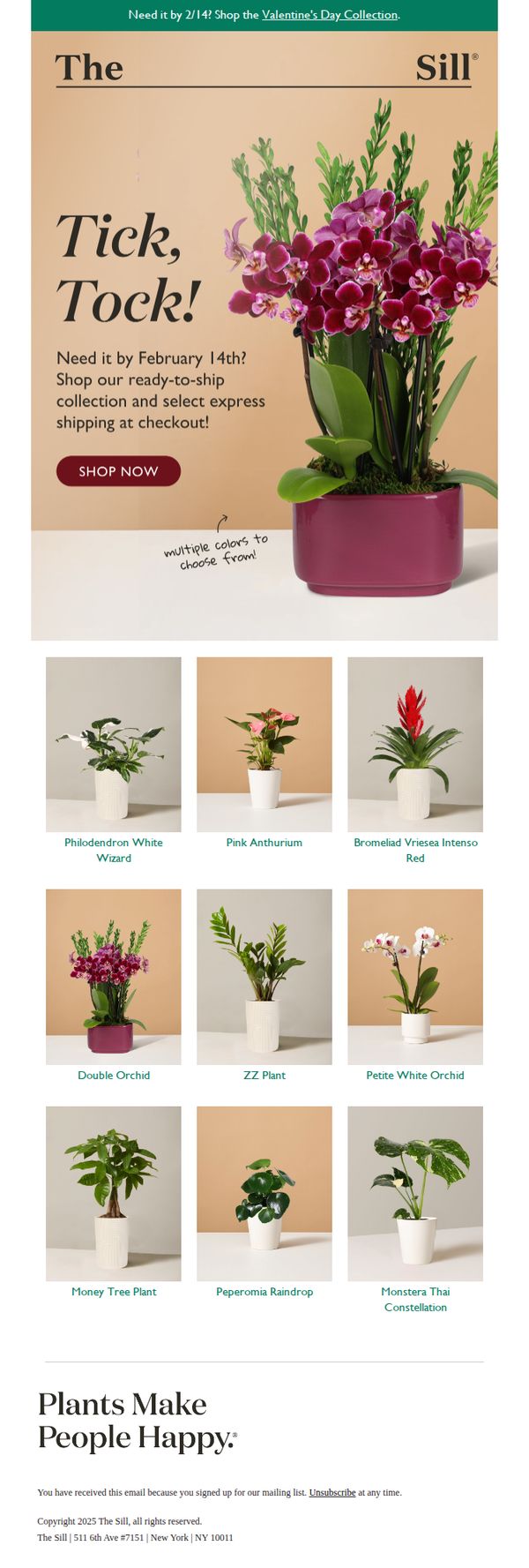
4. Get by February 14! Shop ready to ship →
Objective
This email aims to drive urgency-driven purchases by encouraging customers to shop The Sill’s ready-to-ship Valentine’s Day plant collection before the February 14 deadline, while highlighting express shipping options to ensure timely delivery.
Why this works
The email brilliantly leverages time-sensitive urgency with a bold 'Tick, Tock!' headline paired with a clear cutoff date, making the customer feel the need to act now to secure a gift in time for Valentine’s Day.
How to implement
By featuring a visually rich product grid with labeled plant names and consistent styling, the email simplifies decision-making for gift buyers while showcasing variety without overwhelming the viewer with too many choices.
Pro Tip
Add a small countdown timer beneath the 'Tick, Tock!' headline to visually reinforce urgency and create a more dynamic, interactive experience that nudges users toward immediate action. • Include a brief testimonial or social proof near the product grid, such as '92% of customers say their plant arrived fresh and beautiful', to reduce perceived risk and increase confidence in gifting a live plant.
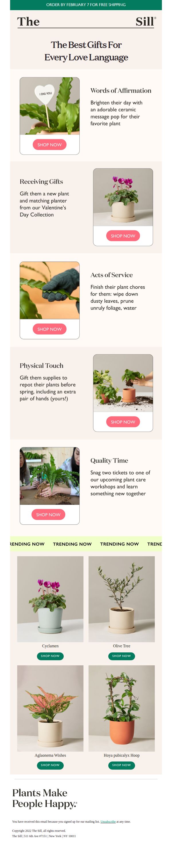
5. Looking for a Valentine's Day gift?
Objective
This email aims to convert Valentine’s Day shoppers into customers by positioning plants as thoughtful, emotionally resonant gifts aligned with the five love languages. It encourages immediate purchase by tying offers to a shipping deadline and showcasing gift-ready plant experiences.
Why this works
The email brilliantly reframes plant gifting through the lens of the five love languages, making it emotionally intelligent and deeply relatable, a strategy that transforms a simple product into a meaningful gesture tailored to how recipients feel loved.
How to implement
By pairing each love language with a specific plant-related experience, from ceramic message pops to hands-on repotting, the campaign creates a narrative that’s both educational and persuasive, guiding shoppers to see plants as active expressions of care, not just decorative items.
Pro Tip
Add a subtle countdown timer or progress bar near the top to visually reinforce the February 7 shipping deadline, increasing urgency without disrupting the clean aesthetic or requiring users to mentally calculate time remaining. • Include a short testimonial or social proof snippet under each love language section, for example, '92% of customers say their partner loved receiving a plant gift', to strengthen trust and validate the emotional positioning with real-world results.
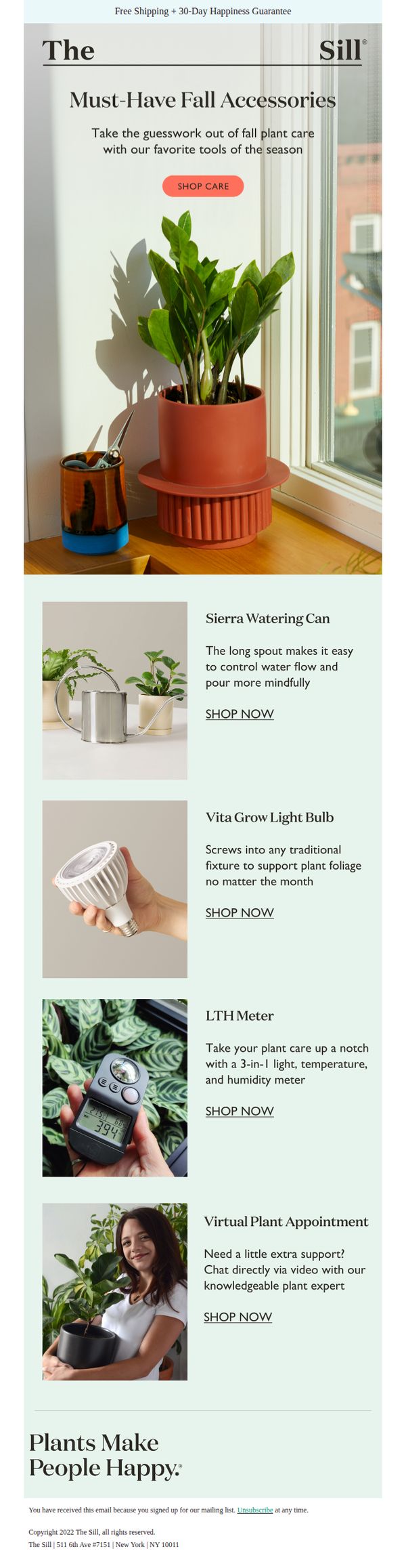
6. Care Accessories We're Using Right Now 🍃
Objective
This email aims to drive sales of seasonal plant care accessories by positioning them as essential, expert-recommended tools for fall plant maintenance, while reinforcing The Sill’s brand as a trusted guide for plant lovers.
Why this works
The email brilliantly frames utility tools as seasonal essentials, not just products, by tying them to fall plant care routines, this emotional and practical positioning makes accessories feel indispensable rather than optional.
How to implement
Each product is sold with a clear, benefit-driven micro-story, like the watering can’s long spout enabling mindful pouring, which transforms specs into relatable, lifestyle-aligned solutions that resonate with plant parents’ daily rituals.
Pro Tip
Add a subtle visual hierarchy or icon to distinguish physical products from the service offering (Virtual Plant Appointment) to prevent confusion and reinforce the tangible nature of most CTAs. • Include a short testimonial or social proof snippet under one or two products, like ‘Loved by 10K+ plant parents’, to reduce perceived risk and boost conversion for first-time accessory buyers.
7. Eric, last chance for our Halloween greens
Objective
This email aims to create urgency for Eric to purchase Halloween-themed plants before the limited collection sells out, leveraging personalization and product highlights to drive last-minute conversions.
Why this works
The email opens with a personalized, time-sensitive hook that immediately signals scarcity, making the reader feel they’re getting exclusive access to dwindling inventory rather than just another promotion.
How to implement
Each plant is described with vivid sensory language, like ‘striking orange stems’ and ‘bumpy surface feels as cool as it looks’, which transforms functional details into emotional triggers that help customers visualize the plant in their space.
Pro Tip
Add a visual thumbnail or icon next to each plant name in the product grid to reinforce recognition and break up text-heavy descriptions, improving scanability and reducing cognitive load for mobile users. • Include a subtle countdown timer or stock indicator (e.g., 'Only 3 left!') near the CTA link to amplify urgency visually, since the current text-based scarcity cue may not be compelling enough on its own.
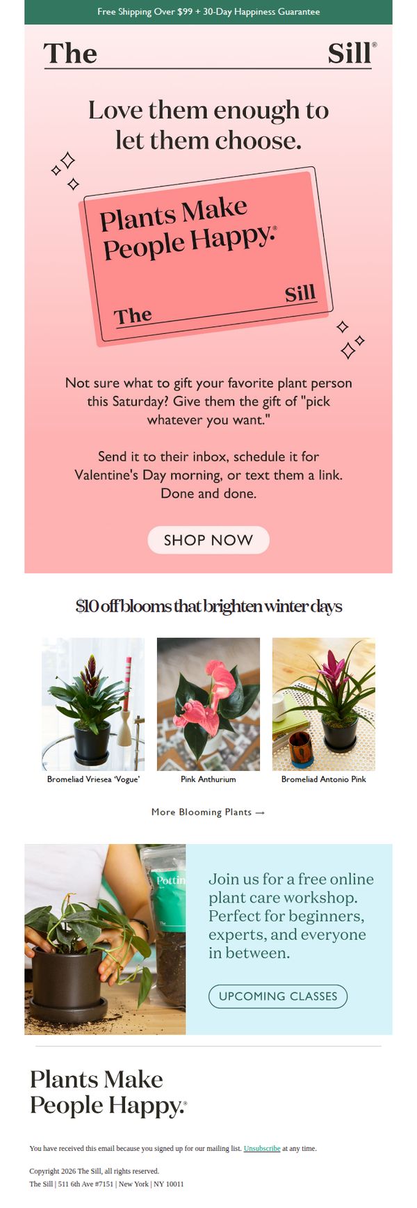
8. For people who are picky (in a good way 😉)
Objective
This email aims to convert gift-givers into customers by positioning The Sill’s plant gift cards as the perfect solution for indecisive or discerning recipients, while also promoting seasonal blooms and educational content to deepen engagement.
Why this works
The email brilliantly reframes indecision as a virtue by targeting 'picky' customers with the empowering message that they can gift the freedom to choose, making the recipient feel valued rather than pressured.
How to implement
By tying the gift card offer to Valentine’s Day with a playful yet practical tone, the campaign leverages emotional timing without being overly sentimental, keeping the focus on convenience and personalization for modern gift-givers.
Pro Tip
Add a subtle countdown timer near the CTA to create urgency around Valentine’s Day gifting, encouraging immediate action without disrupting the email’s calm, friendly tone. • Include a small customer testimonial or social proof near the gift card offer to reinforce trust, for example, '92% of gift recipients chose their own plant and loved it!' to validate the concept.
9. Order NOW for National Grandparents Day!

Objective
This email aims to drive immediate purchases for National Grandparents’ Day by positioning plants as thoughtful, emotional gifts that pair beautifully with a phone call. It leverages urgency and sentiment to convert subscribers into gift-givers before the September 8th deadline.
Why this works
The email brilliantly ties plant gifting to emotional connection by suggesting a phone call alongside the gift, transforming a simple product into a meaningful ritual that resonates with family values and nostalgia.
How to implement
By categorizing plants for 'sills & tables' and 'patios & gardens,' the campaign simplifies decision-making for gifters who may not know the recipient’s space, reducing friction and increasing conversion through thoughtful segmentation.
Pro Tip
Add a countdown timer near the CTA to reinforce urgency for National Grandparents’ Day, since the current design relies solely on text to convey the deadline, which may not trigger immediate action. • Include a short testimonial or customer quote near the product grid to build social proof, for example, 'My grandma cried when she got her Hoya Heart, she said it’s the best gift she’s ever received.'
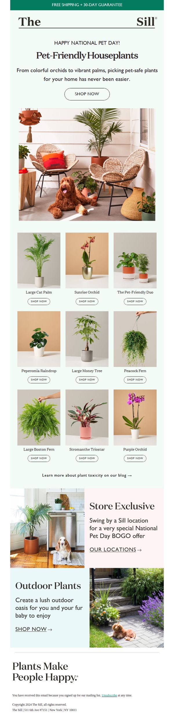
10. Pawsitively Safe 🐾
Objective
This email aims to celebrate National Pet Day by promoting pet-safe houseplants, encouraging immediate purchases through a curated product grid and localized in-store offer, while reinforcing brand trust with a 30-day guarantee and educational resources.
Why this works
The email brilliantly ties a cultural moment, National Pet Day, to product relevance by showcasing pet-safe plants with warm, lifestyle-driven imagery that makes safety feel joyful, not restrictive, which builds emotional trust while driving sales.
How to implement
By featuring a clean 3x3 product grid with consistent 'Shop Now' CTAs beneath each plant, the campaign reduces decision fatigue and creates a frictionless browsing experience that turns casual interest into immediate action without overwhelming the reader.
Pro Tip
Add a subtle countdown timer or urgency indicator near the 'Shop Now' CTA in the hero section to amplify the National Pet Day limited-time feel and nudge procrastinators toward immediate action. • Include a short testimonial or customer photo with a pet near one of the featured plants in the product grid to add social proof and reinforce the 'pet-friendly' claim with real-life validation.