Proven Transport relational campaign email designs you can use

1. BlaBlaCar - UK: Confirm your email address
Objective
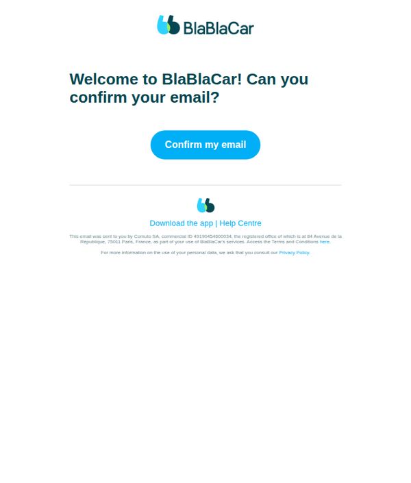
This email aims to verify the user’s email address to complete account setup and ensure secure, personalized access to BlaBlaCar’s ride-sharing platform in the UK.
Why this works
The email uses a warm, conversational tone with 'Welcome to BlaBlaCar!' to instantly build rapport and reduce friction during the onboarding process, making users feel valued from the first interaction.
How to implement
A single, prominent CTA button in a high-contrast color draws immediate attention and simplifies the user’s next step, minimizing decision fatigue and increasing conversion likelihood during critical account verification.
Pro Tip
Add a brief explanation of why email confirmation is required (e.g., 'to keep your rides secure and personalized') to reduce user hesitation and increase trust before clicking the CTA. • Include a secondary CTA or reminder text (e.g., 'Didn’t receive the email? Resend it here') to reduce drop-off for users who may have missed or filtered the message.
2. Singapore Airlines: You have successfully enrolled as a Registered Customer
Objective
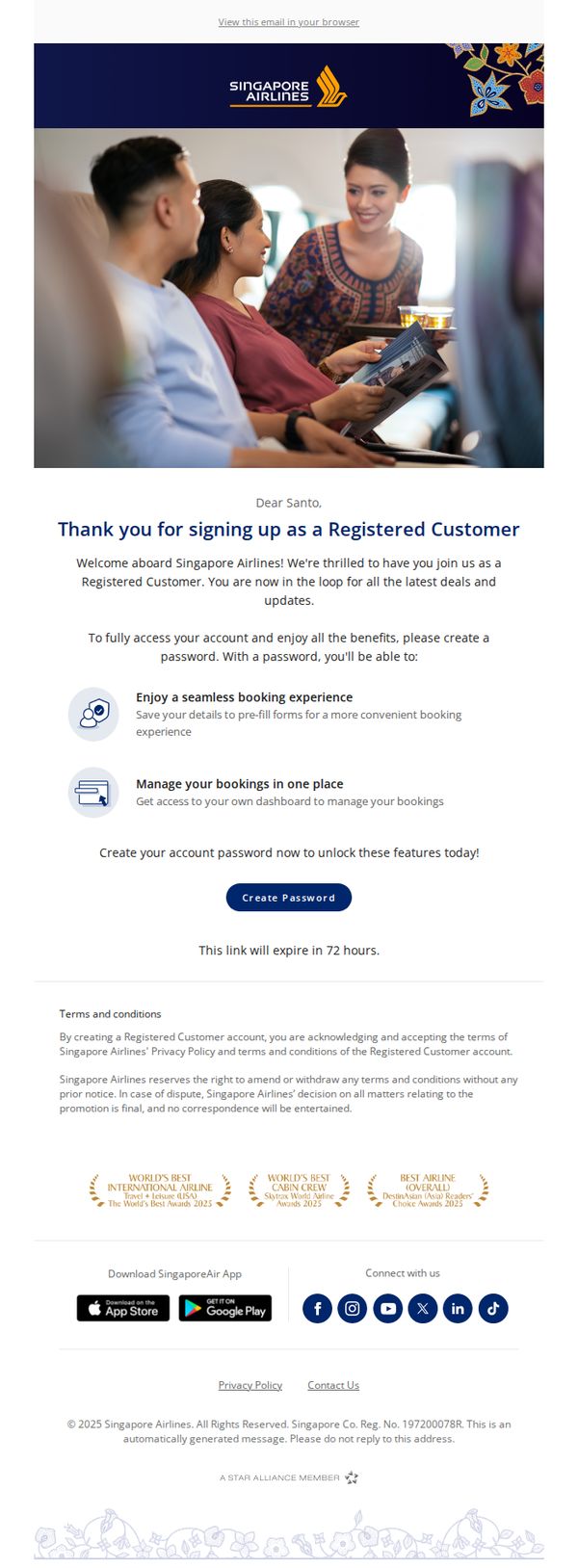
This email confirms successful enrollment as a Registered Customer with Singapore Airlines and encourages immediate password creation to unlock account benefits like seamless booking and centralized trip management. It aims to convert new sign-ups into active, engaged users within 72 hours.
Why this works
The email immediately validates the user’s action with a warm, personalized welcome, reinforcing emotional connection while clearly stating the next critical step, creating a password, to transform passive sign-ups into active account holders.
How to implement
By listing tangible benefits like ‘seamless booking experience’ and ‘manage bookings in one place’ right after the welcome, the email frames password creation not as a chore but as a gateway to real, valuable convenience, increasing conversion motivation.
Pro Tip
Add a secondary CTA or reminder link near the bottom of the email, for users who scroll past the primary button, to reduce drop-off and reinforce the 72-hour deadline visually, especially since the footer contains only legal and social links. • Include a brief, one-sentence value reinforcement above the CTA, such as ‘Your next trip is just one password away’, to re-anchor the user’s motivation at the point of decision, reducing hesitation and boosting click-through rates.
3. ShipBob: Lucky you! Insights from ShipBob 🍀
Objective
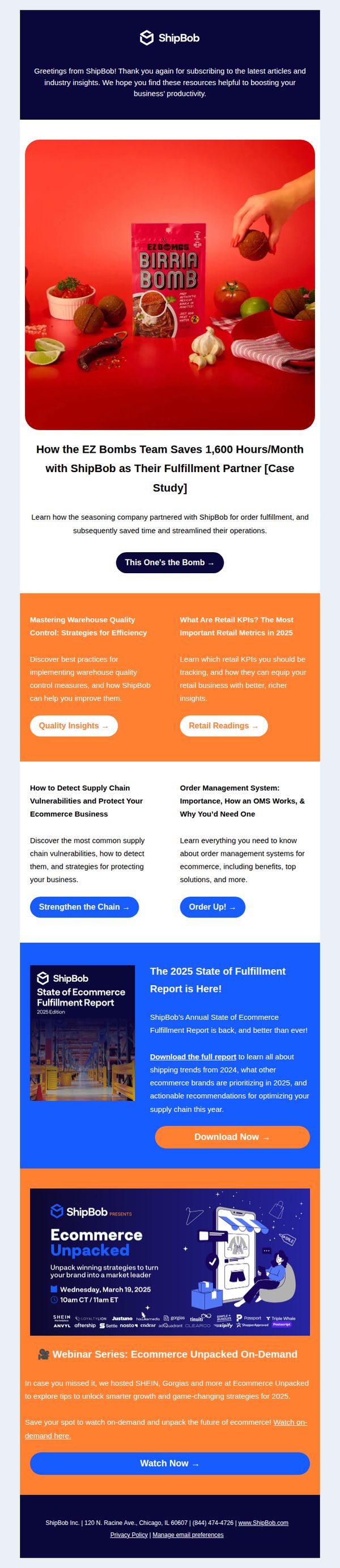
This email aims to engage subscribers by delivering high-value, educational content that showcases ShipBob’s impact on real businesses while subtly reinforcing its role as a strategic fulfillment partner. It also promotes downloadable reports and on-demand webinars to nurture leads and position ShipBob as an industry thought leader.
Why this works
The email opens with a personalized, celebratory tone, 'Lucky you!', which instantly creates emotional resonance and positions the content as a reward rather than a sales pitch, making subscribers more receptive to the value being offered.
How to implement
By leading with a specific, quantifiable case study, 'saves 1,600 hours/month', ShipBob anchors its credibility in tangible results, giving prospects a concrete reason to believe in the platform’s operational impact rather than just its features.
Pro Tip
The primary CTA 'Download Now →' is visually strong but lacks urgency or benefit-driven language; adding a micro-copy like 'Download Now, Unlock 2025’s Top Fulfillment Trends' would better align the CTA with the report’s value proposition. • The layout places the webinar section after the report CTA, which may dilute conversion focus; reordering to place the highest-intent CTA (report download) immediately after the hero section would reduce friction and increase completion rates.
4. easyJet: Last-minute holidays from £219pp 🏖️
Objective
This email aims to drive immediate bookings for last-minute holidays and flights by highlighting affordable prices and enticing destinations, leveraging urgency and visual appeal to convert subscribers into travelers before the end of the booking window.
Why this works
The email masterfully combines urgency with aspirational imagery, using phrases like 'Last-minute holidays from £219pp' alongside breathtaking coastal visuals to trigger FOMO while simultaneously painting a vivid dream of escape.
How to implement
By segmenting offers into clear, visually distinct destination blocks, Morocco, Nice, Malta, the email simplifies decision-making for the reader, allowing them to instantly connect emotionally with a location and act without cognitive overload.
Pro Tip
Add a subtle countdown timer or 'limited seats' indicator near the £23 one-way flight offer to amplify urgency and prevent the perception that deals are always available. • Include a short testimonial or star rating beneath each destination to build social proof and reduce perceived risk, especially for less familiar locations like Morocco or Malta.
5. Ukprefulfillment: Signup Success! 👍
Objective
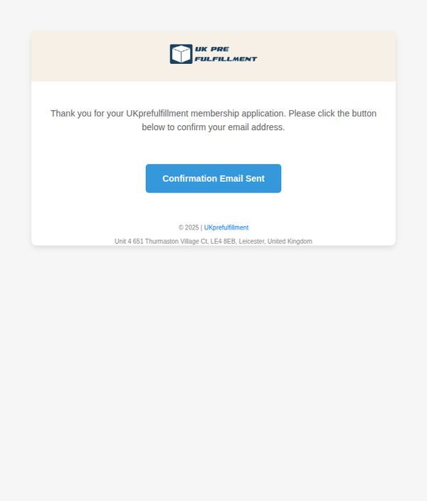
This email aims to confirm the user’s membership application and prompt them to verify their email address to complete the onboarding process, ensuring account legitimacy and engagement from the outset.
Why this works
The email immediately acknowledges the user’s action with a warm, appreciative tone, reinforcing positive sentiment and reducing friction during the critical onboarding phase.
How to implement
By placing a clear, color-contrasted CTA button directly beneath the instruction, the design guides the user’s eye and minimizes decision fatigue, increasing confirmation completion rates.
Pro Tip
The CTA button text 'Confirmation Email Sent' is misleading, it should say 'Confirm Your Email' or 'Verify My Account' to reflect the user’s required action, not the system’s status. • Add a brief line explaining what happens after confirmation (e.g., 'You’ll gain instant access to your dashboard and fulfillment tools') to motivate immediate action and reduce drop-offs.
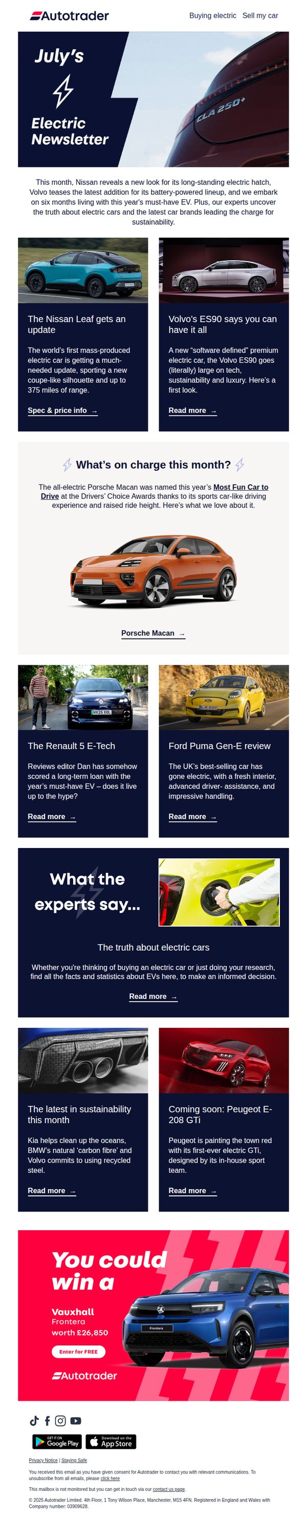
6. AutoTrader : We uncover the truth about electric cars and the latest in sustainability
Objective
This email aims to position AutoTrader as a trusted authority on electric vehicles by delivering curated, expert-driven insights on the latest EV models, sustainability trends, and real-world performance, while subtly encouraging engagement through a giveaway to boost brand loyalty and app downloads.
Why this works
AutoTrader smartly blends editorial credibility with promotional intent by leading with expert reviews and sustainability insights before introducing a giveaway, which makes the CTA feel like a natural reward rather than a sales pitch.
How to implement
The email uses a clean, magazine-style grid layout to showcase multiple EV models without overwhelming the reader, allowing each car to feel like a featured story rather than just another listing, which elevates perceived value and trust.
Pro Tip
The giveaway CTA at the bottom feels disconnected from the editorial content above; adding a transitional line like 'Love what you read? Enter to win the car that’s turning heads this month' would better bridge the content-to-conversion gap. • The 'What the experts say...' section lacks social proof, adding a short quote or nameplate from a named AutoTrader editor or industry analyst would strengthen credibility and make the 'truth about electric cars' claim feel more authoritative.
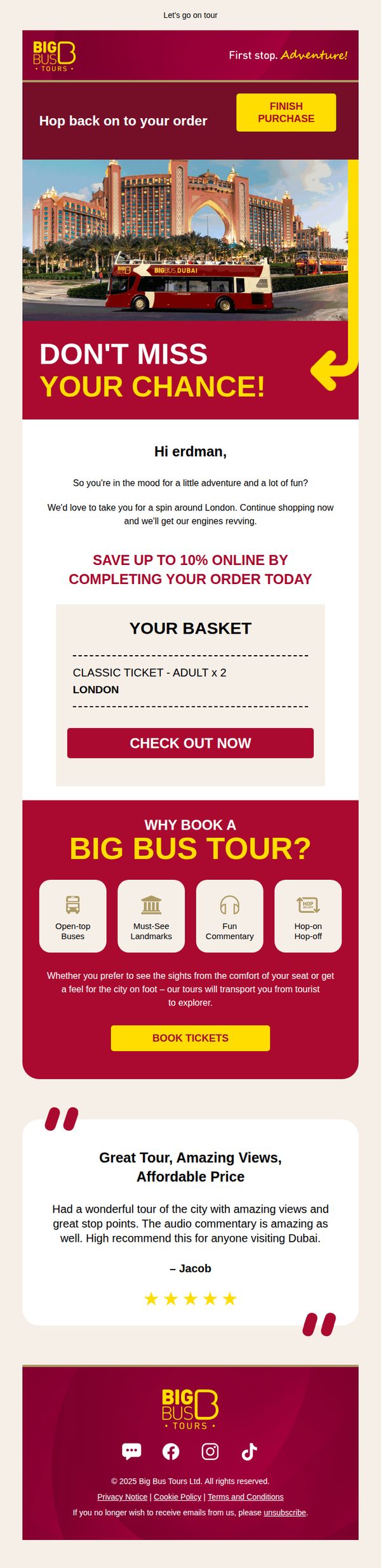
7. Big Bus Tours: We don't want to leave without you 🚌
Objective
This email aims to recover an abandoned cart by reminding the recipient of their incomplete purchase and incentivizing them to complete it with a time-sensitive 10% discount. It also reinforces the value of the tour experience to reignite interest.
Why this works
The email brilliantly personalizes the abandoned cart reminder by addressing the recipient by name and framing the tour as a spontaneous adventure, making the offer feel timely and emotionally resonant rather than transactional.
How to implement
By highlighting a concrete 10% savings tied to immediate action, the campaign creates urgency without being pushy, leveraging FOMO in a friendly tone that aligns with the brand’s adventurous, fun-loving identity.
Pro Tip
The CTA 'FINISH PURCHASE' appears only in the header and is visually disconnected from the basket summary, relocating a duplicate, equally prominent CTA button directly beneath the 'CHECK OUT NOW' section would reduce friction and improve conversion flow. • The testimonial references Dubai, but the basket shows a London tour, this geographic mismatch may confuse or erode trust; replacing it with a London-specific review or adding a note like 'Similar experiences await in London!' would maintain credibility.
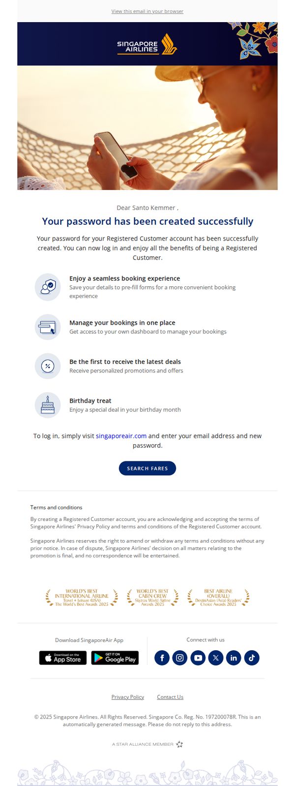
8. Singapore Airlines: Welcome to Singapore Airlines
Objective
This email confirms successful account creation for a new Singapore Airlines customer and encourages immediate engagement by highlighting key benefits and directing them to search for flights. It aims to convert registration into first-time booking behavior.
Why this works
The email immediately validates the user’s action by confirming password creation, then instantly transitions into value-driven benefits, making the customer feel welcomed and rewarded from the very first interaction.
How to implement
By listing four distinct, benefit-focused perks with simple icons, the email transforms a routine account confirmation into a compelling value proposition that motivates users to explore their new dashboard and engage with the brand.
Pro Tip
Add a personalized greeting or dynamic content (e.g., 'Welcome, Santo!') above the main headline to strengthen emotional connection and increase perceived relevance for the recipient. • Include a secondary CTA or micro-action (e.g., 'Download the App for Exclusive Mobile Deals') near the app download section to capture users who may not be ready to book but are open to deeper engagement.
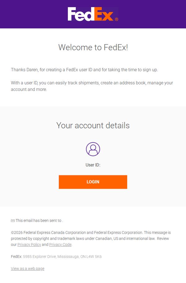
9. FedEx - CA : Your FedEx user ID is ready
Objective
To welcome the new user, confirm their FedEx user ID has been successfully created, and guide them to log in to begin managing their shipping and account preferences with confidence.
Why this works
The email opens with a personalized welcome that immediately validates the user’s effort to sign up, creating emotional momentum and reducing friction for first-time engagement.
How to implement
It clearly explains the functional value of the user ID, tracking shipments, managing accounts, and building address books, so recipients instantly understand why they should take action.
Pro Tip
Add a secondary CTA or link below the main button that says 'Need help setting up?' to reduce abandonment for users who may feel uncertain after account creation. • Include a brief visual or icon-based checklist under 'Your account details' showing what the user can do next (e.g., track a package, save an address) to reinforce value and guide behavior.
10. AutoTrader : BYD builds the world’s fastest car, and we meet the future of Audi design 💥

Objective
This email aims to engage car enthusiasts and potential buyers by highlighting groundbreaking automotive innovations and exclusive deals, while driving traffic to AutoTrader’s platform for research, leasing, and purchasing. It blends editorial content with commercial offers to position AutoTrader as a trusted, forward-looking automotive authority.
Why this works
By leading with a bold, data-driven headline about BYD overtaking Bugatti, the email immediately captures attention with a sense of urgency and technological disruption, making readers feel they’re witnessing automotive history unfold in real time.
How to implement
The seamless blend of editorial-style expert reviews with commercial offers, like the MG HS savings and leasing deals, creates a trusted, magazine-like experience that subtly guides readers from curiosity to conversion without feeling overly salesy.
Pro Tip
The primary CTA 'Read more' is generic and underwhelming, consider tailoring CTAs per section (e.g., 'See the specs' for the BYD hero, 'Watch the reveal' for Audi) to better match user intent and increase click-through relevance. • The leasing offer section lacks visual urgency or social proof, adding a countdown timer for limited-time deals or a testimonial quote like '92% of our leasers saved over £500/month' would strengthen conversion psychology and perceived value.