The complete relational welcome email collection
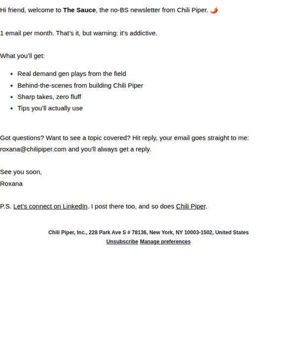
1. Chili Piper: You’re in, welcome to The Sauce!
Objective
To warmly welcome new subscribers to Chili Piper’s newsletter, 'The Sauce,' by setting clear expectations for content and fostering immediate personal connection through direct reply access and social engagement.
Why this works
The email instantly builds trust by promising no fluff and real field-tested demand gen plays, positioning itself as a valuable, no-nonsense resource rather than just another promotional blast.
How to implement
Including a direct reply-to email address with a personal name and guarantee of response transforms a transactional welcome into a human conversation, increasing subscriber loyalty from day one.
Pro Tip
Add a visual hero banner or branded header image to reinforce brand identity and break up text-heavy content, making the email more scannable and memorable on first glance. • Include a secondary CTA button or link encouraging readers to follow Chili Piper on LinkedIn or another platform, rather than burying it in a P.S., to boost social engagement metrics.
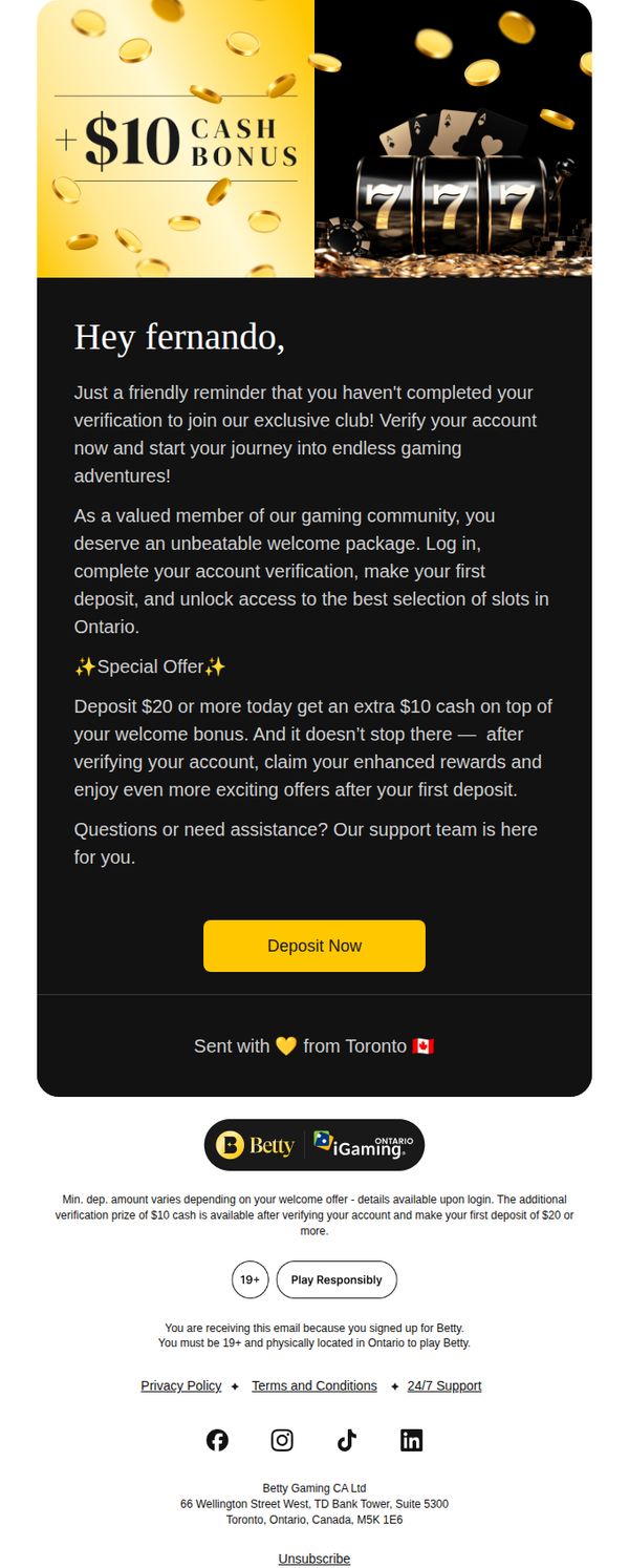
2. Betty : fernando, Let’s Get You Verified! ✅
Objective
This email aims to motivate the recipient, Fernando, to complete account verification by highlighting an exclusive $10 cash bonus and positioning it as a gateway to premium gaming experiences in Ontario. It leverages urgency and personalization to drive immediate action.
Why this works
The email opens with a personalized, friendly tone that frames verification not as a chore but as an invitation to an exclusive club, making the user feel valued and part of a special community.
How to implement
It pairs a clear financial incentive, a $10 bonus, with a behavioral trigger (first deposit of $20+) to create a low-friction path to conversion while subtly encouraging higher initial spend.
Pro Tip
Add a brief FAQ or tooltip near the CTA explaining what ‘verification’ entails, many users abandon at this step due to uncertainty, and a single line like ‘Takes 2 minutes, no documents needed’ could reduce friction. • Include a small progress indicator or countdown timer (e.g., ‘Offer expires in 48 hours’) to create urgency without being pushy, since the current design lacks temporal pressure despite the ‘friendly reminder’ tone.
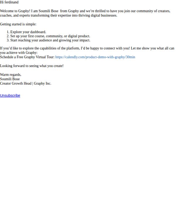
3. Graphy : Welcome to Graphy – Let’s Monetise Your Expertise!
Objective
This email aims to warmly welcome new users to Graphy and guide them toward taking their first meaningful steps on the platform by highlighting the simplicity of onboarding and offering a personalized virtual tour to accelerate their journey toward monetizing their expertise.
Why this works
The email opens with a personal, human touch by introducing the sender by name and role, instantly building trust and signaling that real support is available, a subtle but powerful way to reduce new-user anxiety and increase engagement.
How to implement
It breaks down the onboarding process into three simple, action-oriented steps that feel achievable, helping users mentally map their path forward without overwhelm, a smart psychological nudge that turns intimidation into momentum.
Pro Tip
Add a visual element like a screenshot or short animated GIF of the dashboard to make the 'Explore your dashboard' step more tangible and reduce cognitive load for new users unfamiliar with the interface. • Include a brief social proof element, such as 'Join 10,000+ creators who’ve launched their first course in under 7 days', to reinforce credibility and motivate action by showing peer success.
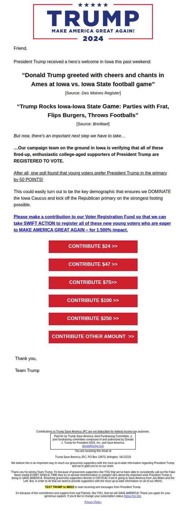
4. Donald J. Trump: RE: An important next step…
Objective
This email aims to convert reader enthusiasm into financial support by framing contributions as essential to registering young, energized voters in Iowa, positioning the donation as a strategic tool to dominate the Republican primary and ultimately 'Make America Great Again.'
Why this works
The email brilliantly ties emotional momentum from a recent public event, Trump’s Iowa football game appearance, to an urgent, mission-driven fundraising ask, making the donation feel like a direct extension of the supporter’s excitement and patriotism.
How to implement
By citing a poll showing young voters prefer Trump by 50 points, the campaign transforms abstract enthusiasm into a tactical advantage, positioning the donor as a key player in leveraging demographic strength to dominate the primary, a powerful psychological trigger for action.
Pro Tip
Add a brief testimonial or quote from a young Iowa voter or volunteer to humanize the '50-point poll' claim and strengthen emotional resonance, currently, the statistic feels abstract without a personal story to anchor it. • Include a small visual element, like a progress bar or countdown timer, near the CTA to create urgency around voter registration deadlines, reinforcing the 'SWIFT ACTION' message with tangible, time-sensitive context.
5. Ikon Pass: Find out what joy is all about
Objective
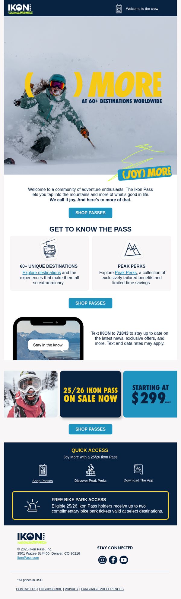
The email aims to convert adventure seekers into Ikon Pass holders by highlighting the emotional reward of mountain experiences and the tangible value of access to 60+ global destinations, while driving immediate action through a limited-time offer starting at $299.
Why this works
The email brilliantly ties emotional payoff, 'joy', to the product by showing a skier mid-action, making the pass feel less like a transaction and more like an invitation to live a fuller, more exhilarating life.
How to implement
By breaking down the pass’s value into digestible, icon-driven sections like '60+ Unique Destinations' and 'Peak Perks,' the email reduces cognitive load and helps prospects quickly grasp the breadth of benefits without feeling overwhelmed.
Pro Tip
Add a countdown timer near the '25/26 Ikon Pass on Sale Now' section to create urgency and reduce decision latency, especially since the price point is a key conversion lever. • Reposition the 'FREE BIKE PARK ACCESS' benefit higher in the flow, perhaps right after the hero, to immediately showcase cross-season value, which could appeal to non-winter sports enthusiasts and broaden the target audience.
6. The Sandbox Game: Welcome to The Sandbox!

Objective
This email aims to welcome new users to The Sandbox by showcasing its immersive, multi-experience virtual world and motivating immediate engagement through compelling visuals and clear calls to action. It seeks to convert curiosity into active participation by highlighting social, creative, and reward-driven opportunities.
Why this works
The email brilliantly opens with a high-energy visual and bold headline that instantly communicates the platform’s futuristic, boundary-pushing identity, making the user feel they’re stepping into something revolutionary, not just another game.
How to implement
By spotlighting recognizable brand collaborations like Snoop Dogg and Hell’s Kitchen in a dynamic product grid, the email leverages social proof and pop culture relevance to build instant credibility and excitement for users unfamiliar with the platform’s ecosystem.
Pro Tip
Add a subtle countdown timer or 'New User Bonus' badge near the first CTA to create urgency and incentivize immediate action, since the current design lacks time-sensitive motivation for new signups. • Include a short testimonial or user stat (e.g., '500K+ creators already building') in the 'Be Rewarded' section to reinforce social proof and validate the reward claims with real-world traction.
7. Betty : fernando, Final Offer: Verify Your Account, Get $10! ✅
Objective
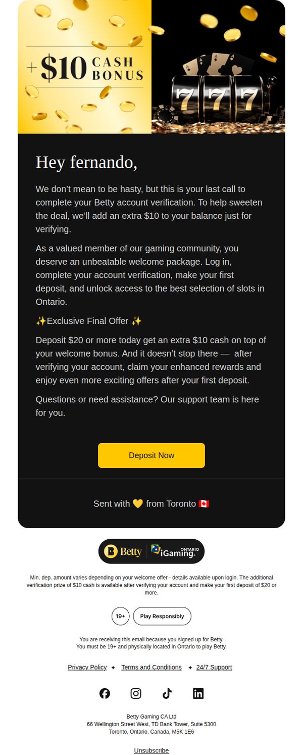
This email aims to drive account verification by offering a time-sensitive $10 cash bonus, encouraging immediate action from the recipient to complete onboarding and make their first deposit. It positions the offer as a final, exclusive opportunity to unlock enhanced rewards and access premium gaming content.
Why this works
The email leverages urgency and exclusivity by framing the $10 bonus as a 'final offer,' which psychologically nudges the recipient to act before the opportunity vanishes, increasing conversion likelihood through scarcity-driven motivation.
How to implement
Personalization is effectively used by addressing the recipient by name and referencing their status as a 'valued member,' which builds rapport and makes the offer feel tailored rather than generic, enhancing emotional engagement and trust.
Pro Tip
Add a countdown timer or 'last chance' badge near the CTA to visually reinforce urgency and reduce hesitation, making the 'final offer' claim more tangible and psychologically compelling. • Include a brief testimonial or social proof snippet from another verified user who unlocked rewards, to reduce perceived risk and increase credibility around the deposit and verification process.
8. Envoy: Overcome the most common visitor management headaches
Objective
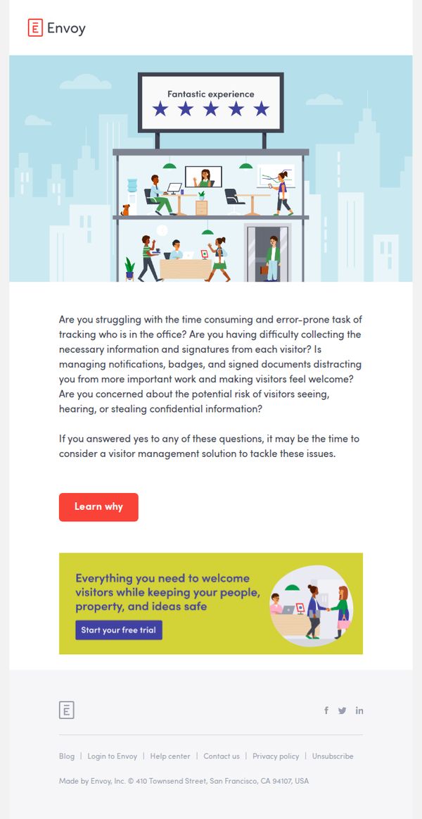
This email aims to identify common visitor management pain points for office administrators and position Envoy as the solution that streamlines visitor check-in while enhancing security and professionalism. It encourages readers to start a free trial by framing the product as essential for operational efficiency and risk reduction.
Why this works
The email opens with a series of empathetic, pain-point-driven questions that immediately resonate with office managers overwhelmed by manual visitor processes, making the solution feel personally relevant rather than salesy.
How to implement
By visually anchoring the message with a clean, friendly illustration of a modern office and a five-star review banner, the email builds trust and positions Envoy as a proven, user-approved tool before the reader even scrolls further.
Pro Tip
Add a short testimonial or customer logo beneath the hero section to reinforce social proof immediately after the pain-point questions, increasing credibility before the CTA. • Include a subtle countdown timer or urgency indicator near the 'Start your free trial' button to nudge procrastinators toward immediate action without disrupting the clean layout.
9. Zenfulfillment - DE: 👋 Welcome to Zenfulfillment
Objective
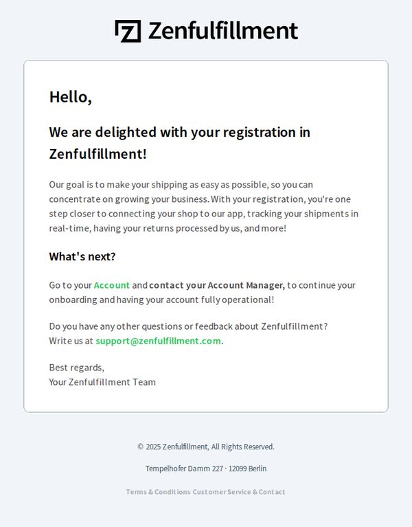
This welcome email aims to warmly acknowledge the user’s registration with Zenfulfillment and guide them toward the next critical step: contacting their Account Manager to complete onboarding. It reassures the user that the platform is designed to simplify shipping so they can focus on growing their business.
Why this works
The email opens with a warm, personalized greeting that immediately validates the user’s action, creating emotional momentum and reducing early drop-off by making the recipient feel seen and supported from day one.
How to implement
It clearly articulates the brand’s core value proposition, simplifying shipping so merchants can focus on growth, which frames the entire onboarding process as a strategic business advantage, not just a technical setup.
Pro Tip
Add a visual cue or button around the 'Go to your Account' CTA to increase click-through; currently, it’s buried in plain text and lacks visual hierarchy, which may reduce conversion from passive readers. • Include a brief bullet-point checklist or timeline of what to expect after contacting the Account Manager, this reduces uncertainty and builds confidence in the onboarding process, encouraging immediate action.
10. Gussi: Gussi Rewards is HERE!! Join to unlock exclusive benefits ✨
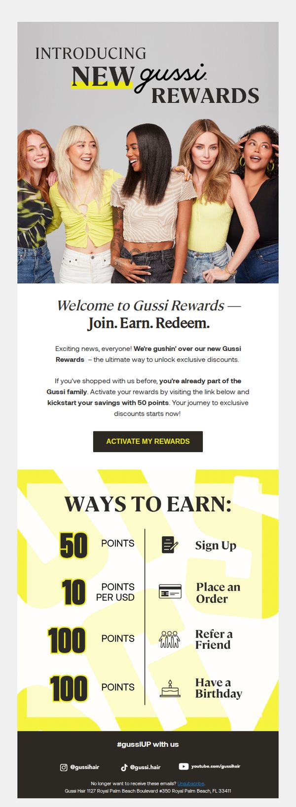
Objective
This email aims to introduce and drive sign-ups for Gussi’s new loyalty program, Gussi Rewards, by highlighting immediate benefits like 50 bonus points and clear earning mechanics to convert existing customers into active members.
Why this works
The email immediately rewards existing customers with 50 points upon activation, turning passive shoppers into engaged members by validating their past loyalty while incentivizing future behavior with zero friction.
How to implement
By visually breaking down point earning into four simple, icon-supported actions, sign up, spend, refer, and celebrate birthdays, the program feels accessible and gamified, making loyalty feel effortless and rewarding rather than transactional.
Pro Tip
Add a countdown timer or urgency cue near the CTA to encourage immediate activation, since the 50-point bonus is a time-sensitive hook that could be amplified with visual scarcity to boost conversion rates. • Include a mini testimonial or social proof snippet, like '92% of members redeemed their first reward within 7 days', to reduce perceived risk and reinforce that joining is a popular, rewarding choice.