Proven relational campaign email designs you can use in Woman Health


1. Lola: Wait — am I the “crisis friend”?
Objective
This email aims to engage readers in a thoughtful conversation about emotional labor in friendships, specifically the role of the 'crisis friend', while subtly positioning Lola as a trusted partner in caregiving through curated content, product recommendations, and cultural insights that validate women’s emotional and practical needs.
Why this works
The email brilliantly frames emotional labor as a cultural conversation rather than a personal failing, using TikTok trends and therapist insights to normalize the reader’s experience and position the brand as a compassionate guide, not a sales pitch.
How to implement
By curating products that double as emotional support tools, like weighted hoodies and cloud robes, the campaign transforms self-care from indulgence into necessity, aligning product utility with the reader’s psychological need for comfort and validation in caregiving roles.
Pro Tip
The CTA 'Read on here to learn more' is vague and underwhelming for a topic this emotionally resonant; it should be rewritten to reflect urgency or empathy, such as 'Find your boundaries without guilt, read the therapist’s guide' to better match the emotional weight of the topic. • The product grid lacks visual hierarchy or emotional cues, each item is listed as plain bullet points. Adding small icons (e.g., a hug emoji for the robe, a puzzle piece for the jigsaw) or short emotional benefit tags (e.g., 'for when you need to melt into comfort') would strengthen the emotional connection and drive clicks.
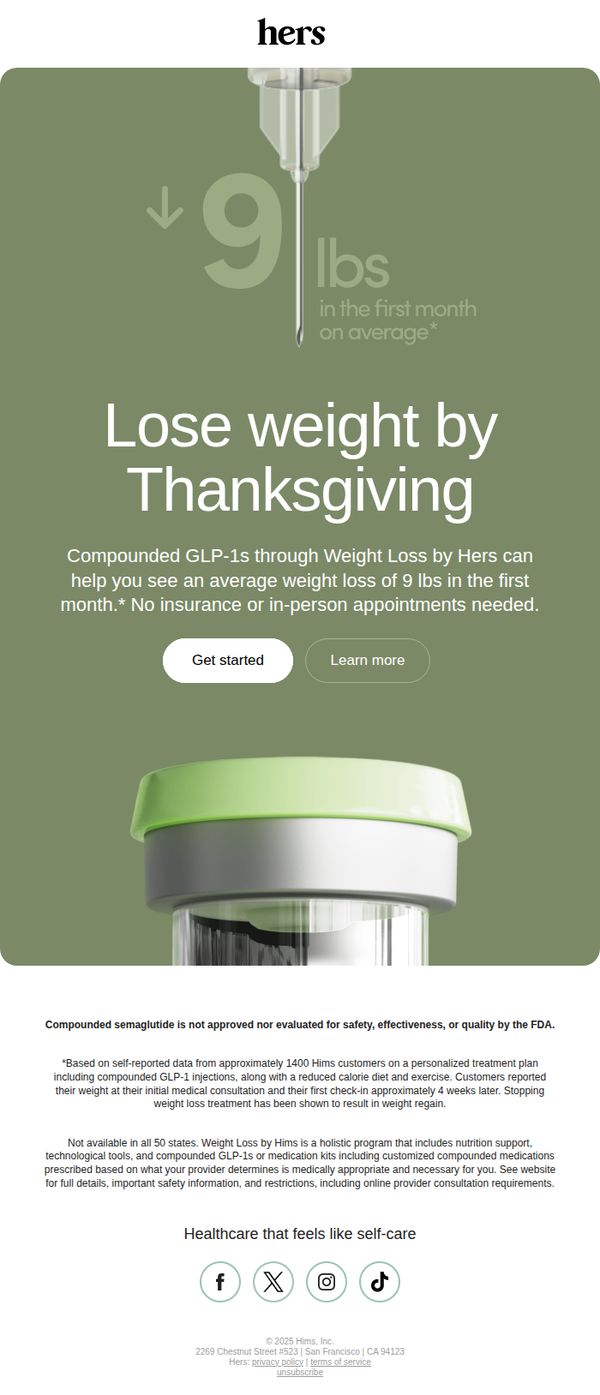
2. Hers: Give yourself the gift of weight loss this year
Objective
This email aims to motivate recipients to begin their weight loss journey with Hers by positioning it as a timely, self-gift opportunity ahead of Thanksgiving, while emphasizing convenience and clinically supported results without insurance or in-person visits.
Why this works
The email brilliantly ties weight loss to a culturally resonant milestone, Thanksgiving, creating urgency and emotional relevance by framing the program as a self-gift rather than a chore, which softens the psychological barrier to starting.
How to implement
By leading with a bold, data-backed claim of '9 lbs in the first month on average,' the campaign immediately establishes credibility and outcome clarity, making the abstract promise of weight loss feel tangible, measurable, and achievable for skeptical audiences.
Pro Tip
Add a subtle countdown timer or seasonal urgency indicator near the CTA (e.g., 'Start by [date] to hit your goal by Thanksgiving') to reinforce the time-sensitive framing and nudge immediate action without feeling pushy. • Include a mini testimonial or user photo snippet just below the hero section, perhaps a 1-2 sentence quote with a first name and result, to humanize the '9 lbs' claim and build social proof before the user scrolls to the fine print.
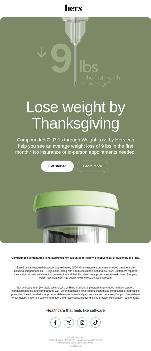
3. Hers: Celebrate the holidays as a healthier you
Objective
The email aims to motivate recipients to begin their weight loss journey before Thanksgiving by promoting Hers’ compounded GLP-1 weight loss program, emphasizing convenience and rapid results without insurance or in-person visits.
Why this works
The email brilliantly ties weight loss to a culturally resonant milestone, Thanksgiving, creating urgency while positioning the product as a timely, achievable solution for holiday confidence.
How to implement
By highlighting a specific, data-backed result (9 lbs in the first month) and immediately clarifying that no insurance or in-person appointments are needed, the email removes common barriers to conversion.
Pro Tip
Add a short testimonial or user quote near the CTA to build social proof and reinforce the 9-lb claim with a relatable voice, increasing emotional resonance and trust. • Include a subtle countdown timer or seasonal graphic (e.g., falling leaves or a calendar icon) to visually reinforce the Thanksgiving deadline and create a sense of time-sensitive opportunity.
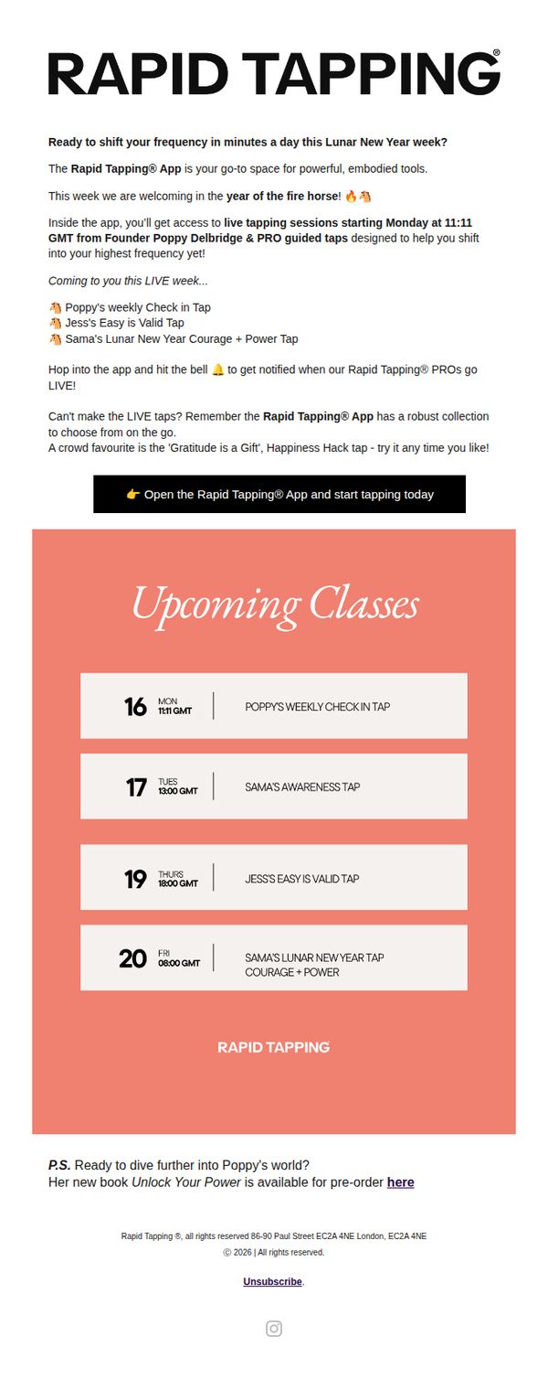
4. Valerie: Lunar New Year Week Taps! 🐴
Objective
This email aims to drive immediate engagement with the Rapid Tapping® App by promoting a limited-time Lunar New Year live tapping event series, encouraging users to open the app and participate in guided sessions with founders and PROs to elevate their emotional frequency.
Why this works
The email brilliantly ties the campaign to a cultural moment, the Lunar New Year, by framing the live tapping sessions as a timely, celebratory ritual that aligns with the year of the fire horse, making the offering feel both urgent and spiritually resonant.
How to implement
It strategically highlights founder-led sessions with named instructors and specific session titles, creating personal connection and perceived exclusivity while subtly reinforcing authority and trust in the brand’s core methodology and teaching team.
Pro Tip
Add a visual countdown timer above the CTA button to emphasize the limited-time nature of the live sessions, increasing urgency and reducing the cognitive load of calculating dates/times from the schedule below. • Include a brief testimonial or user quote near the top, perhaps from someone who benefited from a previous live tap, to reinforce social proof and emotional resonance before diving into the schedule details.
5. FLO Living : 🧬 How I biohack PMS away
Objective
This email aims to educate women on the science behind PMS as a hormonal imbalance, not just a monthly inconvenience, and position Alisa Vitti’s Cycle Syncing® methodology and supplements as the solution to biohacking symptoms away. It also drives conversions to paid programs and memberships by offering exclusive content and personalized coaching.
Why this works
The email brilliantly reframes PMS from a cultural punchline into a critical biomarker of ovarian health, using scientific studies and medical authority to validate the reader’s experience and create urgency for intervention.
How to implement
By breaking down hormonal phases with targeted supplement recommendations and lifestyle tweaks, the email transforms complex endocrinology into actionable, phase-specific self-care, making the science feel personal, practical, and immediately applicable.
Pro Tip
The CTA 'CHECK OUT THE ULTIMATE CYCLE SYNCING® RESET' appears mid-email without visual hierarchy or urgency; adding a countdown timer or limited-availability badge would increase conversion pressure and align with the 'biohacking' urgency theme. • The footer’s dual CTAs ('RESET ME' and 'COUNT ME IN') are visually identical and lack differentiation; redesigning them with distinct color coding or benefit-focused micro-copy (e.g., 'Start My Reset' vs. 'Join the Inner Circle') would clarify user intent and reduce decision fatigue.
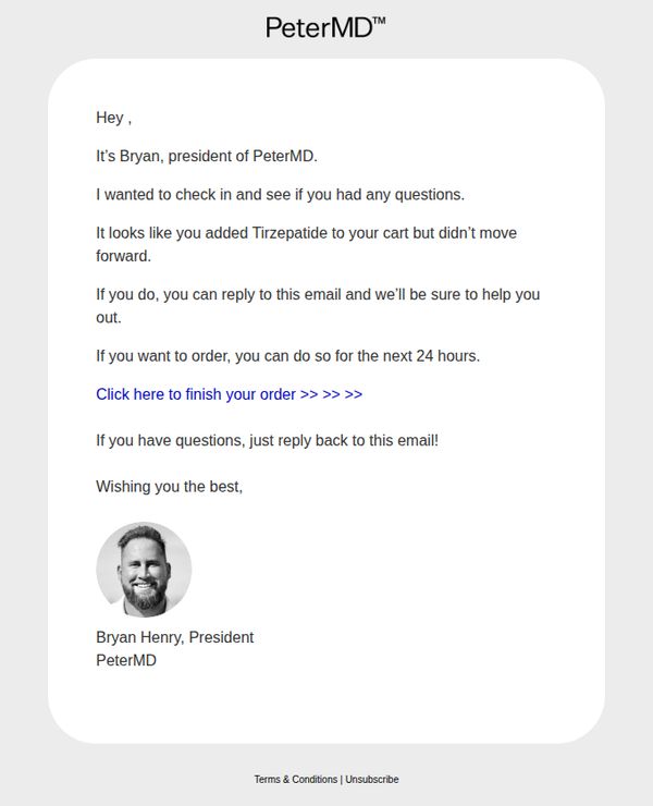
6. Peter MD : ...?
Objective
This email aims to recover an abandoned cart by personally reaching out to the customer through the brand’s president, offering direct support and creating urgency with a 24-hour window to complete the purchase.
Why this works
The email leverages high-level personalization by having the president directly address the customer, which builds trust and reduces perceived risk around a sensitive health product like Tirzepatide.
How to implement
It creates gentle urgency without being pushy by offering a 24-hour window to complete the order, which encourages action while still leaving room for customer questions and support.
Pro Tip
Add a visual element like a small product image or icon of Tirzepatide next to the product name to reinforce recognition and reduce cognitive load for the recipient. • Include a brief, reassuring line about security, privacy, or medical oversight near the CTA to alleviate potential concerns around purchasing a prescription medication online.
7. Ohne: 🩸 THE DRIP #03: Lymphatic drainage, period leaks & hormone testing.

Objective
This email aims to build community trust and deepen engagement by sharing personal reflections, thought-provoking content on women’s health, and curated cultural recommendations, all while positioning Ohne as a thoughtful, informed, and relatable voice in the wellness space.
Why this works
The email masterfully blends personal storytelling with educational content, creating an intimate, trustworthy tone that invites readers to see Ohne not just as a brand but as a thoughtful companion navigating the complexities of women’s health alongside them.
How to implement
By curating a mix of cultural touchpoints, from indie films to podcasts and wellness hacks, the newsletter positions itself as a lifestyle companion, subtly reinforcing brand values without overt product promotion, which builds long-term emotional loyalty.
Pro Tip
The CTA 'Join us on insta' is underwhelming and lacks urgency or value, consider reframing it with a benefit-driven hook like 'See real stories from our community →' or adding a visual Instagram feed preview to increase click-throughs. • The section on AMH fertility tests is rich in insight but lacks a clear next step for readers, adding a micro-CTA like 'Download our guide to evaluating at-home fertility tests' would convert curiosity into actionable engagement.
8. Peter MD : There's more to what you saw 👀

Objective
The email aims to convert curious prospects into customers by positioning PeterMD as the most trusted and affordable telehealth clinic for Tirzepatide, using social proof, price comparison, and urgency to drive immediate action.
Why this works
The email brilliantly leverages a competitive comparison table to visually reinforce value, making PeterMD’s $199 offer feel like an unbeatable deal against competitors charging $1200+, which instantly builds trust and justifies the purchase decision.
How to implement
By featuring a confident, active male model mid-swing, the campaign subtly associates the product with vitality and performance, tapping into aspirational identity rather than just medical need, a smart emotional hook for male audiences seeking wellness transformation.
Pro Tip
The product grid section shows a placeholder image and price ($647.00) that contradicts the hero’s $199 offer, this creates confusion and undermines trust; either remove the grid or align pricing and visuals to reflect the advertised deal. • The testimonial section lacks real user quotes or photos, making the ‘Talk To A Health Expert’ CTA feel generic; adding a short video clip or verified customer quote would significantly boost credibility and conversion potential.
9. Ohne: 🩸 THE DRIP #05: Eating for your menstrual cycle

Objective
This email aims to educate subscribers on how to align their diet with their menstrual cycle phases to support hormonal health and overall wellbeing, while subtly reinforcing Ohne’s brand as a trusted, science-backed resource for cycle-aware living.
Why this works
The email brilliantly frames nutrition as a dynamic, phase-based practice rather than a one-size-fits-all diet, making readers feel seen and empowered to listen to their bodies’ changing needs throughout the cycle.
How to implement
By blending scientific insight with relatable humor, like the pasta-eating face mask photo, it disarms the clinical tone often associated with hormonal health, making complex topics feel approachable and emotionally resonant.
Pro Tip
Add a clear, secondary CTA above the footer, such as 'Download Your Cycle Nutrition Guide', to convert engaged readers into leads, since the current 'Join us on insta' doesn’t align with the educational intent of the content. • Integrate a visual phase tracker or mini calendar graphic next to each cycle phase section to help readers quickly identify where they are in their cycle, enhancing personal relevance and usability.
10. Lola: Take Care: AI-enabled parenting, burned-out nurses, and older unmarried couples navigating caregiving

Objective
This email aims to engage readers with thoughtful, research-backed insights on modern caregiving challenges, from AI-assisted parenting to nurse burnout and unmarried elder care, while subtly promoting partner products and reinforcing Lola’s brand as a trusted voice in women’s wellness and life transitions.
Why this works
The email masterfully blends editorial depth with product placement by framing gift recommendations as natural extensions of caregiving conversations, making commercial content feel like curated advice rather than a sales pitch.
How to implement
By spotlighting underreported societal trends, like AI parenting tools and unmarried elder caregiving, the campaign positions Lola as a forward-thinking authority that anticipates reader needs before they’re widely discussed in mainstream media.
Pro Tip
Add a visual hierarchy to the 'Care-fully selected product recs' section, such as icons or product images, to make gift suggestions more scannable and reduce cognitive load for time-pressed readers. • Include a secondary CTA button or link near the AI parenting section that says 'Explore Parenting Tech Tools' to capture interest from readers intrigued by the topic but not ready to buy a gift.