Sales email examples & ideas from Klaviyo
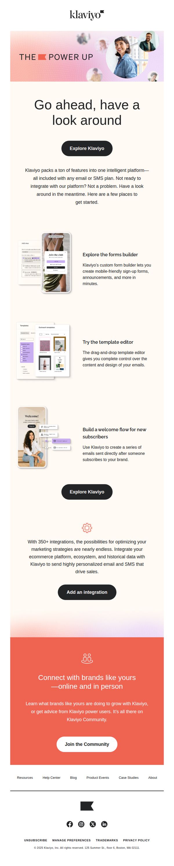


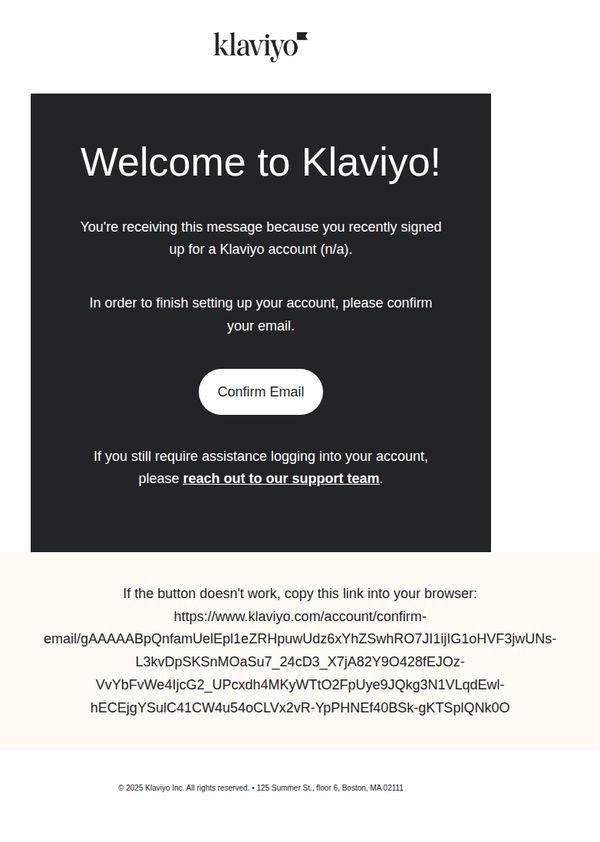

1. Take a look inside—your growth tools are waiting
Objective
This email aims to onboard potential users by showcasing Klaviyo’s key features and integrations, encouraging exploration even before full platform adoption. It positions Klaviyo as an accessible, feature-rich growth tool for brands ready to optimize marketing with email and SMS.
Why this works
By inviting users to 'have a look around' without pressure to commit, Klaviyo lowers the barrier to entry and positions itself as a helpful, exploratory resource rather than a sales-driven platform, building trust through accessibility.
How to implement
The email strategically highlights three core tools, forms builder, template editor, and welcome flows, with concise, benefit-driven descriptions that immediately answer 'What’s in it for me?' and demonstrate tangible value without overwhelming the reader.
Pro Tip
Add a visual progress indicator or checklist (e.g., '3 Tools You Can Try in 5 Minutes') to guide users through the featured sections, creating a sense of momentum and reducing cognitive load during exploration. • Reposition the 'Add an integration' CTA to appear immediately after the integrations paragraph, rather than below it, to capitalize on the persuasive momentum of mentioning 350+ integrations and reduce scroll friction for high-intent users.
2. Introducing RCS: A new era for mobile messaging
Objective
To introduce Klaviyo’s new RCS messaging capability and persuade B2C brands to adopt it by highlighting its premium, interactive features that elevate mobile engagement beyond traditional SMS. The email positions RCS as a strategic upgrade within Klaviyo’s unified CRM platform.
Why this works
By anchoring the launch in customer expectations, not just tech specs, Klaviyo frames RCS as a necessary evolution for brands serious about delivering premium, app-like mobile experiences that build trust and drive engagement at scale.
How to implement
The email smartly leverages Klaviyo’s Google Partner status as social proof, subtly reassuring skeptical marketers that RCS isn’t experimental but a vetted, enterprise-grade solution ready to integrate seamlessly into existing workflows.
Pro Tip
Add a visual comparison slider or side-by-side mockup showing SMS vs. RCS message experiences to make the ‘premium mobile experience’ claim more tangible and emotionally resonant for readers. • Include a short testimonial or case study snippet from an early adopter to reinforce credibility, even one sentence like ‘Our open rates jumped 37% after switching to RCS’ would strengthen the persuasive impact.
3. We make it easy to send your email campaign
Objective
This email aims to re-engage users who haven’t sent a recent campaign by emphasizing ease of use and immediate revenue potential, while offering training support to reduce hesitation and encourage action.
Why this works
The email opens with a bold, benefit-driven headline that ties user action directly to revenue, creating instant motivation by framing the campaign as a revenue accelerator rather than just a marketing task.
How to implement
It acknowledges user hesitation with empathy and immediately offers a solution, targeted training, which reduces friction and positions Klaviyo as a supportive partner rather than just a tool provider.
Pro Tip
Add a visual progress indicator or checklist near the 'Send a campaign' CTA to show users how close they are to completion, reducing perceived effort and increasing urgency to act. • Include a short testimonial or stat (e.g., '87% of users saw higher open rates after sending their first campaign') near the hero section to build social proof and reinforce the revenue claim.
4. Confirm your Klaviyo email
Objective
This email aims to verify the user’s email address to complete account setup, ensuring secure access while reinforcing brand trust through a clean, direct confirmation process.
Why this works
The email immediately establishes purpose with a bold, friendly welcome headline that reduces friction by explaining why the user is receiving it, a subtle but powerful trust-building move for new signups.
How to implement
Placing the primary CTA front and center with high contrast and minimal surrounding text ensures the user’s attention is laser-focused on the single action needed to proceed, reducing cognitive load and abandonment risk.
Pro Tip
Add a brief, reassuring sentence above the CTA explaining what happens after confirmation (e.g., 'Once confirmed, you’ll unlock your dashboard and start building campaigns in minutes') to reduce uncertainty and increase conversion. • Include a subtle visual cue, like a checkmark icon or progress bar, near the CTA to reinforce that this is a step in a larger onboarding journey, helping users feel guided rather than isolated in the process.
5. Updates to Klaviyo Terms of Service, DPA, and Subprocessors
Objective
To inform Klaviyo customers of important legal updates to the Terms of Service and Data Processing Agreement, ensuring compliance and transparency while encouraging users to review the changes that impact their data usage and platform responsibilities.
Why this works
The email opens with a clear, concise statement of purpose that immediately signals the importance of the update, reducing reader friction and setting appropriate expectations for legal content that might otherwise be ignored.
How to implement
By breaking down complex legal changes into bulleted, plain-language summaries, the email transforms intimidating policy updates into digestible, actionable insights that empower users to understand how the changes affect them personally.
Pro Tip
Add a secondary CTA button or link labeled 'Review Full Policy Updates' near the top of the email to increase engagement and reduce the cognitive load of hunting for the 'here' link buried mid-content. • Include a brief timeline or countdown (e.g., 'Effective in 30 days') visually near the top to create urgency and help users prioritize reviewing the updates without needing to parse dates from paragraphs.
6. Turn visitors into subscribers with on-site forms
Objective
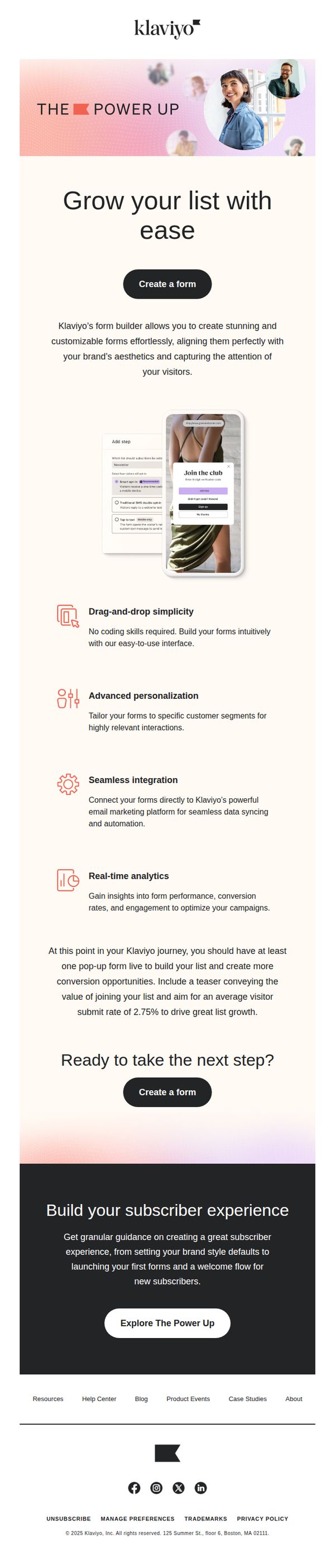
This email aims to guide Klaviyo users toward creating on-site forms to convert website visitors into subscribers, emphasizing ease of use, personalization, and integration with their existing marketing platform to drive list growth.
Why this works
The email brilliantly frames form creation as effortless and visually aligned with brand identity, reducing perceived friction for users who might otherwise delay implementation due to design or technical concerns.
How to implement
By highlighting drag-and-drop simplicity, advanced personalization, and real-time analytics in digestible bullet points, the email transforms a technical feature into a compelling growth lever that speaks directly to marketer priorities.
Pro Tip
Add a visual progress bar or checklist near the 'Ready to take the next step?' section to show users how close they are to launching their first form, increasing urgency and reducing decision paralysis. • Include a short testimonial or case study snippet from a brand that achieved significant list growth using Klaviyo’s forms, this would strengthen social proof and make the value proposition more tangible.
7. Give yourself more room to grow
Objective
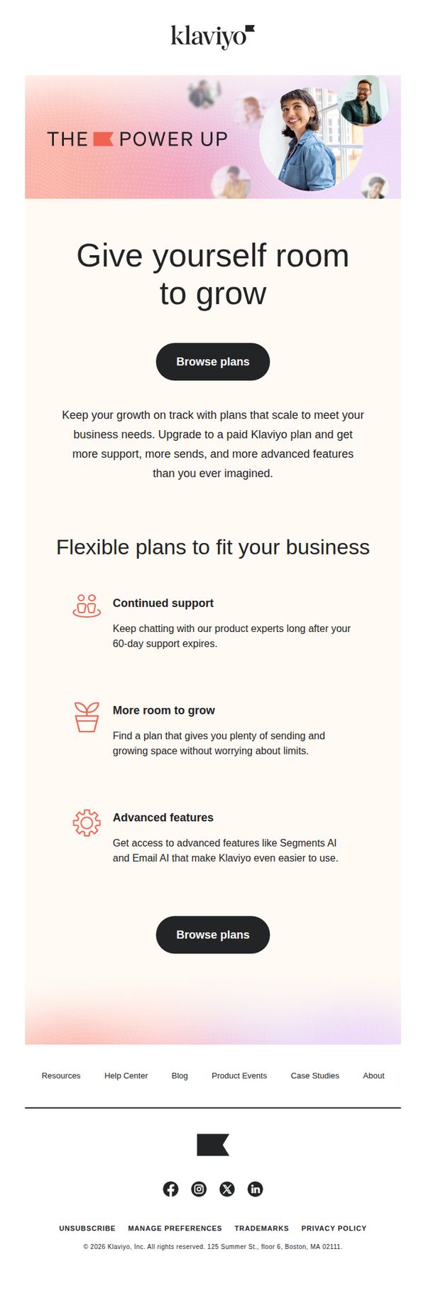
This email aims to encourage current users to upgrade to a paid Klaviyo plan by highlighting scalable features, ongoing support, and AI-powered tools that align with business growth. It positions the upgrade as a natural next step for evolving marketing needs.
Why this works
The email frames the upgrade not as a cost but as an investment in growth, using aspirational language like 'Give yourself room to grow' to emotionally align with business owners’ ambitions rather than just feature comparisons.
How to implement
By breaking down benefits into digestible icons and short copy, 'Continued support,' 'More room to grow,' 'Advanced features', the email simplifies complex SaaS value into intuitive, scannable takeaways that reduce cognitive load for busy entrepreneurs.
Pro Tip
Add a subtle social proof element, like a customer quote or logo, near the 'Advanced features' section to reinforce credibility and reduce perceived risk around upgrading to paid tiers. • Include a visual comparison table or tiered pricing snapshot to help users quickly see which plan matches their current usage, reducing friction and decision paralysis before clicking 'Browse plans'.
8. Your self-serve toolkit

Objective
This email aims to empower Klaviyo users by introducing them to self-serve educational resources tailored to their role and skill level, encouraging continued engagement and mastery of the platform through guided learning paths and community support.
Why this works
The email brilliantly segments its value proposition by role and skill level, making each recipient feel personally addressed and supported in their unique Klaviyo journey, which increases relevance and reduces overwhelm for new users.
How to implement
By listing four distinct self-serve resources with clear, benefit-driven descriptions, the email transforms abstract support into tangible tools, helping users visualize exactly how each resource solves their specific pain points or goals.
Pro Tip
Add a brief testimonial or user stat near the CTA to reinforce social proof, e.g., '92% of users who start the Power Path complete their first campaign within 3 days', to reduce hesitation and boost conversion. • Include a visual icon or small graphic next to each resource bullet point to improve scannability and help users quickly distinguish between learning, troubleshooting, community, and developer paths.
9. Make your emails the main character

Objective
This email aims to convert new Klaviyo users into engaged attendees of a live training session by highlighting actionable email design strategies that improve conversion rates, positioning Klaviyo as a partner in their marketing success.
Why this works
The email positions the training not as a sales pitch but as a strategic upgrade for users already on the platform, which builds trust and frames the session as a natural next step rather than an upsell.
How to implement
By listing specific, tangible takeaways, like best practices, live demos, and real-life examples, the email reduces perceived risk and clearly communicates the ROI of attending, making the value proposition instantly digestible.
Pro Tip
Add a subtle countdown timer near the CTA to create urgency, especially since this is a live training, this would leverage FOMO and nudge procrastinators to register immediately. • Include a short testimonial or stat from a past attendee (e.g., '92% of attendees improved their email CTR within 2 weeks') to build social proof and validate the session’s effectiveness before the user commits.
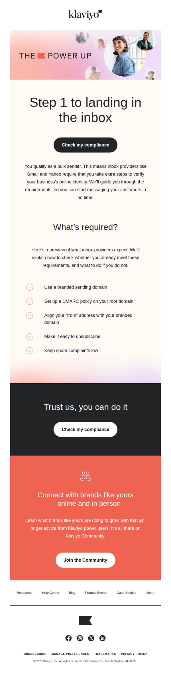
10. Step 1 to landing in the inbox
Objective
This email aims to guide new or transitioning bulk senders through the initial compliance steps required to land in inboxes reliably, while positioning Klaviyo as a trusted partner that simplifies technical email deliverability. It also encourages community engagement to build long-term brand loyalty.
Why this works
The email opens with a clear, action-oriented headline that frames compliance not as a barrier but as the first empowering step toward inbox success, immediately reducing friction for overwhelmed senders.
How to implement
By listing specific, checkable requirements with visual icons, the email transforms abstract deliverability rules into digestible, actionable tasks, making technical compliance feel achievable rather than intimidating.
Pro Tip
Add a brief testimonial or stat near the 'Check my compliance' CTA to reinforce trust, for example, '92% of users pass compliance in under 10 minutes', to reduce perceived effort and increase conversion. • Include a subtle visual indicator (like a progress bar or step counter) after the first CTA to show users they’re on Step 1 of a multi-step journey, improving perceived structure and encouraging follow-through.