Square Sales campaign ideas that work
1. How to take a payment
Objective
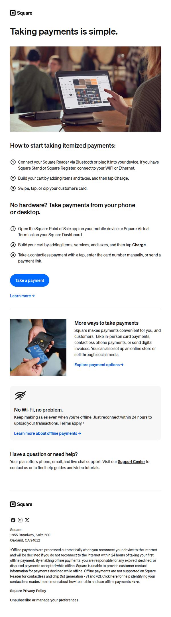
This email aims to educate new or potential Square users on how to start accepting payments quickly and confidently, whether they have hardware or not, while reinforcing Square’s flexibility and ease of use to drive immediate action.
Why this works
Square brilliantly simplifies complex payment workflows into numbered, visual steps that reduce cognitive load and empower users to act immediately, making technical processes feel approachable even for non-tech-savvy business owners.
How to implement
By offering two distinct paths, with and without hardware, the email acknowledges real-world user constraints and positions Square as a flexible, inclusive solution that adapts to the user’s current setup rather than forcing a purchase.
Pro Tip
Add a visual progress indicator or checklist next to the step-by-step instructions to reinforce completion momentum and help users track their setup progress, increasing perceived ease and reducing abandonment. • Reposition the 'Take a payment' CTA to appear immediately after the first set of steps, not after the hardware-free section, to capitalize on early momentum and reduce friction for users ready to act.
2. Try out your POS with a test payment
Objective
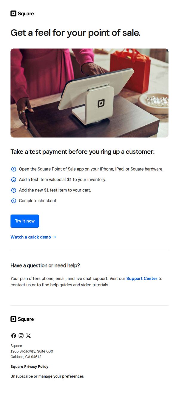
This email aims to encourage new users to experience Square’s point-of-sale system firsthand by simulating a real transaction, reducing hesitation through hands-on familiarity before committing to live use.
Why this works
The email brilliantly lowers the barrier to entry by inviting users to simulate a real transaction with a $1 test item, making the unfamiliar feel safe and intuitive without requiring financial risk or setup complexity.
How to implement
By visually anchoring the message with a warm, real-world photo of a customer interacting with the Square terminal, the email builds emotional trust and subtly positions the product as part of a natural retail experience, not just software.
Pro Tip
Add a subtle countdown or urgency cue near the CTA, like 'Start your test before [date]', to nudge procrastinators, since the current design lacks time-based motivation despite the low-friction offer. • Include a short testimonial or stat (e.g., '92% of users complete their first test payment within 5 minutes') near the steps to reinforce social proof and reduce perceived effort, making the action feel even more effortless and widely adopted.
3. Set up your library to speed up sales
Objective
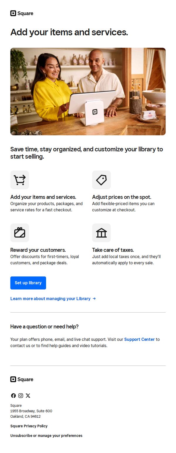
This email aims to guide new Square users to set up their item and service library to streamline sales operations, emphasizing time savings, organization, and customization for faster checkout experiences.
Why this works
The email effectively frames setup as a time-saving, organizational advantage rather than a technical chore, making the action feel immediately valuable to busy business owners.
How to implement
By visually pairing each benefit with a simple icon and concise explanation, the email reduces cognitive load and helps users quickly grasp how each feature directly improves their daily sales workflow.
Pro Tip
Add a progress bar or checklist after the CTA to show users how close they are to completing setup, which can increase completion rates by creating a sense of momentum and accomplishment. • Include a short customer testimonial or stat (e.g., 'Merchants who set up their library see 30% faster checkouts') to reinforce the value proposition with social proof and tangible outcomes.
4. Your point of sale is waiting
Objective
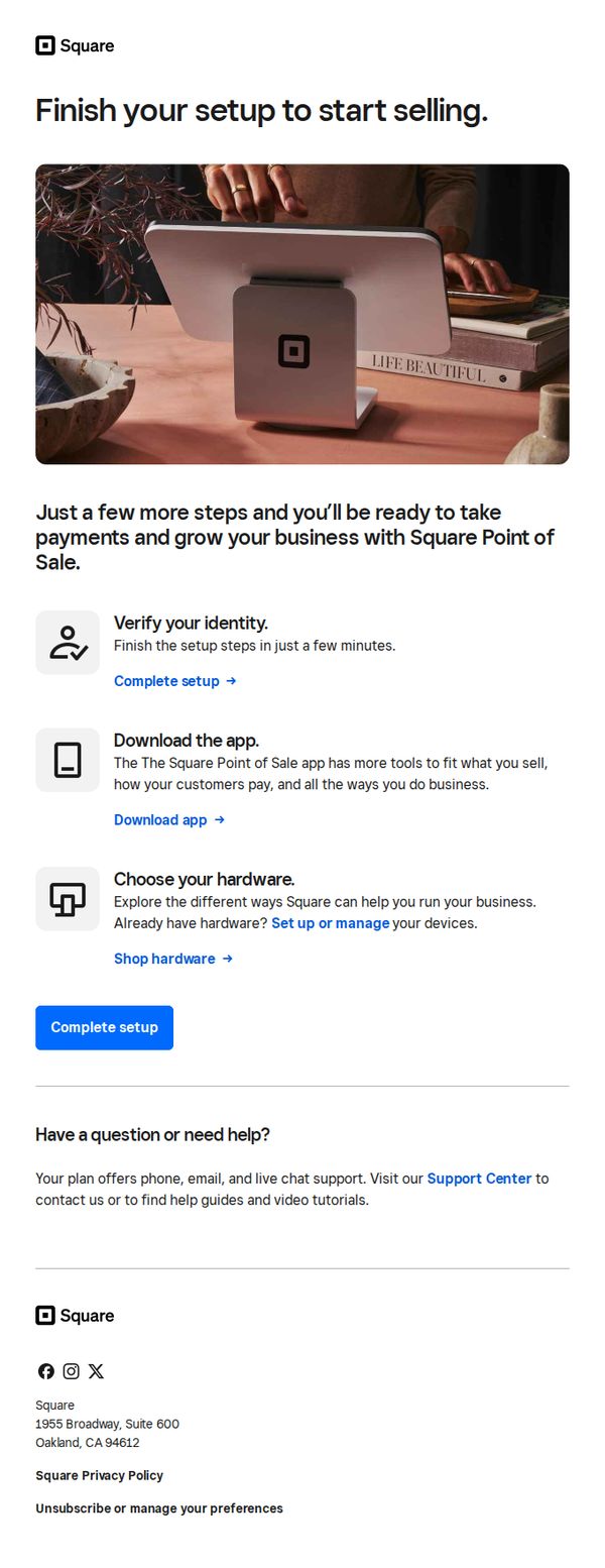
This email aims to guide new Square users through the final steps of setting up their Point of Sale system so they can begin accepting payments and scaling their business quickly. It reduces friction by breaking down setup into simple, actionable tasks with clear next steps.
Why this works
The email frames setup as a near-completion milestone, 'Just a few more steps', which reduces perceived effort and leverages the psychological momentum of almost finishing, making users more likely to act immediately.
How to implement
Each setup step is paired with a benefit-driven micro-CTA, such as 'Download the app' to unlock tools tailored to the user’s business model, which transforms a technical task into a value-driven experience.
Pro Tip
Add a progress bar or checklist visual near the top to show users how many steps remain, this increases perceived control and completion motivation, especially since the email already lists three distinct setup actions. • Include a brief testimonial or social proof near the CTA, such as '92% of users complete setup in under 5 minutes,' to reduce hesitation and reinforce that the process is quick and widely successful.
5. Your Square Plus trial ends in 7 days
Objective
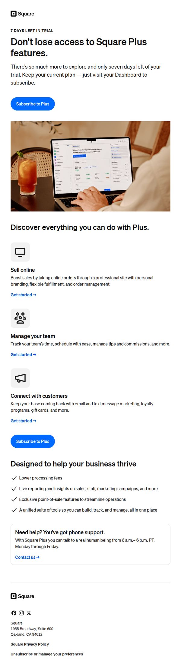
This email aims to convert trial users into paying Square Plus subscribers by highlighting the value of premium features before their 7-day trial expires, encouraging immediate action to avoid losing access.
Why this works
The email creates urgency by front-loading the trial expiration date and pairing it with a clear consequence, losing access, which motivates immediate action without sounding pushy or alarmist.
How to implement
It strategically breaks down complex features into digestible, benefit-driven sections with icons and short explanations, helping users quickly visualize how each capability directly supports their business growth and operational efficiency.
Pro Tip
Add a countdown timer near the primary CTA to visually reinforce urgency and create psychological pressure to act before the trial ends, increasing conversion likelihood. • Include a customer testimonial or case study near the 'Designed to help your business thrive' section to provide social proof and demonstrate real-world results from upgrading to Square Plus.
6. A professional website to call your own
Objective
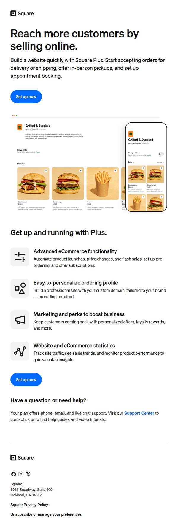
This email aims to convert small business owners into Square Plus subscribers by showcasing how a professional website can help them reach more customers through online sales, delivery, pickup, and appointment booking. It emphasizes ease of setup and powerful built-in tools to drive immediate sign-ups.
Why this works
Square brilliantly frames its website builder as a customer acquisition engine, not just a design tool, tying every feature directly to revenue growth, which resonates deeply with small business owners focused on results.
How to implement
The inclusion of a real-world restaurant example with mobile and desktop views builds instant credibility by showing exactly how the product looks and functions in a familiar, high-impact context without requiring imagination.
Pro Tip
Add a subtle countdown timer or urgency indicator near the CTA to nudge procrastinators, since the email already positions the offer as time-sensitive for business growth, a visual cue could boost conversion rates. • Include a short testimonial or customer quote beneath the hero section to build social proof early; trust is critical for new users considering a paid platform, and real voices can overcome hesitation before they scroll further.
7. Set up your point of sale
Objective
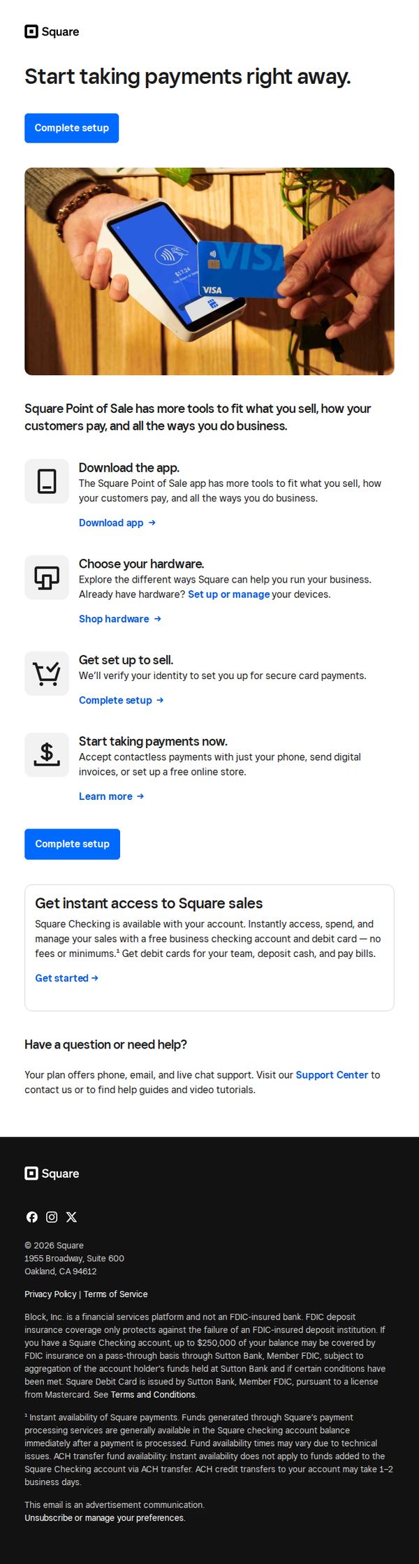
This email aims to guide new or prospective users through the initial setup of Square’s point-of-sale system, encouraging immediate action by simplifying onboarding into payment acceptance, hardware selection, and business management tools.
Why this works
The email strategically breaks down onboarding into four digestible steps, download, choose hardware, set up, and start selling, making a complex process feel approachable and actionable for time-strapped business owners.
How to implement
By embedding the primary CTA 'Complete setup' both above and below the step-by-step guide, the email reinforces urgency and reduces friction, ensuring users never lose sight of the next action regardless of scroll depth.
Pro Tip
Add a visual progress indicator or checklist next to each setup step to give users a sense of momentum and completion, which can increase conversion by reducing perceived effort. • Include a short testimonial or trust badge near the 'Start taking payments now' section to alleviate security concerns, especially for users unfamiliar with contactless or digital invoicing.
8. Let’s set up your point of sale
Objective
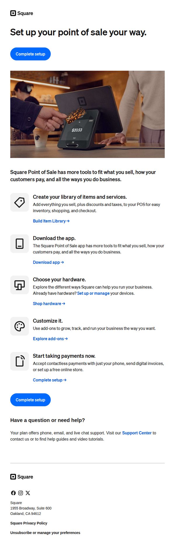
This email aims to guide new Square users through the essential steps to configure their point-of-sale system, encouraging immediate action by simplifying setup into digestible tasks while reinforcing the platform’s flexibility for diverse business needs.
Why this works
The email breaks down a potentially overwhelming setup process into five clear, benefit-driven steps, each paired with a relevant icon and actionable link, making onboarding feel approachable and goal-oriented rather than technical or intimidating.
How to implement
By emphasizing customization and flexibility, 'set up your point of sale your way', the message positions Square not as a rigid system but as a tailored solution, which resonates deeply with small business owners seeking control over their operations and customer experience.
Pro Tip
Add a progress indicator or checklist next to each setup step to visually reinforce completion status, helping users track their progress and reducing abandonment by making the process feel more tangible and rewarding. • Include a short testimonial or social proof near the 'Start taking payments now' section to build trust, e.g., '92% of new users complete setup in under 10 minutes', to alleviate hesitation and validate the ease of use.
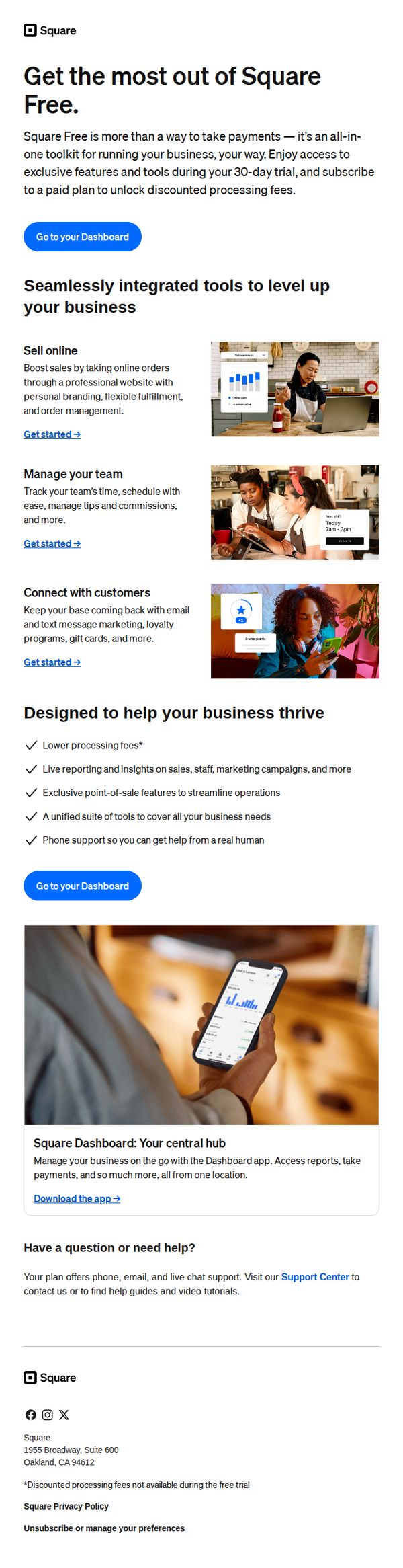
9. Welcome to Square Free
Objective
This email aims to onboard new Square Free users by showcasing the platform’s all-in-one business tools and encouraging immediate engagement through dashboard access, while subtly guiding them toward upgrading to a paid plan after the 30-day trial.
Why this works
The email positions Square Free not just as a payment tool but as a full business operating system, which reframes value perception and justifies future upsells by showing integrated capabilities from day one.
How to implement
Each feature is paired with a clear, action-oriented 'Get started' link and a relevant visual, reducing cognitive load and creating a frictionless path for users to explore tools without feeling overwhelmed.
Pro Tip
Add a subtle countdown timer near the CTA to emphasize the 30-day trial window, creating urgency without being pushy, this would leverage scarcity psychology to nudge users toward exploring paid features sooner. • Include a short testimonial or social proof snippet near the 'Designed to help your business thrive' section to build trust and validate claims about lower fees and live support, especially for users skeptical of free-tier limitations.
10. Free Banking tools that flex with your business.

Objective
This email aims to convert Square merchants into users of Square Banking by highlighting its free, integrated financial tools that help manage cash flow, savings, and growth, all tied directly to their point-of-sale activity. It positions banking as a natural extension of their existing Square ecosystem.
Why this works
Square brilliantly ties banking features directly to merchant pain points, like cash flow and tax savings, by showing real-time visuals of balances and automated tools, making abstract financial benefits feel immediate and actionable for small business owners.
How to implement
The email avoids generic financial jargon and instead uses merchant-centric language like 'flex with your business' and 'never miss a beat,' which builds trust by speaking directly to the operational rhythm of small business owners rather than treating them like bank customers.
Pro Tip
Add a subtle visual indicator (like a progress bar or checkmark animation) next to 'Tax Savings Folder' to imply automation is already working for the user, even if they haven’t set it up yet, creating a sense of momentum and reducing perceived setup friction. • Include a micro-testimonial or social proof badge near the 'Get capital to grow' section, such as '92% of eligible merchants approved within 24 hours', to reduce skepticism around loan eligibility and reinforce speed and accessibility.