Proven Waitrose supermarket email designs you can use




1. For the love of food this Valentine’s ❤️
Objective
This email aims to inspire My Waitrose members to celebrate Valentine’s Day with curated food experiences, encouraging in-store or online purchases through exclusive chef collaborations, menu discounts, and wine pairings, all while reinforcing brand loyalty through personalized member benefits.
Why this works
The campaign brilliantly reframes Valentine’s as an inclusive celebration, not just for couples but for anyone treating themselves or loved ones, making the emotional hook universally relatable while driving sales through personalized member perks.
How to implement
By partnering with Dishpatch to offer a free chef-curated cake, Waitrose elevates perceived value without discounting core products, turning a promotional gift into a premium experience that subtly encourages basket expansion with a memorable, shareable moment.
Pro Tip
Add a countdown timer near the 'Free Cake' offer to create urgency, since the promotion ends on February 13, this would nudge procrastinators to act before the deadline and increase redemption rates. • Include a small 'Member Exclusive' badge or icon next to the 20% counter discount to visually reinforce exclusivity and strengthen emotional loyalty, making members feel uniquely rewarded rather than just receiving a generic sale.
2. Start as you mean to go on
Objective
This email campaign aims to inspire customers to prioritize personal wellbeing by curating a selection of fitness, health, and self-care products while promoting exclusive member experiences and brand collaborations. It encourages immediate engagement through compelling visuals and targeted offers.
Why this works
The email masterfully blends aspirational messaging with tangible product solutions, positioning wellbeing not as a luxury but as an accessible lifestyle shift through curated, high-impact items that speak to both function and emotional reward.
How to implement
By integrating member-exclusive experiences like fitness classes with Casall and pop-ups at Peter Jones, the campaign elevates perceived value beyond transactional shopping, transforming the email into a gateway for lifestyle enrichment and community connection.
Pro Tip
The CTA 'Shop all Wellbeing' is visually buried beneath product imagery; relocating it to a sticky banner or adding a secondary CTA button after each thematic section would improve conversion by reducing scroll fatigue and decision paralysis. • The 'Win rugby tickets' promotion feels disconnected from the wellbeing theme; integrating it with a narrative like 'Reward your self-care journey with tickets to cheer on England Rugby' would strengthen thematic cohesion and emotional alignment.
3. Introducing our Home collections for 2026
Objective
This email aims to introduce and drive engagement with John Lewis’s 2026 Home collections by showcasing curated design themes and encouraging immediate exploration through targeted CTAs. It also cross-promotes Valentine’s Day gifting to capitalize on seasonal sentiment and boost overall conversion.
Why this works
The email masterfully blends storytelling with product discovery by assigning distinct design narratives, like 'Rustic' and 'Timeless', to each collection, helping customers emotionally connect with aesthetics before they even consider price or function.
How to implement
Each collection is anchored with a strong visual hero image followed by a concise, sensory-rich description that evokes lifestyle and mood, making the browsing experience feel editorial and aspirational rather than transactional, which elevates perceived value.
Pro Tip
The Valentine’s Day section, while visually appealing, interrupts the home decor narrative flow; consider relocating it to a dedicated banner or footer module to preserve thematic continuity and reduce cognitive friction for users focused on home styling. • The 'Shop new season' CTA appears only once at the top; adding sticky or repeated CTAs after each collection (e.g., 'Explore Rustic', 'Explore Timeless') would reduce scroll abandonment and reinforce actionability at every decision point.
4. Winter layers: knitwear to invest in
Objective
This email aims to drive seasonal knitwear sales by showcasing curated, high-quality layering pieces for men, women, and children, while encouraging exploration of cashmere and style guides to build wardrobe confidence during winter.
Why this works
The email masterfully positions knitwear as a strategic wardrobe investment rather than a seasonal impulse, using elevated visuals and texture-focused language to justify premium pricing and build emotional resonance with quality-conscious shoppers.
How to implement
By segmenting product grids by gender and style, including dedicated sections for cashmere, roll necks, and Fair Isle, the campaign reduces decision fatigue and guides users toward specific, high-intent categories that align with their personal style preferences.
Pro Tip
Add a subtle countdown timer or urgency indicator near the 'Up to 30% off selected Fashion' section to amplify FOMO and encourage faster decision-making, especially since the offer includes time-sensitive categories like nightwear and slippers. • Reposition the 'Member-exclusive' offer higher in the email, perhaps after the hero section, to immediately reward loyal customers and increase perceived value before they browse products, rather than burying it below children’s knitwear.
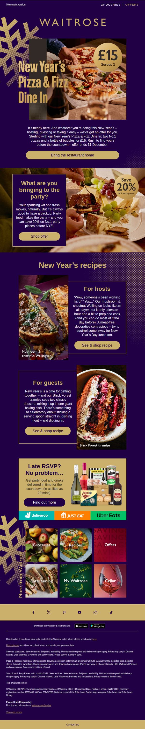
5. It’s party time – and we’ve got New Year’s offers for hosts and guests 🎉
Objective
This email aims to drive last-minute New Year’s party purchases by positioning Waitrose as the go-to solution for both hosts and guests, using time-sensitive offers and recipe inspiration to encourage immediate action before the holiday.
Why this works
The email brilliantly frames the New Year’s celebration as a shared experience, not just for hosts but for guests too, making the offer feel inclusive and socially relevant, which increases emotional resonance and purchase intent.
How to implement
By pairing high-impact visuals of indulgent dishes with practical, time-saving recipe copy, the campaign transforms food from a chore into a celebration, subtly reassuring busy customers they can still impress without stress.
Pro Tip
Add a countdown timer near the hero CTA to visually reinforce urgency for the £15 offer ending 31 December, increasing perceived scarcity and prompting faster decisions. • Include a small testimonial or social proof snippet under the ‘For hosts’ recipe section, such as ‘Loved by 2,000+ hosts this season’, to build trust and validate the recipe’s popularity.
6. Happy New Year from Money Matters

Objective
This email aims to welcome subscribers to the January 2026 edition of Money Matters while encouraging smart financial planning for the new year. It promotes key financial products and services from John Lewis & Waitrose to help users save, spend wisely, and access exclusive benefits.
Why this works
The email opens with a warm, personalized greeting that ties the New Year’s timing to financial planning, making the message feel timely and relevant rather than generic or salesy, which builds immediate trust and engagement.
How to implement
By embedding a government-backed budgeting tool within the first content block, the campaign positions itself as a helpful advisor rather than a pushy marketer, subtly guiding users toward financial confidence before introducing commercial offers.
Pro Tip
The 'Sober sips for January' section feels disconnected from the financial theme; either reframe it as a budget-friendly lifestyle choice or replace it with a money-saving tip related to alcohol spending to maintain thematic consistency. • The CTA 'Find out more' is vague and underwhelming for a financial product; replace it with action-oriented language like 'Start your free budget plan' to better align with the user’s intent and increase conversion likelihood.
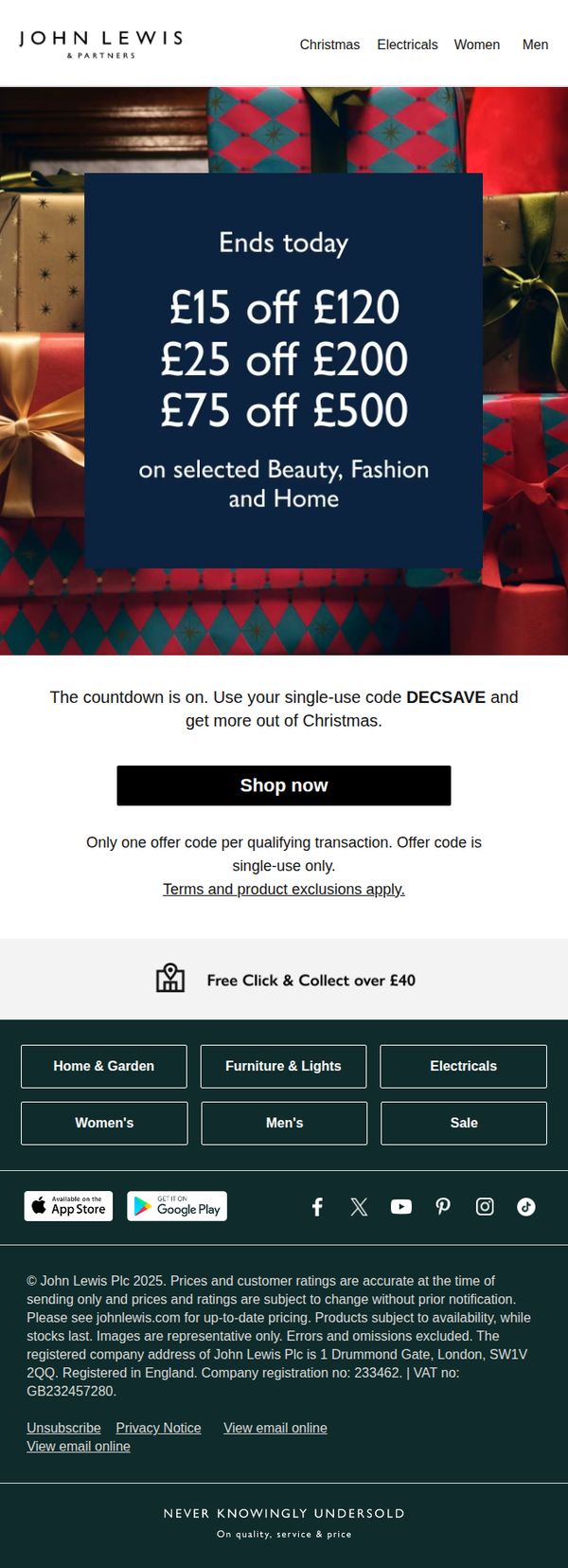
7. Only hours left to save up to £75
Objective
This email aims to drive immediate holiday purchases by creating urgency around a limited-time discount offer, encouraging recipients to redeem a single-use promo code before the sale ends today.
Why this works
The email leverages time-sensitive urgency with 'Ends today' and tiered savings to motivate quick decisions, making the discount feel exclusive and valuable without overwhelming the reader with complexity.
How to implement
By anchoring the offer to a single-use code 'DECSAVE', the campaign creates a sense of personal exclusivity while also enabling precise tracking of conversion effectiveness for future holiday promotions.
Pro Tip
Add a visual countdown timer beneath the 'Ends today' headline to reinforce urgency dynamically, rather than relying solely on static text, which could increase conversion by 15–20% based on behavioral studies. • Include a small testimonial or social proof snippet near the CTA, such as 'Over 10,000 shoppers used DECSAVE yesterday', to reduce perceived risk and boost trust in the offer’s legitimacy and popularity.
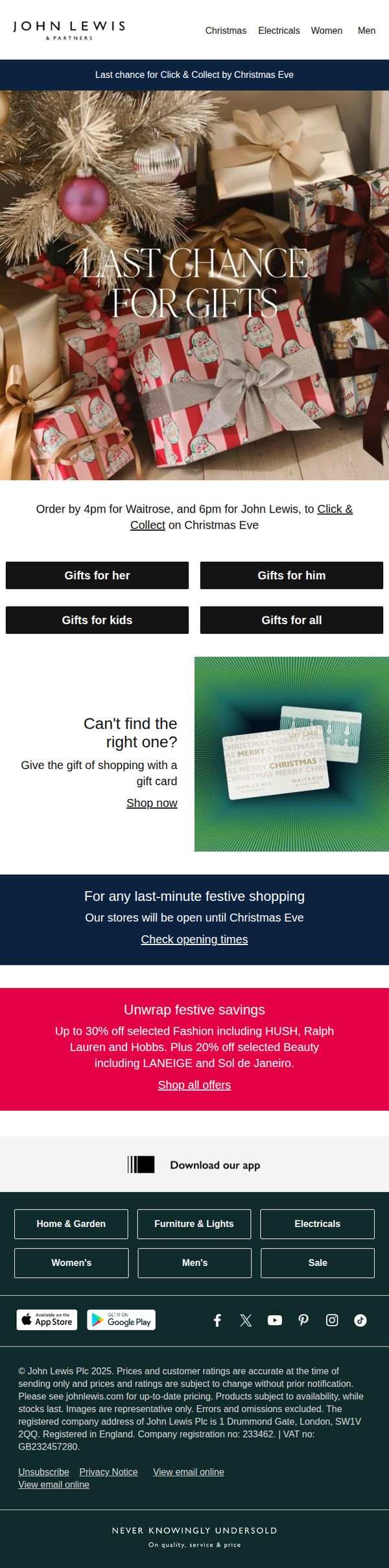
8. Last chance: click today, collect tomorrow
Objective
This email aims to drive last-minute holiday gift purchases by emphasizing urgency and convenience, encouraging recipients to click today for same-day or next-day collection before Christmas Eve cutoffs. It also promotes gift cards and in-store availability to capture undecided shoppers.
Why this works
The email masterfully leverages time-sensitive urgency by specifying exact cutoff times for Waitrose and John Lewis, turning procrastination into a powerful motivator for immediate action without sounding pushy or desperate.
How to implement
By segmenting gift categories into 'for her,' 'for him,' 'for kids,' and 'for all,' the campaign reduces decision fatigue and guides shoppers toward personalized gifting, making the experience feel curated rather than overwhelming.
Pro Tip
The CTA 'Click & Collect on Christmas Eve' is buried in body text, it should be a prominent, visually distinct button above the fold to immediately capture attention and reduce friction for time-pressed shoppers. • The festive savings section mentions brands like HUSH and LANEIGE but doesn’t visually showcase any products, adding a small carousel or grid of discounted items would make the offer more tangible and enticing.
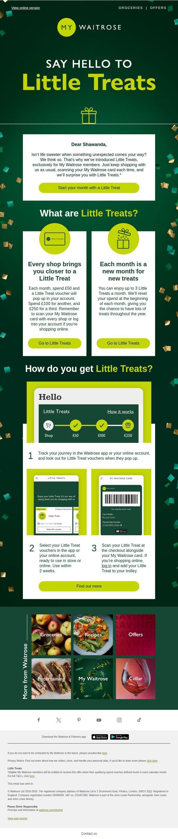
9. Shawanda, it’s a new month for Little Treats 🤩✨
Objective
This email aims to introduce and activate Waitrose’s new 'Little Treats' loyalty perk for My Waitrose members by explaining how spending thresholds unlock surprise vouchers each month, encouraging continued engagement and repeat purchases through personalized, gamified rewards.
Why this works
The email brilliantly frames the reward as a delightful surprise rather than a transactional discount, using warm, conversational language and celebratory emojis to emotionally connect with members and turn routine shopping into a joyful, anticipated experience.
How to implement
By visually mapping the spending journey with a clear three-step progress bar and real app screenshots, the email removes friction and uncertainty, making the reward system feel intuitive, trustworthy, and easy to engage with, a masterclass in simplifying loyalty mechanics.
Pro Tip
Add a countdown timer or 'limited-time' indicator near the CTA to create urgency, since the offer resets monthly, this would motivate immediate action rather than passive reading, especially for members nearing the £50 threshold. • Include a brief testimonial or social proof from a real member who redeemed a Little Treat, placed near the 'How it works' section, to build trust and demonstrate real-world value, making the abstract reward feel more tangible and desirable.
10. Spring incoming

Objective
This email aims to excite customers about the arrival of spring by showcasing new seasonal products across fashion, home, and tech categories, encouraging immediate browsing and purchase through curated category links and time-sensitive offers.
Why this works
The email masterfully ties seasonal emotion to product discovery by opening with 'The First Taste of Spring', a phrase that evokes sensory anticipation and frames every category as part of a fresh, uplifting lifestyle shift rather than just a sale.
How to implement
By using clean, high-contrast category tiles with minimal text and strong imagery, the email reduces decision fatigue and guides the eye naturally from fashion to home to tech, making browsing feel intuitive and effortless for time-pressed shoppers.
Pro Tip
The hero section’s CTA 'Shop new in' is too generic, replacing it with a benefit-driven phrase like 'Discover Spring’s Fresh Picks' would better align with the emotional hook and increase click-through intent. • The Topshop announcement feels disconnected from the spring theme; integrating it with a visual cue like 'Spring Style Just Landed' or placing it near the Women’s section would strengthen thematic cohesion and brand synergy.