Beverage survey campaign email designs from top brands

1. Soylent: rethink carbs with Soylent
Objective
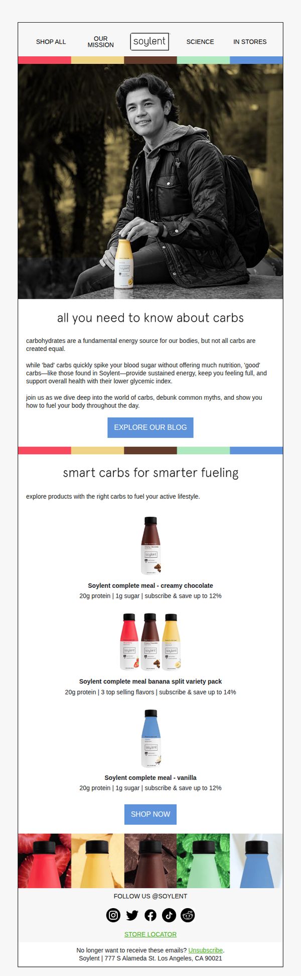
This email aims to educate subscribers on the difference between 'good' and 'bad' carbs while positioning Soylent as a smart, science-backed fuel for active lifestyles. It encourages exploration of their blog and direct product purchases through clear CTAs.
Why this works
The email brilliantly reframes carbohydrates not as a dietary enemy but as a strategic fuel source, using science-backed language to position Soylent as the intelligent choice for sustained energy and health.
How to implement
By featuring specific product benefits like '20g protein | 1g sugar' alongside subscription savings, the email combines nutritional authority with compelling economic incentives that drive conversion without sounding salesy.
Pro Tip
Add a subtle countdown timer or limited-time offer badge near the 'SHOP NOW' CTA to create urgency and increase conversion rates, especially since the email already references subscription savings. • Include a short customer testimonial or satisfaction stat (e.g., '92% of users feel more energized within 3 days') beneath the product grid to reinforce social proof and reduce perceived risk before purchase.
2. Spritz Society: Still thinking about it? 🤔
Objective
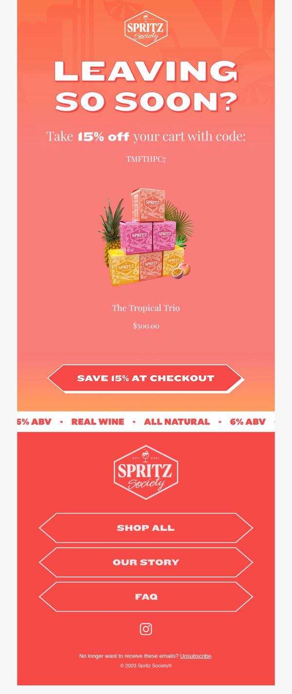
This email aims to re-engage hesitant customers by creating a sense of urgency around an expiring discount, encouraging them to complete their purchase before missing out on 15% off their cart.
Why this works
The email leverages psychological urgency with a direct question, 'Leaving so soon?', which personalizes the message and gently nudges the recipient to reconsider abandoning their cart without sounding aggressive or pushy.
How to implement
By visually anchoring the discount code and product bundle together, the design ensures the offer feels tangible and immediately actionable, reducing friction between interest and conversion with minimal cognitive load for the shopper.
Pro Tip
Add a countdown timer beneath the CTA to amplify urgency, without it, the 'leaving soon' message lacks tangible time pressure, which could reduce conversion impact for procrastinating shoppers. • Include a short testimonial or social proof near the product image to validate the Tropical Trio’s appeal, since the current design relies solely on visual and price cues without emotional or social reinforcement.
3. TOSSWARE: Think outside the glass ✨
Objective
This email aims to showcase the versatility of TOSSWARE’s shatterproof drinkware by positioning it as an elegant solution for serving appetizers, not just beverages. It drives product discovery and conversion by pairing a visually appealing recipe with direct purchasing options.
Why this works
The email brilliantly reframes disposable drinkware as a stylish serving vessel for gourmet appetizers, expanding perceived use cases and elevating the product’s perceived value beyond its basic function.
How to implement
By embedding a full, step-by-step recipe with ingredient lists and cooking instructions, the brand creates an immersive culinary experience that subtly reinforces product utility while keeping the user engaged longer.
Pro Tip
Add a subtle countdown timer or limited-edition badge near the 'Shop Now' CTA to create urgency, especially since the recipe implies event or party use, which benefits from time-sensitive framing. • Include a customer testimonial or social proof snippet under the recipe, perhaps from a host who used TOSSWARE for appetizers, to reinforce trust and validate the product’s versatility beyond the brand’s own claims.
4. Ghia: One less thing to overthink
Objective
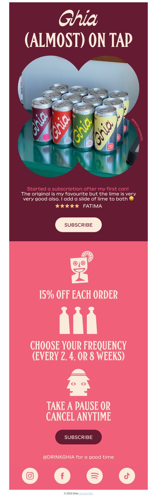
This email aims to convert first-time or curious customers into subscribers by reducing decision fatigue around purchasing Ghia, emphasizing convenience, flexibility, and social proof to make subscription feel effortless and rewarding.
Why this works
The email brilliantly frames subscription as a stress-free solution to overthinking, positioning Ghia not just as a drink but as a lifestyle simplifier that removes decision fatigue from daily routines.
How to implement
By featuring a real customer quote with specific flavor preferences and a personal ritual (adding lime), the campaign builds authentic social proof that feels relatable and encourages others to imagine their own routine with Ghia.
Pro Tip
Add a subtle countdown timer or limited-time badge near the 15% discount to create urgency, since the current offer lacks temporal pressure that could nudge hesitant subscribers toward immediate action. • Include a small visual cue or icon next to the 'Take a Pause or Cancel Anytime' text to reinforce the no-risk message, such as a pause symbol or unlocked padlock, to visually anchor the psychological safety of the offer.
5. Loah Beer: Last call for samples 👋
Objective
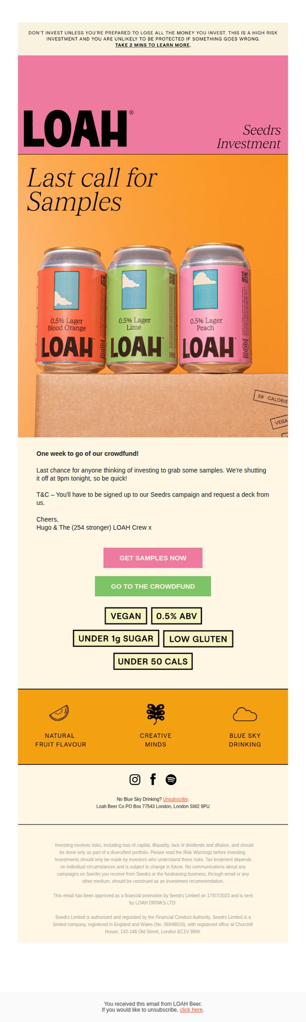
This email aims to create urgency for potential investors to claim free product samples before the Seedrs crowdfunding campaign closes, while reinforcing Loah Beer’s unique low-alcohol, health-conscious positioning to drive conversions and brand affinity.
Why this works
The email brilliantly leverages scarcity by announcing a hard deadline for sample requests, turning a simple product offer into a time-sensitive event that compels immediate action from curious investors.
How to implement
By visually showcasing three colorful, flavor-labeled cans in the hero section, the campaign instantly communicates variety and sensory appeal while anchoring the brand’s identity around low-alcohol, low-sugar innovation.
Pro Tip
Add a countdown timer above the CTA to visually reinforce the 'last call' urgency and reduce cognitive load for recipients deciding whether to act now. • Include a short testimonial or quote from an existing investor or early backer near the product grid to build social proof and reduce perceived risk for new investors.
6. The Cocktail Society: 🍹 Still Thinking About Cocktails?
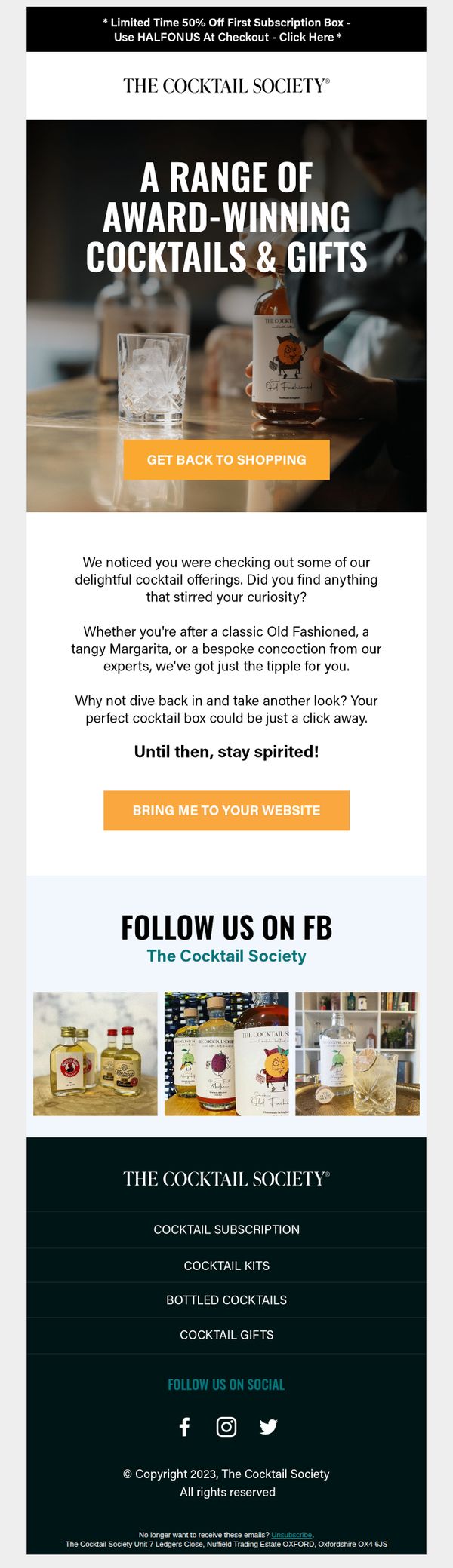
Objective
This email aims to re-engage users who previously browsed cocktail offerings by reminding them of their curiosity and encouraging them to return to the site with a limited-time 50% discount on their first subscription box. It seeks to convert browsing intent into a purchase through personalization and urgency.
Why this works
The email brilliantly leverages behavioral targeting by referencing the recipient’s past browsing activity, making the message feel personally curated and increasing the likelihood of re-engagement through emotional resonance.
How to implement
By framing the discount as a limited-time offer tied to a specific action, first subscription box, the campaign creates urgency without sounding pushy, which aligns perfectly with the audience’s interest in curated, premium cocktail experiences.
Pro Tip
Add a countdown timer next to the 50% off offer in the header to visually reinforce urgency and reduce the cognitive load of calculating time remaining, which can increase click-through rates for time-sensitive promotions. • Include a small grid of 2–3 best-selling or personalized cocktail kit recommendations beneath the ‘Why not dive back in’ paragraph to reduce decision fatigue and guide the user toward a specific product, boosting conversion likelihood.
7. East London Liquor Co.: Thinking about whisky?
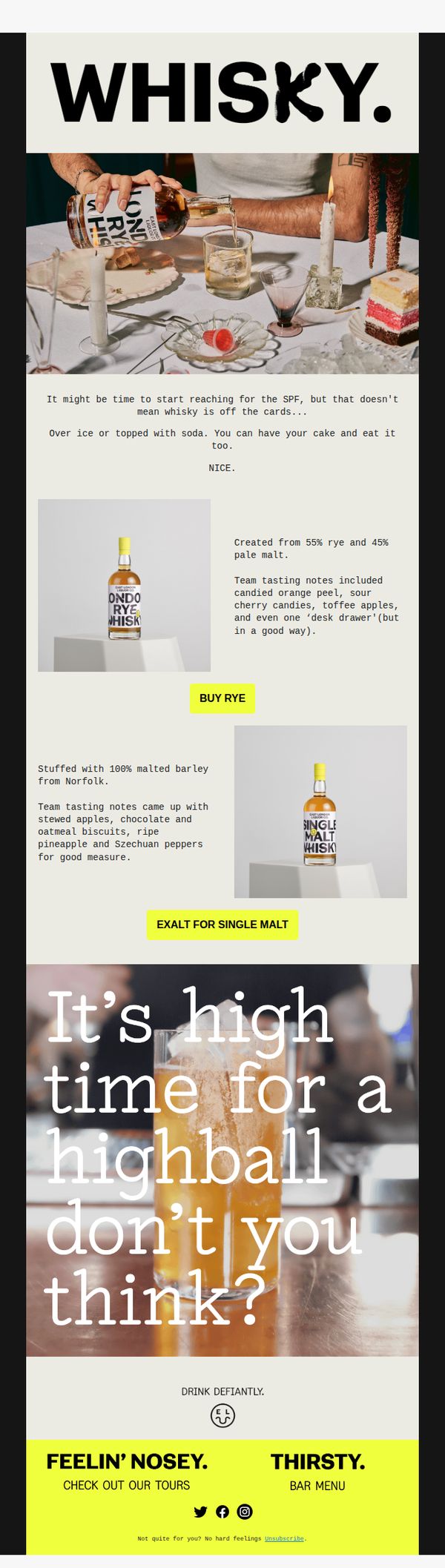
Objective
To re-engage subscribers who may be considering whisky by positioning East London Liquor Co.’s offerings as versatile, approachable, and worth indulging in, even during times when spending might be tighter. The email aims to drive product purchases and bar engagement through playful, sensory-driven messaging.
Why this works
The email brilliantly reframes whisky as a flexible indulgence, not a luxury reserved for special occasions, by suggesting it pairs just as well with soda or ice as it does with cake, making it feel accessible and guilt-free for everyday enjoyment.
How to implement
By weaving tasting notes into casual, human language, like 'desk drawer' or 'stewed apples and Szechuan peppers', the brand turns technical flavor profiles into relatable, memorable experiences that spark curiosity and emotional connection with the product.
Pro Tip
Add a subtle countdown timer or limited-stock indicator near the 'BUY RYE' CTA to create urgency, especially since the email’s tone implies timely indulgence, this would strengthen the psychological nudge to act now rather than later. • Include a short testimonial or user-generated photo near the product grid to build social proof, seeing real people enjoying the drinks would reinforce the 'highball' invitation and make the experience feel more communal and validated.
8. Waterdrop: Ends tomorrow! Buy now, think later.
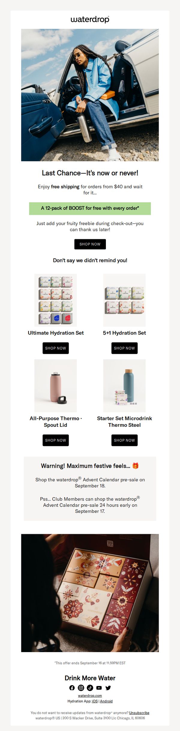
Objective
This email aims to drive immediate purchases by creating urgency with a 'last chance' deadline and incentivizing buyers with a free 12-pack of BOOST with every order, while also teasing an upcoming Advent Calendar pre-sale to build anticipation and reward loyalty.
Why this works
The email brilliantly combines urgency with generosity, offering a free 12-pack of BOOST with every order while framing it as a 'last chance' deal, which turns a simple discount into an emotionally charged, can’t-miss moment that drives instant action.
How to implement
By teasing the Advent Calendar pre-sale exclusively for Club Members 24 hours early, the campaign transforms a standard promotion into a loyalty-building tool that rewards repeat customers and subtly encourages sign-ups, turning one-time buyers into long-term brand advocates.
Pro Tip
Add a visible countdown timer under the 'Last Chance' headline to reinforce urgency visually, since the current text-only deadline at the bottom is easily missed and doesn’t create the same psychological pressure to act immediately. • Reposition the Advent Calendar teaser higher in the email, ideally right after the main offer, so it doesn’t get buried; this would better leverage FOMO for early access and prevent loyal customers from scrolling past the exclusive perk.
9. Grind: Answer a five-minute survey, win a Coffee Machine.
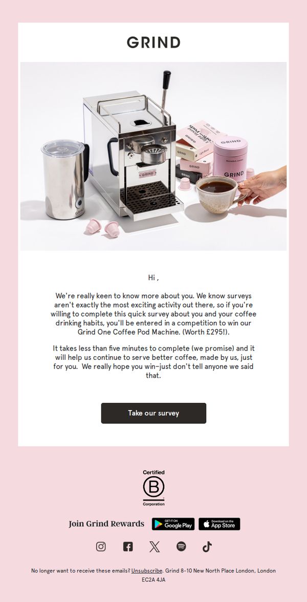
Objective
The email aims to encourage recipients to complete a short survey in exchange for entry into a prize draw for a Grind One Coffee Pod Machine, while also gathering customer insights to improve personalized coffee offerings.
Why this works
By acknowledging that surveys aren’t inherently exciting, the brand builds trust through honesty, then immediately offsets that friction with a high-value, relevant reward that aligns perfectly with the audience’s coffee-loving identity.
How to implement
The email frames participation not as a chore but as a gateway to personalization, subtly suggesting that completing the survey helps the brand serve better coffee tailored just for the recipient, making the action feel mutually beneficial.
Pro Tip
Add a subtle countdown timer or limited-time indicator near the CTA to create urgency, since the prize draw likely has an end date that isn’t currently visible, this would increase immediate click-through rates. • Include a brief bullet-point list under the CTA highlighting what the survey covers (e.g., 'Your favorite roast, brew time, preferred pod flavors') to reduce perceived effort and increase transparency before clicking.
10. Grind: A guide to what everyone's loving right now.
Objective
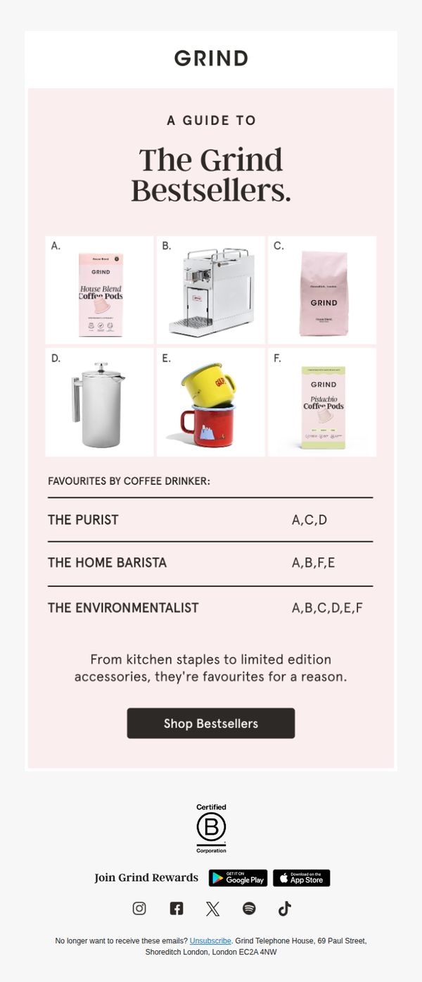
This email aims to drive sales by showcasing Grind’s top-selling products in an engaging, personality-driven format that helps subscribers discover items aligned with their coffee-drinking identity. It positions bestsellers as trusted, crowd-approved choices to reduce purchase hesitation.
Why this works
Grind brilliantly segments its bestsellers by customer persona, 'The Purist,' 'The Home Barista,' 'The Environmentalist', making product discovery feel personal and intuitive rather than overwhelming, which increases relevance and reduces decision fatigue for subscribers.
How to implement
By labeling products with simple letters (A–F) and mapping them to each persona’s preferences, the email creates a visual shorthand that’s easy to scan, remember, and act on, turning a static product grid into an interactive, self-guided shopping experience.
Pro Tip
Add a brief one-sentence descriptor under each product letter (A–F) to clarify what it is, e.g., 'A: House Blend Pods', so subscribers don’t have to scroll back and forth to decode the grid, improving clarity and reducing friction. • Include a small visual indicator (like a star or badge) next to products that are top-rated or have limited stock, to create urgency and highlight social proof directly within the product grid, reinforcing the 'bestseller' claim visually.