Survey Campaign brand engagement ideas that work


1. Us Weekly: Celebrity Deaths in 2023: Stars We've Lost
Objective
This email aims to drive engagement by highlighting emotionally resonant celebrity news, particularly focusing on recent deaths in 2023, while encouraging readers to click through for deeper stories and stay subscribed for ongoing celebrity updates.
Why this works
The email opens with a high-emotion hook, celebrity deaths in 2023, immediately capturing attention by tapping into collective grief and curiosity, which is a powerful driver for click-throughs in celebrity news audiences.
How to implement
Each story is paired with a compelling thumbnail and a concise, curiosity-driven headline that promises insider context or drama, making it easy for readers to quickly choose what to explore next without feeling overwhelmed.
Pro Tip
Add a brief emotional hook or tribute sentence under the main hero headline (e.g., 'We remember the stars who left us too soon') to deepen connection before the CTA, making the call-to-action feel more meaningful than just a click. • Include a small 'Top Story' badge or visual indicator on the most urgent or high-traffic article (e.g., the celebrity death feature) to guide attention and reinforce hierarchy, helping readers prioritize content in a crowded layout.
2. Decanter: Luce vertical: A ‘winning varietal blend’
Objective
To engage wine enthusiasts by showcasing a curated vertical tasting of Luce, a premium Tuscan blend, while driving traffic to Decanter’s editorial content and reinforcing brand authority in fine wine journalism.
Why this works
The email leverages expert credibility by naming Stephen Brook as the taster, which instantly signals authority and invites readers to trust the depth of the review before even clicking through.
How to implement
By framing the Luce vertical as a 'winning varietal blend' rather than just another tasting note, the subject line and headline tap into emotional appeal and curiosity, making it feel like a discovery rather than an information dump.
Pro Tip
Add a subtle countdown or urgency cue near the 'READ MORE' CTA, such as 'Limited vintage insights available until [date]', to increase click-through rates by creating perceived scarcity around exclusive content. • Integrate a short teaser quote from Stephen Brook’s tasting notes directly under the hero image to give immediate sensory context and entice skimmers who may not scroll further.
3. Coco & Eve: STOP the Frizz Once & for All
Objective
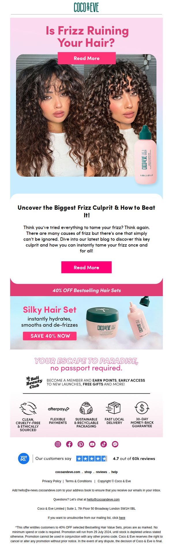
This email aims to convert frizz-prone customers by positioning Coco & Eve’s hair products as the ultimate solution through educational content and a compelling discount. It drives traffic to a blog post while promoting a limited-time 40% off offer on bestselling hair sets.
Why this works
The email brilliantly frames frizz as a solvable problem rather than just a cosmetic flaw, using a before-and-after visual and urgent headline to emotionally hook the reader and position the brand as the authority on curly hair care.
How to implement
By embedding a compelling discount directly under an educational teaser, the campaign smartly bridges awareness with conversion, offering immediate value while encouraging deeper engagement with the brand’s content to justify the purchase decision.
Pro Tip
The primary CTA 'Read More' appears twice with identical text, consider differentiating them (e.g., 'Discover the Cause' and 'Shop the Fix') to better guide users based on their intent and reduce decision fatigue. • The offer section lacks urgency cues like a countdown timer or stock indicator; adding one would amplify FOMO and drive faster conversions, especially since the promotion is time-bound and tied to inventory.
4. Bombas: We’d Love Your Feedback (Get a $5 Gift Card)
Objective
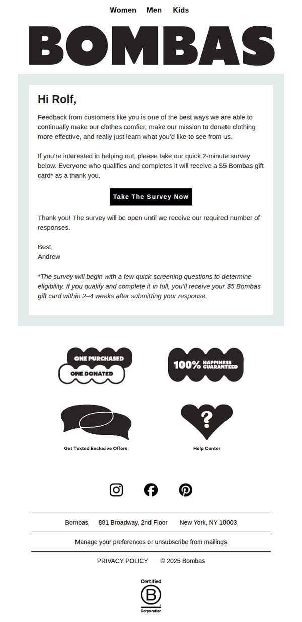
To encourage customer participation in a short survey by offering a $5 gift card incentive, while reinforcing Bombas’ mission of comfort and donation. The email aims to gather actionable feedback to improve products and customer experience.
Why this works
Bombas frames customer feedback not as a chore but as a meaningful contribution to their mission, making respondents feel valued and aligned with the brand’s social purpose rather than just completing a survey.
How to implement
The incentive is clearly tied to completion and eligibility, with a time-bound promise of delivery (2–4 weeks), which builds trust and reduces perceived risk while still managing operational expectations.
Pro Tip
Add a subtle countdown timer or progress bar near the CTA to create urgency and signal how many responses are still needed, which could increase completion rates by leveraging scarcity and social proof. • Include a brief preview of one or two survey questions in the body to reduce friction and set expectations, this transparency can lower abandonment rates by reassuring users it’s truly a 2-minute commitment.
5. Pangaia: What are your sneakers made of?
Objective
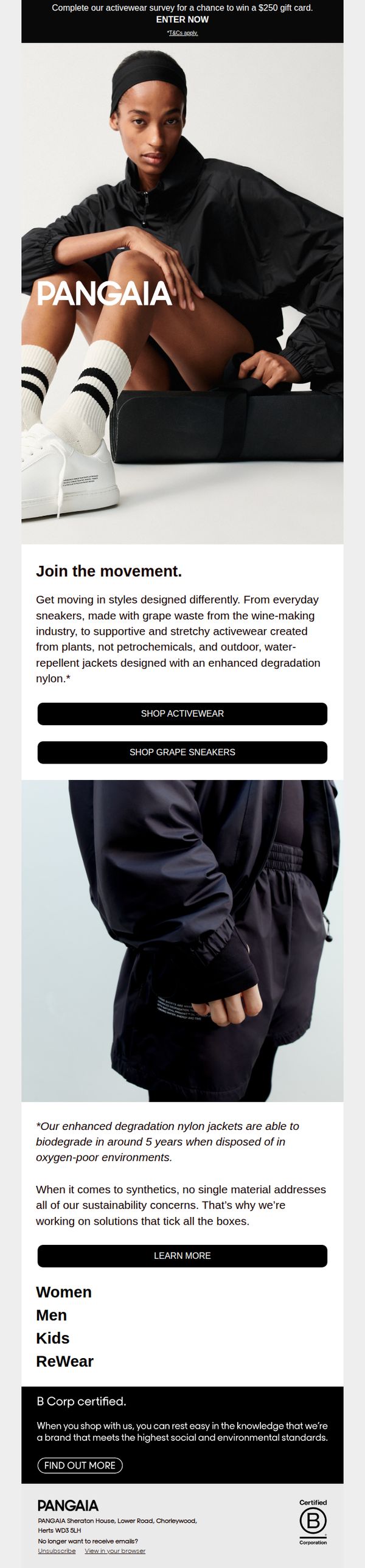
This email aims to drive engagement with Pangaia’s sustainable activewear line by highlighting innovative materials like grape waste and plant-based synthetics, while encouraging clicks to shop or learn more through clear CTAs and a survey incentive.
Why this works
Pangaia brilliantly turns material science into a compelling story by naming specific sustainable sources like 'grape waste from the wine-making industry,' making eco-innovation feel tangible and trustworthy to conscious shoppers.
How to implement
The email uses a dual-CTA strategy that caters to different buyer intents, 'Shop Activewear' for broad exploration and 'Shop Grape Sneakers' for product-specific curiosity, increasing conversion potential without overwhelming the reader.
Pro Tip
Add a visual indicator or small icon next to the 'enhanced degradation nylon' footnote to draw attention to the biodegradability claim, this would reinforce the sustainability message without adding text clutter. • Reposition the 'LEARN MORE' button directly under the sustainability paragraph it references, rather than after the gender/category links, to maintain content-to-CTA flow and reduce cognitive friction for interested readers.
6. Harvard Business Review: The Latest Research from Harvard Business Review Analytic Services
Objective
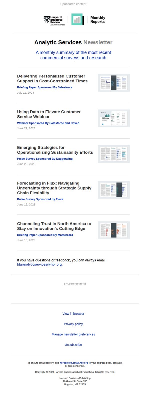
This email aims to position Harvard Business Review Analytic Services as a trusted source of timely, data-driven business insights by delivering a curated monthly digest of sponsored research and webinars. It seeks to engage professionals with high-value content while subtly reinforcing brand authority and partnership credibility.
Why this works
The email leverages sponsorships not as ads but as credibility signals, subtly aligning HBR with industry leaders like Salesforce and Mastercard to reinforce its research authority without compromising editorial tone.
How to implement
Each content item is presented with a clear title, sponsor attribution, and date, creating a professional, magazine-style rhythm that helps busy executives quickly scan and prioritize what’s relevant to their strategic needs.
Pro Tip
Add a primary CTA button above the content list, such as 'Download the Latest Briefing', to drive immediate action instead of relying solely on passive 'View in browser' links buried in the footer. • Include a short teaser or one-sentence value proposition under each content title to clarify why the reader should care, reducing cognitive load and increasing click-through by answering 'What’s in it for me?'
7. Native Union: Help us shape a more sustainable future 🌎
Objective
This email aims to engage customers in a sustainability-focused conversation by inviting them to share their thoughts on eco-friendly practices, while subtly reinforcing Native Union’s brand values around responsible growth and durable tech accessories.
Why this works
By framing sustainability as a collaborative mission rather than a corporate statement, Native Union invites customers to co-create their eco-friendly future, turning passive recipients into active participants in brand storytelling.
How to implement
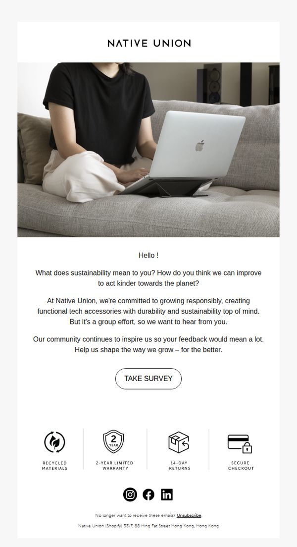
The email’s minimalist aesthetic, paired with a relatable lifestyle photo of someone using a laptop on a couch, creates an emotional bridge between the product and everyday life, making sustainability feel personal and attainable.
Pro Tip
Add a brief sentence or icon indicating how long the survey takes (e.g., '2-minute survey') to reduce perceived effort and increase completion rates, especially since the CTA is the sole conversion point. • Introduce a visual cue, such as a subtle arrow or highlight, around the 'TAKE SURVEY' button to guide the eye more effectively, since the layout currently lacks directional hierarchy despite its clean design.
8. Us Weekly: Maya Hawke Thinks Her Family Is the ‘Boring, Indie Kardashians’

Objective
To drive engagement and click-throughs by highlighting trending celebrity news and personal stories that appeal to fans of pop culture and Hollywood gossip, encouraging readers to explore deeper content via 'Read more' links.
Why this works
The email opens with a bold, personality-driven headline featuring a relatable celebrity quote, instantly hooking readers by blending humor with star power to create emotional resonance and curiosity.
How to implement
Each story tile pairs a high-impact photo with a concise, curiosity-piquing headline, making it effortless for readers to scan and choose what to click, a smart visual hierarchy that respects short attention spans.
Pro Tip
Add a subtle countdown or 'Trending Now' badge to the top story to create urgency and signal timeliness, which could boost immediate clicks on the hero section. • Introduce a personalized subject line or dynamic headline based on past reader behavior, for example, 'You loved Taylor Swift’s exes? Here’s what they’re doing now', to increase open and engagement rates.
9. Rocketbook: Cloud Connected Think Board X Works Hard

Objective
This email aims to drive immediate purchases of the Think Board X by highlighting its smart, cloud-connected whiteboard functionality and seamless integration with the Rocketbook app, positioning it as an essential productivity tool for professionals and creatives.
Why this works
The email brilliantly positions the Think Board X not just as a whiteboard, but as a dynamic, cloud-connected workspace that bridges physical brainstorming with digital organization, making it irresistible to productivity-focused users.
How to implement
By visually demonstrating the product in action, showing real handwritten notes being digitized via the app, the email builds trust through tangible proof of functionality, which is far more persuasive than generic feature lists.
Pro Tip
Add a brief testimonial or social proof near the CTA to reinforce credibility, since the product is tech-integrated, a quote from a designer or project manager who uses it daily would strengthen conversion intent. • Include a size comparison graphic or short video loop showing the Think Board X next to common office items (like a laptop or notebook) to help users visualize scale and practicality in real-world settings.
10. KURU Footwear: How Much Do Americans Spend on Footwear? 💰
Objective
This email aims to engage subscribers by sharing surprising, data-driven insights about American footwear spending habits, positioning KURU as a brand that understands consumer behavior while subtly promoting its own products through credibility and relevance.
Why this works
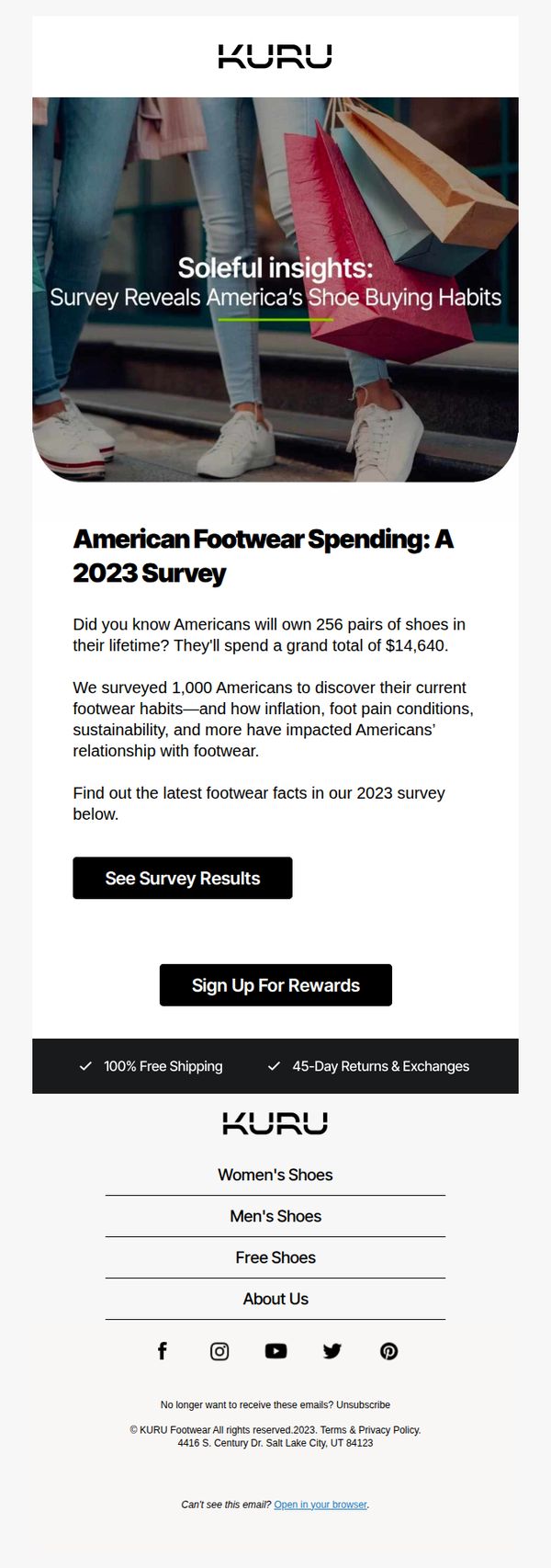
The email opens with a bold, emotionally resonant headline, 'Soleful insights', that cleverly ties the brand’s focus on foot comfort to a data-driven story, making the content feel both personal and authoritative right from the start.
How to implement
By leading with a shocking stat, '256 pairs of shoes in a lifetime', the email instantly grabs attention and frames footwear as a high-investment, high-impact category, which primes readers to consider KURU’s value proposition as a smart long-term choice.
Pro Tip
Add a brief testimonial or customer quote near the survey stat to humanize the data, e.g., 'I spent $1,200 on shoes last year... until I found KURU', to bridge the gap between abstract numbers and real-world pain points. • Include a small visual cue or icon next to the 'See Survey Results' CTA (like a magnifying glass or chart icon) to reinforce the action’s purpose and increase click-through by making the intent more intuitive at a glance.