Proven survey campaign email designs you can use
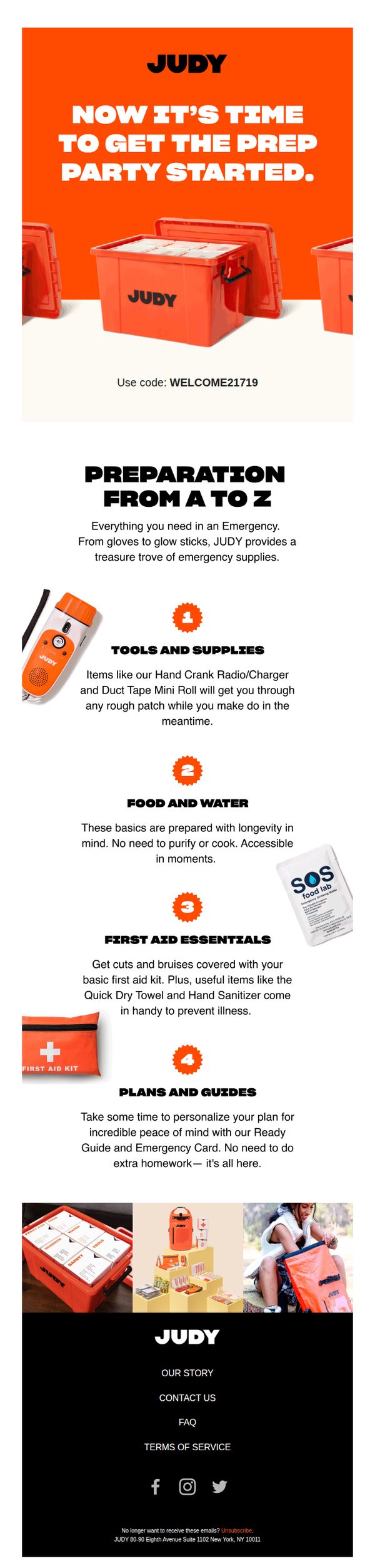



1. Judy: “just in case” happens more than we think.
Objective
This email aims to motivate recipients to proactively prepare for emergencies by highlighting the comprehensive, ready-to-use nature of JUDY’s emergency kits, while encouraging immediate purchase through a promotional discount code.
Why this works
The email brilliantly reframes emergency prep as a proactive, celebratory 'prep party,' turning a potentially stressful topic into an empowering, shareable moment that invites action without fear-mongering.
How to implement
By breaking down preparedness into four digestible categories, tools, food, first aid, and planning, the email transforms an overwhelming task into a manageable checklist, making the product feel essential and intuitive to adopt.
Pro Tip
Add a visible, time-sensitive countdown timer near the promo code to create urgency and encourage immediate redemption, since the current CTA lacks temporal pressure despite the 'just in case' theme. • Include a customer testimonial or social proof element after the education section to reinforce credibility, for example, a short quote from a user who relied on their JUDY kit during a real emergency.
2. Tiffany & Co. - US: Fernan, Embrace the Strength of HardWear by Tiffany
Objective
This email aims to emotionally connect the recipient with the HardWear by Tiffany collection by highlighting personal stories of strength and resilience from real women, encouraging them to see the jewelry as a symbol of their own power and to explore or purchase the collection.
Why this works
Tiffany brilliantly humanizes luxury by anchoring the HardWear collection to authentic, emotionally resonant stories from real women, transforming jewelry from an accessory into a personal emblem of resilience and self-worth.
How to implement
The email strategically uses minimal, high-contrast visuals and clean typography to let the emotional weight of each testimonial shine, proving that luxury marketing doesn’t need clutter, it needs clarity and conviction.
Pro Tip
Add a subtle countdown timer or limited-edition badge near the CTA to create urgency, since the current design lacks any time-sensitive incentive that could nudge hesitant shoppers toward immediate action. • Include a small visual cue or icon next to each 'Explore the Collection' link to indicate it’s clickable, currently, the text blends into the body copy, reducing perceived interactivity and potentially lowering engagement rates.
3. Flaviar: We think you'll love this small-batch beauty from Houston 😍🥃
Objective
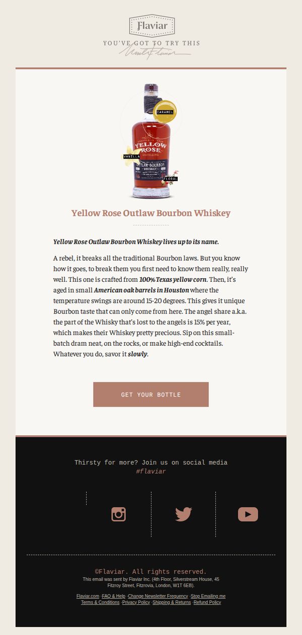
This email aims to drive immediate purchase of a niche, small-batch bourbon by highlighting its unique origin and craftsmanship, while positioning it as a must-try experience for whiskey enthusiasts who appreciate rebellious, regionally distinct spirits.
Why this works
The email masterfully frames the bourbon as a rebellious, rule-breaking spirit by first establishing traditional bourbon norms, then shattering them with its Texas corn and Houston barrel aging, making the product feel exclusive and culturally defiant.
How to implement
By quantifying the 'angel’s share' at 15% per year, the email transforms a technical distilling term into a compelling scarcity signal, subtly implying that each bottle is rare and worth savoring, a clever psychological nudge toward urgency and appreciation.
Pro Tip
Add a small visual indicator, like a 'Limited Stock' badge or 'Only 37 Bottles Left' counter, near the CTA to amplify scarcity and reduce hesitation, since the 15% angel’s share already implies rarity but doesn’t translate to immediate action. • Include a micro-testimonial or user rating (e.g., 'Rated 4.8/5 by 212 Flaviar members') beneath the product description to build social proof, especially since the email relies heavily on product uniqueness without third-party validation.
4. Texas Monthly: Weekly Roundup: Think You’re Hot? Try Being a Pitmaster During the Hottest Summer in Texas History.
Objective
This email aims to engage readers with timely, culturally relevant Texas stories while driving subscriptions through a limited-time offer. It positions Texas Monthly as an essential source for understanding life in the state, especially during extreme conditions.
Why this works
The email opens with a bold, relatable hook, comparing reader discomfort to a pitmaster’s suffering in extreme heat, which instantly creates emotional resonance and frames Texas Monthly as the voice of authentic local experience.
How to implement
Strategically placing the subscription CTA twice, once mid-email after high-engagement content and again in the footer, capitalizes on reader momentum while reinforcing urgency with a time-sensitive price point that feels like a local insider deal.
Pro Tip
The hero image of the pitmaster is strong, but adding a subtle overlay text or caption like 'The Real Heat of Texas' would reinforce the theme and improve scannability for mobile readers who may not read the full headline immediately. • The 'Recommended' section lacks visual hierarchy, adding category tags or small icons next to each story type (e.g., a fork for Food & Drink, a suitcase for Travel) would help readers quickly identify content aligned with their interests.
5. Elle Magazine: The Liberal Arts Colleges with the Best Return on Investment
Objective
This email aims to engage readers with thought-provoking content about the value of liberal arts education while subtly promoting lifestyle, travel, and retail offers that align with the audience’s aspirational interests. It balances editorial depth with commercial appeal to drive clicks and brand loyalty.
Why this works
The email opens with a bold, culturally relevant headline that immediately addresses a pain point, college ROI, while positioning liberal arts as a counterintuitive but valuable investment, making it irresistible to parents and students alike.
How to implement
By weaving in lifestyle and luxury offers, like a European river cruise or designer sleepwear, the campaign transforms educational content into a broader aspirational narrative, subtly aligning intellectual value with consumer desire without feeling salesy.
Pro Tip
The CTA for the river cruise giveaway is visually strong but buried at the bottom; relocating it to a sticky banner or floating button would increase conversion by capturing attention earlier in the scroll journey. • The Fisher Investments ad interrupts the editorial flow with a jarring tone and visual style; replacing it with a native content partnership or branded editorial would preserve the email’s curated, high-end aesthetic.
6. Dishpatch: A Mexican fiesta 🎉
Objective
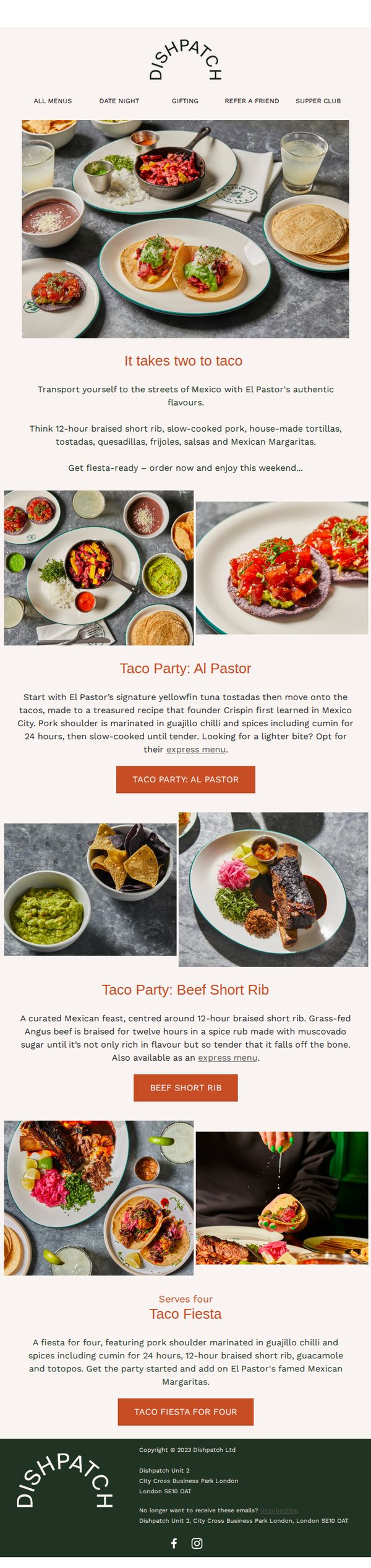
This email aims to drive weekend orders by immersing subscribers in a vibrant Mexican dining experience through El Pastor’s authentic menu, highlighting shareable feasts and signature dishes that encourage group ordering and celebration.
Why this works
The email brilliantly uses sensory storytelling by describing 12-hour braised meats and house-made tortillas to evoke authenticity and anticipation, making the reader feel like they’re already at a lively Mexican street feast before they even click.
How to implement
Each product section is framed as a themed experience, like 'Taco Party: Al Pastor', which transforms menu items into memorable occasions, encouraging customers to think beyond individual dishes and instead envision a full, shareable celebration with friends or family.
Pro Tip
Add a visual countdown timer near the CTA to create urgency around the weekend ordering window, reinforcing the 'fiesta-ready' message and nudging procrastinators to act before the celebration passes. • Include a small testimonial or social proof snippet under the hero section, such as 'Over 500 fiestas served last weekend', to build credibility and FOMO, making the experience feel popular and socially validated.
7. Judy: THINK. ⚡️ FAST. ⚡️
Objective
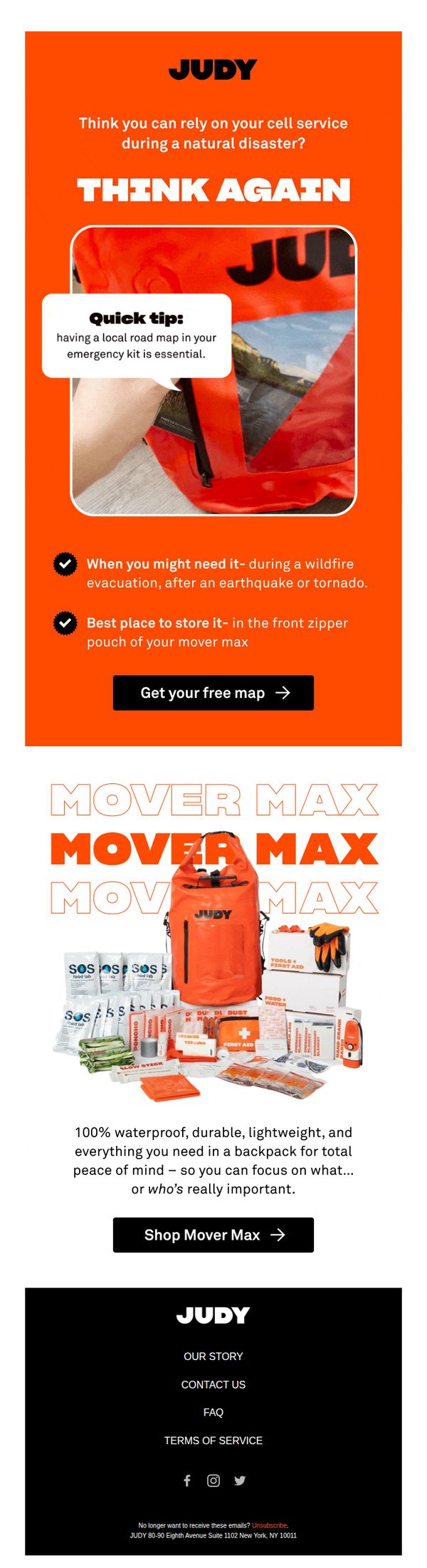
This email aims to provoke urgency around emergency preparedness by challenging the reader’s assumptions about cell service reliability during disasters, then immediately offers a practical solution, a free local road map, while showcasing the Mover Max emergency kit as the ultimate peace-of-mind product.
Why this works
The email opens with a provocative rhetorical question that instantly disrupts complacency, making the reader emotionally invested before they even realize they’re being sold something, a brilliant psychological hook for high-stakes products like emergency gear.
How to implement
By positioning the free map as both an educational tool and a gateway to the main product, the campaign transforms a low-commitment offer into a strategic funnel step that builds trust while subtly reinforcing the urgency of owning the Mover Max kit.
Pro Tip
Add a countdown timer next to the 'Get your free map' CTA to create scarcity around the free offer, which would increase urgency and reduce hesitation since disaster prep is inherently time-sensitive. • Include a short testimonial or stat near the product grid (e.g., '92% of customers say Mover Max gave them confidence during evacuations') to strengthen social proof and validate the emotional appeal with real-world outcomes.
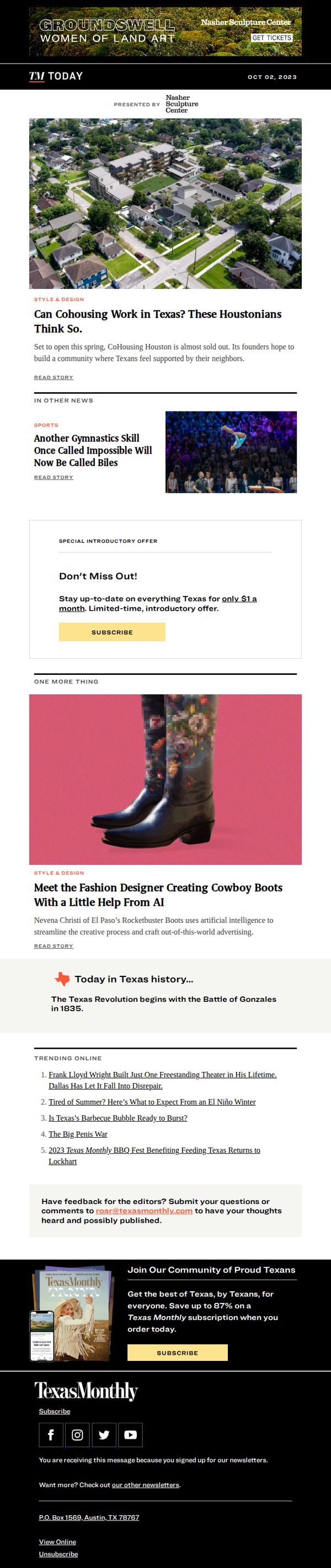
8. Texas Monthly: Can Cohousing Work in Texas? These Houstonians Think So.
Objective
This email aims to engage Texas Monthly readers by highlighting compelling local stories that reflect Texan identity and innovation, while subtly encouraging subscription through a limited-time offer and a strong closing CTA that ties community pride to readership.
Why this works
The email opens with a visually rich, locally relevant story that immediately taps into Texan curiosity and pride, making the reader feel like they’re being let in on an insider trend shaping their own communities.
How to implement
By embedding a time-sensitive, low-friction subscription offer mid-email, Texas Monthly turns passive readers into potential subscribers without interrupting the narrative flow, making the CTA feel like a natural next step rather than a sales pitch.
Pro Tip
The hero image and headline about cohousing are strong, but adding a brief sub-headline or pull quote from a founder would increase emotional pull and give readers a reason to click beyond curiosity. • The ‘Special Introductory Offer’ section uses generic phrasing, adding social proof like ‘Join 12,000+ Texans already subscribed’ or a small badge like ‘Limited to first 500’ would boost urgency and credibility.
9. Town & Country: The Liberal Arts Colleges with the Best Return on Investment

Objective
This email aims to engage readers with high-value, curiosity-driven content while subtly promoting brand partnerships and a luxury giveaway to boost reader interaction and brand loyalty. It balances editorial storytelling with promotional elements to maintain reader trust while driving conversions.
Why this works
The email opens with a bold, visually arresting image of money spilling from a graduation cap atop books, instantly framing the liberal arts ROI debate as both urgent and emotionally resonant for parents and students alike.
How to implement
By weaving in expert commentary from IvyWise and Columbia lecturers, the email lends academic credibility to its argument, transforming a potentially dry topic into a compelling narrative that reassures readers about the enduring value of humanities education.
Pro Tip
The repeated Fisher Investments ad block feels redundant and disrupts content flow, consolidate into one visually distinct, non-repetitive placement to preserve editorial integrity while still honoring the sponsorship. • The CTA 'ENTER' is visually strong but lacks urgency or benefit-driven language; rephrase to 'Enter to Win a 7-Night Luxury River Cruise, Limited Spots!' to increase perceived value and drive immediate action.
10. TRIWA: Solar powered watches🔆

Objective
This email aims to introduce and promote TRIWA’s solar-powered watch collection by highlighting their eco-friendly innovation and extended battery life, encouraging recipients to explore and shop the sustainable timepieces as part of a forward-thinking lifestyle.
Why this works
The email brilliantly frames solar power not just as a feature but as a lifestyle statement, positioning the watches as tools for environmentally conscious consumers who want their accessories to reflect their values and drive positive change.
How to implement
By visually deconstructing the watch with labeled components like 'solar cell' and 'mineral glass,' the campaign educates without overwhelming, turning technical specs into compelling storytelling that builds trust and justifies premium positioning.
Pro Tip
Add a subtle countdown timer or limited-edition badge near the 'Shop Solar' CTA to create urgency, since the current design lacks any temporal incentive that could nudge immediate action. • Include a short customer testimonial or social proof near the product grid to reinforce credibility, the current email relies heavily on technical specs but misses an emotional validation layer that could boost conversion.