Survey Campaign emails worth copying for cosmetics brands
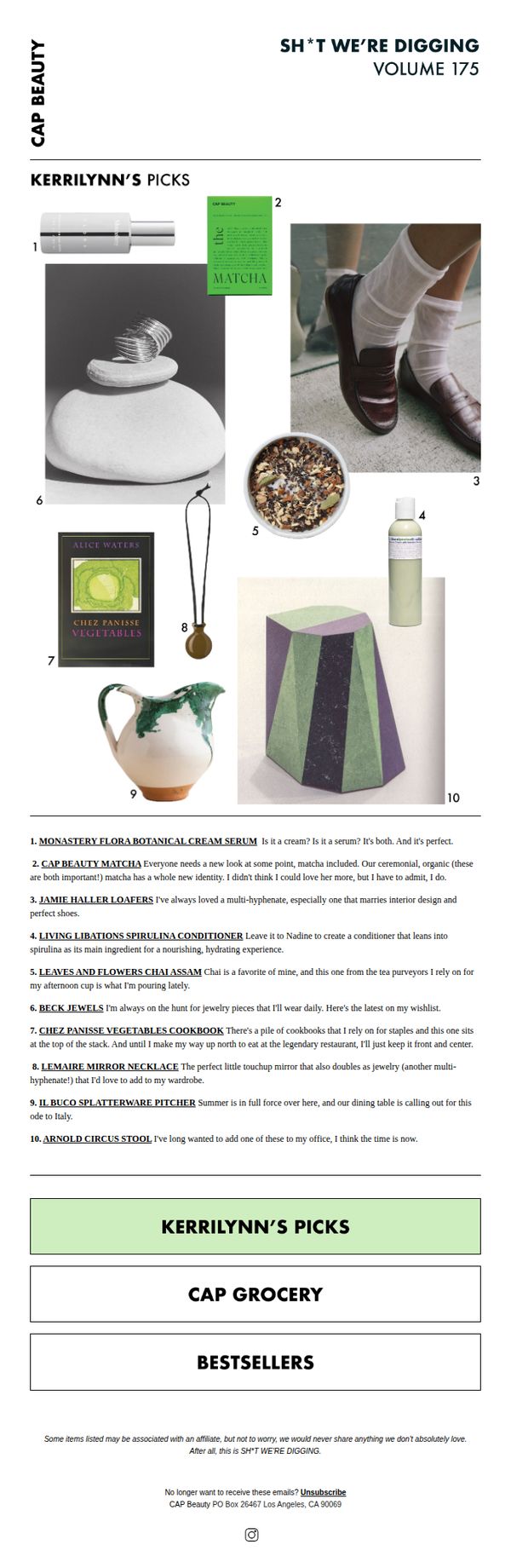

1. CAP Beauty: SH*T WE'RE DIGGING: VOLUME 175
Objective
This email aims to engage subscribers by curating a personal, editorial-style selection of favorite products and lifestyle items, fostering brand affinity through authentic curation rather than direct sales. It positions CAP Beauty as a tastemaker while subtly driving traffic to explore featured items.
Why this works
The email leverages a personal, conversational tone through 'Kerrilynn’s Picks' to build trust and intimacy, making product recommendations feel like advice from a stylish friend rather than a sales pitch, which increases emotional resonance and click-through likelihood.
How to implement
By blending beauty products with lifestyle items like cookbooks and home decor, the campaign expands the brand’s perceived value beyond cosmetics, positioning CAP Beauty as a curator of holistic, elevated living, a strategy that deepens customer loyalty and broadens purchase intent.
Pro Tip
Add a subtle visual indicator or hover effect on each numbered product image to clarify that they’re clickable, reducing friction for users who may not immediately recognize the interactive nature of the grid. • Include a short, time-sensitive incentive, like 'Free shipping on Kerrilynn’s Picks this week only', beneath the CTA to nudge immediate action without compromising the editorial tone.
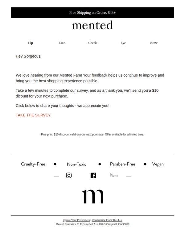
2. Mented Cosmetics: Your Feedback = $10 Off Your Next Order!
Objective
The email aims to encourage customer feedback by offering a $10 discount on the next purchase, turning survey participation into a mutually beneficial exchange that strengthens brand loyalty and gathers actionable insights.
Why this works
By framing feedback as a valued contribution rather than a chore, the email transforms customer surveys into a rewarding experience that fosters emotional investment and brand advocacy.
How to implement
The clear, immediate incentive of a $10 discount creates urgency and reduces friction, making it easy for customers to justify spending a few minutes sharing their honest opinions.
Pro Tip
Add a progress indicator or estimated time to complete the survey (e.g., 'Takes 2 minutes') to reduce perceived effort and increase completion rates. • Include a brief testimonial or social proof near the CTA, such as 'Over 5,000 customers have shared their feedback, help us make Mented even better!' to build momentum and trust.
3. Lush - EN: Is that what we think it is?
Objective
This email aims to drive engagement and sales by introducing Lush’s spring collection with a playful, curiosity-driven subject line and highlighting limited-edition, seasonal products that evoke freshness and renewal. It encourages immediate exploration through clear CTAs and storytelling around ingredients and ethics.
Why this works
The email opens with a teasing subject line and hero section that sparks curiosity while immediately anchoring the campaign in seasonal renewal, making the customer feel they’re discovering something exclusive and timely.
How to implement
Each product is presented with a mini-narrative, highlighting scent, origin, or inspiration, which transforms a simple grid into an immersive storytelling experience that builds emotional connection and justifies premium positioning.
Pro Tip
Add a subtle countdown timer or ‘Limited Stock’ indicator near the Sakura shower gel to create urgency and nudge immediate action, especially since it’s labeled ‘Limited Edition’ but lacks time-sensitive cues. • Reposition the ‘Carry-on Friendly’ section higher in the email, ideally after the hero, to better align with spring travel intent and capitalize on the seasonal theme before users scroll past.
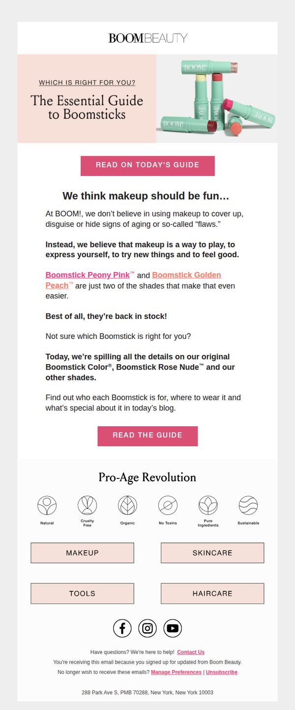
4. BOOM by Cindy Joseph: Get to know our Boomsticks better 💋
Objective
This email aims to reintroduce and educate subscribers about BOOM Beauty’s Boomstick lip products, emphasizing their fun, empowering philosophy while driving traffic to a detailed guide that helps customers choose the right shade. It also reinforces brand values around aging positively and clean beauty.
Why this works
The email brilliantly reframes makeup as a joyful, self-expression tool rather than a corrective one, perfectly aligning with its pro-aging audience by celebrating individuality over hiding 'flaws.'
How to implement
By highlighting specific shades like Peony Pink and Golden Peach as newly restocked, the email creates urgency and personal relevance without resorting to generic sales language or discount tactics.
Pro Tip
Add a small visual cue or icon next to the CTA button, like a lipstick or sparkle, to reinforce the product category and increase click-through by visually anchoring the action to the subject. • Include a short customer testimonial or quote beneath the product description to build social proof and answer the unspoken question: 'Do other women like me love this?'
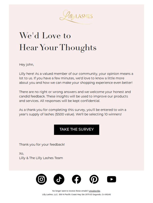
5. Lilly Lashes: Hey John, got a sec for feedback? 🖤
Objective
The email aims to gather honest customer feedback to improve products and services while incentivizing participation with a high-value prize. It positions the recipient as a valued community member to encourage engagement and loyalty.
Why this works
By addressing the recipient by name and framing feedback as a privilege rather than a chore, the email builds emotional connection and makes the customer feel personally valued within the brand’s community.
How to implement
Offering a tangible, high-perceived-value reward, a year’s supply of lashes worth $500, transforms a simple survey into a compelling incentive that motivates action without feeling transactional or cheap.
Pro Tip
Add a subtle countdown timer or urgency cue near the CTA to encourage immediate action, since the prize is limited to 10 winners, this would reduce procrastination and boost survey completion rates. • Include a brief preview of 1–2 sample survey questions to reduce perceived effort and increase transparency, helping recipients feel more comfortable committing to the time investment.
6. Lush - EN: Is that what we think it is?

Objective
This email aims to drive engagement and sales by introducing Lush’s spring collection with a playful, curiosity-driven subject line and highlighting limited-edition products that evoke seasonal renewal and sensory delight.
Why this works
The email masterfully uses seasonal storytelling by framing products as ‘fresh starts’ and tying them to spring’s emotional renewal, making the collection feel timely, relevant, and emotionally resonant rather than just promotional.
How to implement
By spotlighting limited-edition items like ‘Sakura’ with vivid visuals and sensory descriptions, the campaign creates urgency and exclusivity without relying on discounts, appealing to customers who value uniqueness and craftsmanship.
Pro Tip
Add a subtle countdown timer or ‘Limited Stock’ indicator near the Sakura product to amplify urgency, since the ‘Limited Edition’ tag alone may not trigger immediate action for hesitant shoppers. • Reposition the ‘Carry-on Friendly’ section higher in the email or integrate it into the hero area, as travel-sized products are highly relevant for spring travelers and could serve as a stronger secondary conversion hook.
7. Kiko Milano - US: Try the Maxi Mod Volume & Definition Mascara
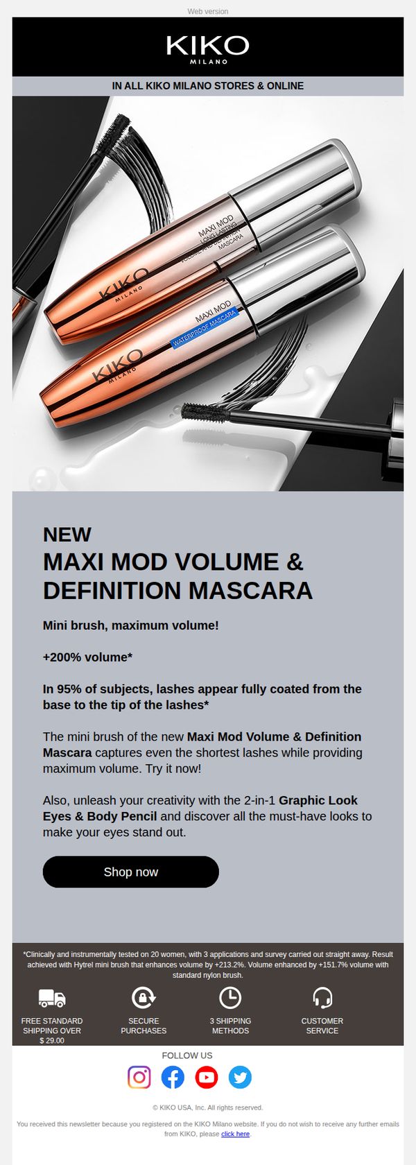
Objective
This email aims to drive immediate trial and purchase of Kiko Milano’s new Maxi Mod Volume & Definition Mascara by highlighting its unique mini brush technology and dramatic volume results, while cross-promoting a complementary eye pencil to increase average order value.
Why this works
The email smartly anchors its value proposition in a specific, quantifiable benefit, '+200% volume', which immediately grabs attention and builds credibility by implying clinical backing without overwhelming the reader with data.
How to implement
By pairing the mascara with a complementary product, the 2-in-1 Graphic Look Eyes & Body Pencil, the campaign subtly encourages bundling, expanding the customer’s consideration set without diluting the primary product’s spotlight or overwhelming the CTA.
Pro Tip
Add a visual comparison or before/after image of lashes to demonstrate the '+200% volume' claim, this would make the benefit more tangible and emotionally compelling, increasing conversion potential beyond text-based claims. • Reposition the 'Shop now' CTA to appear immediately after the product’s key benefit and before the cross-sell mention, reducing friction by prioritizing the primary action before introducing secondary options.
8. CAP Beauty: THE THINKING CAP: CLASS IS IN SESSION

Objective
This email aims to position CAP Beauty’s blog, 'The Thinking Cap,' as a trusted educational hub for holistic wellness, skincare, and mindful living by showcasing expert-driven content and personal stories that foster community and curiosity. It invites readers to explore deeper learning through curated articles and recipes that align with the brand’s philosophy.
Why this works
The email brilliantly frames the brand’s blog as a 'classroom for curiosity,' transforming educational content into an inviting, experiential journey that positions the reader as a student eager to learn, a clever emotional hook that builds loyalty through intellectual engagement.
How to implement
By spotlighting real people, from estheticians to mothers to chefs, the campaign humanizes skincare and wellness, making abstract concepts feel personal and actionable, which builds trust and encourages readers to see themselves in the stories and solutions offered.
Pro Tip
Add a subtle visual hierarchy or numbered progression (e.g., 'Lesson 1: Skincare Layering, Lesson 2: Postpartum Care') to guide readers through the content flow, making the educational journey feel more structured and intentional, which can increase time-on-page and content completion. • Include a micro-CTA beneath each article preview (e.g., 'Read Amalie’s Story →') to reduce friction and encourage immediate clicks, rather than relying solely on the single hero CTA, which may not capture interest from readers drawn to specific topics.
9. Lush - US: Think pink!
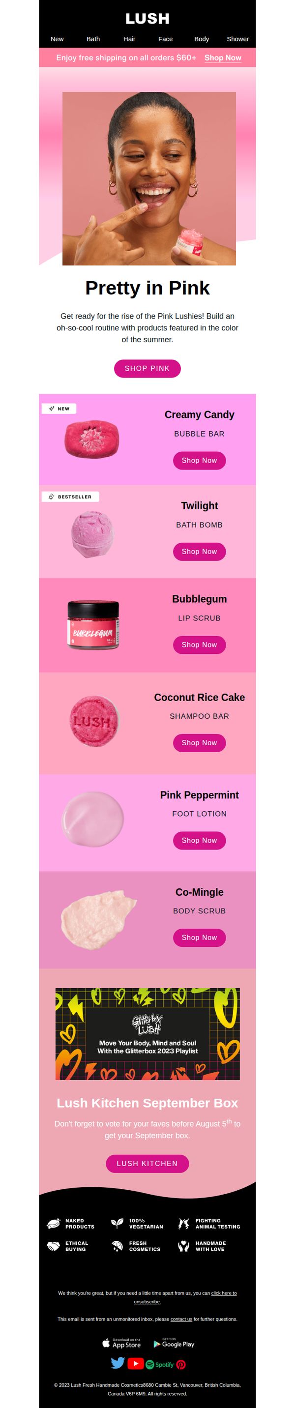
Objective
This email aims to drive engagement and sales by spotlighting Lush’s pink-themed products for summer, encouraging customers to build a seasonal self-care routine while promoting the brand’s values of ethical, handmade, and vegetarian cosmetics.
Why this works
The email brilliantly ties seasonal color trends to product discovery by framing pink as a summer ritual, making the collection feel timely, playful, and emotionally resonant rather than just promotional.
How to implement
Each product is presented with clear labeling, like 'NEW' or 'BESTSELLER', which instantly communicates value and urgency, helping shoppers prioritize without overwhelming them with choice.
Pro Tip
Add a countdown timer or urgency cue near the 'Lush Kitchen September Box' section to encourage faster voting and increase participation before the August 5th deadline. • Include a short customer testimonial or review snippet under one or two top products to build social proof and reduce perceived risk for first-time buyers.
10. Adore Beauty: Don't miss out on a $50 gift card*

Objective
This email aims to drive immediate purchase behavior by incentivizing customers with tiered gift card rewards based on spending thresholds, while also promoting exclusive and limited-time product offers to create urgency and boost conversion.
Why this works
The email brilliantly leverages tiered spending incentives to encourage higher cart values, turning a simple reward into a strategic upsell tool that aligns customer behavior with business revenue goals.
How to implement
By curating a personalized product edit featuring high-margin and trending items, the campaign speaks directly to individual preferences while subtly guiding users toward popular, high-converting SKUs without feeling pushy.
Pro Tip
Add a visible countdown timer under the 'Spend. Gift. Redeem.' section to amplify urgency and remind users of the deadline without requiring them to scroll to the fine print. • Replace the generic 'SHOP HERE' CTA buttons under each product with benefit-driven language like 'Get Smoother Skin' or 'Try This Bestseller' to increase click-through by aligning CTAs with user intent.