Educational Survey Campaign email gallery from real brands

1. Coco & Eve: The Hair Wash Mistake To Avoid at All Costs
Objective
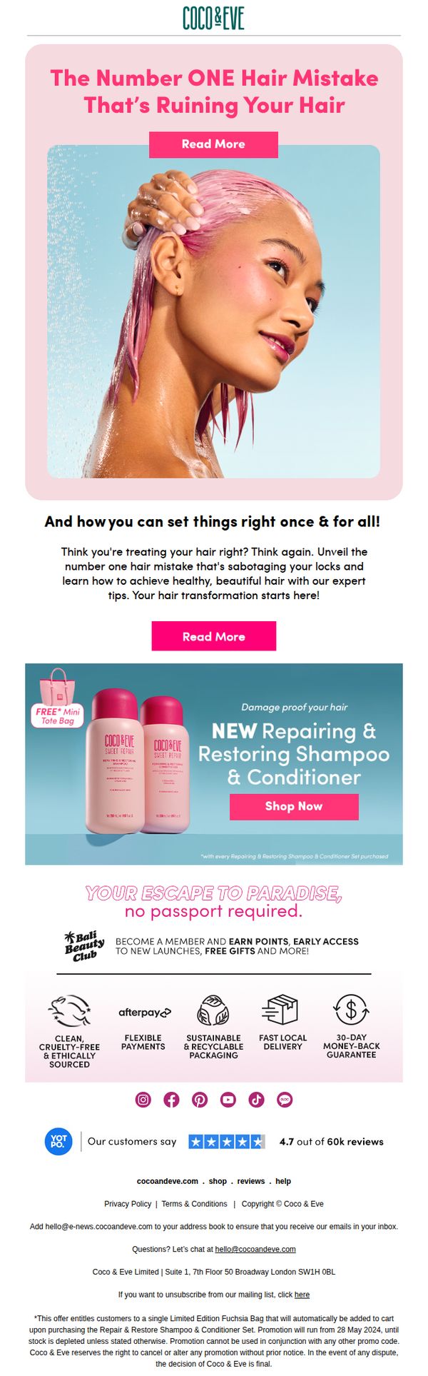
This email aims to educate subscribers on a common hair care mistake while positioning Coco & Eve’s Repairing & Restoring Shampoo & Conditioner as the expert solution, ultimately driving product purchases through urgency and social proof.
Why this works
The email opens with a bold, curiosity-driven headline that frames a common hair mistake as a critical problem, instantly hooking readers by implying they’re unknowingly damaging their hair, a powerful psychological trigger for engagement.
How to implement
By pairing educational content with a visually appealing product shot and a time-sensitive free gift offer, the campaign seamlessly transitions from problem-awareness to solution-selling without feeling pushy or salesy.
Pro Tip
Add a countdown timer or stock depletion indicator near the 'Shop Now' CTA to amplify urgency, since the free tote bag offer is time-limited, this would leverage scarcity psychology more effectively. • Reposition the 'Read More' button in the hero section to appear below the subheadline, not above the image, to avoid visual competition and ensure the CTA doesn’t get overlooked by users scanning top-down.
2. Pittsburgh: Nest: Ready to think pink? Here's how to incorporate Barbiecore into your decor
Objective
This email aims to engage readers with trending home design inspiration, specifically the Barbiecore aesthetic, while showcasing local Pittsburgh properties and sponsored partners to drive traffic to articles and external business pages.
Why this works
The email brilliantly taps into cultural momentum by anchoring its design trend around a blockbuster movie, making interior design feel timely, fun, and socially relevant to readers who want to stay stylishly current.
How to implement
By blending editorial content with local real estate highlights and sponsored retail partners, the email creates a seamless ecosystem that entertains, informs, and drives commercial engagement without feeling overly promotional or disjointed.
Pro Tip
The CTA 'READ MORE >>' is generic and overused; replacing it with action-oriented, benefit-driven text like 'See How to Style Barbiecore in Your Home' would better align with the campaign’s trend-focused objective and increase click-through intent. • The sponsored section for Paracca Interiors lacks visual hierarchy and emotional hook, adding a lifestyle image of a styled room or customer testimonial alongside the 'BUY NOW' tag would make the ad feel more integrated and persuasive rather than interruptive.
3. Backdrop: We think you’ll love FREDERIC Magazine.
Objective
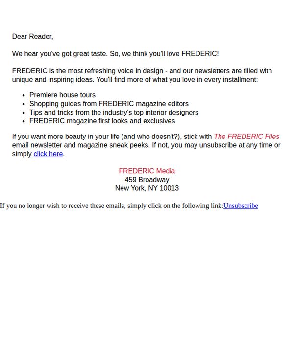
This email aims to convert a reader into a loyal subscriber of FREDERIC Magazine by appealing to their design sensibilities and promising exclusive, high-value content that aligns with their aesthetic interests. It positions the newsletter as a natural extension of their existing taste.
Why this works
The email opens with a personal, flattering assumption, 'we hear you’ve got great taste', which instantly builds rapport and positions the recipient as someone already aligned with the brand’s elite aesthetic, making the pitch feel like an invitation rather than a sales pitch.
How to implement
By listing specific, high-value content types, like 'premiere house tours' and 'tips from top interior designers', the email transforms abstract promises into tangible, desirable outcomes, helping the reader visualize the benefit and reducing perceived risk in subscribing.
Pro Tip
The CTA 'click here' is generic and lacks urgency or emotional pull; replacing it with action-oriented, benefit-driven text like 'Get Your First Issue of FREDERIC, Free' would better align with the campaign’s goal of conversion. • The email lacks visual hierarchy and branding elements, adding a small FREDERIC logo, a hero image of a magazine cover, or even a color accent would reinforce brand identity and increase perceived value without cluttering the minimalist layout.
4. Kiko Milano - US: Try the Maxi Mod Volume & Definition Mascara
Objective
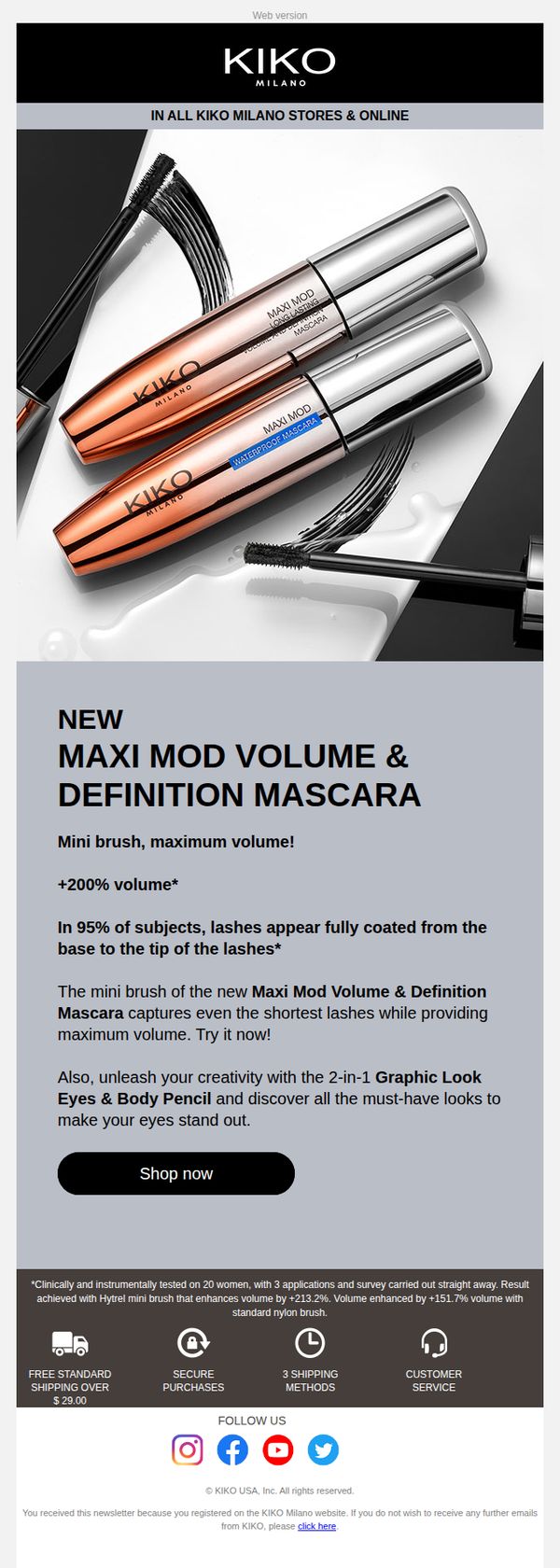
This email aims to drive immediate trial and purchase of Kiko Milano’s new Maxi Mod Volume & Definition Mascara by highlighting its unique mini brush technology and dramatic volume results, while cross-promoting a complementary eye pencil to increase average order value.
Why this works
The email smartly anchors its value proposition in a specific, quantifiable benefit, '+200% volume', which immediately grabs attention and builds credibility by implying clinical backing without overwhelming the reader with data.
How to implement
By pairing the mascara with a complementary product, the 2-in-1 Graphic Look Eyes & Body Pencil, the campaign subtly encourages bundling, expanding the customer’s consideration set without diluting the primary product’s spotlight or overwhelming the CTA.
Pro Tip
Add a visual comparison or before/after image of lashes to demonstrate the '+200% volume' claim, this would make the benefit more tangible and emotionally compelling, increasing conversion potential beyond text-based claims. • Reposition the 'Shop now' CTA to appear immediately after the product’s key benefit and before the cross-sell mention, reducing friction by prioritizing the primary action before introducing secondary options.
5. OKA: Our most refined autumn look
Objective
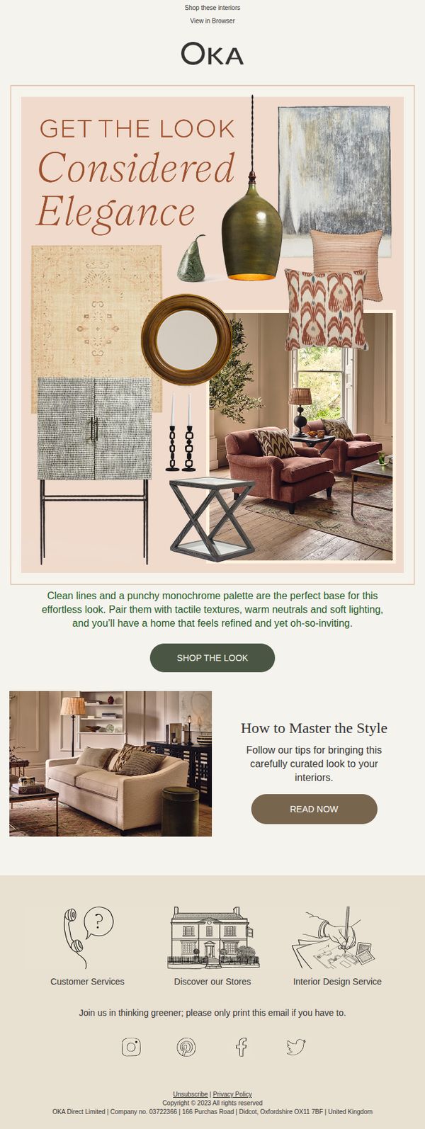
This email aims to inspire customers with a curated autumn interior design aesthetic called 'Considered Elegance' and drive them to shop the full look or explore styling tips, blending aspiration with actionable next steps to increase engagement and conversions.
Why this works
The email masterfully combines aspirational imagery with practical guidance, using a mood board-style hero section to evoke emotion while immediately offering a clear path to purchase or learn more, making luxury feel accessible and actionable.
How to implement
By naming the aesthetic 'Considered Elegance' and pairing it with a concise, benefit-driven description, the campaign gives customers a memorable style identity to latch onto, turning abstract design into a tangible, shoppable concept they can adopt.
Pro Tip
Add a subtle countdown timer or limited-edition tag near the 'SHOP THE LOOK' CTA to create urgency, especially since autumn collections often have seasonal scarcity, which could nudge hesitant browsers toward immediate action. • Include a small testimonial or customer photo in the hero section showing a real home styled with this look, social proof would reinforce credibility and help customers visualize the aesthetic in their own space.
6. Sun Coast Sciences: 5 unusual eye care tips
Objective
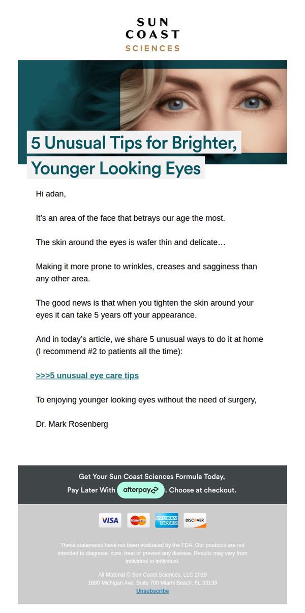
To engage subscribers with educational, non-invasive eye care advice while subtly promoting Sun Coast Sciences’ formula as a solution for achieving younger-looking eyes without surgery. The email aims to build trust through expert endorsement and drive conversions via a low-friction payment option.
Why this works
The email opens with a personalized greeting and immediately frames the eye area as emotionally resonant, the first thing people notice, which creates instant relevance and primes the reader for the value proposition without being salesy.
How to implement
By positioning the content as '5 unusual tips' and having a doctor recommend one specifically, the brand leverages curiosity and authority simultaneously, making the educational hook feel exclusive and trustworthy rather than generic or promotional.
Pro Tip
Add a visual product image or icon next to the CTA to reinforce what’s being offered, currently, the formula is mentioned but not shown, which may reduce conversion by leaving the offer abstract. • Include a short testimonial or user result snippet after the educational section to bridge the gap between tips and product efficacy, this would strengthen social proof and justify the transition to the CTA.
7. Peloton : ✨Get Inspired By These Pelomoms
Objective
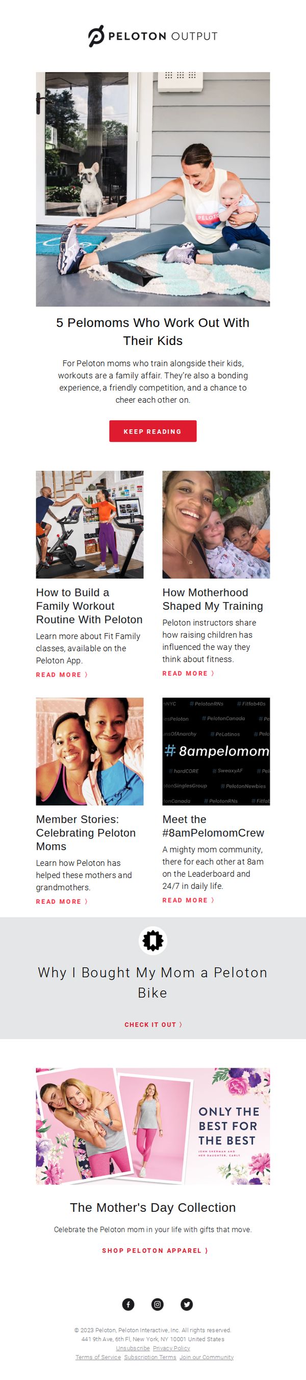
This email aims to inspire and connect with mothers in the Peloton community by showcasing real stories of moms who integrate fitness into family life, while subtly encouraging engagement with Peloton content and products as thoughtful Mother’s Day gifts.
Why this works
The email brilliantly humanizes the brand by spotlighting real Peloton moms in candid, relatable moments, proving that fitness isn’t about perfection but presence, which builds emotional resonance with time-crunched parents seeking community and balance.
How to implement
By weaving educational content like ‘How to Build a Family Workout Routine’ directly into inspirational storytelling, Peloton positions itself not just as a fitness platform but as a lifestyle partner that solves real parenting pain points with actionable, encouraging guidance.
Pro Tip
Add a subtle countdown timer or urgency cue near the Mother’s Day apparel CTA to reinforce gifting deadlines, since the current layout lacks time-sensitive motivation that could nudge procrastinating gift buyers toward immediate action. • Include a short video thumbnail or GIF in the hero section showing a Pelomom mid-workout with her child, this would increase emotional pull and engagement by making the ‘family fitness’ concept more dynamic and instantly relatable than a static image alone.
8. First for Women: How To Find Studs In A Wall Without a Stud Finder ��� It's Easier Than You Think!
Objective
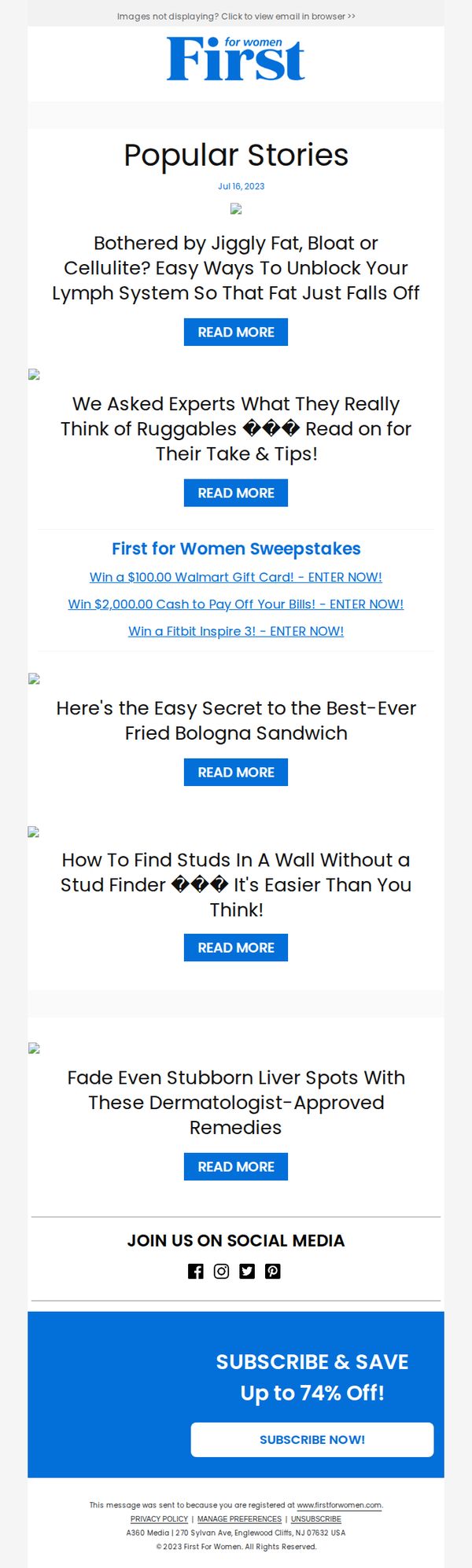
This email aims to drive engagement by offering practical, surprising life hacks and health tips that resonate with its female audience, while subtly promoting subscription through a discount offer at the bottom.
Why this works
The email leverages curiosity-driven headlines like 'It’s Easier Than You Think!' to hook readers instantly, turning mundane DIY topics into must-read content by promising effortless solutions that feel like insider secrets.
How to implement
By mixing health, home, and lifestyle content under one 'Popular Stories' umbrella, the brand creates a relatable, magazine-style experience that keeps readers scrolling, not just clicking, for multiple value-packed reasons.
Pro Tip
The CTA 'SUBSCRIBE NOW!' is visually strong but lacks urgency or personalization; adding a time-sensitive phrase like 'Limited-Time Offer for You' or 'Your Exclusive 74% Discount Ends Soon' would boost conversion. • The email lacks visual hierarchy between content blocks, using subtle dividers, icons, or alternating background shades between articles would improve scannability and help readers distinguish topics faster.
9. Léon & George: You've been thinking about it for a while 👀
Objective
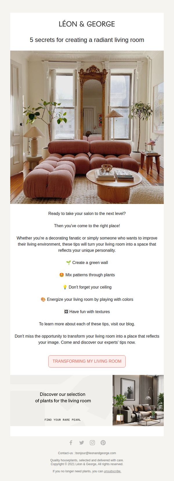
This email aims to re-engage subscribers who have shown interest in home decor by offering them actionable design tips, positioning Léon & George as a trusted authority while gently guiding them toward plant purchases that enhance living spaces.
Why this works
The email opens with a psychologically smart subject line that implies the recipient has been contemplating a change, creating instant relevance and reducing resistance by validating their existing interest in home improvement.
How to implement
Instead of pushing products immediately, the campaign leads with value-driven educational content, five design secrets, that builds trust and positions the brand as a helpful guide rather than a sales-driven entity, increasing long-term conversion potential.
Pro Tip
Add a subtle countdown timer or urgency indicator near the CTA to encourage immediate action, especially since the email targets users who’ve been ‘thinking about it for a while’, a gentle nudge could convert hesitation into purchase. • Include a mini testimonial or social proof snippet under the education section (e.g., 'Over 10,000 customers used these tips to refresh their spaces') to reinforce credibility and reduce perceived risk before the CTA.
10. Thread: Things we think you'll *love*

Objective
This email aims to drive immediate in-store sales by highlighting a time-sensitive discount while curating personalized fashion recommendations that align with the recipient’s style preferences. It blends urgency with inspiration to convert browsing interest into purchases.
Why this works
The email masterfully combines urgency with personalization by leading with a bold, time-limited in-store discount while immediately following it with curated outfit inspiration that feels tailored to the recipient’s taste, making the promotion feel both exclusive and relevant.
How to implement
By segmenting product recommendations into lifestyle-driven categories like 'Places to be' and 'Feeling fancy,' the email transforms generic product listings into aspirational storytelling, helping customers visualize how each item fits into their real-life moments and boosting emotional engagement.
Pro Tip
The primary CTA 'Shop dresses' is buried below secondary CTAs and lacks visual hierarchy; repositioning it as a bold, colored button directly under the hero image would better capture attention and align with the campaign’s goal of driving immediate conversions. • The 'Up to 40% off selected homeware' banner feels disconnected from the fashion-focused content above; either integrate it with a lifestyle narrative (e.g., 'Style your space') or move it to a dedicated section to avoid diluting the core fashion message and confusing the user journey.