Survey Campaign + Gift Guides email examples & ideas



1. Universal Standard - US: Why we think poplin is perfect
Objective
This email aims to introduce and drive sales of Universal Standard’s new poplin collection by highlighting its versatility, comfort, and seasonal relevance while encouraging immediate purchase through curated outfit pairings and limited-time offers.
Why this works
The email masterfully positions poplin as a lifestyle fabric by tying it to seasonal comfort and effortless style, making the material itself the hero rather than just the garments, which builds emotional resonance with warm-weather shoppers.
How to implement
By featuring real, diverse models in natural poses and pairing each product with a short, personality-driven description, the campaign humanizes the collection and makes styling feel intuitive and aspirational without being intimidating.
Pro Tip
Add a subtle countdown timer or 'Limited Stock' indicator near the 20% Off offer to create urgency and reduce hesitation, especially since the discount is tied to a specific outfit pairing that may not be immediately obvious to all shoppers. • Include a small 'Style Tip' or 'How to Wear' icon next to each product image to visually reinforce the styling message, for example, showing how to tuck or layer, which would help less confident shoppers visualize the outfit more easily.
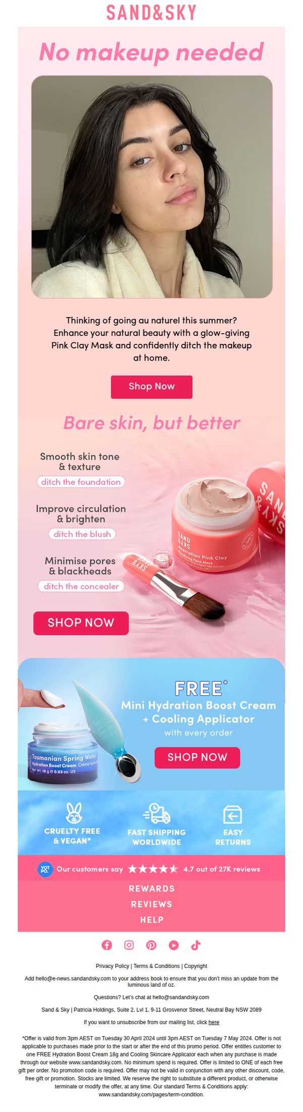
2. Sand & Sky: Your makeup replacement this summer
Objective
This email aims to encourage customers to embrace natural skin this summer by replacing makeup with Sand & Sky’s Pink Clay Mask, positioning it as a glow-enhancing, confidence-boosting alternative to traditional cosmetics. It drives immediate purchases through a compelling offer and social proof.
Why this works
The email brilliantly reframes skincare as a makeup replacement by using the empowering phrase 'No makeup needed', a bold, confidence-driven hook that speaks directly to summer beauty trends and the growing desire for natural radiance over coverage.
How to implement
By pairing each skin benefit, like smoothing texture or minimizing pores, with a specific makeup product to ditch, the campaign creates a clear, relatable value proposition that helps customers visualize the transformation and feel justified in swapping cosmetics for skincare.
Pro Tip
Add a countdown timer or urgency indicator near the CTA to reinforce the limited-time nature of the free gift offer, which could increase immediate click-through by leveraging FOMO without altering the existing layout or messaging. • Include a short customer testimonial quote directly under the hero image or product benefits to humanize the claims, e.g., 'I stopped wearing foundation after using this mask for a week', to strengthen emotional resonance and credibility before the CTA.
3. Big Heart Tea: Think cool, think pink 🌺
Objective
This email aims to drive engagement and sales for Big Heart Tea’s 'Blushing' herbal tea by highlighting its refreshing flavor profile and versatility, especially as an iced tea, while leveraging playful, seasonal messaging to resonate with summer audiences seeking cooling, vibrant experiences.
Why this works
The email brilliantly frames the tea’s flavor as a 'party in your mouth', a vivid, sensory metaphor that instantly communicates joy and excitement, making the product feel experiential rather than just another beverage.
How to implement
By tying the tea’s pink hue to summer humidity and the need for 'serious chill,' the campaign creates emotional urgency and relevance, positioning the product as a seasonal mood-lifter rather than just a drink.
Pro Tip
The 'Shop Now' CTA under the product image is visually underwhelming compared to the more prominent 'Get The Recipe' button, repositioning or restyling it to match the primary CTA’s vibrancy would better balance conversion paths and reduce friction for direct buyers. • The 'Blue Tea Summer' section feels disconnected from the pink-themed campaign; either integrate it with a thematic bridge (e.g., 'Cool Down in Color') or replace it with a related testimonial or user-generated content to maintain narrative cohesion.
4. uncommon goods: It’s our guide to Father's Day gifts
Objective
This email aims to guide shoppers toward unique, thoughtful Father’s Day gifts by curating categories tailored to different types of dads, while encouraging immediate purchase through clear CTAs and membership perks.
Why this works
The email brilliantly segments gift ideas by dad persona, like 'Husbands,' 'New Dads,' and 'Geek', making it easy for shoppers to self-identify and feel personally guided, which reduces decision fatigue and increases conversion likelihood.
How to implement
Each category features a dedicated 'Shop Now' button that creates micro-conversions throughout the scroll, keeping momentum high and preventing users from abandoning the journey before reaching the bottom of the page.
Pro Tip
Add a subtle countdown timer near the hero section to create urgency around Father’s Day, since the current design lacks time-sensitive motivation despite the holiday context. • Include short customer testimonials or star ratings under top products in each category to build social proof and reduce perceived risk for first-time buyers.
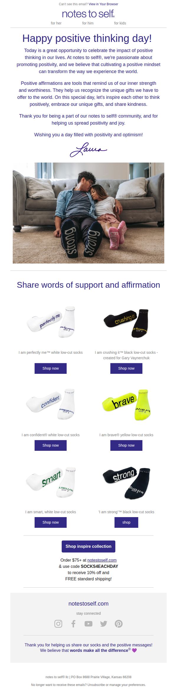
5. Notes to Self Socks: It's Positive Thinking Day! 😀
Objective
This email aims to celebrate Positive Thinking Day by reinforcing the brand’s mission of spreading positivity through empowering sock messages, while encouraging immediate purchases with a limited-time discount to drive sales and community engagement.
Why this works
The email brilliantly ties a cultural moment, Positive Thinking Day, to the brand’s core message, making the promotion feel timely, emotionally resonant, and mission-driven rather than purely transactional.
How to implement
By showcasing real-life models wearing the socks with affirmations like 'strong' and 'brave,' the campaign creates an aspirational, relatable visual narrative that connects emotional empowerment with everyday comfort and style.
Pro Tip
Add a subtle countdown timer beneath the promo code to create urgency around the 10% discount, which could increase conversion by leveraging scarcity psychology without disrupting the email’s uplifting tone. • Include a brief customer testimonial or social proof snippet near the product grid to reinforce trust and validate the emotional impact of the socks, helping hesitant buyers connect the product to real-life positivity outcomes.
6. uncommon goods: Unique garden goods for all shades of green thumbs

Objective
This email aims to engage garden enthusiasts by categorizing them into personality-based shopper segments, beginner, intermediate, and expert, and guiding them to curated product collections that match their skill level and interests, while also introducing a playful CBD-themed section for alternative relaxation.
Why this works
The email brilliantly segments its audience by gardening skill level, turning a generic product category into a personalized journey that makes shoppers feel seen and understood, which increases relevance and reduces decision fatigue.
How to implement
By introducing a whimsical 'Calm Cultivator' section tied to 4/20, the brand extends its garden theme into wellness and self-care, creating unexpected but emotionally resonant product pairings that surprise and delight without feeling forced or off-brand.
Pro Tip
The 'Calm Cultivator' section, while creative, lacks a clear transition from gardening to CBD products, adding a brief explanatory line like 'For when your green thumb needs a moment of zen' would better bridge the thematic gap and reduce confusion. • The primary CTA 'get growing' is buried under the hero headline and lacks visual prominence; increasing its size, adding a contrasting button background, or placing it directly beneath the headline would improve click-through rates by making the next step unmistakable.
7. Kin Euphorics: We think you'll love High Rhode, so enjoy a FREE bottle on us 🍾
Objective
To convert curious or new customers into first-time buyers of High Rhode by offering a free bottle with a $99+ purchase, while positioning the product as a mood-boosting, social ritual enhancer for nights out and self-care moments.
Why this works
The email confidently assumes the recipient will love the product, creating psychological ownership before purchase, a subtle but powerful persuasion tactic that reduces hesitation and builds anticipation.
How to implement
By tying the free bottle to a $99+ spend, the campaign strategically increases average order value while framing the gift as a reward for commitment, not just a discount, which preserves brand value perception.
Pro Tip
Add a visual of the High Rhode bottle or a lifestyle image showing it in use, the current text-only layout lacks sensory appeal and fails to trigger desire or context for how the product fits into the recipient’s life. • Include a brief testimonial or social proof near the CTA, even one sentence from a customer who ‘fell in love’ with High Rhode would reinforce the brand’s confidence and reduce perceived risk for first-time buyers.
8. Fortune: Boards still think this kind of diversity is ‘frivolous,’ one advocate says

Objective
This email aims to inform corporate leaders and board members about the persistent undervaluation of LGBTQ+ representation in boardrooms, while positioning Fortune as a thought leader on governance and diversity. It also drives engagement through event promotion and newsletter subscription.
Why this works
The email opens with a provocative, data-backed headline that immediately frames LGBTQ+ board diversity as a strategic imperative rather than a symbolic gesture, compelling readers to confront corporate complacency with real-world consequences and executive quotes.
How to implement
By weaving in timely cultural references, like Bud Light’s controversy and Target’s Pride withdrawal, the email grounds abstract governance issues in tangible business risks, making the case for inclusion feel urgent and relevant to C-suite decision-makers who track brand reputation and consumer sentiment.
Pro Tip
The primary CTA 'Register here' is buried in a low-contrast peach box near the bottom; relocating it to a high-visibility, color-contrasted button directly beneath the headline would significantly increase event sign-ups by aligning with the email’s urgency-driven narrative. • The email lacks a clear visual hierarchy between the main article and the 'In Brief' section; adding subtle dividers or iconography to distinguish content blocks would improve scanability and help readers prioritize information based on their interests or time constraints.
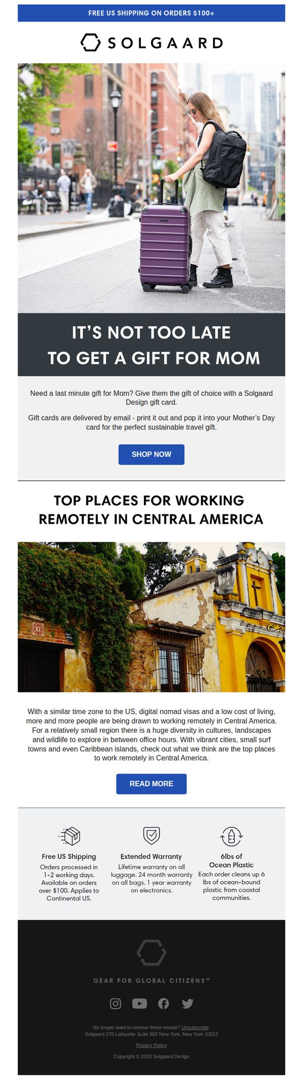
9. Solgaard: Need a last minute gift for Mom?
Objective
This email aims to convert last-minute Mother’s Day shoppers by positioning Solgaard gift cards as the ideal, sustainable solution for busy customers. It also subtly promotes brand values and lifestyle content to deepen engagement beyond the immediate sale.
Why this works
The email brilliantly reframes urgency as opportunity, instead of pressuring buyers, it reassures them that it’s ‘not too late’ to give a thoughtful, sustainable gift, reducing purchase anxiety while aligning with eco-conscious values.
How to implement
By embedding a lifestyle article about remote work in Central America, the brand elevates itself beyond transactional marketing, subtly reinforcing its identity as a companion for global, conscious travelers, a powerful emotional hook for its target audience.
Pro Tip
The hero section’s CTA ‘SHOP NOW’ is generic, it should be benefit-driven like ‘Give Her the Gift of Sustainable Travel’ to better align with the emotional hook and increase conversion intent. • The ‘Top Places for Working Remotely’ section, while interesting, distracts from the core Mother’s Day gift objective, either tie it directly to gifting (e.g., ‘Gift Her an Adventure’) or move it to a post-purchase nurture email.
10. Lush - EN: Think Pink 💖

Objective
This email aims to generate excitement and drive early engagement for Lush’s Barbie collaboration by leveraging the cultural momentum of pink and summer aesthetics, while encouraging app downloads for exclusive 24-hour early access to new products.
Why this works
The email brilliantly taps into cultural zeitgeist by pairing the Barbie collaboration with the ‘Think Pink’ summer trend, creating emotional resonance and urgency that goes beyond product features to evoke lifestyle and identity.
How to implement
By gating early access behind app download, Lush turns a promotional email into a strategic funnel that boosts app adoption while rewarding loyal customers with exclusivity, a clever way to grow owned channels without discounting.
Pro Tip
Add a countdown timer under the ‘Coming 10/08/23’ headline to heighten urgency for the 24-hour early access, making the limited-time nature more visceral and prompting immediate app download. • Include a short testimonial or social proof snippet near the product grid, such as ‘92% of early access users rated this collection 5 stars’, to reduce friction and validate the hype with real user sentiment.