Survey campaign ideas that work for Health & Wellness brands
1. Better Bones: We finally know what causes osteoporosis
Objective
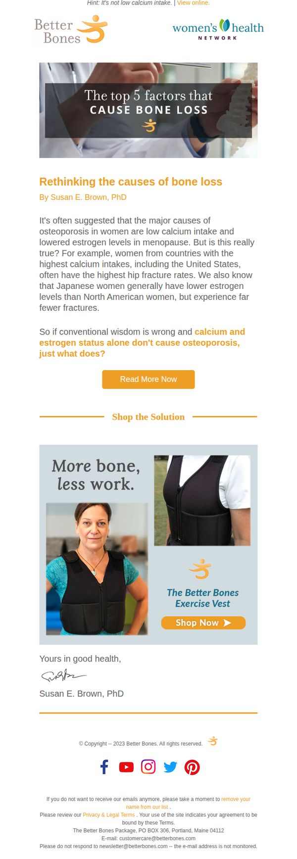
This email aims to challenge conventional beliefs about osteoporosis by presenting new research insights, positioning Better Bones as a thought leader while guiding readers toward a science-backed solution, the Exercise Vest, to improve bone health without relying solely on calcium or estrogen.
Why this works
The email opens with a bold, myth-busting headline that immediately grabs attention by contradicting common assumptions, creating curiosity and positioning the brand as an authority willing to challenge outdated medical narratives.
How to implement
By featuring a PhD author and citing cross-cultural data, the email builds scientific credibility without overwhelming the reader, making complex research feel accessible and trustworthy to a health-conscious audience.
Pro Tip
Add a brief testimonial or user result near the product section to reinforce social proof, readers are more likely to convert when they see real outcomes from others who’ve used the vest. • Include a subtle urgency element like 'Limited stock' or 'Used by 10,000+ women' near the CTA to nudge hesitant readers toward immediate action without compromising the educational tone.
2. Hanx: 💸 Psst: £250 Amazon Voucher Up For Grabs! 👀
Objective
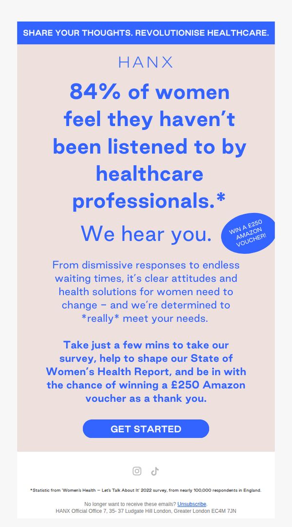
This email aims to drive survey participation by highlighting a relatable pain point for women in healthcare and incentivizing engagement with a high-value £250 Amazon voucher giveaway. It positions Hanx as a brand that listens and acts on women’s health needs.
Why this works
The email opens with a bold, emotionally resonant statistic that immediately validates the reader’s experience, creating instant trust and making the survey feel like a meaningful act of advocacy rather than just data collection.
How to implement
By tying the £250 Amazon voucher to participation in a women’s health report, the campaign transforms a standard survey into a mission-driven opportunity, making the incentive feel earned and aligned with the brand’s purpose rather than transactional.
Pro Tip
Add a subtle countdown timer or urgency indicator near the CTA to boost conversion, since the voucher incentive is time-sensitive in nature, even if not explicitly stated, implying scarcity increases perceived value and action. • Include a short testimonial or quote from a past survey participant near the CTA to build social proof, reassuring readers that their input has already led to real change, which strengthens the 'we hear you' promise with evidence.
3. Cellular Goods: Festive gifting – we’d love your thoughts
Objective
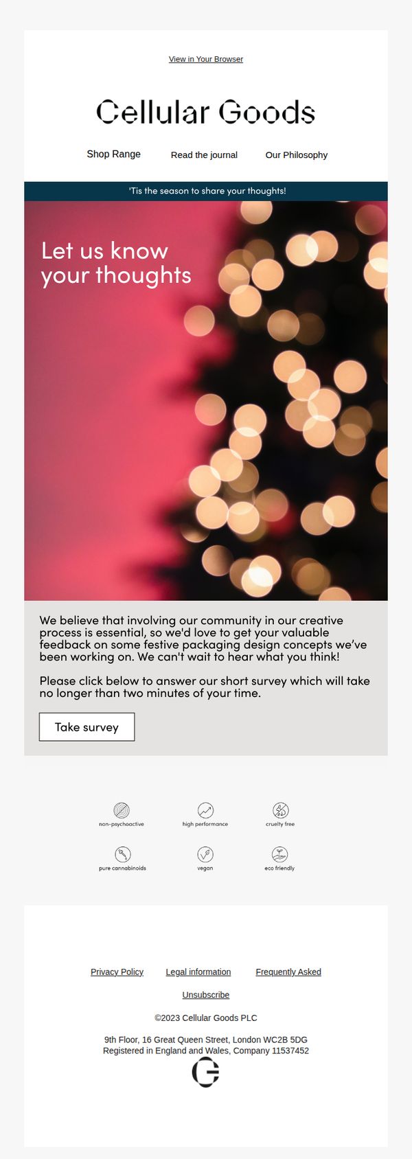
This email aims to engage the brand’s community by inviting feedback on festive packaging design concepts, fostering co-creation while subtly reinforcing brand values through a quick, low-effort survey during the holiday gifting season.
Why this works
By framing the survey as a creative collaboration rather than a generic feedback request, the brand taps into community pride and makes recipients feel like valued insiders shaping the holiday experience.
How to implement
The festive bokeh background paired with a clean, minimalist layout creates emotional warmth without visual clutter, subtly signaling that the brand values both aesthetics and user experience during the busy season.
Pro Tip
Add a micro-copy line above the CTA like 'Your input shapes our 2024 holiday collection' to strengthen the sense of impact and urgency, making the survey feel more consequential than optional. • Include a small festive icon or animated sparkle near the 'Take survey' button to visually cue interactivity and draw attention without disrupting the clean layout, increasing click-through likelihood.
4. Nutritious Life: We think you'd make a great nutrition and wellness coach!
Objective
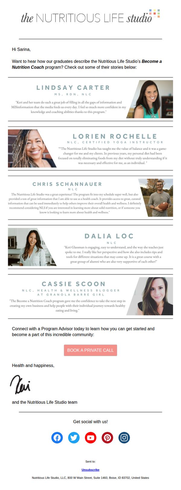
This email aims to inspire and convert interested individuals into applicants for the Nutritious Life Studio’s nutrition coach certification program by showcasing authentic graduate success stories and inviting them to book a private consultation with an advisor.
Why this works
The email strategically leads with real graduate testimonials instead of program features, building instant credibility by letting alumni voices validate the program’s life-changing impact before any sales pitch begins.
How to implement
Each testimonial includes the graduate’s name, credentials, and a personal photo, which humanizes the brand and creates social proof that feels authentic and trustworthy rather than promotional or staged.
Pro Tip
Add a brief hero section above the testimonials that states the program’s core promise, such as 'Become a Certified Nutrition Coach in 6 Months', to immediately anchor the reader’s attention before diving into social proof. • Include a subtle visual cue or icon next to each graduate’s name indicating their credential level (e.g., 'NLC', 'RDN') to reinforce authority at a glance without requiring the reader to parse text.
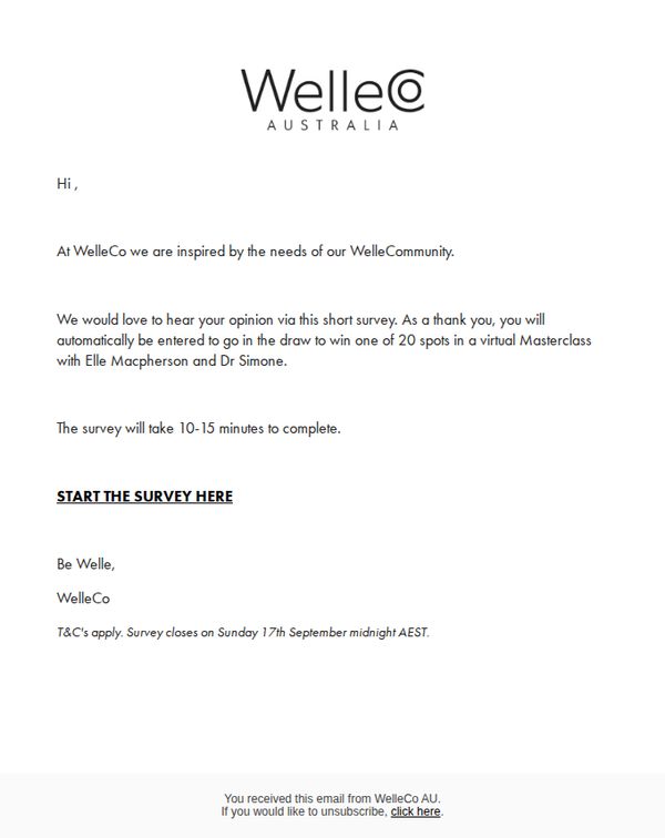
5. WelleCo: Elle Macpherson & Dr Simone masterclass
Objective
To engage the WelleCo community by inviting them to complete a short survey in exchange for entry into a draw to win one of 20 spots in an exclusive virtual masterclass with Elle Macpherson and Dr Simone, thereby gathering customer insights while boosting brand loyalty.
Why this works
The email brilliantly ties customer feedback to a high-value experiential reward, a virtual masterclass with celebrity wellness icons, transforming a routine survey into a coveted opportunity that feels personal and exclusive.
How to implement
By framing the survey as a gesture of gratitude, 'as a thank you', the brand elevates the user’s role from respondent to valued community member, subtly reinforcing emotional connection and reciprocity without overt sales pressure.
Pro Tip
Add a visual element, even a simple headshot of Elle Macpherson and Dr Simone, to the hero section to humanize the masterclass offer and strengthen emotional appeal, since the current text-only layout underutilizes the star power driving the campaign. • Reposition the CTA 'START THE SURVEY HERE' higher in the email or repeat it after the deadline note to reinforce actionability, as the current placement risks being overlooked after the paragraph-heavy body copy.
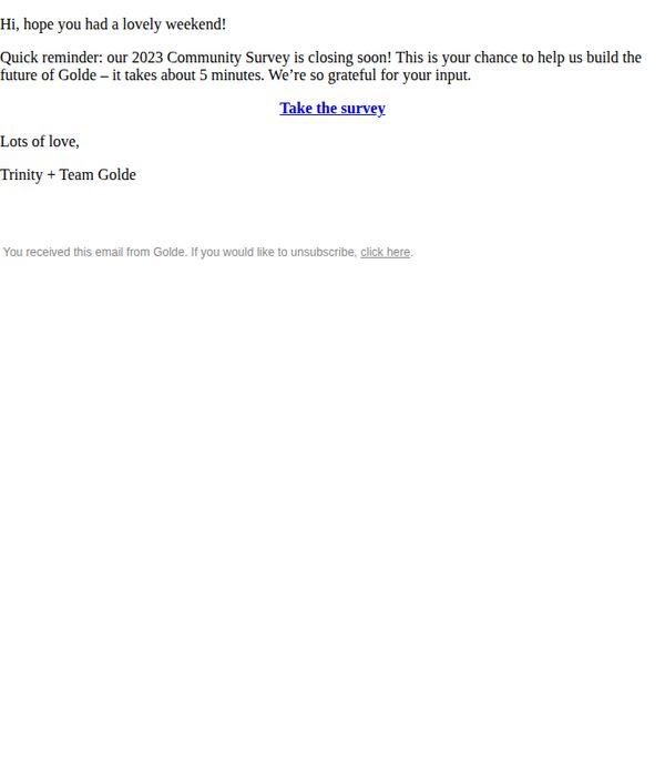
6. Golde: Re: your survey response 📝
Objective
This email aims to gently remind recipients to complete Golde’s 2023 Community Survey before it closes, positioning their feedback as valuable for shaping the brand’s future while expressing gratitude for their time and participation.
Why this works
The email opens with a warm, personal greeting that acknowledges the recipient’s weekend, instantly humanizing the brand and making the request feel less transactional and more like a friendly nudge from a trusted community member.
How to implement
By framing survey participation as a chance to ‘help us build the future of Golde,’ the message transforms a simple data request into a co-creation opportunity, making the recipient feel like a valued partner rather than just a respondent.
Pro Tip
Add a subtle visual cue or icon next to the CTA link, such as a small arrow or survey icon, to draw the eye and increase click-through, since the current plain blue hyperlink blends into the minimal layout and lacks visual urgency. • Include a soft deadline reminder, such as ‘Survey closes in 48 hours,’ to create gentle urgency without pressure, which would help motivate procrastinators while still preserving the email’s warm, appreciative tone.
7. HUM Nutrition: WTF are Hormones?

Objective
This email aims to educate subscribers on female hormones in an approachable, engaging way while subtly guiding them toward relevant HUM Nutrition products that support hormonal and skin health. It blends educational content with promotional offers to build trust and drive conversions.
Why this works
The email opens with a bold, conversational hook, 'WTF ARE HORMONES?', that instantly resonates with curious readers, making complex health topics feel approachable and reducing the intimidation factor around hormonal education.
How to implement
By weaving product recommendations into educational content, like linking Vitamin C to skin health, the campaign positions supplements as natural solutions rather than sales pitches, building credibility while guiding users toward relevant purchases.
Pro Tip
The 'Shop the Story' product grid lacks clear visual hierarchy, consider adding subtle badges or icons to highlight bestsellers or new arrivals to guide decision-making and reduce cognitive load for shoppers. • The anniversary sale banner is visually strong but doesn’t clearly state the end date, adding a countdown timer or 'Limited Time' tag would create urgency and improve conversion rates for time-sensitive offers.
8. Ancient + Brave: Want to think, feel and look your best?

Objective
This email aims to build trust and credibility by showcasing Ancient + Brave’s ethical, environmental, and quality commitments through 10 compelling reasons to shop with them, ultimately driving product purchases by highlighting bestsellers at the end.
Why this works
The email brilliantly transforms brand values into a numbered, digestible list that feels like a trustworthy manifesto, making complex ethical claims feel personal, credible, and easy to scan without sacrificing depth or emotional resonance.
How to implement
By anchoring each of the 10 reasons with a vivid, nature-inspired circular image and a certification badge, the campaign visually reinforces authenticity and creates an emotional rhythm that keeps readers engaged from top to bottom without feeling salesy.
Pro Tip
Add a subtle visual arrow or directional cue after the 10th reason pointing toward the 'Meet our Bestsellers' section to guide the eye and reinforce the conversion path, reducing friction between trust-building and purchasing. • Include a short, benefit-driven headline above the product grid, such as 'Loved by 100,000+ customers for glowing skin and steady energy', to emotionally prime readers before they see the 'Buy Now' buttons.
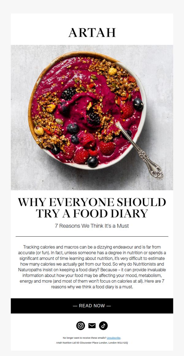
9. ARTAH: WHY EVERYONE SHOULD TRY A FOOD DIARY
Objective
To educate readers on the non-calorie-related benefits of keeping a food diary and to drive engagement by encouraging them to read the full article, thereby positioning ARTAH as a trusted authority in nutrition and mindful eating.
Why this works
The email reframes food tracking not as a numbers game but as a holistic tool for understanding how food impacts mood and energy, a smart emotional hook that resonates with wellness-focused audiences who avoid calorie counting.
How to implement
By anchoring the message in the authority of nutritionists and naturopaths, the email builds instant credibility without hard-selling, making the educational content feel trustworthy and aligned with the brand’s health-conscious positioning.
Pro Tip
Add a subtle visual cue like a downward arrow or 'Scroll to learn why' beneath the hero image to guide users toward the educational content, reducing the chance they’ll miss the value proposition before the CTA. • Include a micro-testimonial or quote from a real user who discovered mood or energy improvements through food journaling, this would strengthen social proof and make the benefits feel more tangible and immediate.
10. Dose: Skipping shut-eye? Think again.

Objective
This email aims to educate recipients on the critical link between sleep quality and liver health, positioning Dose as a science-backed, natural solution to support liver function through better rest. It seeks to convert curiosity into product trial by framing sleep improvement as preventive liver care.
Why this works
The email brilliantly reframes sleep not as a luxury but as a liver health imperative, using a startling stat, 60–80% of people with liver issues report poor sleep, to create urgency and position the product as a preventive, not reactive, solution.
How to implement
By anchoring the product in circadian rhythm science and citing a 29% risk reduction from improved sleep, the campaign builds credibility without overpromising, making the health claim feel grounded, trustworthy, and emotionally resonant with health-conscious consumers.
Pro Tip
Add a subtle countdown timer or urgency cue near the CTA (e.g., 'First 50 orders get free shipping') to nudge hesitant readers toward immediate action, since the current layout lacks any time-sensitive incentive despite the health-focused urgency. • Include a short testimonial or user quote near the product image, such as 'I slept deeper and felt lighter within a week', to humanize the science and bridge the gap between clinical claims and real-world results, which currently feels slightly abstract.