Survey Campaign email examples & ideas for Home Decor

1. OKA: Our Autumn Magazine is here
Objective
This email aims to drive engagement with OKA’s Autumn 2023 Magazine by teasing seasonal interior design inspiration and encouraging readers to explore curated looks, ultimately guiding them toward product discovery and purchase.
Why this works
The email brilliantly uses seasonal emotion, 'Feel that chill in the air?', to create immediate relevance and urgency, making the magazine feel like a timely companion rather than just another promotional asset.
How to implement
By segmenting the magazine content into themed looks like 'Comfort & Charm' and 'Considered Elegance,' OKA transforms passive browsing into an aspirational shopping journey that speaks directly to distinct customer aesthetics.
Pro Tip
Add a subtle countdown timer or limited-time tag near the 'READ ONLINE' CTA to create urgency, since the magazine is a seasonal asset and early engagement drives higher conversion. • Include a brief customer testimonial or social proof near the 'Shop the Look' sections to reinforce trust and validate the curated aesthetics with real-user endorsement.
2. OKA: Bring the seaside home
Objective
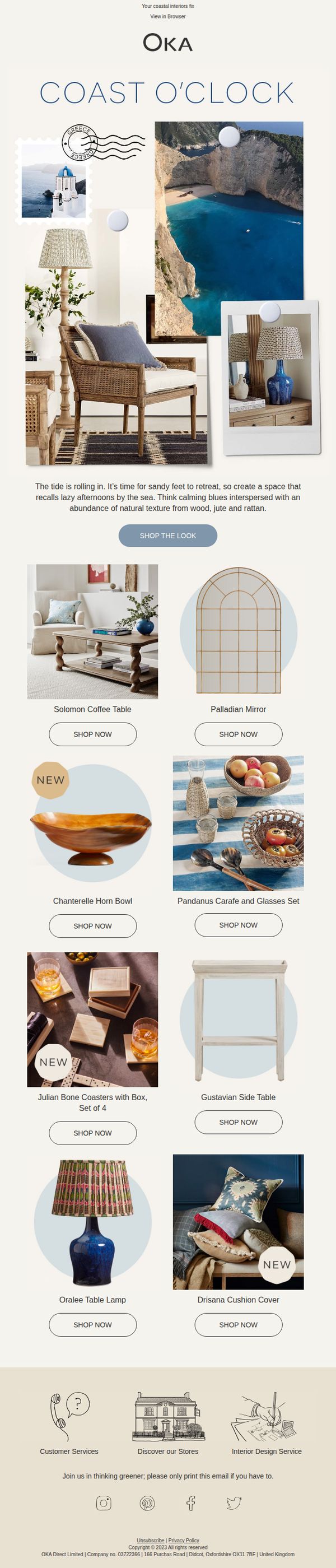
This email aims to inspire customers to recreate a coastal, seaside-inspired aesthetic in their homes by showcasing curated furniture and decor items that evoke lazy afternoons by the sea, encouraging immediate purchase through a themed collection.
Why this works
The email masterfully blends aspirational imagery with tangible product offerings, using a cohesive coastal narrative to emotionally connect with customers while guiding them toward shoppable items that fulfill that dream aesthetic.
How to implement
By anchoring the campaign in a seasonal, sensory theme, 'sandy feet to retreat' and 'calming blues', the brand transforms product browsing into an immersive lifestyle experience that feels both timely and deeply personal.
Pro Tip
Add a subtle countdown timer or limited-time badge near the 'SHOP THE LOOK' CTA to create urgency, especially since the coastal theme implies seasonal relevance that could benefit from time-sensitive framing. • Include a short testimonial or customer review snippet beneath the hero section to build social proof, for example, 'Over 2,000 customers recreated their living room with this coastal look', to reinforce trust and desirability.
3. AmourPrints: Its Over After This...
Objective
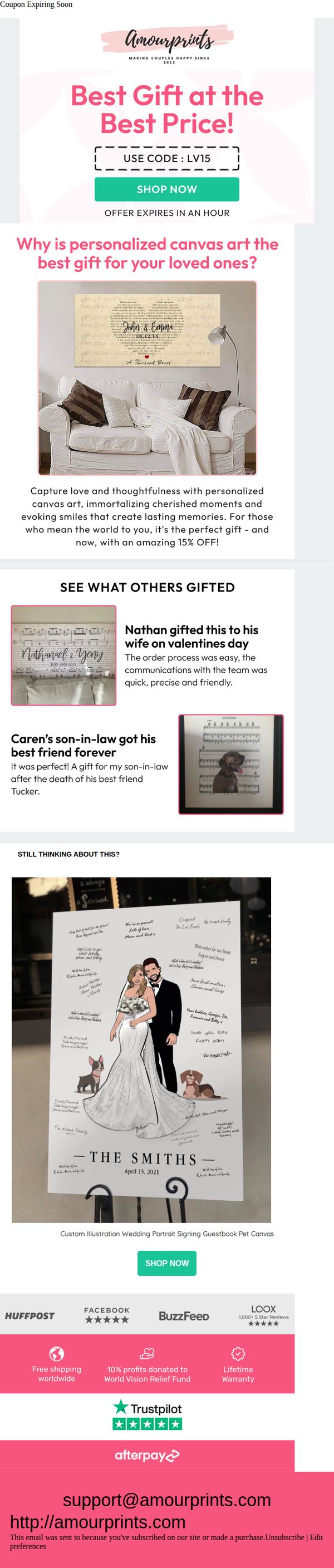
This email aims to drive immediate purchases of personalized canvas art by leveraging urgency and emotional storytelling, positioning the product as the ultimate sentimental gift while offering a limited-time 15% discount to accelerate conversion.
Why this works
The email masterfully combines urgency with emotional resonance by framing personalized canvas art as a timeless gift that captures love and cherished memories, making it irresistible for gift-givers seeking meaningful presents.
How to implement
By featuring real customer stories with specific names and heartfelt contexts, like gifting to a grieving son-in-law or a Valentine’s Day surprise, the campaign builds trust and shows tangible emotional impact, which drives relatability and conversion.
Pro Tip
Add a visible countdown timer next to 'OFFER EXPIRES IN AN HOUR' to visually reinforce urgency and reduce cognitive load, increasing the likelihood of immediate action without requiring mental calculation. • Include a brief FAQ or 'How It Works' section beneath the testimonials to address common objections like turnaround time or customization options, reducing friction for hesitant buyers.
4. Ruggable: Still thinking about it?
Objective
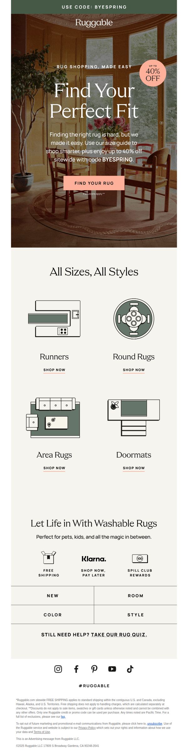
This email aims to re-engage hesitant shoppers by reminding them of the ongoing discount and simplifying the rug selection process with a size guide and clear category navigation. It encourages immediate action by emphasizing the ease of finding the perfect rug and the limited-time savings.
Why this works
The email brilliantly reduces decision fatigue by leading with a helpful size guide and pairing it with a compelling discount, making the purchase feel both smart and timely rather than overwhelming or impulsive.
How to implement
By visually categorizing rugs into four intuitive types with simple icons and direct 'Shop Now' links, the email transforms a potentially confusing browsing experience into a frictionless, guided journey that respects the shopper’s time and intent.
Pro Tip
Add a subtle countdown timer near the CTA or discount badge to create urgency around the 'BYESPRING' code, since the current design implies a limited offer without visually reinforcing its time sensitivity. • Reposition the 'STILL NEED HELP? TAKE OUR RUG QUIZ.' link higher, perhaps beneath the category grid, to capture users who are still unsure, rather than burying it at the bottom where it’s easily missed after scrolling past key offers.
5. OKA: Our most refined autumn look
Objective
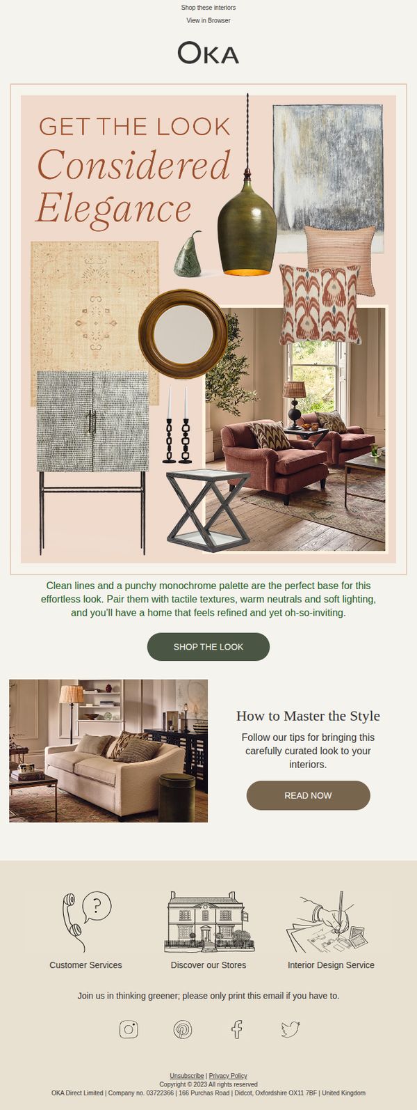
This email aims to inspire customers with a curated autumn interior design aesthetic called 'Considered Elegance' and drive them to shop the full look or explore styling tips, blending aspiration with actionable next steps to increase engagement and conversions.
Why this works
The email masterfully combines aspirational imagery with practical guidance, using a mood board-style hero section to evoke emotion while immediately offering a clear path to purchase or learn more, making luxury feel accessible and actionable.
How to implement
By naming the aesthetic 'Considered Elegance' and pairing it with a concise, benefit-driven description, the campaign gives customers a memorable style identity to latch onto, turning abstract design into a tangible, shoppable concept they can adopt.
Pro Tip
Add a subtle countdown timer or limited-edition tag near the 'SHOP THE LOOK' CTA to create urgency, especially since autumn collections often have seasonal scarcity, which could nudge hesitant browsers toward immediate action. • Include a small testimonial or customer photo in the hero section showing a real home styled with this look, social proof would reinforce credibility and help customers visualize the aesthetic in their own space.
6. OKA: Bring la dolce vita home

Objective
To inspire customers to embrace Mediterranean summer aesthetics by curating a themed edit of home furnishings and decor, encouraging immediate exploration and purchase through aspirational storytelling and tiered spending incentives.
Why this works
The email brilliantly taps into seasonal wanderlust by framing home decor as a portal to the Amalfi Coast, transforming product browsing into an emotional escape that resonates with summer fantasies and lifestyle aspirations.
How to implement
By pairing a visually rich hero collage with a concise, evocative narrative, the campaign creates instant thematic cohesion, making the Mediterranean trend feel both aspirational and immediately actionable for the reader’s own space.
Pro Tip
Add a subtle countdown timer to the 'Spend More, Save More' offer section to create urgency and encourage immediate action, especially since the campaign leans into seasonal summer appeal that naturally fades over time. • Include a short customer testimonial or styled room photo within the 'Shop the Look' grid to build social proof and show real-life application, which would strengthen trust and help visualize how items work together in a home setting.
7. eLuxury: Dream homes DO exist! 😍

Objective
This email aims to inspire potential customers by showcasing real-life styling examples of eLuxury furniture, encouraging them to visualize products in their own homes and ultimately drive clicks to product pages. It leverages social proof through customer testimonials to build trust and reduce purchase hesitation.
Why this works
The email brilliantly uses real customer spaces to demonstrate product versatility, making it easier for shoppers to mentally place items in their own homes and reducing the abstractness of online furniture shopping.
How to implement
Each product highlight pairs a strong testimonial with a clean product shot and a direct CTA, creating a micro-conversion loop that builds credibility while guiding the reader toward immediate action without overwhelming them.
Pro Tip
Add a subtle visual cue or arrow near each 'GET THE LOOK >' CTA to draw the eye downward and reinforce the action path, especially since the CTAs are visually similar and could benefit from directional guidance. • Include a short, bold headline above each testimonial (e.g., 'Perfect for Small Spaces' or 'Ideal for Home Offices') to immediately communicate the product’s functional benefit and help skimmers quickly identify relevance.
8. OKA: You’re invited to Sue Jones’

Objective
This email aims to drive engagement and sales by inviting subscribers to explore a curated home edit inspired by OKA’s co-founder Sue Jones, as featured in Veranda magazine, while simultaneously promoting a time-sensitive discount offer to encourage immediate purchases.
Why this works
The email brilliantly leverages editorial credibility by anchoring the campaign in a Veranda magazine feature, which instantly elevates perceived value and gives shoppers a storytelling reason to explore the collection beyond just price.
How to implement
By pairing a personal narrative, Sue Jones’ home, with a shoppable product grid, the campaign transforms passive inspiration into active commerce, making it easy for readers to visualize and purchase items that reflect a real, aspirational lifestyle.
Pro Tip
The CTA 'SHOP NOW' appears twice with identical text but different styling, consolidating or differentiating the CTAs (e.g., 'Explore the Edit' vs. 'Claim Your Discount') would reduce friction and clarify intent based on user scroll depth. • The product grid lacks visual hierarchy or badges indicating bestsellers or new arrivals, adding subtle indicators would guide decision-making and highlight high-margin or trending items without disrupting the aesthetic.
9. OKA: Say I do

Objective
This email campaign aims to inspire gift-givers to shop wedding presents for couples by curating beautifully styled home goods that symbolize lasting love and shared domestic joy. It positions OKA as the thoughtful, elevated source for meaningful wedding gifts that help couples build their new life together.
Why this works
The email brilliantly frames wedding gifts as emotional investments in a couple’s future home, using evocative language like 'permanent reminder of their happy day' to elevate everyday items into sentimental keepsakes that resonate with gift-givers’ desire to contribute meaningfully.
How to implement
Each product category is introduced with a warm, conversational hook that ties the item to a cherished ritual, like toasting with glassware or sipping tea from mugs, making the products feel indispensable to the couple’s new life rather than just decorative objects.
Pro Tip
Add a subtle countdown timer or 'limited stock' indicator near the hero CTA to create urgency, since wedding shoppers often operate on tight timelines and respond well to time-sensitive cues that validate their decision to act now. • Include a short testimonial or customer quote under one of the product sections (e.g., 'Over 80% of our wedding gift buyers say these vases became their couple’s favorite centerpiece') to build social proof and reassure gift-givers they’re choosing wisely.
10. One Kings Lane: Think of these savings as a Labor Day preview...

Objective
This email aims to drive early Labor Day sales by showcasing deep discounts on best-selling home furnishings, encouraging immediate browsing and purchase through curated product categories and aspirational imagery.
Why this works
The email brilliantly frames savings as a 'Labor Day preview,' creating urgency without waiting for the holiday, which primes customers to act now while still feeling like they’re getting an exclusive early advantage.
How to implement
Each product category is anchored by high-quality lifestyle photography that evokes emotion and aspiration, turning discount messaging into a visual story of elevated home living rather than just a sale announcement.
Pro Tip
Add a dynamic countdown timer near the hero section to reinforce the 'preview' urgency and create real-time pressure for immediate action, especially since the Labor Day angle implies limited-time access. • Include a small testimonial or customer rating badge under 1–2 high-ticket items (like the Fairfax Marble Table) to reduce perceived risk and increase conversion confidence for premium purchases.