Home survey campaign email designs from top brands




1. Our Place: Designed with Kenji López-Alt
Objective
This email aims to drive sales of the Carbon Steel Wok by leveraging Kenji López-Alt’s culinary authority and emphasizing the product’s thoughtful design, durability, and ready-to-use convenience. It positions the wok as a premium, expert-approved tool for home cooks seeking professional results.
Why this works
By anchoring the product launch to a trusted culinary expert, the email instantly builds credibility and transforms a kitchen tool into a chef-endorsed experience, making the purchase feel like an investment in professional-grade cooking rather than just another pan.
How to implement
The email smartly breaks down technical advantages, like super-nitrided carbon steel and pre-seasoning, into digestible, benefit-driven explanations that resonate with home cooks who care about performance but don’t want to decode metallurgy or maintenance manuals.
Pro Tip
Add a subtle countdown timer or limited-edition badge near the CTA to create urgency, especially since the email mentions a points promotion, this would reinforce the time-sensitive value and nudge immediate action. • Include a short video or animated GIF in the 'Ready Right Out of the Box' section showing the wok in action with the pre-seasoned surface, visually proving the 'no seasoning required' claim and reducing perceived friction for new users.
2. Jolie Skin: Stop thinking about self care
Objective
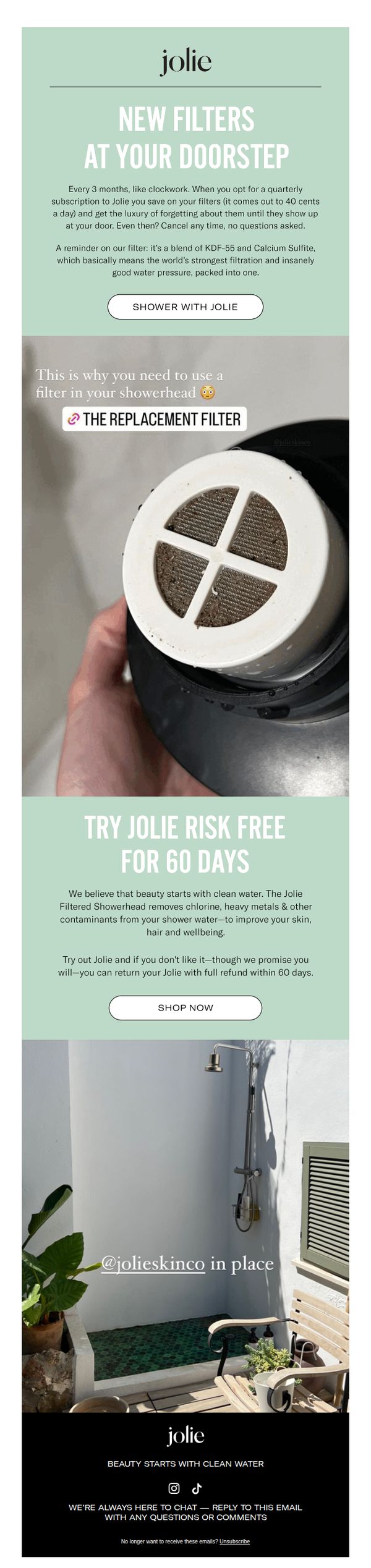
The email aims to convert subscribers into customers by positioning Jolie’s shower filter as an effortless self-care essential, emphasizing convenience, skin benefits, and risk-free trial to reduce purchase hesitation.
Why this works
The email brilliantly reframes a functional product as a self-care luxury by tying clean shower water to visible beauty outcomes, making the filter feel indispensable rather than optional for skincare-conscious consumers.
How to implement
By anchoring the offer in a 60-day risk-free trial with full refund, the campaign removes friction and builds trust, turning skepticism into confidence without requiring upfront commitment from the customer.
Pro Tip
Add a subtle countdown timer or urgency indicator near the CTA to nudge immediate action, since the 60-day trial is generous but doesn’t inherently create time-sensitive motivation. • Include a short customer testimonial or skin transformation quote in the offer section to reinforce the beauty benefit claim with social proof, making the ‘clean water = better skin’ promise more tangible.
3. Clare: Tips + inspo to make your whole home look like a Pinterest board 👉
Objective
This email aims to inspire homeowners to embrace seasonal color trends by offering practical guidance on creating cohesive, Pinterest-worthy interiors, while subtly driving traffic to explore and purchase Clare’s curated paint palettes ahead of their biggest annual sale.
Why this works
The email brilliantly frames paint selection as a stress-free, strategic design journey, not just a product purchase, by offering a clear, three-step system that empowers users to build confidence in their color choices without feeling overwhelmed.
How to implement
By organizing color palettes around emotional and lifestyle-driven themes like 'Hygge vibes' and 'Coastal cool,' Clare transforms paint swatches into storytelling tools that resonate with personal aspirations, making the decision feel intuitive and emotionally rewarding.
Pro Tip
Add a subtle countdown timer beneath the 'PREP YOUR CART' CTA in the hero section to create urgency around the upcoming sale, leveraging FOMO without disrupting the inspirational tone of the email. • Include a mini testimonial or user-generated photo next to one of the palette categories (e.g., 'Hygge vibes') to add social proof and help readers visualize how these colors look in real homes, increasing perceived credibility and relatability.
4. Murphy Door: 2023 Hot Hits We Think You’ll Enjoy
Objective
This email aims to drive immediate sales by showcasing Murphy Door’s most popular products of 2023, leveraging urgency and social proof to inspire customers to shop bestsellers before they sell out.
Why this works
The email brilliantly uses urgency-driven language like 'Get Them While They’re Hot!' to create FOMO without sounding pushy, making top-selling products feel exclusive and timely rather than just discounted.
How to implement
By pairing each product with a clean, lifestyle-focused image and a direct 'Shop Now' button, the email reduces friction and guides the user seamlessly from visual inspiration to purchase decision in a single glance.
Pro Tip
Add a subtle countdown timer or 'Low Stock' indicator beneath top-selling items to amplify urgency and encourage faster decision-making, especially since the email already uses 'hot' and 'sizzlin’' language. • Include a brief 'Why These Are Best Sellers' bullet list under the hero section to quickly communicate product benefits (e.g., space-saving, stylish, easy install) and reduce the need for users to click through to learn more.
5. Outer: Your Chance to Test Drive Outer
Objective
This email aims to drive engagement with Outer’s Neighborhood Showrooms by inviting potential customers to experience the furniture in real-life settings, leveraging social proof and personal testimonials to build trust and reduce purchase hesitation.
Why this works
The email brilliantly turns customer homes into authentic showrooms, creating a low-pressure, high-trust environment where prospects can physically interact with products while hearing real stories from neighbors who’ve already made the leap.
How to implement
By featuring geotagged testimonials from real customers in their own backyards, the campaign builds hyper-local credibility and emotional resonance, making the product feel attainable and community-endorsed rather than just another online furniture ad.
Pro Tip
Add a subtle countdown or urgency indicator near the CTA (e.g., 'Showrooms fill fast, book your visit today') to nudge procrastinators without compromising the relaxed, community-driven tone. • Include a small map snippet or city filter option directly under the CTA to reduce friction for users who want to quickly see nearby showrooms without clicking through to a new page.
6. Modern Sprout: Top Tips For DIY Bouquets 💐

Objective
This email aims to educate subscribers on creating beautiful DIY flower arrangements while subtly promoting Modern Sprout’s floral tools and accessories. It blends practical how-to content with product placement to inspire purchases through empowerment, not pressure.
Why this works
The email brilliantly turns a simple how-to guide into a soft-sell moment by embedding product relevance within each step, readers don’t feel sold to, they feel equipped, which builds trust and nudges them toward the tools they didn’t know they needed.
How to implement
Using numbered, color-coded tips with clean visuals transforms complex floral arranging into digestible, shareable advice, this structure keeps attention high and makes the content feel like a mini-course, increasing perceived value and encouraging repeat engagement with the brand.
Pro Tip
Add a subtle countdown or urgency cue near the 'SHOP NOW' CTA, like 'Limited stock on Botanical Keepers', to nudge hesitant readers toward immediate action without undermining the educational tone of the email. • Include a short customer testimonial or social proof snippet under the 'SHEARS & PRUNERS' section to reinforce credibility, phrases like 'Rated 4.9/5 by 2K+ florists' would validate the product’s value without adding clutter.
7. Blueland: Refugia, we’d love your thoughts
Objective
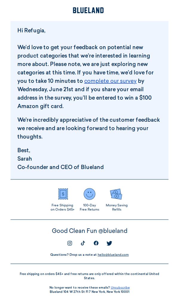
Blueland aims to gather customer insights on potential new product categories by inviting Refugia to complete a 10-minute survey, incentivized with a $100 Amazon gift card entry, to inform future product development while reinforcing brand appreciation.
Why this works
Blueland personalizes the outreach by addressing the recipient by name and positions the survey as a collaborative exploration rather than a transactional request, which builds emotional investment and increases response likelihood.
How to implement
The email strategically ties the incentive, a $100 Amazon gift card, directly to sharing an email address within the survey, creating a dual benefit for the brand: feedback plus lead capture, without compromising perceived generosity.
Pro Tip
Add a visual countdown timer or bold deadline reminder near the CTA to create urgency around the June 21st survey cutoff, which could increase completion rates by leveraging time-sensitive motivation. • Include a brief teaser or example of the new product categories being explored, even as bullet points, to spark curiosity and help recipients visualize their impact, making the survey feel more relevant and engaging.
8. Floyd Detroit: Take the survey for a chance to win $1,000!
Objective
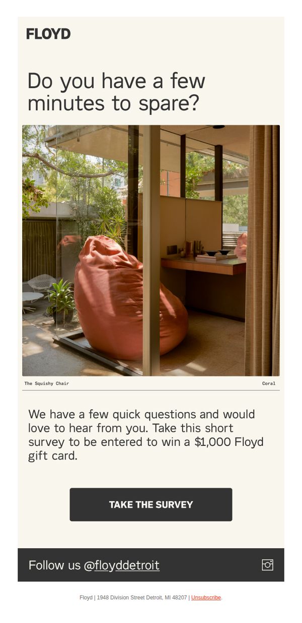
The email aims to encourage recipients to complete a short customer survey by offering a $1,000 Floyd gift card as an incentive, thereby gathering valuable feedback while increasing brand engagement.
Why this works
The email opens with a warm, conversational question, 'Do you have a few minutes to spare?', which lowers psychological resistance and invites participation without sounding demanding or transactional.
How to implement
By featuring a high-quality lifestyle image of 'The Squishy Chair' in a serene, sunlit space, the email subtly reinforces brand aesthetic and product desirability while anchoring the survey in a tangible, aspirational context.
Pro Tip
Add a subtle countdown timer or urgency cue near the CTA to encourage immediate action, since the survey incentive lacks a time-bound element that could boost conversion rates. • Include a brief testimonial or social proof (e.g., 'Over 5,000 customers have already shared their thoughts') to build trust and reduce perceived effort, making the survey feel more worthwhile and widely participated in.
9. OKA: The reviews are in

Objective
This email aims to build trust and drive sales by showcasing real customer reviews for OKA’s lighting collection, while highlighting new arrivals and encouraging immediate purchases through direct product links.
Why this works
The email smartly opens with a bold hero image and headline that immediately signals the campaign’s focus, customer validation, while subtly reinforcing brand confidence in their lighting collection’s quality and design.
How to implement
Each testimonial is paired with a specific product and a direct 'Shop Now' button, creating a seamless path from social proof to purchase, which reduces friction and leverages emotional resonance to drive conversion.
Pro Tip
Add a subtle countdown timer or limited-stock indicator next to 'NEW' products to create urgency, especially since the email highlights new arrivals but lacks any time-sensitive incentive to act immediately. • Reposition the 'SHOP LIGHTING' CTA higher in the email or repeat it after the third testimonial to reinforce the primary action, as users may scroll past the initial button without engaging.
10. MailPix: Start thinking about Father's Day!
Objective
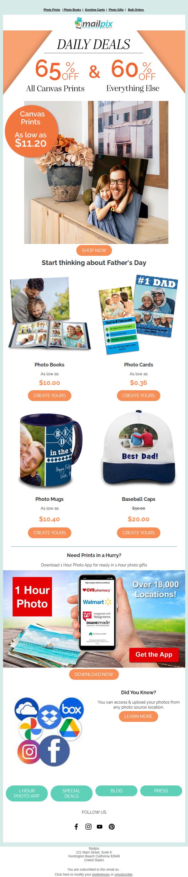
This email aims to inspire early Father’s Day gift shopping by showcasing personalized photo products with deep discounts, while also promoting the convenience of their 1-hour photo app for last-minute shoppers.
Why this works
The email brilliantly ties emotional storytelling to product promotion by featuring real family photos on gifts, subtly reminding recipients that personalized memories make the most meaningful Father’s Day presents.
How to implement
By front-loading the biggest discounts, 65% off canvas prints and 60% off everything else, the campaign creates immediate urgency and positions the brand as the go-to solution for budget-conscious, last-minute gift shoppers.
Pro Tip
Add a countdown timer near the top of the email to reinforce the urgency of the daily deals and prevent procrastination, especially since Father’s Day is a time-sensitive occasion. • Include a short customer testimonial or social proof near the product grid to build trust, for example, a quote like 'My dad cried when he opened his custom photo book!' to enhance emotional appeal.