Survey Campaign email examples & ideas for magazine brands



1. Town & Country: The Liberal Arts Colleges with the Best Return on Investment
Objective
This email aims to engage readers by highlighting the enduring value of liberal arts education amid rising STEM-focused pressures, while also promoting lifestyle content and a high-value sweepstakes to drive traffic and brand loyalty.
Why this works
The email smartly reframes liberal arts as a strategic investment rather than an outdated path, using real-world testimonials and economic context to validate its relevance in today’s job market.
How to implement
By juxtaposing serious educational content with aspirational lifestyle pieces and a luxury sweepstakes, the campaign creates a layered experience that appeals to both intellect and desire, keeping readers scrolling longer.
Pro Tip
The primary CTA 'ENTER' is visually strong but lacks urgency or benefit-driven context, adding a micro-copy line like 'Limited spots, win a European river cruise before it’s gone' would boost conversion. • The education section’s persuasive argument could be strengthened with a data point or stat (e.g., 'Graduates earn 20% more in mid-career') to reinforce ROI claims and build credibility.
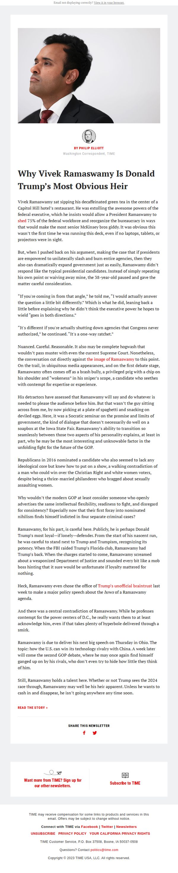
2. TIME: Why Ramswamy is the most under-valued 2024 candidate
Objective
This email aims to position Vivek Ramaswamy as a strategically undervalued and intellectually nuanced 2024 GOP candidate who defies conventional political expectations, while driving readers to engage with the full article and deepen their connection with TIME’s political coverage.
Why this works
The email masterfully reframes Ramaswamy not as a typical populist but as a paradoxical thinker who balances radical policy ideas with intellectual humility, making him unexpectedly compelling to readers tired of performative politics.
How to implement
By anchoring the narrative in a vivid, human moment, Ramaswamy sipping green tea in a Capitol Hill hotel, the email creates immediate intimacy and curiosity, transforming a political profile into a character-driven story worth reading.
Pro Tip
Add a brief, bolded pull quote from the article near the top to immediately signal the article’s provocative angle and reduce scroll friction for readers deciding whether to continue. • Include a small visual indicator, such as a 'TIME Exclusive' badge or 'Must-Read Analysis' tag, near the headline to elevate perceived authority and urgency, encouraging higher click-through on the CTA.
3. Pittsburgh: Nest: Ready to think pink? Here's how to incorporate Barbiecore into your decor
Objective
This email aims to engage readers with trending home design inspiration, specifically the Barbiecore aesthetic, while showcasing local Pittsburgh properties and sponsored partners to drive traffic to articles and external business pages.
Why this works
The email brilliantly taps into cultural momentum by anchoring its design trend around a blockbuster movie, making interior design feel timely, fun, and socially relevant to readers who want to stay stylishly current.
How to implement
By blending editorial content with local real estate highlights and sponsored retail partners, the email creates a seamless ecosystem that entertains, informs, and drives commercial engagement without feeling overly promotional or disjointed.
Pro Tip
The CTA 'READ MORE >>' is generic and overused; replacing it with action-oriented, benefit-driven text like 'See How to Style Barbiecore in Your Home' would better align with the campaign’s trend-focused objective and increase click-through intent. • The sponsored section for Paracca Interiors lacks visual hierarchy and emotional hook, adding a lifestyle image of a styled room or customer testimonial alongside the 'BUY NOW' tag would make the ad feel more integrated and persuasive rather than interruptive.
4. Us Weekly: Steve Martin Addresses Miriam Margolyes' Claim He Was ‘Horrid’ on Set
Objective
This email aims to drive immediate engagement by spotlighting a high-profile celebrity controversy involving Steve Martin, while also encouraging readers to explore additional trending celebrity stories through multiple clickable article links. It seeks to retain subscribers by offering a curated mix of gossip, fashion, and personal revelations that align with Us Weekly’s brand identity.
Why this works
The email opens with a provocative, celebrity-driven headline that leverages controversy to instantly capture attention, making it irresistible for fans of Hollywood drama to click through and satisfy their curiosity.
How to implement
Each article preview is paired with a high-contrast, emotionally resonant image and a concise, curiosity-driven subheadline that works together to create a visually scannable grid that encourages multiple clicks without overwhelming the reader.
Pro Tip
Add a subtle visual hierarchy to the CTA buttons, such as varying button sizes or using a primary color for the hero story, to guide the reader’s eye toward the most important story first, improving conversion focus. • Include a short teaser sentence under each headline (e.g., 'Steve Martin responds with surprising grace') to add emotional context and increase click-through rates by reducing ambiguity about what the article delivers.
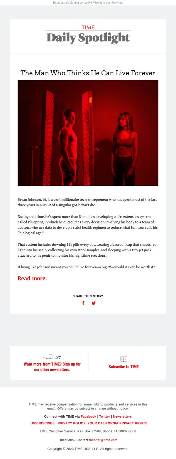
5. TIME: The man who thinks he can live forever
Objective
This email aims to captivate readers with a provocative human-interest story about extreme life extension, driving engagement through curiosity and encouraging newsletter signups or subscriptions to TIME’s content ecosystem.
Why this works
The headline masterfully combines intrigue and audacity, 'The Man Who Thinks He Can Live Forever', immediately hooking readers by challenging universal assumptions about mortality and human limits.
How to implement
The visual storytelling through the red-lit, sci-fi-inspired image creates an emotional tone of mystery and futurism, perfectly mirroring the article’s theme and enhancing reader immersion before they even read a word.
Pro Tip
The primary CTA 'Read more.' is underwhelming; replacing it with a benefit-driven phrase like 'Discover the extreme science behind living forever' would better align with the curiosity-driven objective and increase click-through rates. • The footer’s dual CTAs, 'Sign up for our other newsletters' and 'Subscribe to TIME', are visually equal but strategically misaligned; prioritizing one based on user segmentation (e.g., new vs. returning readers) would improve conversion clarity.
6. Fortune: ROI and reboots

Objective
This email aims to inform CFOs and finance leaders about strategic brand reboots, AI investment trends, and executive leadership changes while positioning Fortune as a thought leader in finance and corporate strategy. It also drives engagement through event promotion and content deep dives.
Why this works
The email masterfully ties pop culture nostalgia, like Barbie and Care Bears, to high-stakes corporate strategy, making complex financial concepts feel accessible and timely for C-suite readers who appreciate cultural relevance in business analysis.
How to implement
By embedding a data-rich bar chart on AI spending by industry, the email transforms abstract trends into concrete, visually digestible insights that empower finance leaders to benchmark their own investment strategies against peer organizations.
Pro Tip
The primary CTA 'Read more on Fortune.com' is buried at the bottom and lacks urgency or value proposition; reposition it above the fold with a benefit-driven variant like 'Unlock the ROI Playbook for Brand Reboots' to increase click-throughs. • The 'Fortune’s Impact Initiative' event promotion lacks visual hierarchy and social proof; add a countdown timer or attendee badge (e.g., 'Join 500+ CFOs') to create FOMO and improve registration conversion.
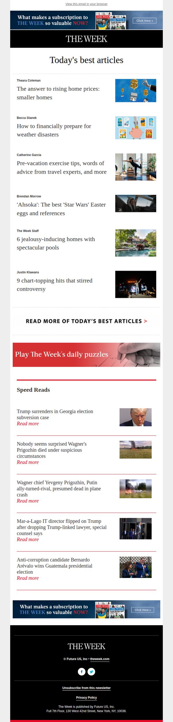
7. The Week - US: Think smaller
Objective
To drive subscription conversions by showcasing the breadth and depth of daily content available to subscribers, while positioning The Week as an indispensable source for concise, high-value news and analysis.
Why this works
The email brilliantly frames subscription value not through price alone, but by curating a compelling snapshot of daily content diversity, from policy to pop culture, making readers feel they’re missing out on essential, well-rounded insight if they don’t subscribe.
How to implement
By featuring both in-depth articles and quick-hit 'Speed Reads,' the email caters to multiple reader behaviors, those seeking deep dives and those scanning for headlines, subtly signaling that The Week adapts to your time, not the other way around.
Pro Tip
Add a countdown timer or limited-time discount near the CTA to create urgency, since the current design lacks temporal pressure that could nudge hesitant readers toward immediate subscription. • Include a short testimonial or subscriber stat (e.g., 'Join 500,000+ informed readers') near the CTA to build social proof and credibility, which is currently missing despite the strong content showcase.
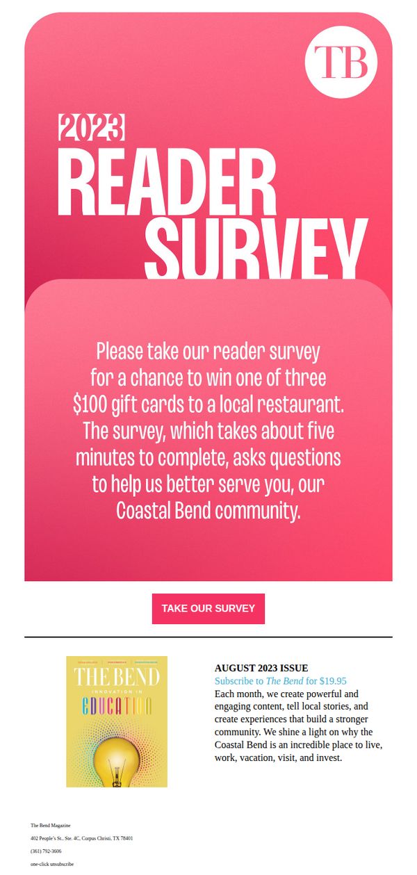
8. The Bend Magazine: Be honest, we can take it.
Objective
The email aims to encourage readers to complete a 2023 reader survey by offering an incentive, a chance to win one of three $100 gift cards, while reinforcing community connection and improving future content relevance for the Coastal Bend audience.
Why this works
The email opens with a disarmingly honest tone, 'Be honest, we can take it', which lowers reader resistance and invites authentic feedback by signaling psychological safety and genuine interest in improvement.
How to implement
By tying the survey to a tangible, locally relevant reward, $100 gift cards to local restaurants, the campaign transforms a passive request into an active, community-driven incentive that resonates emotionally and economically.
Pro Tip
Add a progress bar or estimated time counter near the CTA to reduce perceived effort, even though it says 'five minutes,' visually reinforcing low friction can increase completion rates. • Include a short testimonial or quote from a past survey respondent who benefited from changes made based on feedback, to build trust and demonstrate that reader input actually drives real improvements.
9. Tucson Lifestyles: What Seniors Say About Hacienda Living.
Objective
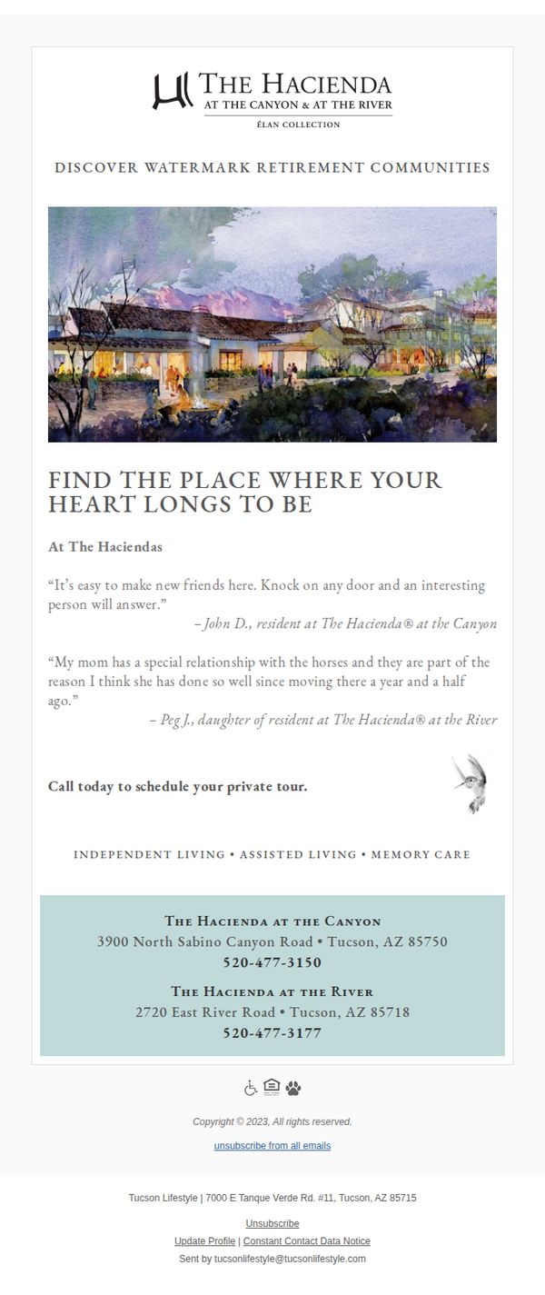
This email aims to emotionally connect with prospective senior residents by showcasing authentic resident and family testimonials, positioning The Hacienda as a warm, community-driven retirement destination that fosters meaningful relationships and personalized care. It encourages immediate action by inviting recipients to schedule a private tour.
Why this works
The email leverages heartfelt, first-person testimonials from both residents and family members to build emotional credibility, making the community feel lived-in and trustworthy rather than just marketed.
How to implement
By pairing a warm watercolor illustration of the property with soft, natural typography, the design evokes comfort and nostalgia, key emotional triggers for seniors seeking a peaceful, welcoming next chapter.
Pro Tip
Add a subtle visual cue like a phone icon or button around the CTA text to increase click-to-call conversion, especially since the primary action is phone-based and many seniors may prefer tapping over typing. • Include a brief bullet list of key amenities or lifestyle highlights (e.g., 'Daily social events • On-site wellness programs • Pet-friendly grounds') beneath the testimonials to reinforce value beyond emotional appeal.
10. Food Network: What We Really Think of Magic Spoon Cereal

Objective
This email aims to engage Food Network readers by offering authentic, editorial-style product reviews and curated gift guides, while subtly driving traffic to shoppable content and encouraging social media follows. It blends editorial credibility with commerce to build trust and guide purchasing decisions.
Why this works
The email opens with a bold, curiosity-driven headline that positions the brand as a trusted reviewer, not just a promoter, this builds credibility before asking for any action, making readers more receptive to the CTA.
How to implement
Each content block is tightly themed around a specific audience need, from gift-giving to kitchen tools, and pairs a compelling hook with a clear, benefit-driven CTA, making it easy for readers to self-select what matters most to them.
Pro Tip
Add a visual hierarchy to the hero section by increasing the font size of the headline and adding a subtle background tint behind the CTA button to make it stand out more against the white background, improving click-through potential. • Include a short testimonial or quote from a Food Network chef or editor in the Magic Spoon review section to reinforce authority and personal experience, making the 'We Tried It' claim feel more authentic and compelling.