Survey Campaign + Product Highlight email gallery from real brands

1. Industry West: 🩷 Thinking PINK today? 🩷
Objective
This email campaign aims to drive immediate sales by promoting a limited-time 20% sitewide discount using the code SUMMER, while inspiring customers to embrace bold pink and colorful design through curated product collections and designer collaborations.
Why this works
The email brilliantly uses a bold, monochromatic pink theme to instantly signal a mood shift and emotional appeal, making the color itself the hero rather than just a product attribute, which strengthens brand memorability and visual impact.
How to implement
By featuring a high-profile designer collaboration with Dani Dazey, the campaign elevates perceived value and taps into influencer-driven credibility, turning product promotion into a lifestyle narrative that feels exclusive and culturally relevant.
Pro Tip
Add a countdown timer near the primary CTA to amplify urgency, since the promotion ends August 7, this would visually reinforce the limited-time nature of the 20% discount and nudge procrastinators toward immediate action. • Include a short customer testimonial or social proof snippet under the Trixie Motel collaboration section to validate the designer’s impact and build trust, especially for shoppers unfamiliar with Dani Dazey’s work or Industry West’s collaborative credibility.
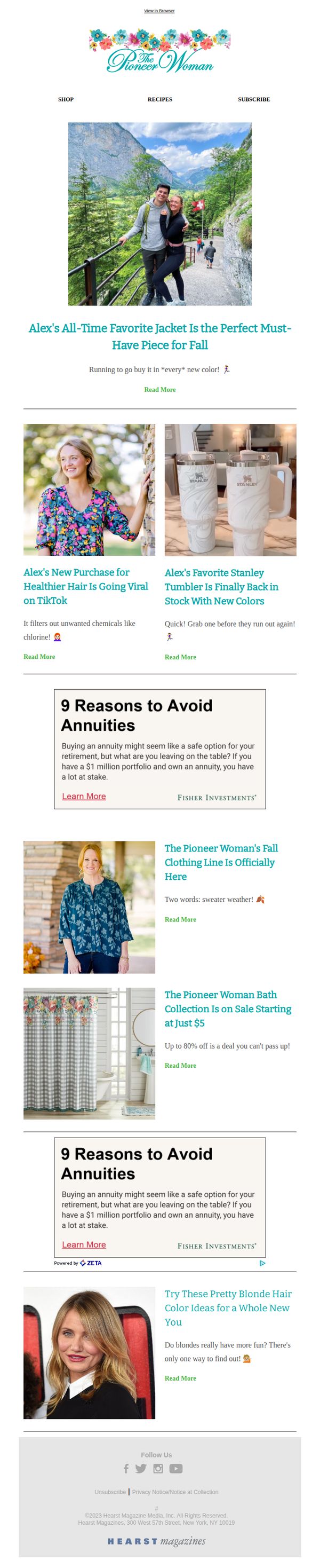
2. The Pioneer Woman: Alex thinks everyone needs this jacket for fall
Objective
This email aims to drive engagement and sales by spotlighting Alex’s personal favorite fall jacket while cross-promoting other trending products and lifestyle content, creating a sense of urgency and relatability through personal endorsement.
Why this works
The email leverages personal storytelling by featuring Alex’s favorite jacket, making the product feel trusted and emotionally resonant rather than just another item for sale, which builds immediate connection with the audience.
How to implement
By blending product highlights with lifestyle content like hair care and home goods, the campaign creates a holistic shopping experience that encourages browsing beyond the initial offer, increasing average order value through natural cross-selling.
Pro Tip
The primary CTA 'Read More' is too generic, replacing it with action-driven text like 'Shop Alex’s Favorite Jacket Now' would better align with the campaign’s goal of driving immediate purchases. • The two identical Fisher Investments ads disrupt the brand’s warm, personal tone, replacing them with user-generated content or customer reviews would reinforce trust and keep the focus on The Pioneer Woman’s curated lifestyle.
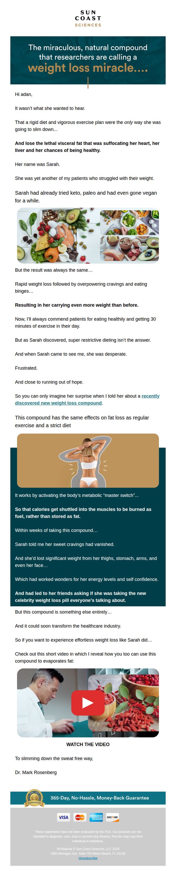
3. Sun Coast Sciences: New compound better than exercise for a slim waist?
Objective
The email aims to persuade readers that a newly discovered natural compound can deliver weight loss results comparable to exercise and diet, without the effort, by sharing a relatable patient story and prompting immediate engagement through a video reveal. It seeks to convert curiosity into action by positioning the product as a revolutionary, effortless solution.
Why this works
The email opens with a compelling patient story that humanizes the struggle with weight loss, making the reader emotionally invested before introducing the product as the unexpected solution that defied conventional methods.
How to implement
By comparing the compound’s effects to exercise and diet without requiring either, the campaign taps into deep consumer desire for effortless results, positioning the product as a revolutionary alternative rather than just another supplement.
Pro Tip
Add a brief bullet-point summary of the compound’s key benefits just before the video CTA to reinforce value for readers who may skim, ensuring the core message isn’t lost if they don’t watch the video. • Include a small visual indicator, like a progress bar or countdown timer, near the guarantee section to create urgency and subtly suggest limited availability or time-sensitive access to the offer.
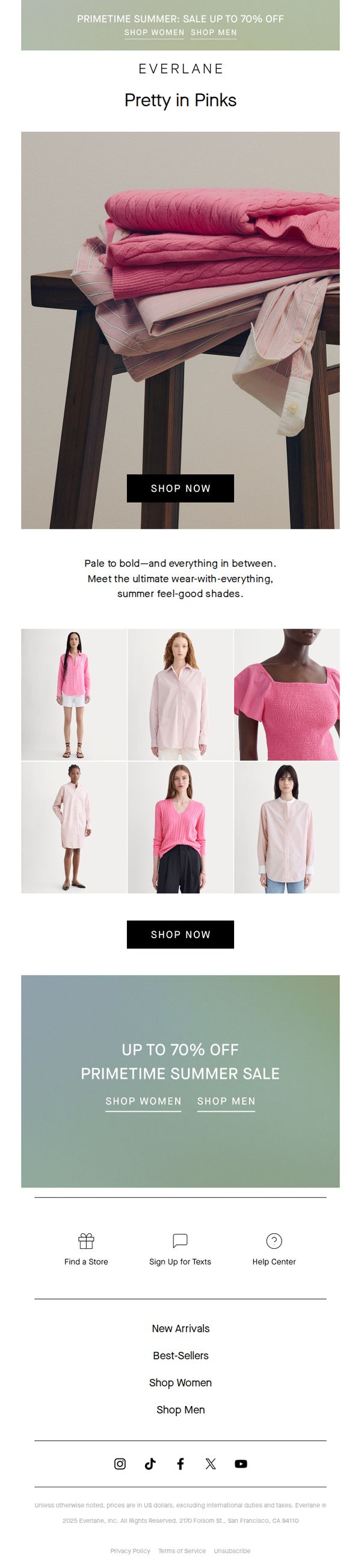
4. Everlane: Think Pink
Objective
This email aims to drive immediate sales by showcasing a curated collection of pink apparel under the 'Pretty in Pinks' theme, while reinforcing the urgency of the Primetime Summer Sale with up to 70% off. It targets customers seeking versatile, feel-good summer pieces in a range of pink tones.
Why this works
The email masterfully uses a single color story, pink, to create visual cohesion and emotional resonance, turning a seasonal sale into a curated fashion moment that feels intentional and elevated rather than just promotional.
How to implement
By featuring diverse models in a grid layout beneath a strong hero image, the campaign subtly communicates inclusivity and versatility, helping shoppers envision how each shade of pink can work for their personal style and body type.
Pro Tip
Add a subtle countdown timer or 'Sale ends soon' microcopy near the top CTA to heighten urgency and reduce hesitation, especially since the sale is time-sensitive and the current design lacks temporal pressure cues. • Include a short testimonial or customer review snippet near the product grid to build social proof, for example, '92% of customers say these pinks are their summer wardrobe staples', to reinforce trust and reduce perceived risk.
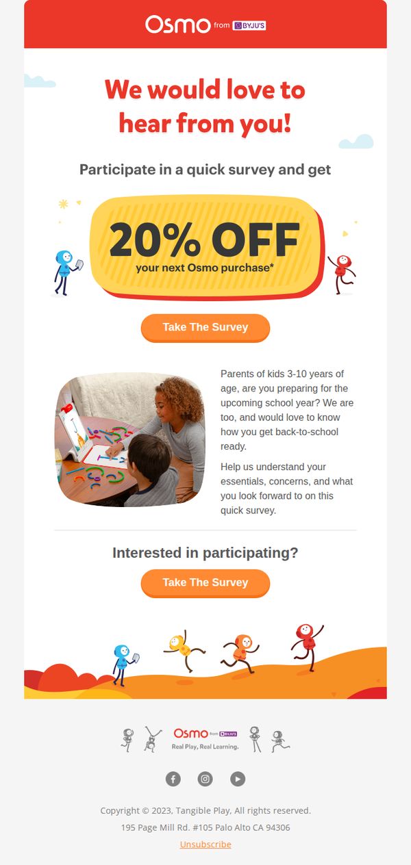
5. Osmo: Back-to-school survey: tell us your must-haves
Objective
This email aims to drive parent engagement by inviting them to complete a back-to-school survey in exchange for a 20% discount on their next Osmo purchase, while gathering insights to better tailor future product offerings and marketing efforts.
Why this works
The email brilliantly pairs emotional resonance with tangible value by acknowledging parents’ back-to-school prep stress while immediately offering a 20% discount as a thank-you for their time, making participation feel rewarding rather than burdensome.
How to implement
Using playful, childlike illustrations alongside a real-life photo of a parent and child creates a warm, relatable tone that reinforces Osmo’s brand identity as a partner in joyful, educational play, not just another toy seller.
Pro Tip
Add a subtle countdown timer or urgency cue near the CTA (e.g., 'Offer expires in 48 hours') to nudge procrastinators, since the current design lacks time-sensitive motivation despite offering a valuable discount. • Include a short bullet list or icon-based preview of the survey’s 2–3 key questions to reduce perceived effort, parents may hesitate if they don’t know what’s being asked, even if the survey is quick.
6. Cohorted: COMING SOON! The Think Pink Exclusive Edit...

Objective
This email aims to build anticipation for the upcoming Cohorted x Think Pink Beauty Box while driving immediate subscription sign-ups by highlighting exclusive product sneak peeks and time-sensitive free gifts. It also reinforces brand values through cause-related messaging and social proof.
Why this works
The email masterfully blends cause marketing with product promotion by tying the Think Pink Beauty Box to Breast Cancer Awareness Month, creating emotional resonance while driving commercial intent without feeling transactional.
How to implement
By teasing the iconic Pixi Glow Tonic as a sneak peek, the campaign leverages a cult-favorite product to build credibility and curiosity, turning a simple preview into a compelling reason to subscribe before the box launches.
Pro Tip
Add a countdown timer under the 'Coming Next Month!' headline to create urgency around the box launch, encouraging readers to act now rather than wait and potentially forget. • Replace the generic 'LEARN MORE' buttons in the middle sections with action-oriented CTAs like 'See the Full Box Contents' or 'Get Early Access' to better guide users toward conversion and reduce friction.
7. Sun Coast Sciences: “I’ve already lost 33 pounds!”

Objective
This email aims to convert skeptical readers into customers by positioning a natural weight loss supplement as a breakthrough solution that works without diet or exercise, using social proof and a doctor’s endorsement to build credibility and urgency.
Why this works
The email brilliantly leverages real user testimonials with specific, quantifiable results, like losing 33 pounds or eliminating afternoon slumps, to create emotional resonance and social proof that feels authentic and trustworthy, not promotional.
How to implement
By acknowledging skepticism upfront and validating the reader’s doubt, the email disarms resistance and positions the product as a surprising, science-backed solution rather than a miracle cure, making the persuasion feel honest and grounded.
Pro Tip
Add a visible countdown timer or urgency indicator near the CTA to reinforce scarcity and encourage immediate action, since the current design lacks time-sensitive motivation despite the high-stakes health claims. • Integrate a brief bullet-point summary of key benefits (e.g., 'No diet required • No exercise needed • Clinically studied ingredients') above the testimonials to quickly reinforce value for skimmers who may not read the full narrative.
8. Sun Coast Sciences: FINAL CALL
Objective
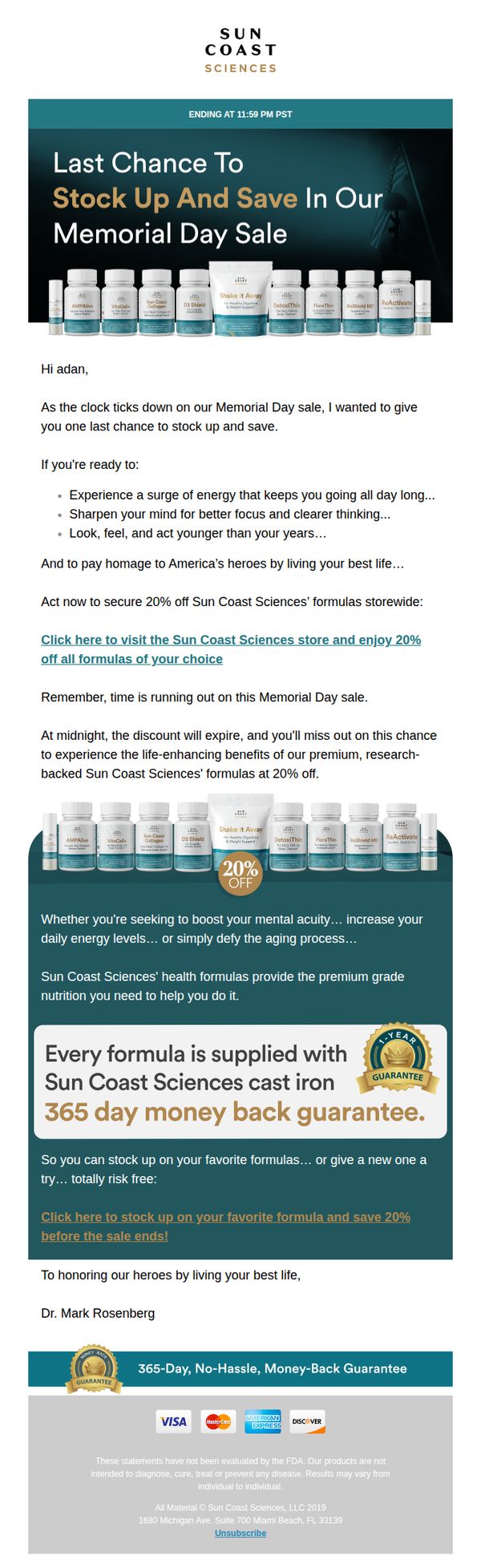
This email aims to create urgency and drive last-minute conversions by reminding subscribers that the Memorial Day sale is ending soon, while positioning the brand’s formulas as tools to enhance energy, focus, and youthfulness in honor of America’s heroes.
Why this works
The email masterfully ties the Memorial Day sale to a patriotic mission, living your best life as a tribute to heroes, which transforms a discount into an emotionally resonant call to action that feels meaningful, not just transactional.
How to implement
By listing specific lifestyle benefits like mental clarity, sustained energy, and youthful vitality, the email speaks directly to the reader’s personal aspirations, making the formulas feel indispensable rather than optional supplements.
Pro Tip
Add a visible countdown timer near the top of the email to visually reinforce urgency, as the current text-based deadline lacks the psychological impact of a real-time clock ticking down to sale expiration. • Reposition the second CTA button higher in the email, ideally below the first benefit bullet list, to reduce friction for readers who are convinced early and don’t want to scroll past repeated product images to act.
9. CAP Beauty: SH*T WE'RE DIGGING: VOLUME 175
Objective
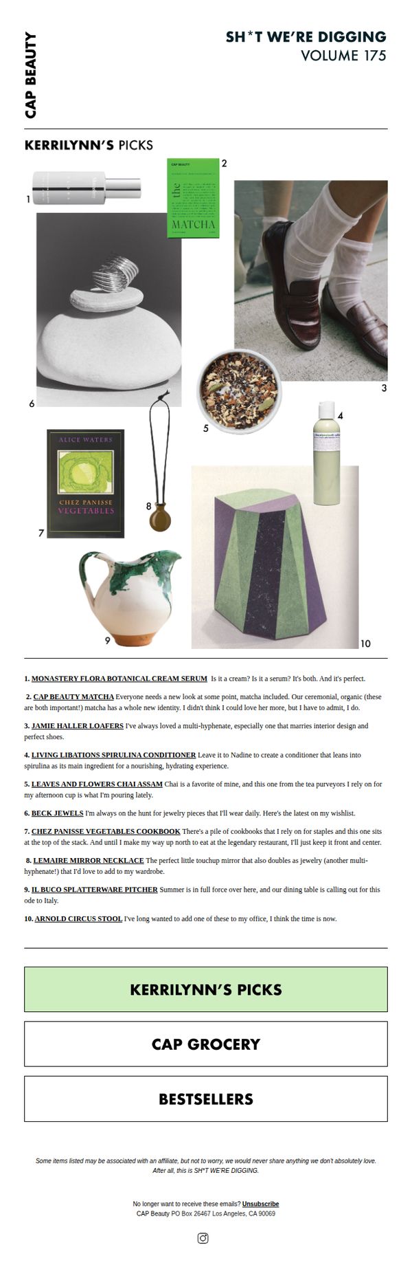
This email aims to engage subscribers by curating a personal, editorial-style selection of favorite products and lifestyle items, fostering brand affinity through authentic curation rather than direct sales. It positions CAP Beauty as a tastemaker while subtly driving traffic to explore featured items.
Why this works
The email leverages a personal, conversational tone through 'Kerrilynn’s Picks' to build trust and intimacy, making product recommendations feel like advice from a stylish friend rather than a sales pitch, which increases emotional resonance and click-through likelihood.
How to implement
By blending beauty products with lifestyle items like cookbooks and home decor, the campaign expands the brand’s perceived value beyond cosmetics, positioning CAP Beauty as a curator of holistic, elevated living, a strategy that deepens customer loyalty and broadens purchase intent.
Pro Tip
Add a subtle visual indicator or hover effect on each numbered product image to clarify that they’re clickable, reducing friction for users who may not immediately recognize the interactive nature of the grid. • Include a short, time-sensitive incentive, like 'Free shipping on Kerrilynn’s Picks this week only', beneath the CTA to nudge immediate action without compromising the editorial tone.
10. Mid-Day Squares: Make those protein bars rethink themselves…
Objective
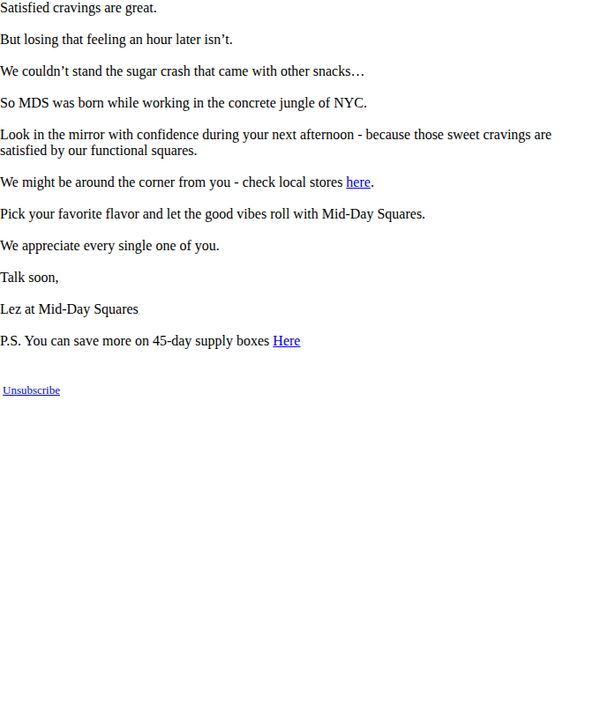
To position Mid-Day Squares as the superior, guilt-free alternative to sugary snacks by highlighting their functional benefits and emotional payoff, while driving local store visits and bulk purchases through personalized CTAs.
Why this works
The email brilliantly reframes snack cravings not as a weakness but as a signal for smarter nourishment, turning emotional hunger into a reason to choose Mid-Day Squares with confidence and joy.
How to implement
By anchoring the brand origin in the gritty reality of NYC work life, the message builds instant relatability and positions the product as a practical, empowering tool for busy professionals seeking sustainable energy.
Pro Tip
Add a visual product hero image or flavor grid to the Hero Section to immediately communicate variety and appeal, since text-only messaging misses the chance to trigger sensory desire and product recognition. • Reinforce the CTA hierarchy by making the 'check local stores here' link more prominent, perhaps with a button or bold styling, since the current underlined text risks being overlooked in a dense paragraph.