How ecommerce brands do seasonal survey campaign emails
1. Bee Inspired Clothing: Brentford FC x Bee Inspired ⚽ 🐝
Objective
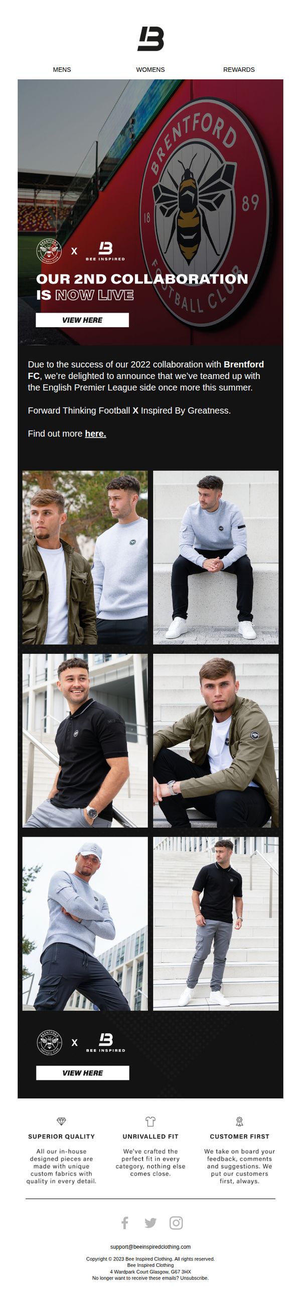
This email aims to announce and drive traffic to Bee Inspired Clothing’s second collaboration with Brentford FC, leveraging the excitement of their prior success to convert fans and fashion-conscious shoppers into buyers through a strong visual and emotional connection to the brand partnership.
Why this works
The email brilliantly leverages nostalgia and social proof by referencing the success of the 2022 collaboration, instantly validating the new drop as a must-have for fans who already trust the partnership’s quality and style.
How to implement
By placing the Brentford FC crest front and center with bold typography and a stadium backdrop, the campaign taps into tribal identity and fan loyalty, making the collection feel like an exclusive extension of the club’s brand rather than just apparel.
Pro Tip
Add a limited-time urgency element like a countdown timer or 'First 100 orders get a free pin' to the hero section to incentivize immediate clicks, since the current CTA lacks time-sensitive motivation despite the 'now live' announcement. • Include a short testimonial or social proof quote from a fan or influencer who bought the 2022 collection, placed just below the announcement paragraph, to strengthen credibility and reduce hesitation for new buyers.
2. Texas Monthly: Can Cohousing Work in Texas? These Houstonians Think So.
Objective
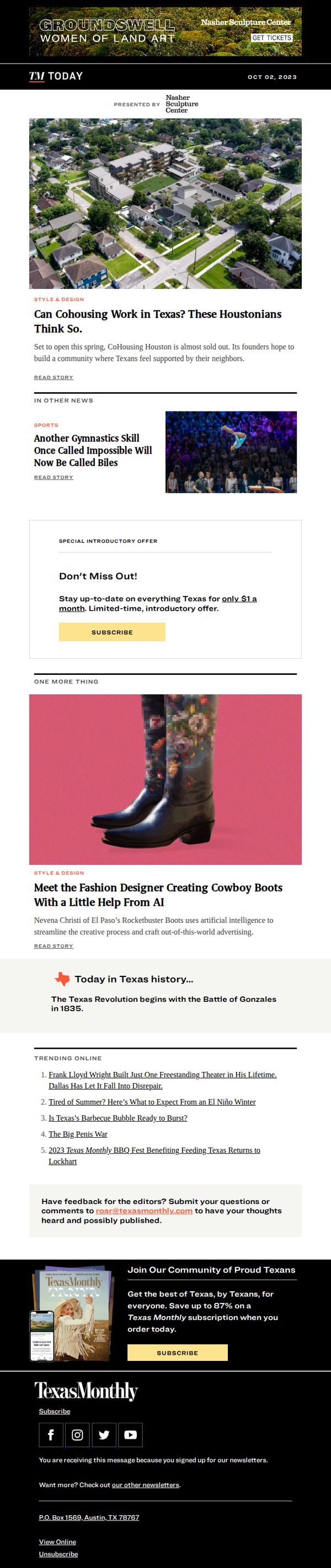
This email aims to engage Texas Monthly readers by highlighting compelling local stories that reflect Texan identity and innovation, while subtly encouraging subscription through a limited-time offer and a strong closing CTA that ties community pride to readership.
Why this works
The email opens with a visually rich, locally relevant story that immediately taps into Texan curiosity and pride, making the reader feel like they’re being let in on an insider trend shaping their own communities.
How to implement
By embedding a time-sensitive, low-friction subscription offer mid-email, Texas Monthly turns passive readers into potential subscribers without interrupting the narrative flow, making the CTA feel like a natural next step rather than a sales pitch.
Pro Tip
The hero image and headline about cohousing are strong, but adding a brief sub-headline or pull quote from a founder would increase emotional pull and give readers a reason to click beyond curiosity. • The ‘Special Introductory Offer’ section uses generic phrasing, adding social proof like ‘Join 12,000+ Texans already subscribed’ or a small badge like ‘Limited to first 500’ would boost urgency and credibility.
3. Huel: Too old to get fit? Think again 🏃
Objective
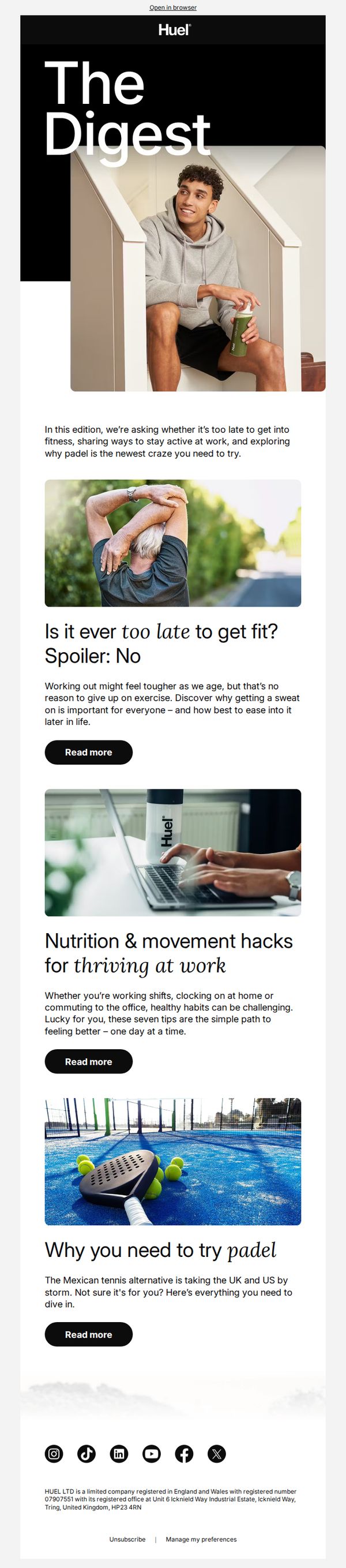
This email aims to inspire older adults to embrace fitness by debunking age-related myths and offering practical, accessible wellness tips, all while subtly positioning Huel as a supportive nutrition partner for active lifestyles at any age.
Why this works
The email opens with a bold, emotionally resonant question, 'Too old to get fit?', that immediately grabs attention by addressing a common fear, then instantly reframes it with a confident, empowering spoiler: 'No,' making the reader feel seen and motivated to keep reading.
How to implement
Each article preview pairs a relatable visual with a concise, benefit-driven headline and subhead, creating a snackable, scannable experience that respects the reader’s time while promising tangible value, whether it’s fitness after 50, workplace wellness, or trying a new sport.
Pro Tip
Add a subtle product tie-in or CTA variation under each 'Read more' button, such as 'Pair this routine with Huel’s balanced nutrition', to gently bridge educational content with conversion without disrupting the editorial tone. • Include a short testimonial or user quote under one of the article previews (e.g., from someone over 50 who started fitness with Huel) to add social proof and humanize the message, reinforcing that the advice is not just theoretical but lived and validated.
4. Original Penguin: We Think You'll Like Theses Summer Styles
Objective
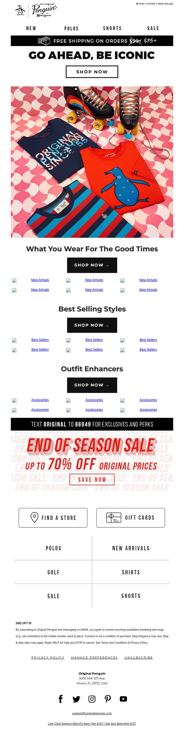
This email aims to drive summer apparel sales by showcasing curated seasonal styles and promoting an end-of-season sale with up to 70% off, while encouraging immediate action through multiple CTAs and personalized product recommendations.
Why this works
The email leverages nostalgic, lifestyle-driven visuals, like roller skates and bold graphic tees, to evoke summer memories and emotionally connect with customers, making product discovery feel like rediscovering fun rather than shopping.
How to implement
By segmenting product recommendations into themed sections like 'Best Selling Styles' and 'Outfit Enhancers,' the campaign guides users through a curated journey that reduces decision fatigue while subtly cross-selling complementary items.
Pro Tip
Replace generic 'New Arrivals' and 'Best Sellers' placeholder images with actual product visuals to increase relevance, reduce bounce rates, and reinforce trust by showing real inventory instead of repetitive stock placeholders. • Add a countdown timer beneath the 'END OF SEASON SALE' banner to amplify urgency, as the current static text lacks temporal pressure that could significantly boost conversion rates for time-sensitive offers.
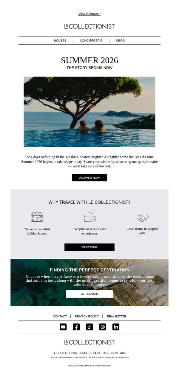
5. Le Collectionist: // What if summer started now?
Objective
The email aims to inspire early summer travel planning by inviting recipients to envision their ideal 2026 getaway through a personalized questionnaire, positioning Le Collectionist as the curator of unforgettable, tailor-made luxury vacations.
Why this works
The email masterfully blends aspirational storytelling with a low-friction CTA, inviting users to co-create their dream summer by answering a simple questionnaire, turning passive readers into active participants in their own luxury narrative.
How to implement
By framing the experience as 'The Story Begins Now,' the campaign taps into emotional anticipation rather than just transactional booking, making the act of planning feel like the first luxurious step of the vacation itself.
Pro Tip
Add a subtle countdown or urgency indicator near the 'ANSWER NOW' CTA to nudge procrastinators, for example, 'Only 72 hours to shape your 2026 summer story', to increase immediate response rates without compromising elegance. • Include a micro-testimonial or social proof element beneath the 'WHY TRAVEL WITH LE COLLECTIONIST?' section, such as a short quote from a past guest, to reinforce credibility and reduce perceived risk for first-time users.
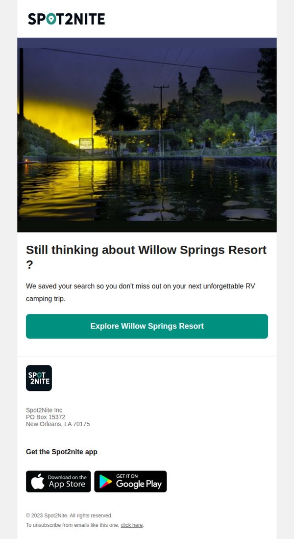
6. Spot2Nite: Still thinking about Willow Springs Resort?
Objective
The email aims to re-engage users who previously viewed Willow Springs Resort by reminding them their search was saved, encouraging them to return and book an unforgettable RV camping trip before they miss out.
Why this works
By referencing the user’s saved search, the email creates a personalized sense of continuity, making the recipient feel remembered and reducing friction in returning to complete their booking journey.
How to implement
The subject line and headline work together to trigger FOMO by implying the user is still deliberating, a smart psychological nudge that positions the resort as a desirable, time-sensitive opportunity.
Pro Tip
Add a subtle countdown timer or urgency indicator near the CTA to reinforce the 'don’t miss out' message and increase conversion pressure without being pushy. • Include a small testimonial or star rating snippet under the hero image to build social proof and reassure hesitant users about the quality of the resort experience.
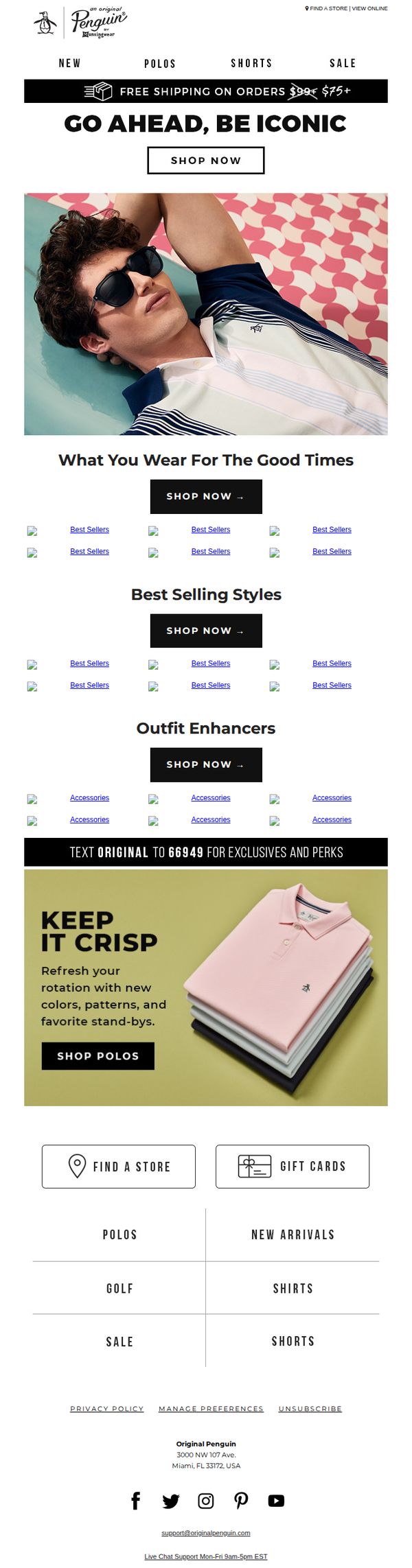
7. Original Penguin: We Think You'll Like Theses Summer Styles
Objective
This email aims to drive summer apparel sales by showcasing curated collections and best-selling styles while encouraging immediate purchases through clear CTAs and promotional offers like free shipping on orders over $75.
Why this works
The email leverages aspirational lifestyle imagery with a relaxed, sun-soaked model to emotionally connect with summer shoppers and position clothing as part of memorable experiences rather than just products.
How to implement
Strategically repeating the 'SHOP NOW' CTA beneath each product category creates multiple conversion points without overwhelming the user, making it easy to act on impulse regardless of where they scroll.
Pro Tip
Add a visible countdown timer near the free shipping offer to create urgency and encourage faster decision-making, especially since the threshold is clearly stated but lacks time-sensitive motivation. • Replace placeholder 'Best Sellers' and 'Accessories' image labels with actual product thumbnails or category previews to reduce visual ambiguity and increase click-through confidence.
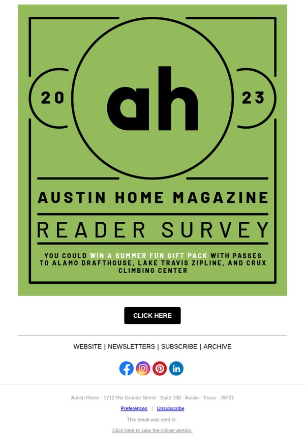
8. Austin Monthly: REMINDER: Take Our Reader Survey and You Could Win a Summer Fun Gift Pack
Objective
This email aims to remind subscribers to complete the Austin Home Magazine reader survey by highlighting a compelling incentive, a summer fun gift pack with local experience passes, to boost participation and gather valuable audience insights.
Why this works
The email leverages local experiential rewards, like passes to Alamo Drafthouse and Lake Travis Zipline, to create emotional resonance and urgency, making the survey feel less like a chore and more like a gateway to summer adventure.
How to implement
Using a bold, minimalist graphic with the year and magazine initials frames the survey as a significant annual event, subtly signaling exclusivity and encouraging readers to feel part of a curated community.
Pro Tip
Add a brief testimonial or stat like 'Over 85% of past respondents said they loved their prize!' to build social proof and reduce perceived effort by showing others benefited from participating. • Include a countdown timer or deadline (e.g., 'Survey closes in 48 hours!') near the CTA to create urgency and prevent procrastination, especially since this is a reminder email.
9. Cleveland Magazine: CLE Daily: Rethinking Our Sunscreen Staples

Objective
To engage local readers with timely, culturally relevant content while subtly promoting brand loyalty and subscription growth through curated lifestyle stories and community-driven themes.
Why this works
The email masterfully ties a local environmental concern, sunscreen’s impact on Lake Erie, to a national cultural moment (Barbie fever), making the story feel both urgent and relatable to Clevelanders’ daily lives.
How to implement
By featuring a local expert and linking to deeper research, the newsletter positions itself as a trusted, community-rooted source, not just a media outlet, building credibility while encouraging readers to explore beyond the email.
Pro Tip
The primary CTA ‘Subscribe to Cleveland Magazine’ appears too early and is visually isolated; it should be repeated at the bottom after the editorial content to capture readers who’ve been engaged by the storytelling. • The ‘Deal of the Week’ section features a product image but lacks a direct, compelling CTA button, adding a ‘Shop Now’ or ‘See the Deal’ button would improve conversion and align with the commercial intent of the section.
10. Sand & Sky: Your makeup replacement this summer
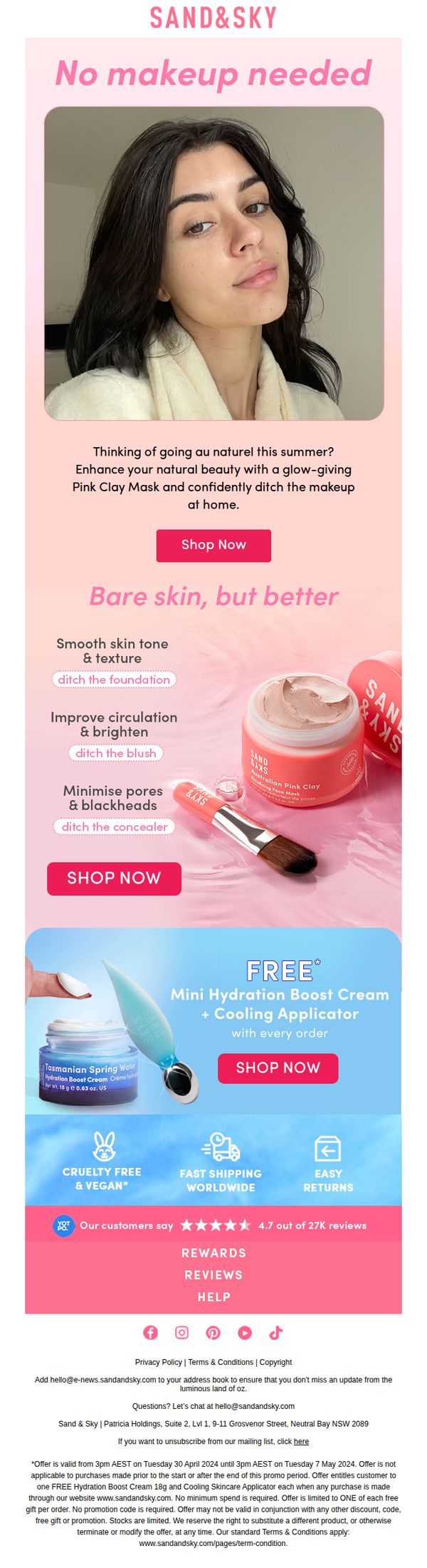
Objective
This email aims to encourage customers to embrace natural skin this summer by replacing makeup with Sand & Sky’s Pink Clay Mask, positioning it as a glow-enhancing, confidence-boosting alternative to traditional cosmetics. It drives immediate purchases through a compelling offer and social proof.
Why this works
The email brilliantly reframes skincare as a makeup replacement by using the empowering phrase 'No makeup needed', a bold, confidence-driven hook that speaks directly to summer beauty trends and the growing desire for natural radiance over coverage.
How to implement
By pairing each skin benefit, like smoothing texture or minimizing pores, with a specific makeup product to ditch, the campaign creates a clear, relatable value proposition that helps customers visualize the transformation and feel justified in swapping cosmetics for skincare.
Pro Tip
Add a countdown timer or urgency indicator near the CTA to reinforce the limited-time nature of the free gift offer, which could increase immediate click-through by leveraging FOMO without altering the existing layout or messaging. • Include a short customer testimonial quote directly under the hero image or product benefits to humanize the claims, e.g., 'I stopped wearing foundation after using this mask for a week', to strengthen emotional resonance and credibility before the CTA.