Agency testimonial email gallery from real brands




1. Pilothouse : 📦 - 5,000 Toothbrushes, One Week
Objective
This email aims to position Pilothouse as a strategic partner for scaling DTC brands by sharing actionable Meta campaign insights, real-world case studies like SURI’s toothbrush success, and thought leadership on AI’s impact, all while inviting brands to start a no-obligation conversation.
Why this works
The email brilliantly uses a meme-driven, self-deprecating tone to disarm readers while delivering hard-hitting strategy, making complex Meta campaign decisions feel approachable and urgent for growth-focused founders.
How to implement
By spotlighting SURI’s 5,000-toothbrush-in-a-week story with real data and a podcast tie-in, the email transforms a product case study into a compelling narrative that proves DTC success is replicable, even in ‘boring’ categories.
Pro Tip
The primary CTA 'let's talk' is buried mid-email and lacks visual prominence; relocating it to the top-right of the hero section with a contrasting button color would capture attention before readers scroll past. • The podcast section includes a YouTube and Spotify link but omits a direct embedded player or timestamped highlight, adding a 60-second audio clip would increase engagement and reduce friction for time-constrained founders.
2. Klick: February at Klick: Rare Disease, Women’s Health & What’s Next
Objective
This email aims to inform subscribers about Klick Health’s February initiatives, achievements, and thought leadership in rare disease and women’s health, while reinforcing brand credibility through awards and team recognition to nurture long-term engagement and trust.
Why this works
The email strategically ties industry awareness months like Rare Disease and Women’s Health to Klick’s thought leadership, transforming calendar events into compelling narratives that position the brand as a proactive innovator rather than a passive observer.
How to implement
By spotlighting internal team members’ accolades and conference participation, the email humanizes the brand and builds credibility through social proof, subtly signaling to prospects that Klick attracts and empowers top-tier talent in healthcare marketing.
Pro Tip
The CTA 'Get in Touch' is generic and lacks urgency or value proposition; rephrase it to reflect the email’s content, such as 'Explore Our Rare Disease Solutions' or 'See How We’re Advancing Women’s Health,' to better align with the reader’s context and intent. • The 'News & Awards' section lists multiple honors without visual hierarchy or emotional emphasis; consider adding small icons, bolded names, or a 'Featured Award' highlight to draw attention to the most prestigious recognitions and reinforce brand authority.
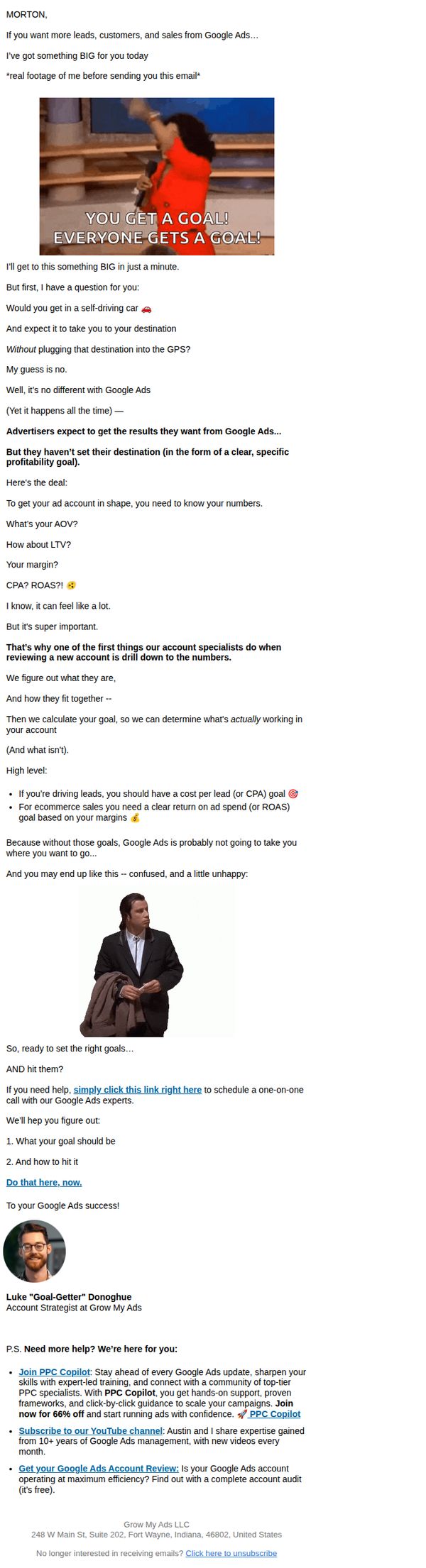
3. Grow My Ads : Are You Making This (Costly) Google Ads Mistake? 😱
Objective
This email aims to educate Google Ads advertisers on the critical mistake of running campaigns without clear profitability goals, and to drive them toward scheduling a free consultation with Grow My Ads to set measurable, goal-driven KPIs that align with business outcomes.
Why this works
The email brilliantly uses a pop culture reference, the 'You Get a Goal!' meme, to instantly grab attention and frame goal-setting as both urgent and universally relevant, making a technical marketing concept feel personal and emotionally resonant.
How to implement
It masterfully simplifies complex Google Ads metrics like CPA, ROAS, and LTV by comparing them to driving a self-driving car without a destination, creating a memorable analogy that helps overwhelmed advertisers instantly grasp why goal-setting is non-negotiable for campaign success.
Pro Tip
The primary CTA is buried mid-email and lacks visual emphasis; redesigning it with a contrasting button and placing it after the problem-solution narrative would significantly increase conversion rates by reducing friction for motivated readers. • The email relies heavily on text and lacks visual hierarchy, adding icons, bolded key metrics, or a simple infographic to illustrate the goal-setting framework would improve scannability and reinforce the educational value for time-pressed advertisers.
4. 5 & Vine: The Unmistakable Brands Review
Objective
This email introduces 'The Unmistakable Brands Review,' a year-long editorial series designed to help impact-driven brands build trust, relevance, and integrity by tackling quarterly brand challenges. It invites readers to engage by nominating brands and following the journey.
Why this works
The email brilliantly frames brand-building as a quarterly journey with clear thematic pillars, Clarity, Resonance, Alignment, Leadership, giving readers a structured, digestible roadmap to follow rather than overwhelming them with abstract theory.
How to implement
By inviting readers to nominate brands, the campaign transforms passive subscribers into active participants, fostering community ownership and creating a feedback loop that deepens engagement while sourcing real-world case studies for future content.
Pro Tip
The primary CTA 'Submit a Brand' is buried mid-email and visually underwhelming; it should be repeated above the fold with stronger visual contrast and urgency cues to increase conversion from interested readers. • The 'Why now?' section lacks emotional anchoring, adding a brief customer quote or statistic about brand confusion in 2026 would strengthen the rationale and make the problem feel more immediate and relatable.
5. Ski Line: Book Now For Winter 2026/2027 | From £759pp
Objective
This email aims to drive early bookings for the 2026/2027 ski season by highlighting limited-time offers, exclusive savings, and resort variety to encourage immediate action before peak availability disappears.
Why this works
The email strategically positions urgency by emphasizing that ‘the best holidays won’t hang around long,’ which taps into FOMO while subtly reinforcing the value of early planning for discerning travelers.
How to implement
Each offer is anchored with a clear saving figure, like ‘Save £50pp’ or ‘Up to £75pp Off’, making the financial benefit instantly digestible and emotionally compelling without requiring mental calculation from the reader.
Pro Tip
Add a countdown timer near the hero section or above the first CTA to visually reinforce the urgency of the July 31st offer deadline, increasing perceived scarcity and prompting faster decisions. • Reposition the ‘Enquire Now’ button closer to each individual offer block instead of only at the mid-page break, reducing friction for users who want to act immediately on specific deals.
6. Ski Line: Club Med Winter 2026/2027 ❄ On Sale Now! ❄ Save Up To 20%

Objective
This email aims to drive immediate bookings for Club Med’s 2026/2027 winter ski holidays by highlighting limited-time discounts of up to 20%, while emphasizing family-friendly amenities and inclusive packages to appeal to parents planning ahead.
Why this works
The email brilliantly combines urgency with value by front-loading the 20% discount and a 4-day countdown, creating psychological pressure without sacrificing clarity on what’s included in each all-inclusive package.
How to implement
Each resort listing is visually anchored with high-res photos of both slopes and amenities, which reassures potential customers that luxury and family fun coexist, perfect for overcoming hesitation in high-ticket travel decisions.
Pro Tip
Add a small countdown timer under the hero section to reinforce urgency visually, since the 4-day window is mentioned but not dynamically displayed, which could increase immediate click-through rates. • Include a short testimonial or star rating near the top of the product grid to build trust early, many users may not scroll far enough to see the footer’s Platinum Trusted Service Award, missing social proof.
7. Ski Line: Large Catered Chalets For 26/27 | From £407pp

Objective
This email aims to drive bookings for large, catered ski chalets for the 2026/2027 season by targeting groups seeking luxury, convenience, and shared experiences, while creating urgency around limited availability and peak dates.
Why this works
The email brilliantly frames large chalets not just as accommodations, but as curated group experiences, emphasizing shared meals, cozy amenities, and stress-free logistics to emotionally resonate with families and friend groups planning ski trips.
How to implement
By prominently displaying real-time pricing, seasonal variations, and sold-out indicators, the campaign builds credibility and urgency, subtly nudging readers to act before prime dates vanish, a smart psychological trigger for high-intent travelers.
Pro Tip
The primary CTA 'Enquire Now' is buried below multiple chalet listings; moving a sticky or floating CTA button to the top-right of the hero section would capture high-intent users immediately without scrolling. • The product grid lacks visual hierarchy, chalets with sold-out dates or premium amenities (like pools or hot tubs) should be visually highlighted with badges or color-coded tags to guide decision-making faster.
8. Thrive Internet Marketing Agency: How Negative Online Word-of-Mouth Can Hurt Businesses in 2026 📉

Objective
This email aims to educate businesses on the risks of negative online word-of-mouth while positioning Thrive as the solution through reputation management and PPC expertise. It drives conversions by offering free resources and demos to capture leads and build trust.
Why this works
The email opens with a fear-based but data-backed hook about negative word-of-mouth, immediately creating urgency and relevance for business owners who rely on public perception to drive sales and retention.
How to implement
Each content block is paired with a highly specific, benefit-driven CTA that matches the reader’s inferred intent, whether they’re worried about reviews, ad fatigue, or agency selection, making the journey feel personalized and frictionless.
Pro Tip
The primary CTA 'Get My Free Proposal' appears only once at the bottom; adding a sticky or repeated CTA button after each major section would capture attention earlier and reduce drop-off for readers who don’t scroll fully. • The 'Education Section' on PPC ad fatigue lacks a visual hierarchy, using bullet points or icons to break down symptoms (e.g., falling CTR, rising CPC) would make the content scannable and increase retention for time-poor business owners.
9. Thrive Internet Marketing Agency: The Rise of ‘Silent Churn’ Hidden in Online Customer Reviews 🔎

Objective
This email aims to educate B2B marketers on the hidden threat of 'silent churn' revealed through online reviews while positioning Thrive as the solution through a free demo and social media resources. It seeks to convert readers into leads by offering actionable tools and social proof.
Why this works
The email opens with a compelling, industry-specific pain point, 'silent churn', that immediately resonates with B2B marketers who may not realize how customer disengagement hides in plain sight within online reviews, making the message instantly relevant and urgent.
How to implement
By embedding a free RFP template and LinkedIn strategy guide within the content flow, the email delivers immediate value before asking for commitment, building trust and positioning Thrive as a helpful authority rather than just a sales-driven agency.
Pro Tip
The primary CTA 'SCHEDULE MY FREE DEMO NOW' appears mid-email but lacks visual hierarchy compared to secondary CTAs; increasing its size, contrast, or adding a subtle animation would better guide users toward the desired action without competing with other offers. • The email presents multiple offers (RFP template, LinkedIn guide, demo) without clear prioritization; adding a numbered or tiered visual cue (e.g., 'Step 1: Download Template → Step 2: Book Demo') would streamline the user journey and reduce decision fatigue.
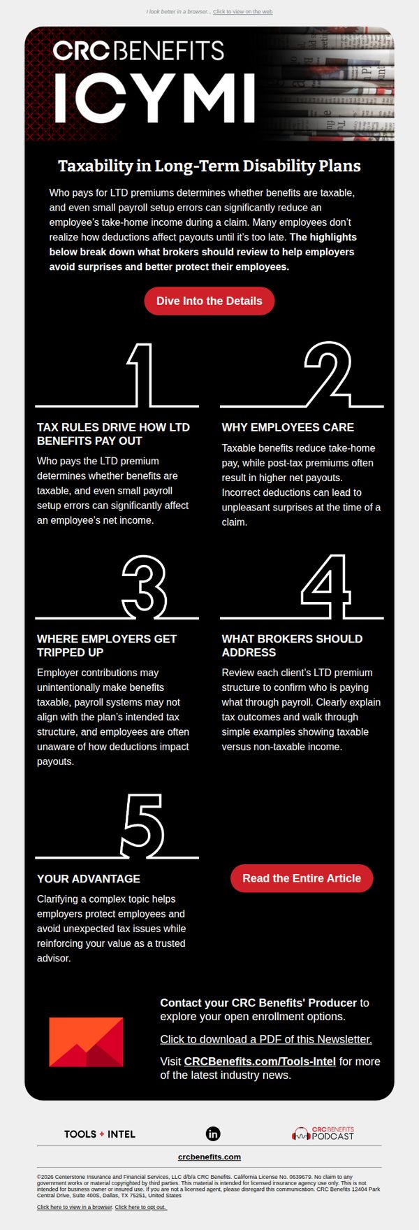
10. CRC Benefits (formerly BenefitMall): Countdown to Open Enrollment: Get Your Clients Ready Now
Objective
This email aims to educate brokers on the tax implications of long-term disability plans to help them better advise employers and avoid payroll surprises during open enrollment. It positions CRC Benefits as a trusted advisor by offering actionable insights and resources.
Why this works
By breaking down complex tax rules into five digestible numbered sections, the email transforms a dense financial topic into an approachable, scannable guide that empowers brokers to act confidently with their clients.
How to implement
The email strategically positions the brand not as a sales entity but as a trusted advisor, using educational content to build credibility and reinforce the value of proactive planning before open enrollment begins.
Pro Tip
Add a subtle countdown timer near the CTA to reinforce urgency around open enrollment, visually anchoring the subject line’s ‘Countdown’ promise and encouraging immediate action. • Include a short testimonial or client quote under the ‘Your Advantage’ section to humanize the value proposition and demonstrate real-world impact of CRC Benefits’ advisory role.