Fashion testimonial email gallery from real brands




1. Cupshe: Fuzzy & Eye-Catching Pieces 👀
Objective
To drive immediate sales by showcasing best-selling and new fashion items with layered discounts, while encouraging app downloads and loyalty sign-ups through exclusive offers and gamified engagement.
Why this works
The email brilliantly layers multiple discounts, from 30% off bestsellers to 50% off clearance, creating a sense of urgency and value stacking that compels shoppers to act immediately rather than wait.
How to implement
By featuring a gamified 'Spin to Win' wheel alongside tangible rewards like $35 for $0.99, the campaign transforms passive browsing into active engagement, making the customer feel like they’re playing to win rather than just shopping.
Pro Tip
The 'Hello, savings!' section visually clusters three different discount tiers (10-30%, 30-50%, over 50%) without clear segmentation, which could confuse users, consider using distinct card borders or icons to differentiate each offer’s scope and eligibility. • The CTA 'SHOP NOW' appears multiple times but lacks visual hierarchy; consider using a contrasting button color or animation on the primary hero CTA to ensure it stands out as the first action point above all others.
2. Desmond and Dempsey: Delighting Between The Years
Objective
This email aims to convert post-holiday shoppers into buyers by framing the 'between the years' period as a cozy, guilt-free time to indulge in self-care and rest, while promoting discounted luxury loungewear and sleep accessories to encourage immediate purchase.
Why this works
The email brilliantly reframes the post-holiday lull as a luxurious, intentional pause, not a gap to fill, but a moment to savor with indulgent products that support relaxation and comfort, making the sale feel emotionally resonant rather than transactional.
How to implement
By pairing each product with a lifestyle vignette, from cozy socks for hikes to silk eye masks for naps, the campaign transforms functional items into narrative-driven experiences, subtly guiding customers to envision how each piece enhances their personal downtime.
Pro Tip
Add a subtle countdown timer near the CTA to reinforce urgency for the 'End of Season Sale', the current phrasing implies limited-time value but lacks a visual trigger to prompt immediate action. • Integrate a customer testimonial or social proof snippet beneath the first product image to validate the comfort and quality claims, especially since the brand’s luxury positioning relies heavily on perceived experience and trust.
3. Desmond and Dempsey: An Ode To Idleness
Objective
This email campaign aims to reframe January as a season of intentional rest and comfort, encouraging recipients to embrace idleness by purchasing Desmond & Dempsey’s cozy loungewear and sleepwear collections. It positions the brand as a luxurious companion for slow, indulgent moments.
Why this works
The campaign brilliantly reframes post-holiday lethargy as a luxury worth investing in, transforming emotional fatigue into a desirable aesthetic that aligns perfectly with the brand’s cozy, elevated loungewear identity.
How to implement
Each product is positioned not just as apparel but as a ritual enabler, whether it’s slipping into slippers to do nothing or wrapping in a robe to watch a movie, making the purchase feel experiential and emotionally resonant.
Pro Tip
Add a subtle countdown or limited-time offer tag near the CTA to create urgency around the 'cosy collections,' since the current message lacks a time-bound incentive to act immediately. • Integrate a small visual cue or icon next to the Klarna and referral offers to increase their visibility, currently, they’re buried in text and may be overlooked by users scanning for payment or sharing options.
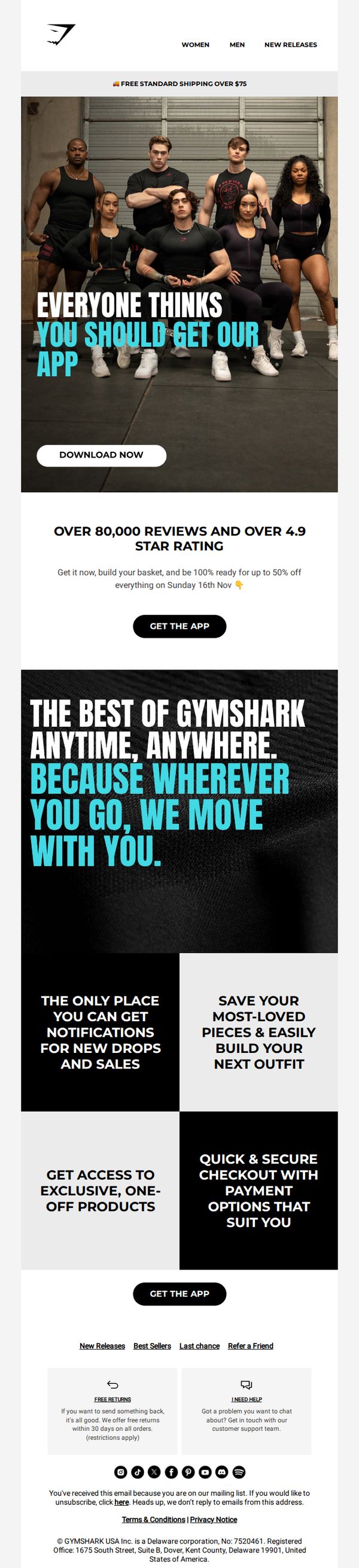
4. Gymshark - US: Black Friday 🤝 The Gymshark app
Objective
This email aims to drive app downloads by positioning the Gymshark app as essential for Black Friday shopping, highlighting exclusive deals, personalized notifications, and seamless checkout to convert subscribers into active app users.
Why this works
The email brilliantly ties app adoption to a time-sensitive Black Friday sale, making the download feel urgent and valuable rather than optional, which increases conversion likelihood by aligning user behavior with promotional momentum.
How to implement
By showcasing real customer reviews and a 4.9-star rating upfront, the campaign builds instant credibility and social proof, reassuring skeptical users that downloading the app is a trusted, community-backed decision rather than a marketing gimmick.
Pro Tip
Add a countdown timer near the 'Get the App' CTA to reinforce urgency around the Sunday 16th Nov sale, visually anchoring the time-sensitive offer and reducing decision latency for hesitant users. • Reposition the second 'Get the App' button higher in the flow, perhaps after the benefit grid, to reduce scroll depth required for conversion, especially since the hero CTA is visually separated from the persuasive content below.
5. Commonry: Save the date: your exclusive preview
Objective
This email aims to build anticipation and drive attendance for Commonry’s exclusive Digital Styling Event by highlighting its unique value, early access to the new collection, expert styling advice, and live shopping, all while reinforcing brand prestige through curated guest hosts.
Why this works
The email leverages exclusivity and celebrity-style credibility by naming recognizable hosts, which elevates perceived value and taps into audience trust before the event even begins, making the invitation feel like a VIP pass rather than a promotional blast.
How to implement
By clearly stating the event’s triple benefit, previewing new arrivals, receiving styling advice, and shopping live, the email transforms a simple date announcement into a compelling experience that answers the reader’s ‘What’s in it for me?’ before they even click through.
Pro Tip
Add a countdown timer beneath the 'SAVE THE DATE' CTA to create urgency and reinforce the event’s proximity, which would visually nudge recipients to act sooner rather than later, especially since the event date is over a week away. • Include a brief teaser image or icon grid of 2–3 standout pieces from the new collection to spark visual desire and give recipients a tangible reason to attend, bridging the gap between curiosity and commitment.
6. Lazy Oaf: DIGITAL DISTRACTIONS: FESTIVE EDITION 🎄☃️

Objective
This email aims to entertain and engage subscribers during the holiday season by curating quirky, internet-inspired content that aligns with Lazy Oaf’s offbeat brand identity, while subtly driving traffic to product pages through themed sections and CTAs.
Why this works
Lazy Oaf brilliantly leans into internet culture by transforming memes and viral moments into relatable holiday content, making their brand feel like a trusted friend who gets your chaotic festive energy instead of just selling you products.
How to implement
By framing everyday household items as festive DIY ornaments and turning snack reviews into cultural commentary, the email creates a playful narrative that makes shopping feel like joining an inside joke rather than responding to a sales pitch.
Pro Tip
Add a visual countdown timer or seasonal urgency indicator near the product grid to convert casual browsers into buyers by leveraging holiday FOMO without compromising the playful tone. • Integrate a personalized subject line or dynamic content block (e.g., ‘Based on your last purchase, you’ll love this festive twist’) to increase relevance and click-through by aligning with individual browsing or purchase history.
7. Hello Molly: Our In-Office International Women's Day Celebrations

Objective
This email aims to humanize the Hello Molly brand by showcasing their internal International Women’s Day celebration, fostering emotional connection through team stories and self-care moments, while subtly promoting new arrivals and brand values.
Why this works
The email brilliantly blends brand storytelling with product promotion by framing staff celebrations as authentic moments of empowerment, making the brand feel relatable and emotionally resonant without overt sales pressure.
How to implement
Including real team Q&A responses adds a layer of vulnerability and authenticity that builds trust, readers don’t just see models in dresses, they connect with the people behind the brand who share personal, uplifting perspectives.
Pro Tip
Add a secondary CTA button beneath the TikTok link, such as 'Shop the Looks from Our IWD Celebration', to directly convert emotional engagement into product exploration without requiring users to scroll further. • Include a short, bolded stat or quote in the hero section, like '100+ team members celebrated together', to immediately convey scale and energy, reinforcing the brand’s community-driven ethos before diving into visuals.
8. Cupshe: GET UP TO AN EXTRA 35% OFF!

Objective
This email aims to drive immediate sales by promoting a limited-time discount of up to 35% off across multiple categories, while also encouraging app downloads, SMS sign-ups, and loyalty program enrollment to boost long-term customer retention and repeat purchases.
Why this works
The email masterfully combines urgency with visual storytelling by leading with a bold red banner and real-time pricing, making the discount feel immediate and irresistible while showcasing aspirational lifestyle imagery that connects emotionally with the target audience.
How to implement
By segmenting product categories into a clean, grid-based layout with clear labels like 'One-Pieces' and 'Cover-Ups,' the email reduces decision fatigue and guides shoppers intuitively through their desired style journey without overwhelming them with too many options at once.
Pro Tip
Add a countdown timer beneath the 'EXTRA 35% OFF' headline to amplify urgency and create a stronger psychological trigger for immediate action, especially since the offer lacks a visible expiration date. • Reposition the 'SHOP NOW' CTA button to appear directly under each featured product in the hero section, rather than only at the bottom, to reduce friction and capitalize on impulse buying behavior while users are visually engaged.
9. Cupshe: We Dare You To Find Better Deals!

Objective
This email aims to drive urgency and conversions by promoting Black Friday discounts of up to 90% off, while also encouraging holiday shopping and app downloads through layered incentives and gamified engagement.
Why this works
The email masterfully combines urgency with visual hierarchy by placing a bold, neon-green 'sale' headline over a high-contrast black-and-white photo, immediately signaling value while drawing the eye to the primary CTA.
How to implement
By segmenting product categories like dresses and swimwear into distinct visual grids with seasonal labels, the email guides users intuitively through relevant collections without overwhelming them, increasing the likelihood of targeted clicks.
Pro Tip
Add a visible countdown timer in the hero section to reinforce urgency beyond the 'Black Friday' text, leveraging psychological scarcity to push immediate action before the sale ends. • Reposition the 'Shop for Christmas' section higher in the email flow, ideally after the hero but before swimwear, to better align with seasonal shopping intent and capitalize on gift-buying momentum.
10. Lululemon: New drop, starring iridescence

Objective
This email aims to drive immediate engagement with Lululemon’s new iridescent accessory collection while cross-promoting Cyber Monday deals, encouraging both new product discovery and seasonal urgency through visual storytelling and targeted CTAs.
Why this works
The email brilliantly uses aspirational lifestyle imagery to transform accessories from functional items into statement pieces, making the iridescent bags feel like must-have fashion icons rather than mere add-ons.
How to implement
By embedding Cyber Monday promotions within the same flow as new product launches, the campaign creates a dual incentive, novelty and savings, that caters to both trend-driven and deal-seeking shoppers without diluting either message.
Pro Tip
Add a subtle countdown timer under the Cyber Monday banner to heighten urgency, since the current design relies solely on text and lacks a visual cue to reinforce time-sensitive action. • Include a short customer testimonial or social proof near the iridescent accessory hero section to validate the product’s appeal beyond aesthetics, perhaps a quote like ‘These bags turn heads at the gym and on the street.’