How Healthcare Services brands do testimonial emails
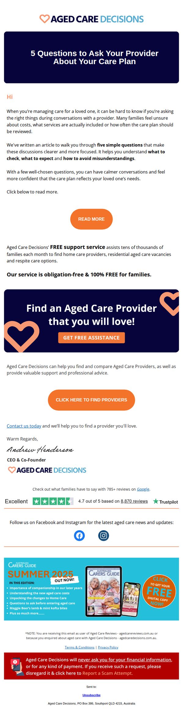

1. Aged Care Decisions: , are you asking the right care plan questions?
Objective
This email aims to empower families managing aged care by guiding them through essential questions to ask providers, while positioning Aged Care Decisions as a trusted, free support service that simplifies provider selection and reduces emotional stress during decision-making.
Why this works
The email opens with an empathetic tone that acknowledges the emotional weight of aged care decisions, instantly building trust by validating the reader’s uncertainty rather than jumping into sales or solutions too quickly.
How to implement
By framing the core content as five simple, actionable questions, the campaign transforms overwhelming complexity into manageable guidance, making the reader feel supported and equipped, not overwhelmed or judged for their lack of knowledge.
Pro Tip
Add a subtle countdown timer or urgency cue near the 'GET FREE ASSISTANCE' CTA to encourage faster action, especially since the service is positioned as timely and emotionally supportive during high-stress decision windows. • Include a short bulleted list under the hero section summarizing the five key questions to preview value upfront, this improves scannability and reinforces the educational promise before the reader clicks through.
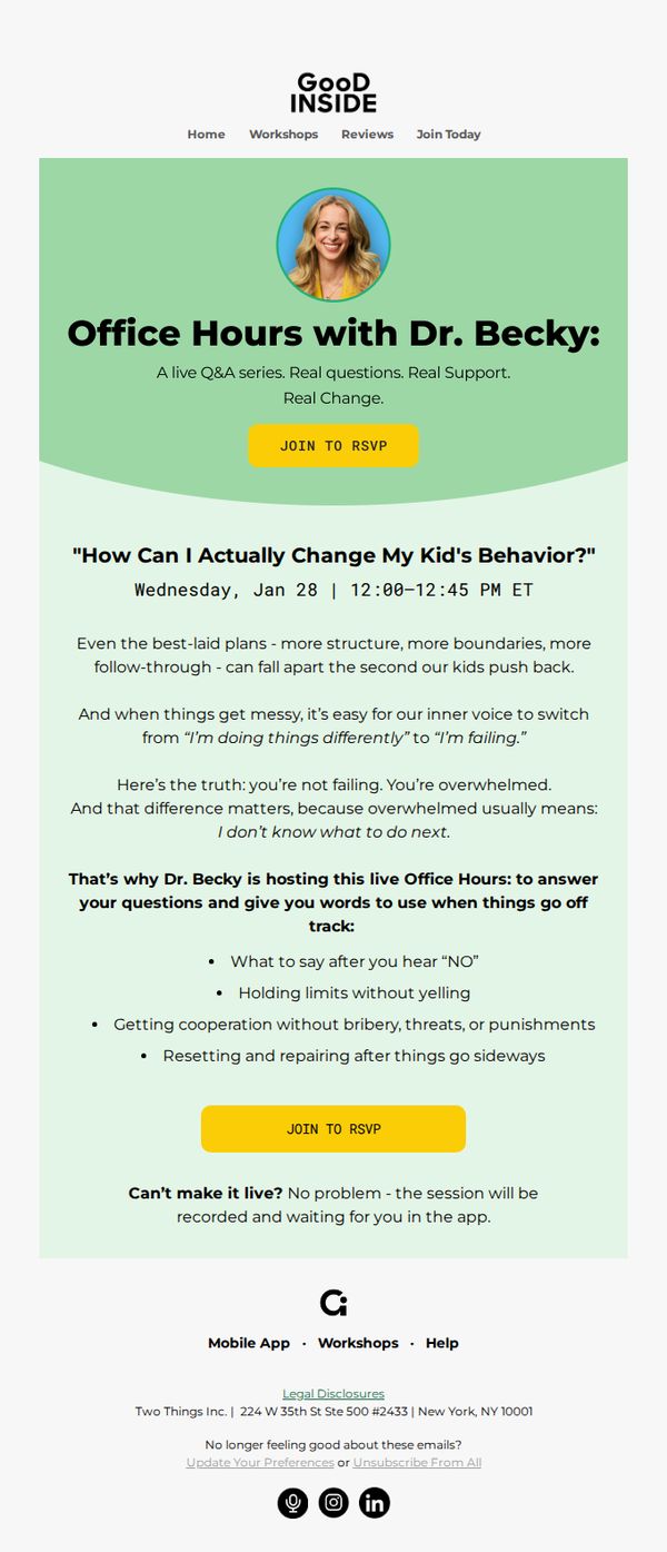
2. Good Inside: More pushback lately? Ask Dr. Becky!
Objective
This email aims to drive attendance to a live Q&A session with Dr. Becky, offering emotional support and practical strategies for parents struggling with children’s behavioral pushback, while reinforcing the brand’s empathetic, solution-oriented voice.
Why this works
The email opens with an emotionally resonant question that mirrors the reader’s daily struggle, instantly validating their experience and creating a sense of being seen before offering a solution.
How to implement
By framing the session as a live ‘Office Hours’ event with Dr. Becky, the campaign positions the brand as a trusted, accessible mentor rather than a distant expert, fostering intimacy and trust.
Pro Tip
Add a subtle countdown timer near the CTA to create urgency and reinforce the live nature of the event, especially since the session date is over a week away and may feel distant to recipients. • Include a short testimonial or quote from a past attendee near the bullet points to socially validate the session’s impact, helping skeptical or time-strapped parents justify attending.
3. Randox Health : Your monthly update with Randox Health🗓️
Objective
This email aims to keep subscribers informed and engaged by delivering curated, evidence-based health insights while gently guiding them toward booking personalized health tests. It blends educational content with strategic service promotion to reinforce Randox Health’s authority and drive conversions.
Why this works
By anchoring each health topic to real-world research and media coverage, the email builds credibility while making complex medical concepts feel accessible and urgent, encouraging readers to trust Randox Health’s guidance over generic online advice.
How to implement
The consistent use of dual CTAs, 'Read Article' for education and 'Book Now' for conversion, creates a frictionless journey that respects the reader’s intent while strategically nudging them toward action without feeling pushy or salesy.
Pro Tip
Add a visual progress bar or countdown timer near the 10% discount CTA to create urgency and reduce decision fatigue, especially since the offer is time-sensitive and buried near the footer. • Reposition the Trustpilot review section higher in the email, perhaps after the first article, to leverage social proof earlier in the journey, increasing trust before readers encounter conversion prompts.
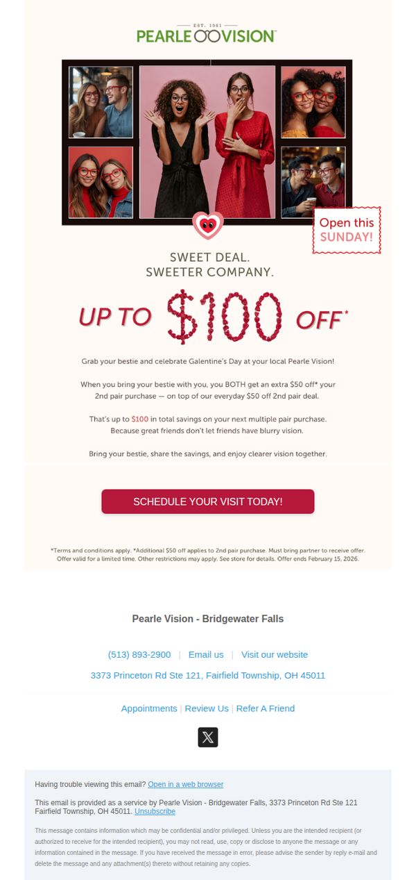
4. Pearle Vision: Sweet Deal. Sweeter Company. Up to $100 off!
Objective
This email aims to drive in-store visits by encouraging customers to bring a friend for a shared Valentine’s Day discount, leveraging social bonding to increase purchase volume and customer retention through a limited-time offer.
Why this works
The campaign brilliantly ties emotional connection to a practical discount, positioning eyewear as a shared experience rather than a solo purchase, which increases perceived value and drives dual conversions.
How to implement
By framing the offer around ‘Galentine’s Day’ and using candid photos of friends laughing together, the email taps into cultural trends while making the promotion feel personal, joyful, and socially relevant.
Pro Tip
Add a small countdown timer or urgency badge near the CTA to reinforce the February 15 deadline visually, since the current text-based reminder is buried at the bottom and easily missed. • Include a brief testimonial or customer quote near the offer section, such as ‘My bestie and I saved $100 and got matching frames!’, to build social proof and reduce hesitation around bringing a friend.
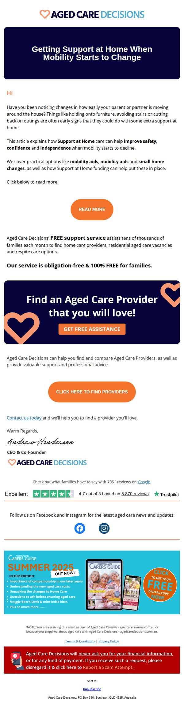
5. Aged Care Decisions: , noticing changes in your loved one's mobility?
Objective
This email aims to gently alert caregivers to early signs of declining mobility in loved ones and position Aged Care Decisions as a trusted, no-obligation resource for finding tailored home care support. It seeks to convert concern into action by offering free, personalized assistance with provider matching.
Why this works
The email opens with empathetic, observational language that validates the reader’s concerns, framing mobility changes as common, early signs rather than alarming red flags, which reduces defensiveness and builds trust before introducing solutions.
How to implement
It strategically separates educational value from the sales offer: first explaining how support at home improves safety and independence, then introducing the free service as a natural next step, making the CTA feel helpful, not pushy.
Pro Tip
Add a brief, bulleted list under the 'READ MORE' CTA highlighting 2–3 specific mobility aids or home modifications mentioned in the article to give immediate value and reduce friction for readers unsure whether to click. • Reposition the 'CLICK HERE TO FIND PROVIDERS' button higher, ideally directly under the hero section, to reduce scroll depth for users already primed to act, since the current layout buries the primary conversion point.
6. Aesthetic Medicine : MPs call for urgent licensing of non-surgical cosmetic procedures in new Commons report

Objective
This email aims to inform professionals in the aesthetic medicine industry about urgent regulatory developments in the UK, while also promoting engagement with industry events, sponsored content, and magazine subscriptions to reinforce brand authority and drive traffic to key offerings.
Why this works
The email opens with a high-impact regulatory headline that immediately signals urgency and relevance to industry professionals, creating instant engagement by tying the brand to policy-level conversations that affect daily practice and compliance.
How to implement
By blending hard news with sponsored clinical content and event promotion, the email positions the brand as a central hub for both education and commerce, subtly guiding readers from awareness to action without disrupting the editorial tone or trust.
Pro Tip
The primary CTA 'Read more' is generic and underwhelming for a high-stakes regulatory story; it should be rephrased to reflect urgency or consequence, such as 'See how this affects your clinic' or 'Read the full Commons report now' to increase click-through intent. • The layout buries the AM Awards ticket CTA beneath a sponsored ad and a tragic news story, which dilutes its emotional appeal; reordering to place the celebratory 'Book Tickets' section immediately after the hero would better capitalize on reader momentum and industry pride.
7. Aged Care Decisions: , how long do you have to wait before your Home Care Services start?
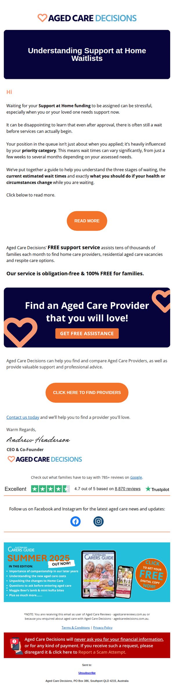
Objective
This email aims to alleviate anxiety around wait times for Home Care Services by educating recipients on the support queue process, while positioning Aged Care Decisions as a trusted, free guide to help families find suitable providers quickly and confidently.
Why this works
The email brilliantly reframes a stressful waiting period into an educational journey, using empathetic language to validate the recipient’s anxiety while positioning the brand as a calm, authoritative guide through bureaucratic uncertainty.
How to implement
By anchoring the CTA in emotional reassurance, 'Find an Aged Care Provider that you will love!', the campaign transforms a transactional service into a relationship-driven promise, making the offer feel personal, not procedural.
Pro Tip
Add a countdown timer or urgency indicator near the 'GET FREE ASSISTANCE' CTA to encourage immediate action, especially since wait times are a core pain point, this would leverage scarcity psychology to reduce procrastination. • Integrate a brief FAQ or 'What to Expect Next' section after the 'READ MORE' button to preempt common follow-up questions, reducing friction and increasing the likelihood of conversion by making the next steps feel predictable and safe.
8. Pearle Vision: We're Open, Warm, and Ready for You ❄️
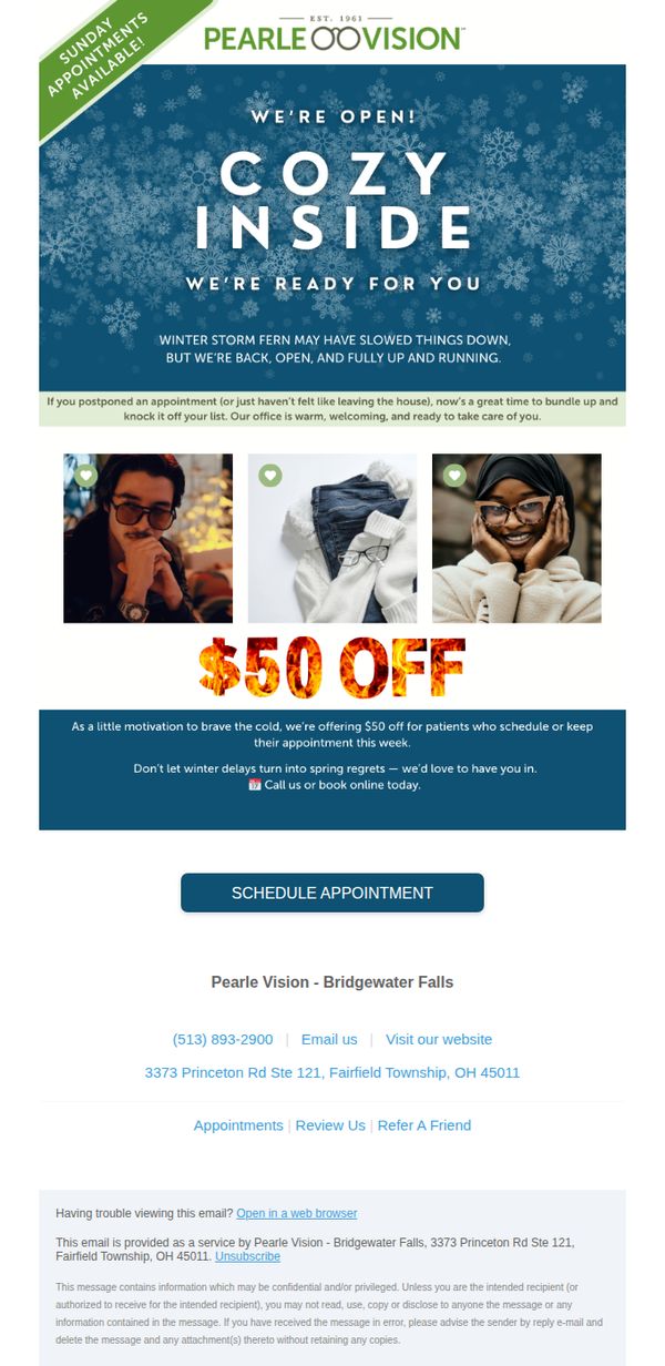
Objective
To re-engage customers who may have postponed eye care appointments during winter weather by offering a timely $50 discount, encouraging them to book while emphasizing a warm, welcoming in-office experience.
Why this works
The email cleverly ties seasonal discomfort, winter storms and staying indoors, to a compelling reason to act now, transforming weather-related delays into a persuasive motivator for booking eye care appointments.
How to implement
By using warm, human-centered visuals and phrases like 'cozy inside' and 'we’re open, warm, and ready for you,' the campaign emotionally reassures customers that the experience will be comforting, not clinical or rushed.
Pro Tip
Add a countdown timer or urgency indicator near the CTA to reinforce the limited-time nature of the $50 offer, increasing conversion by leveraging scarcity psychology. • Include a brief testimonial or patient quote near the offer section to build social proof and reduce perceived risk, especially for those hesitant to return post-winter delays.
9. Aged Care Decisions: CHSP vs Support at Home: What’s the difference?
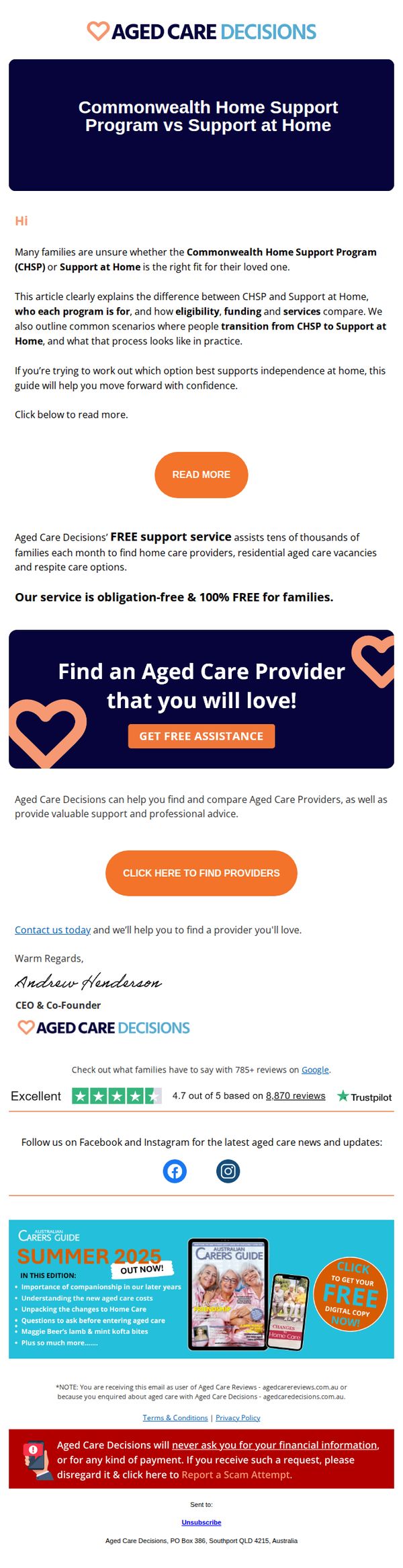
Objective
This email aims to educate families on the key differences between CHSP and Support at Home programs, helping them make informed decisions about aged care options while positioning Aged Care Decisions as a trusted, free guidance resource to assist with provider selection.
Why this works
The email opens with a clear, empathetic hook that acknowledges family uncertainty around aged care programs, immediately establishing relevance and trust by addressing a real emotional pain point before diving into educational content.
How to implement
By framing the comparison as a practical guide rather than a sales pitch, the email positions the brand as a helpful advisor, subtly building authority while encouraging engagement through a low-barrier CTA that promises clarity, not commitment.
Pro Tip
Add a brief visual comparison table or icon-based breakdown between CHSP and Support at Home directly in the email body to reduce cognitive load and help readers quickly grasp key differences without clicking through. • Reposition the 'GET FREE ASSISTANCE' CTA higher in the flow, perhaps immediately after the hero section, to capture interest while readers are still emotionally engaged, rather than waiting until after the educational content.
10. Doctor On Demand : Don’t need care right now? We’re here whenever you do.
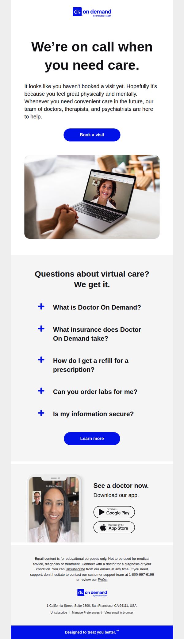
Objective
This email aims to gently re-engage users who haven’t yet booked a virtual care visit by reassuring them that support is available whenever needed, while subtly encouraging immediate action through clear CTAs and educational content. It positions Doctor On Demand as a reliable, on-demand healthcare partner rather than pushing urgency.
Why this works
The email opens with empathetic, non-pushy language that assumes the recipient is healthy, turning a potential point of friction into a moment of trust and emotional alignment, which makes the CTA feel supportive rather than salesy.
How to implement
By structuring FAQs as expandable accordions with bold, benefit-driven questions, the email reduces cognitive load while proactively addressing common barriers to virtual care adoption, making the service feel more accessible and trustworthy.
Pro Tip
Add a subtle social proof element, such as a short testimonial or stat like '95% of users feel better after their first visit', near the CTA to reduce hesitation and reinforce credibility without overwhelming the clean layout. • Include a secondary CTA like 'See how it works in 60 seconds' linked to a short explainer video or animated walkthrough, placed just below the FAQ section, to engage users who need more context before booking.