Testimonial email designs from top brands: Hungryroot
1. 20 minutes to dinnertime
Objective
This email aims to convert hungry, time-pressed customers by showcasing how Hungryroot’s pre-chopped ingredients and simple recipes can turn hunger into a delicious meal in under 20 minutes, while incentivizing first-time orders with a 40% discount.
Why this works
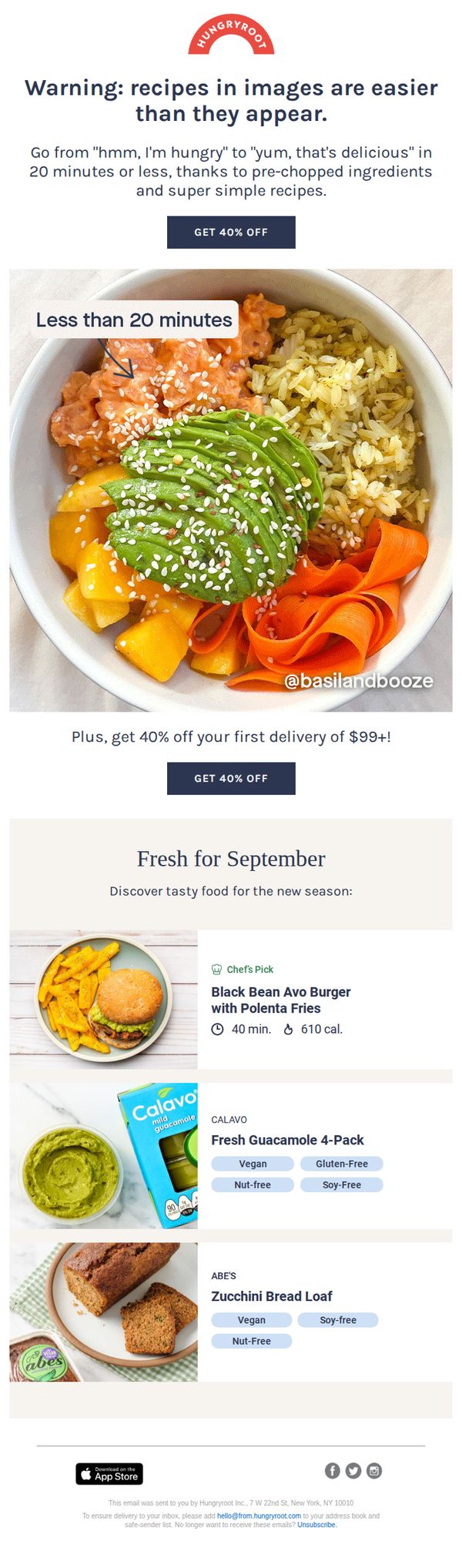
The email opens with a playful warning that recipes look harder than they are, immediately lowering perceived effort and building trust by addressing the reader’s skepticism about quick meals actually tasting good.
How to implement
By anchoring the offer to a specific time frame, 'Less than 20 minutes', the campaign taps into urgency and convenience, making the value proposition feel immediate and achievable for busy consumers.
Pro Tip
Add a subtle countdown timer near the CTA to reinforce urgency, since the offer is time-sensitive (first delivery), a visual timer could nudge procrastinators to act before the discount expires. • Include a short testimonial or user-generated photo near the hero image to build social proof, seeing real people enjoying the meal would strengthen credibility beyond just the @basilandbooze credit.
2. Eat well all day, easily
Objective
The email aims to convert new customers by showcasing how Hungryroot makes healthy eating effortless throughout the day, while incentivizing sign-ups with a time-sensitive 40% discount on the first delivery of $99+.
Why this works
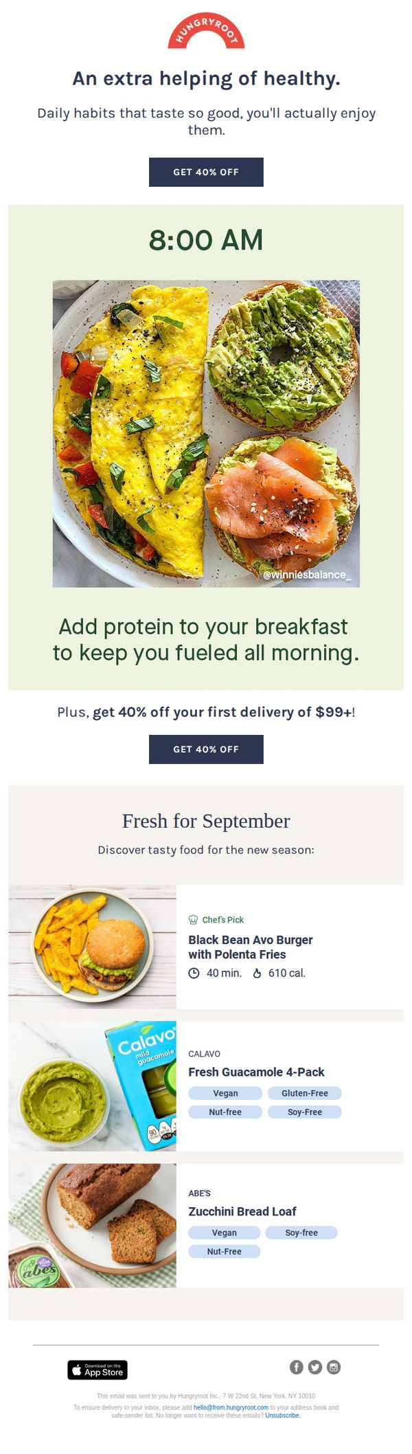
By anchoring the campaign to a specific time of day, 8:00 AM, the email creates an immediate, relatable context that makes healthy eating feel achievable and integrated into daily routines rather than aspirational.
How to implement
The strategic repetition of the 40% discount offer, once in the hero section and again after the breakfast visual, reinforces urgency without being pushy, subtly guiding the reader toward conversion through visual rhythm and placement.
Pro Tip
Add a subtle countdown timer near the CTA to amplify urgency around the 40% discount, especially since the offer is tied to a first delivery threshold, this would nudge hesitant users to act before the perceived window closes. • Include a short testimonial or social proof near the breakfast section (e.g., '92% of members say they eat healthier since joining') to validate the claim that these meals are both tasty and sustaining, strengthening emotional buy-in.
3. 20 minutes to dinnertime
Objective
The email aims to convert hungry, time-pressed customers by showcasing how Hungryroot’s pre-chopped ingredients and simple recipes deliver delicious meals in under 20 minutes, while incentivizing first-time orders with a 40% discount on deliveries of $99 or more.
Why this works
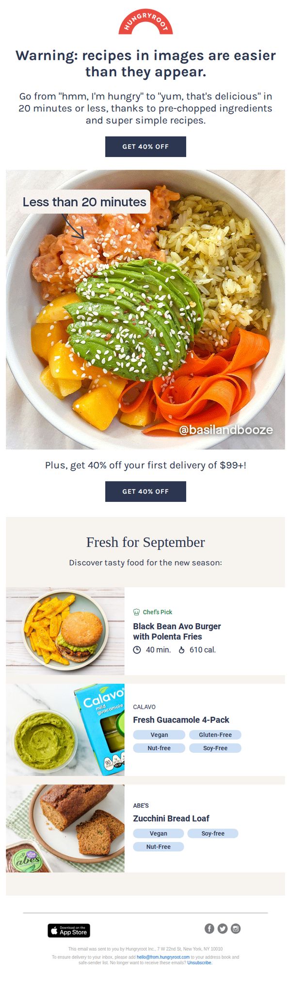
By opening with a playful warning that recipes are easier than they look, the email instantly disarms skepticism and positions the brand as approachable, making the 20-minute promise feel achievable rather than gimmicky.
How to implement
The hero image is strategically annotated with 'Less than 20 minutes' and a social handle, blending time-saving proof with social validation, a smart visual cue that reinforces speed and credibility without cluttering the message.
Pro Tip
Add a subtle countdown timer or urgency indicator near the CTA to amplify the '20 minutes to dinnertime' theme, this would visually reinforce speed and scarcity, nudging hesitant users toward immediate action. • Include a short testimonial or user rating under the 'Chef’s Pick' item to build trust around the 40-minute prep claim, social proof here would strengthen perceived reliability of the time-saving promise.
4. 20 minutes to dinnertime
Objective
The email aims to convert hungry, time-pressed customers by showcasing how Hungryroot’s pre-chopped ingredients and simple recipes deliver delicious meals in under 20 minutes, while incentivizing first-time orders with a 40% discount on deliveries over $99.
Why this works
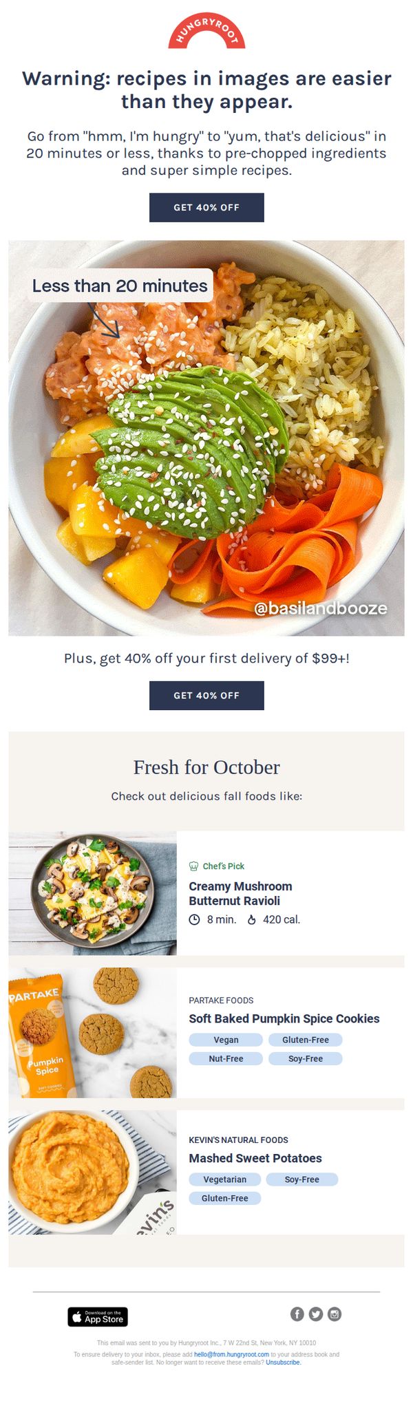
The email opens with a playful warning that recipes are easier than they look, a clever psychological hook that disarms skepticism and primes the reader for a frictionless cooking experience, making the value proposition instantly relatable to busy home cooks.
How to implement
By anchoring the offer to a specific time-saving benefit, 'Less than 20 minutes', the campaign transforms a generic discount into a tangible lifestyle upgrade, positioning the brand not just as a food provider but as a time-saving solution for modern meal stress.
Pro Tip
Add a subtle countdown timer or urgency indicator near the 'GET 40% OFF' CTA to increase conversion pressure, especially since the offer is tied to a first delivery, this would leverage scarcity psychology without disrupting the clean layout. • Include a short testimonial or social proof snippet under the hero image (e.g., '92% of customers say dinner’s ready in under 20 mins') to reinforce credibility and reduce perceived risk for new users considering their first order.
5. Build healthy habits for life
Objective
This email aims to encourage new users to adopt long-term healthy eating habits by positioning Hungryroot as a daily solution that makes nutritious meals effortless and enjoyable, while incentivizing sign-up with a limited-time 40% discount on the first delivery.
Why this works
By framing healthy eating as a daily, sustainable habit rather than a short-term diet, this email emotionally connects with users who want lasting lifestyle change, not just quick fixes.
How to implement
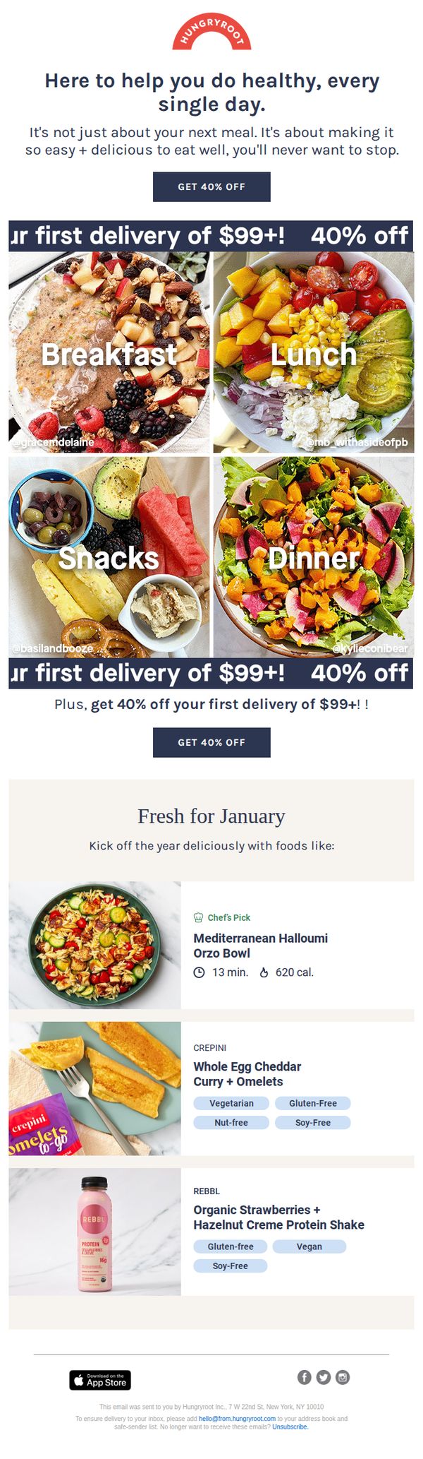
The visual grid of breakfast, lunch, snacks, and dinner meals effectively demonstrates variety and convenience, reassuring users that Hungryroot covers all eating occasions without requiring meal planning.
Pro Tip
Add a countdown timer near the CTA to create urgency around the 40% discount, which would increase conversion by leveraging time-sensitive FOMO without altering the core offer. • Include a short customer testimonial or rating next to the 'Chef’s Pick' or protein shake to reinforce social proof within the product grid, helping users overcome skepticism about taste or quality.
6. 20 minutes to dinnertime
Objective
This email aims to convert hungry, time-pressed customers by showcasing how Hungryroot’s pre-chopped ingredients and simple recipes deliver delicious meals in under 20 minutes, while incentivizing first-time orders with a 40% discount on deliveries of $99 or more.
Why this works
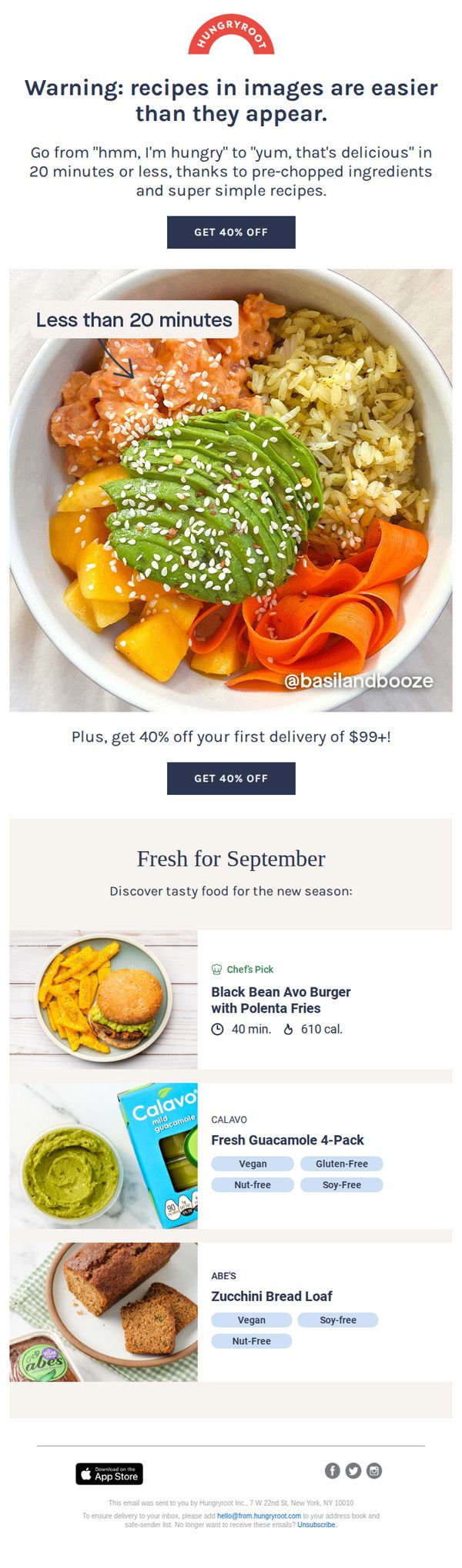
The email brilliantly reframes meal prep from a chore into a quick win by using the phrase 'Less than 20 minutes' directly on the hero image, visually anchoring the core benefit where the eye naturally lands.
How to implement
By pairing a bold discount with a minimum order threshold ($99+), Hungryroot encourages higher basket value while still making the offer feel generous, a smart psychological nudge that balances urgency with perceived value.
Pro Tip
Add a subtle countdown timer near the CTA to amplify urgency, since the offer is time-sensitive, a visual reminder like 'Offer expires in 48 hours' would increase conversion without cluttering the layout. • Include a micro-testimonial or social proof badge (e.g., 'Loved by 50K+ home cooks') near the hero image to reinforce credibility and reduce skepticism about the '20-minute' claim.
7. Throw out your to-do list
Objective
The email aims to reduce the perceived effort of meal planning by positioning Hungryroot as a stress-free solution that eliminates grocery shopping and prep, while incentivizing sign-ups with a 40% discount on the first delivery.
Why this works
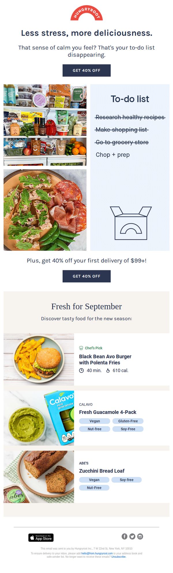
By reframing meal prep as a burdensome to-do list and then visually erasing it, the email creates an emotional hook that positions Hungryroot not just as a food service, but as a lifestyle simplifier that restores calm and control.
How to implement
The strategic repetition of the 40% discount across two prominent CTAs reinforces urgency and value without feeling pushy, leveraging psychological anchoring to make the first delivery feel like a no-brainer investment in personal well-being.
Pro Tip
Add a subtle countdown timer next to the 'GET 40% OFF' CTA to create urgency without disrupting the clean layout, encouraging immediate action before the discount feels like a missed opportunity. • Include a short testimonial or social proof snippet under the hero section, such as '92% of new members say they saved 5+ hours/week', to validate the stress-reduction claim with real user outcomes.
8. Throw out your to-do list
Objective
This email aims to reduce the friction of meal planning by positioning Hungryroot as the solution to eliminating stressful food prep tasks, while incentivizing sign-ups with a time-sensitive 40% discount on the first delivery.
Why this works
The email brilliantly reframes meal prep as a source of stress rather than a chore, making the emotional payoff of convenience feel like a luxury rather than just a time-saver, which elevates the perceived value of the service.
How to implement
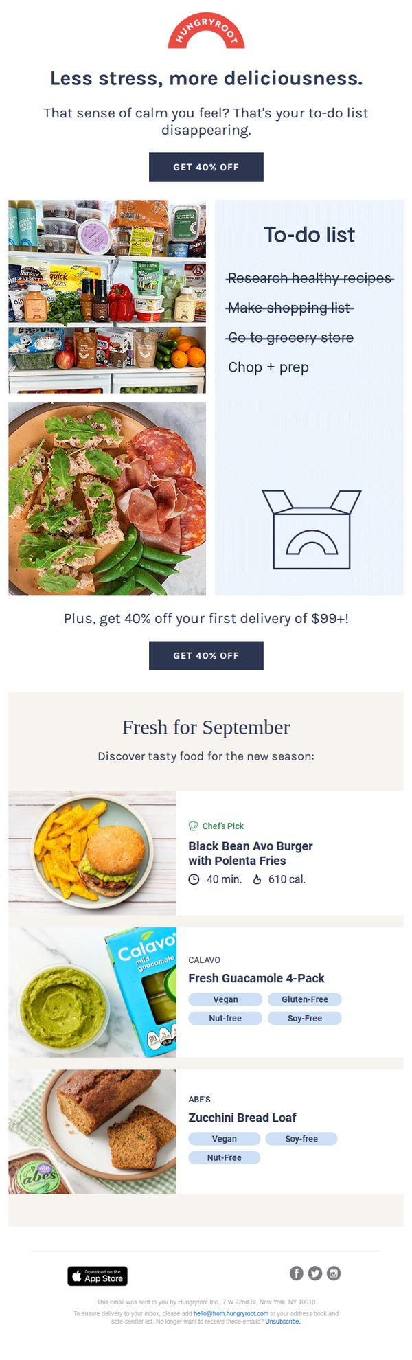
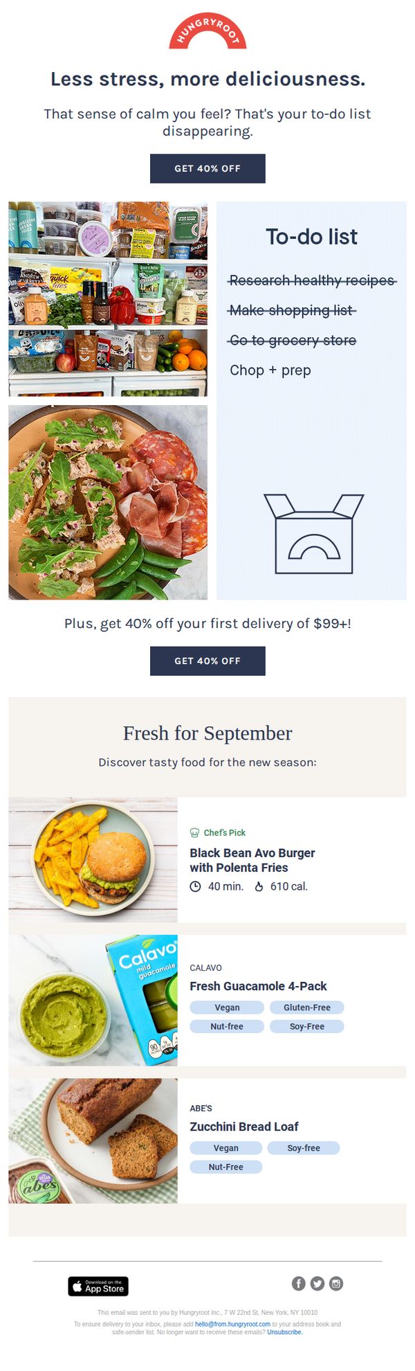
By visually contrasting a cluttered fridge and a to-do list with a clean, delicious plated meal, the email creates an instant emotional contrast that makes the customer feel the relief of switching to Hungryroot without needing to explain it.
Pro Tip
Add a subtle countdown timer near the CTA to reinforce urgency around the 40% discount, since the current design relies solely on text and may not trigger immediate action from hesitant subscribers. • Include a short testimonial or social proof near the product grid to build trust, since the email highlights new seasonal items, a customer quote like 'I tried the Black Bean Burger and it’s now my weekly go-to!' would validate quality and reduce hesitation.
9. Throw out your to-do list
Objective
This email aims to reduce the friction of meal planning by positioning Hungryroot as the solution to eliminating stressful food prep tasks, while incentivizing sign-ups with a time-sensitive 40% discount on the first delivery.
Why this works
By reframing meal prep as a burdensome to-do list and then visually erasing it, the email taps into emotional relief rather than just convenience, making the value proposition feel deeply personal and immediately satisfying.
How to implement
The dual CTA placement, once above the fold and again after the product showcase, strategically captures both impulse-driven and consideration-stage readers, reinforcing urgency without overwhelming the user with repetitive messaging.
Pro Tip
Add a subtle countdown timer near the CTA to amplify urgency around the 40% discount, since the current design relies solely on text and lacks a visual trigger that encourages immediate action. • Include a short testimonial or social proof snippet under the hero section, such as '92% of new members say they saved 5+ hours/week', to validate the stress-reduction claim with real user outcomes.
10. Throw out your to-do list
Objective
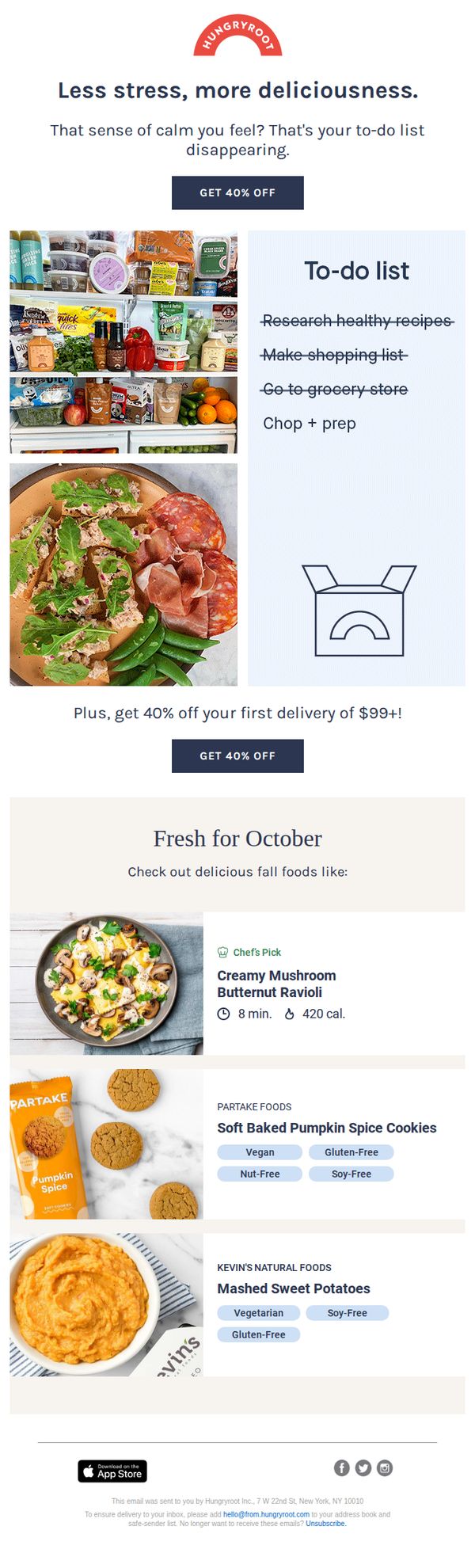
The email aims to reduce the perceived effort of meal planning and preparation by positioning Hungryroot as a stress-free, delicious solution that eliminates grocery shopping and cooking chores. It incentivizes first-time customers with a 40% discount to convert interest into immediate action.
Why this works
By reframing meal prep as a burdensome to-do list and then visually erasing it with a delivery box, the email emotionally resonates with busy consumers who crave simplicity and instant relief from daily kitchen stress.
How to implement
The dual CTA placement, once above the fold and again after the product showcase, strategically reinforces urgency and value, ensuring the discount remains top-of-mind even after the user scrolls past the initial emotional hook.
Pro Tip
Add a subtle countdown timer next to the 40% off CTA to create urgency, since the offer lacks a time limit and may not motivate immediate action from hesitant subscribers. • Include a short testimonial or social proof near the product grid to build trust, especially for first-time buyers, by showing real users who’ve successfully replaced their to-do list with Hungryroot’s convenience.