How Lifestyle brands do testimonial emails that build trust
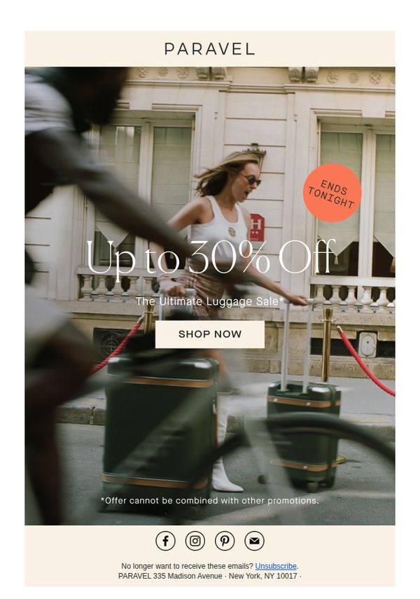




1. Paravel: Only 6 Hours Left: The Ultimate Luggage Event
Objective
This email aims to drive immediate urgency-driven purchases by highlighting a limited-time sale on luggage, leveraging time-sensitive messaging and a bold discount to convert subscribers before the offer expires tonight.
Why this works
The email masterfully combines motion blur photography with a crisp, centered discount message to create visual urgency while keeping the product front and center, making the offer feel both dynamic and trustworthy.
How to implement
By placing a bright orange 'ENDS TONIGHT' badge in the top-right corner, the campaign visually anchors the time-sensitive nature of the sale without cluttering the hero message, subtly guiding the eye toward immediate action.
Pro Tip
Add a small countdown timer beneath the 'ENDS TONIGHT' badge to reinforce urgency visually and psychologically, making the time constraint feel more tangible and immediate to hesitant shoppers. • Include a micro-testimonial or social proof snippet near the CTA, such as 'Over 5,000 travelers grabbed this deal already', to reduce perceived risk and nudge fence-sitters toward conversion.
2. AllTrails: A summer well spent ☀️
Objective
This email aims to celebrate the community’s collective outdoor achievements during summer while encouraging continued engagement by inspiring users to plan their next trail adventure. It reinforces brand loyalty by highlighting user-generated content and promoting app features that enhance the hiking experience.
Why this works
The email opens with a powerful community-driven milestone, 25 million hours outdoors, to create emotional resonance and position the brand as a facilitator of shared adventure, not just a tool.
How to implement
By embedding user-generated photos with social handles, the campaign turns customers into ambassadors, subtly validating the platform’s value through authentic, aspirational imagery that feels personal and trustworthy.
Pro Tip
Add a subtle countdown or seasonal urgency element near the 'Find a trail' CTA, like 'Fall trails are calling, plan before the leaves drop', to nudge immediate action without disrupting the celebratory tone. • Include a micro-testimonial or quote from a featured user (e.g., '@hellofromoutdoors: 'This trail changed my summer!') beneath their photo to deepen social proof and humanize the stats.
3. AllTrails: A summer well spent ☀️
Objective
This email aims to celebrate users’ collective outdoor achievements during summer while encouraging continued engagement by inspiring them to plan their next trail adventure using AllTrails’ features and local trail recommendations.
Why this works
The email brilliantly leverages social proof by highlighting 25 million collective outdoor hours, making users feel part of a larger, active community that values exploration and adventure, which subtly motivates continued participation.
How to implement
By blending personal achievement tracking with local trail discovery, the campaign creates a seamless bridge between past accomplishments and future planning, turning nostalgia into actionable motivation without feeling pushy or salesy.
Pro Tip
Add a subtle countdown or seasonal urgency cue near the 'Find a trail' CTA to nudge users toward immediate action, since the email references summer’s end but doesn’t leverage that transition as a motivator. • Include a mini testimonial or user quote next to the 'Keep a record of your adventures' section to humanize the feature and demonstrate real-world value, making the benefit more tangible than stats alone.
4. GearJunkie : Border Wall Set for National Park
Objective
This email aims to inform outdoor enthusiasts about urgent environmental, wildlife, and policy issues affecting national parks and public lands while subtly integrating product recommendations and promotional offers to drive engagement and sales. It balances news with commerce to maintain reader loyalty and monetize attention.
Why this works
The email masterfully blends hard-hitting environmental news with product placement, making the commercial elements feel like natural extensions of the editorial mission rather than disruptive ads, which builds trust while driving conversions.
How to implement
By anchoring each product or sale section within a relevant news story, like pairing ski bibs with a story about ski theft, the campaign creates contextual relevance that makes the offer feel timely, necessary, and emotionally resonant with the reader’s interests.
Pro Tip
The primary CTA 'Shop the Winter Semi-Annual Sale Now →' is buried near the bottom and lacks visual urgency; relocating it above the fold with a contrasting button and adding a countdown timer would significantly boost conversion by aligning with the 'Final Hours' urgency mentioned in the copy. • The product review section for REI ski bibs lacks social proof, adding a short customer quote or star rating next to the price would increase perceived value and reduce hesitation, especially since the review is positioned as an 'Editor’s Gear Pick' which implies authority.
5. Floom: Favourite 5 ⭐ florists
Objective
This email aims to drive Mother’s Day flower purchases by showcasing top-rated local florists selected by customer reviews, encouraging immediate action through same-day delivery incentives and social proof.
Why this works
The email brilliantly leverages user-generated social proof by embedding real customer testimonials next to each florist, making the recommendation feel personal and trustworthy rather than just promotional.
How to implement
By organizing florists geographically and pairing each with vivid bouquet photos and clear pricing, the campaign reduces decision fatigue and creates a curated, local shopping experience that feels both intimate and efficient.
Pro Tip
Add a countdown timer beneath the hero section to visually reinforce the Mother’s Day deadline, increasing urgency without adding text clutter and aligning with the time-sensitive delivery promise. • Include a small map pin or distance indicator next to each florist’s location to help users quickly assess proximity, enhancing the local appeal and reducing friction for time-sensitive shoppers.
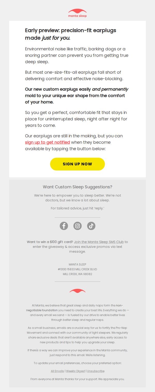
6. Manta Sleep: Earplugs made precisely for you
Objective
This email aims to generate early interest and pre-launch sign-ups for Manta Sleep’s custom-molded earplugs by highlighting their precision fit and long-term comfort, while positioning the brand as a thoughtful sleep solutions partner.
Why this works
The email brilliantly frames the product as a personalized solution to a universal sleep disruptor, environmental noise, making the pain point feel immediate and the remedy uniquely tailored to each recipient’s anatomy.
How to implement
By emphasizing that the earplugs are ‘still in the making,’ the campaign creates scarcity and exclusivity without pressure, inviting users to be early adopters rather than pushing a hard sell, which builds anticipation and brand loyalty.
Pro Tip
Add a visual mockup or short animation showing how the earplugs mold to the ear, this would strengthen the ‘precision-fit’ claim and reduce perceived risk for users unfamiliar with custom ear products. • Include a brief testimonial or user quote near the CTA to build social proof, even a single line like ‘I finally sleep through my partner’s snoring’ would humanize the benefit and increase conversion confidence.
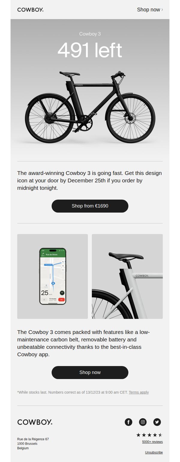
7. Cowboy - EN: Get a Cowboy 3 from €1690
Objective
This email aims to drive urgency-driven conversions by highlighting limited stock of the Cowboy 3 e-bike and encouraging immediate purchase before Christmas delivery cutoff. It positions the product as a premium, design-forward gift option with time-sensitive availability.
Why this works
The email masterfully combines scarcity psychology with a holiday deadline, making the limited stock count feel personal and urgent while aligning the purchase with a culturally relevant gifting window.
How to implement
By spotlighting the Cowboy app and technical differentiators like the carbon belt and removable battery, the email elevates the product beyond aesthetics into a smart, practical mobility solution worth the premium price.
Pro Tip
Add a visible countdown timer under the '491 left' headline to intensify urgency and give users a real-time visual cue of dwindling availability before the December 25th cutoff. • Include a short customer testimonial or review snippet near the CTA to reinforce social proof and alleviate purchase hesitation, especially since the price point is premium and the product is high-involvement.
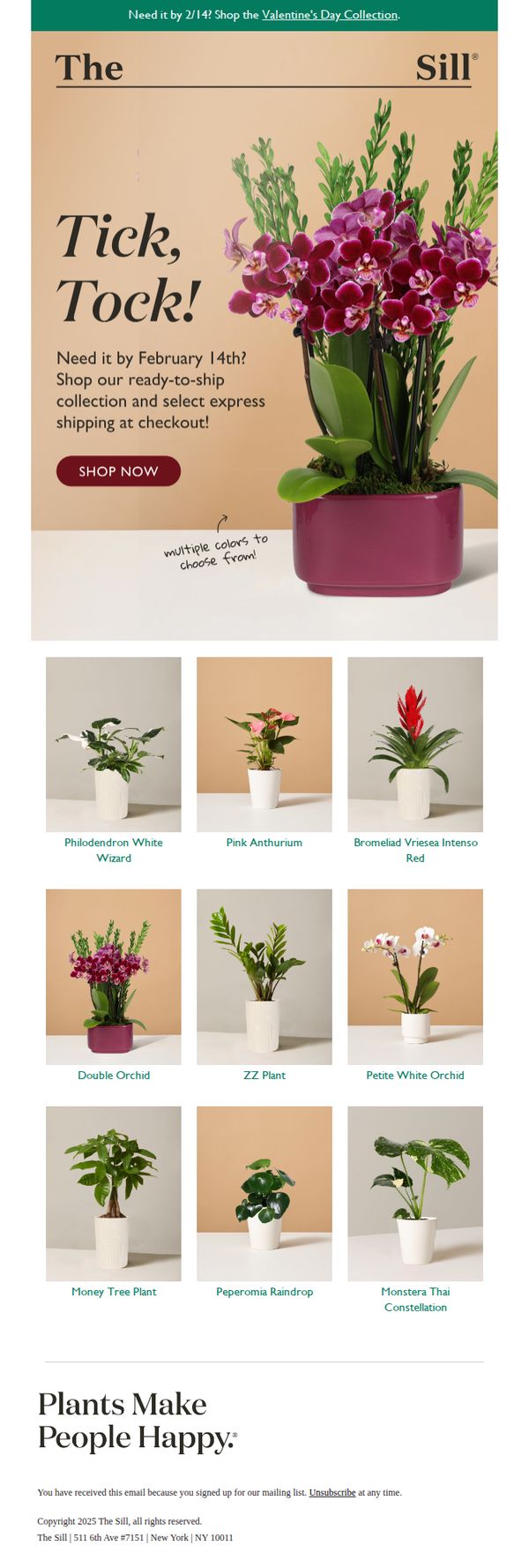
8. The Sill: Get by February 14! Shop ready to ship →
Objective
This email aims to drive urgency-driven purchases by encouraging customers to shop The Sill’s ready-to-ship Valentine’s Day plant collection before the February 14 deadline, while highlighting express shipping options to ensure timely delivery.
Why this works
The email brilliantly leverages time-sensitive urgency with a bold 'Tick, Tock!' headline paired with a clear cutoff date, making the customer feel the need to act now to secure a gift in time for Valentine’s Day.
How to implement
By featuring a visually rich product grid with labeled plant names and consistent styling, the email simplifies decision-making for gift buyers while showcasing variety without overwhelming the viewer with too many choices.
Pro Tip
Add a small countdown timer beneath the 'Tick, Tock!' headline to visually reinforce urgency and create a more dynamic, interactive experience that nudges users toward immediate action. • Include a brief testimonial or social proof near the product grid, such as '92% of customers say their plant arrived fresh and beautiful', to reduce perceived risk and increase confidence in gifting a live plant.
9. SkiWebShop: ☃️ Start the year with the best brands

Objective
This email campaign aims to drive immediate sales by encouraging skiers to upgrade their winter gear before the season ends, using a time-sensitive 20% New Year discount to create urgency and highlight top-performing brands.
Why this works
The email brilliantly ties seasonal urgency to product relevance by framing the discount as a 'New Year’s Eve' offer that aligns with skiers’ desire to start fresh, turning a calendar milestone into a compelling shopping trigger.
How to implement
By spotlighting three major ski brands with distinct value propositions, Rossignol for performance, Spyder for tech-driven design, and Dare2b for accessible style, the email caters to diverse customer segments without diluting its core message.
Pro Tip
Add a countdown timer near the hero CTA to visually reinforce the urgency of the New Year’s Eve promotion, increasing conversion pressure without requiring users to scroll or calculate dates. • Include a short testimonial or user review snippet under each brand section to build social proof and reduce perceived risk, especially since high-ticket winter gear often requires validation before purchase.
10. Cowboy - EN: The connected bike, in review
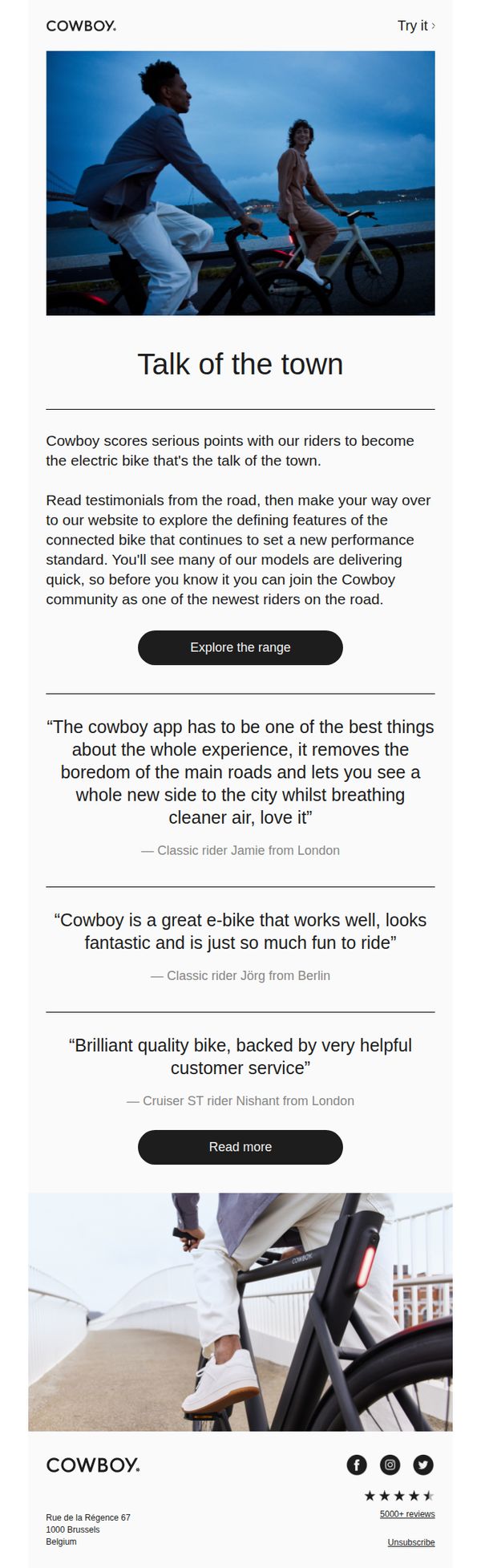
Objective
This email aims to build credibility and social proof for Cowboy’s connected e-bike by showcasing authentic rider testimonials, encouraging recipients to explore the product range and join the growing community of satisfied users.
Why this works
The email leverages real rider quotes from diverse global cities to create relatable, emotionally resonant social proof that positions the bike as both a lifestyle upgrade and a community experience, not just a product.
How to implement
By framing testimonials around specific benefits, like app-driven exploration and customer service, the email subtly answers unspoken objections while reinforcing the brand’s unique value proposition without sounding salesy.
Pro Tip
Add a secondary CTA like 'Watch a rider video' or 'See how the app works' beneath the testimonials to guide users deeper into the experience before asking them to explore the full range. • Include a small visual indicator (e.g., '5000+ reviews') near the testimonial section to reinforce credibility at a glance, since the current placement at the footer is too late in the user journey to influence decision-making.