Agency welcome emails worth copying




1. Pilothouse : 📦 - Your Repeat Rate Might Be a Red Flag
Objective
This email aims to challenge marketers’ reliance on repeat rate as a vanity metric and reframe retention strategy around five more meaningful, growth-oriented KPIs that reveal whether retention is actually driving business expansion or just masking acquisition decay.
Why this works
The email brilliantly reframes retention success not as a percentage increase but as a diagnostic tool for growth health, forcing brands to ask whether their repeat buyers are actually fueling expansion or just covering up acquisition leaks.
How to implement
By introducing five specific, actionable metrics like Same-Quarter Repeat and Incremental Repeat Share, the campaign gives marketers a concrete, spreadsheet-ready framework to move beyond vanity dashboards and into real business impact measurement.
Pro Tip
Add a visual flowchart or mini-dashboard mockup next to the five metrics to help readers instantly map how each KPI connects to their own data sources, reducing the cognitive load of translating theory into practice. • Place the 'Get connected →' CTA earlier, perhaps after the first metric explanation, to capture interest while the reader is still in problem-awareness mode, rather than waiting until the end when momentum may have faded.
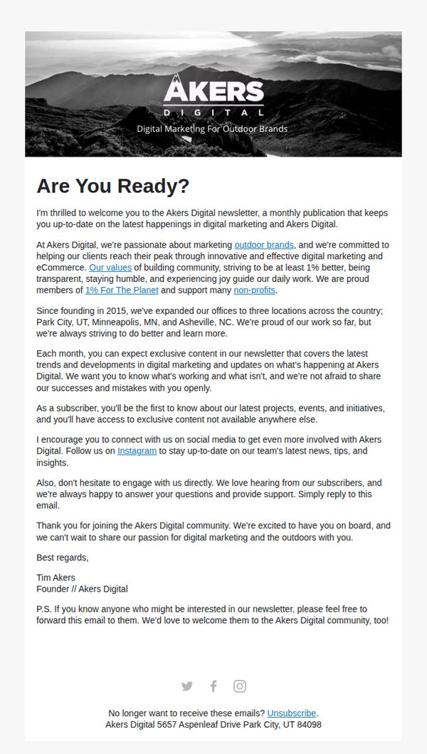
2. Akers Digital: Welcome to Akers Digital - Growing Outdoor Brands!
Objective
This email aims to warmly welcome new subscribers to Akers Digital’s monthly newsletter while establishing brand credibility and community values. It seeks to foster long-term engagement by highlighting the company’s mission, transparency, and exclusive content offerings for outdoor brand marketers.
Why this works
The email opens with a bold, emotionally resonant question, 'Are You Ready?', that immediately aligns the reader’s mindset with the brand’s adventurous, growth-oriented mission, creating instant psychological buy-in before any details are shared.
How to implement
By weaving in tangible proof points like founding year, office locations, and 1% For The Planet membership, the email builds trust without sounding boastful, subtly signaling stability and values-driven operations that resonate with purpose-led outdoor brands.
Pro Tip
Add a secondary CTA button or link near the top, such as 'Explore Our Case Studies' or 'See How We Help Outdoor Brands', to give readers an immediate, low-friction next step beyond social media, aligning with the goal of driving deeper engagement. • Include a brief visual element or icon next to the '1% For The Planet' and 'non-profits' mentions to reinforce brand values visually, since text-only references may be overlooked in a dense paragraph and fail to maximize emotional impact.
3. Common Thread Collective: Turning incrementality tests into CASH
Objective
This email aims to drive engagement with a video episode that explains how to turn incremental testing insights into profitable marketing decisions, while also promoting Axon by AppLovin as a performance solution and sharing a newly published measurement methodology to establish authority and trust.
Why this works
The email masterfully bridges tactical curiosity with strategic urgency by listing real, painful questions marketers face, making the content feel immediately relevant and personally valuable rather than just educational.
How to implement
By featuring recognizable brand names like Home Chef and Cozy Earth alongside specific performance metrics (1B+ customers, 35-second watch time), the email builds social proof and credibility without sounding like generic fluff or exaggerated claims.
Pro Tip
The CTA 'WATCH NOW' appears only once above the Axon ad, adding a secondary, sticky CTA button near the bottom after the methodology section would capture late-stage readers who’ve scrolled for value but haven’t yet converted. • The Axon section feels slightly disconnected from the main theme; adding a brief transition line like 'Here’s how brands like these are applying the insights from our episode' would better integrate the sponsor and reinforce campaign cohesion.
4. Pilothouse : 📦 - Have You Crunched the Numbers?
Objective
This email aims to position Pilothouse as a thought leader in email revenue forecasting by sharing Jordan Gordon’s proprietary 6-part projection model, while driving engagement with Klaviyo’s 2026 benchmark reports to help marketers plan smarter, data-driven strategies for the year ahead.
Why this works
The email brilliantly frames email revenue as a controllable, predictable lever by introducing a six-part projection model that turns vague marketing goals into precise, actionable forecasts, a powerful shift for data-driven brands tired of guesswork.
How to implement
By anchoring the entire narrative around Jordan Gordon’s real-world success, hitting within $50K of his forecast, the email builds instant credibility and transforms abstract theory into a proven, replicable system that readers feel compelled to adopt.
Pro Tip
The CTA 'Download Now' appears twice but lacks visual hierarchy, consider using a contrasting color or larger button size for the second CTA to reinforce urgency and guide the eye after the reader absorbs the model’s value. • The 'Steal This Tactic' section under the 6-part model is buried mid-email; move it higher or add a visual cue (like an icon or border) to highlight this actionable takeaway, increasing the likelihood readers will implement the framework immediately.
5. Pilothouse : 📦 - Bala’s First-Purchase Engine
Objective
This email aims to educate DTC marketers on how Bala optimizes its first-purchase and cart abandonment email flows, while offering actionable, brand-aligned improvements to increase conversion and revenue without compromising aesthetic integrity.
Why this works
Bala’s welcome flow strategically layers social proof and product bundles after the initial discount, which builds trust before pushing conversion, making the promo feel earned rather than desperate, which aligns perfectly with their premium, community-driven brand voice.
How to implement
The email recommends introducing the discount code immediately in the first welcome email, not burying it until later, because early clarity reduces friction and leverages the subscriber’s peak intent right when they’re most emotionally primed to act.
Pro Tip
The CTA 'Explore Behind the Brands' is visually strong but lacks urgency or benefit-driven language; rephrasing it to 'Get the 2026 Playbook: 11 Brands That Turned Marketing Into Revenue' would better align with the sponsor’s value proposition and increase click-through intent. • The 'Bala in the News' section, while credible, interrupts the conversion flow by placing social proof before the product offer in Email 3; reordering to show product bundles first, then press mentions, would reduce friction and keep the customer focused on purchasing.
6. Common Thread Collective: Starting February With Clearer Signals

Objective
This email aims to re-engage a recipient by addressing early-year performance uncertainty and positioning the Prophit System as the solution to bridge planning and execution gaps. It seeks to drive a conversation through a personalized, consultative CTA.
Why this works
The email opens with a timely, empathetic question that mirrors the recipient’s likely internal dialogue, making the message feel less like a pitch and more like a strategic check-in tailored to their current business rhythm.
How to implement
By anchoring the product’s value in a specific, quantifiable client result, a $20M apparel brand turning negative margins into $22.79 positive, the email transforms abstract promise into credible, outcome-driven proof that builds immediate trust.
Pro Tip
Add a subtle visual hierarchy to the testimonial section, perhaps a light background tint or icon, to visually separate the client result from the surrounding text and draw the eye to the most persuasive data point. • Include a micro-copy line just above the CTA (e.g., 'Spots fill fast, let’s map your Q1 adjustments in 15 minutes') to reduce friction and create mild urgency without compromising the consultative tone.
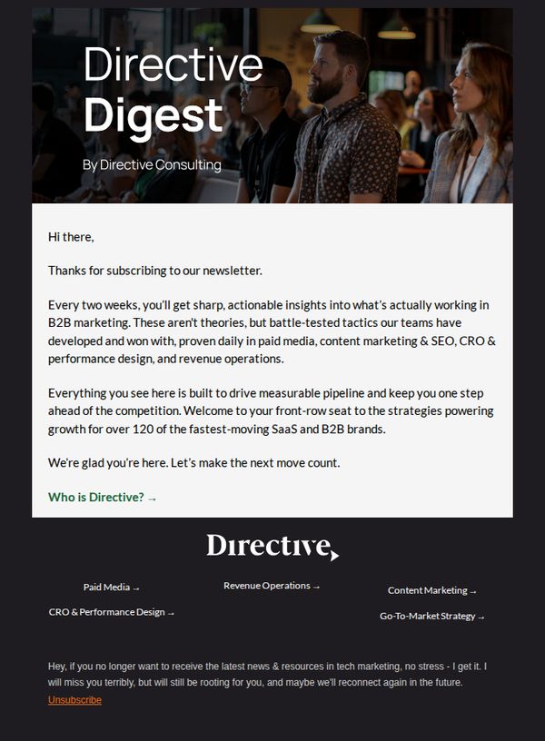
7. Directive: Welcome to Directive Digest
Objective
This email aims to warmly welcome new subscribers to the Directive Digest newsletter by establishing credibility through real-world B2B marketing tactics and positioning Directive as a strategic partner for growth. It seeks to build immediate trust and set expectations for biweekly, high-value content.
Why this works
The email opens with a personal, conversational tone that immediately reduces subscriber friction by acknowledging their choice to join, making them feel valued rather than just added to a list.
How to implement
It strategically frames its content as 'battle-tested tactics' rather than theory, which builds instant credibility by implying real-world validation and measurable results for SaaS and B2B brands.
Pro Tip
Add a secondary CTA below the main one, such as 'Browse Our Latest Case Study', to give subscribers an immediate next step beyond learning about the brand, increasing early engagement. • Include a brief visual element or icon next to each service category (Paid Media, Revenue Operations, etc.) in the footer to improve scannability and reinforce brand professionalism without adding clutter.
8. Technology Therapy Group : Understand the New Customer Journey & Stay Ahead

Objective
This email aims to educate retail professionals on the evolving, non-linear customer journey shaped by AI and digital behavior, while driving registrations for a live webinar and encouraging one-on-one strategy consultations to help businesses adapt proactively.
Why this works
The email brilliantly reframes customer journey disruption not as a problem to fix, but as an evolution to understand, creating urgency without fear, which positions the brand as a strategic partner rather than a problem-solver.
How to implement
By embedding multiple content touchpoints, blog, video replay, and webinar, the campaign nurtures leads across stages, subtly guiding readers from awareness to action without overwhelming them with a single hard sell.
Pro Tip
Add a countdown timer beneath the 'Register Now' CTA to create urgency around the March 25th webinar, leveraging FOMO to boost conversion without altering the email’s educational tone. • Include a short, bulleted list under the webinar description highlighting 3 key takeaways attendees will gain, this reduces cognitive load and clarifies value for skimmers who may otherwise skip the paragraph.
9. Click&Go HOLIDAYS: Get up to $400 in FREE Drinks 🍹 Alphanitz!

Objective
This email aims to drive immediate bookings for Virgin Voyages cruises by highlighting a limited-time offer of up to $400 in free drinks for Sea Terrace cabin bookings, while showcasing curated itineraries and reinforcing brand trust through social proof and expert consultation.
Why this works
The email brilliantly anchors its entire value proposition around a time-sensitive, high-perceived-value perk, free drinks, which emotionally resonates with luxury travelers while subtly encouraging urgency without aggressive sales language.
How to implement
Each cruise deal is visually anchored with a lifestyle photo, clear pricing, and a consistent 'Enquire now' CTA, creating a scannable, trustworthy grid that reduces decision fatigue and guides users toward the next step without overwhelming them.
Pro Tip
Add a countdown timer beneath the hero offer to visually reinforce the 26th February deadline, creating stronger urgency and reducing the chance users will delay action. • Include a brief 'Why Book Now?' bullet list under each deal (e.g., 'Limited cabins', 'Early bird pricing', 'Free drink credit expires') to clarify the unique incentive for each itinerary and reduce ambiguity.
10. Motorhome Republic : Welcome to Motorhome Republic there! 🎉 🚐

Objective
This email aims to welcome new subscribers with an immediate incentive, $50 off their first motorhome booking, while introducing them to the brand’s value proposition and guiding them toward exploration and conversion. It seeks to build trust and excitement around the motorhome rental experience.
Why this works
The email opens with a bold, emotionally resonant headline, 'Welcome to Adventure', paired with a scenic hero image that instantly aligns the brand with freedom, exploration, and lifestyle, making the offer feel like an invitation rather than a transaction.
How to implement
By embedding a clear, step-by-step visual guide on how to redeem the promo code, the email reduces friction and cognitive load, turning a potentially confusing process into a simple, reassuring journey that increases the likelihood of conversion.
Pro Tip
Add a countdown timer or urgency indicator near the promo code section to encourage immediate action, since the offer is time-sensitive (30 days) but currently lacks visual urgency cues that could boost redemption rates. • Include a small map or 'popular destinations' visual in the education section to spark wanderlust and help users visualize their next trip, making the 'Explore Itineraries' and 'Explore Deals' CTAs more compelling and contextually grounded.