Applications welcome email designs from top brands
1. Strava: Download Strava and start looking forward to training.
Objective
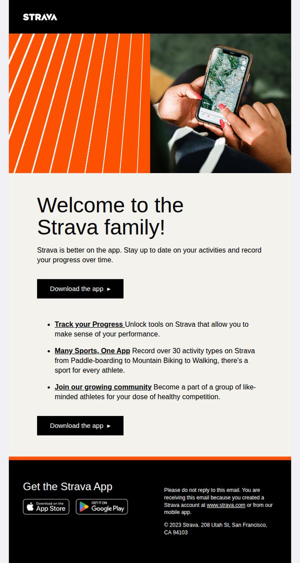
This email aims to convert new users by welcoming them to Strava and encouraging immediate app download through clear value propositions around progress tracking, multi-sport support, and community engagement.
Why this works
Strava brilliantly frames app adoption as joining a family, not just installing software, this emotional hook transforms a functional download into a tribal belonging moment that resonates with athletic identity.
How to implement
By listing three specific, benefit-driven features, progress tracking, multi-sport versatility, and community connection, the email avoids vague promises and gives users concrete reasons to act now instead of later.
Pro Tip
Add a subtle countdown or social proof element near the CTA (e.g., 'Join 100K athletes this week') to create urgency and reduce hesitation for users on the fence about downloading. • Include a short testimonial or user quote beneath the bullet points to humanize the benefits, seeing real athletes describe their progress or community wins can significantly boost trust and conversion.
2. Uber Eats - ES: Welcome to Uber
Objective
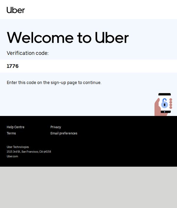
This email aims to guide new users through account verification by delivering a one-time code, ensuring secure onboarding while reinforcing brand trust and encouraging immediate action to complete sign-up.
Why this works
The email instantly builds credibility by clearly stating the purpose of the verification code and linking it directly to the next user action, reducing friction and confusion during onboarding.
How to implement
Using minimal design with high contrast between text and background ensures the verification code stands out visually, helping users locate and act on the most critical information without delay.
Pro Tip
Add a subtle countdown timer or expiration notice for the verification code to create urgency and reduce abandonment, especially since users may delay entering the code. • Include a secondary CTA button labeled 'Resend Code' in case the user misses or forgets the code, improving usability without requiring them to restart the sign-up process.
3. Wolt: Welcome to Wolt
Objective
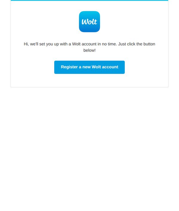
This email aims to guide new users through the initial account setup process by encouraging immediate registration with a clear, frictionless call to action. It sets a welcoming tone to build early trust and drive conversion from first contact to active user status.
Why this works
The email opens with a warm, conversational greeting that immediately reassures the recipient they’re about to experience a fast, effortless onboarding, a smart emotional hook that reduces signup hesitation.
How to implement
By placing the primary CTA button front and center with high-contrast color and action-oriented text, the design eliminates decision fatigue and funnels users directly toward the desired behavior: account creation.
Pro Tip
Add a brief value proposition or benefit statement above the CTA, such as 'Get food delivered in 30 minutes or less', to give users a concrete reason to register beyond just setting up an account. • Include a secondary, lower-friction option like 'Continue as guest' or 'Skip for now' to reduce abandonment for users not ready to commit, while still guiding them toward the primary CTA.
4. Uber: Welcome to Uber
Objective
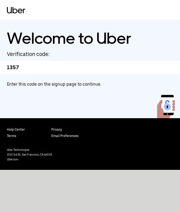
This email aims to guide new users through account verification by delivering a one-time code, ensuring secure onboarding while reinforcing brand trust through clear instructions and recognizable visual elements.
Why this works
The email immediately establishes trust by displaying a clean, minimalist layout with bold typography that draws attention to the verification code, making the critical action unmistakable for first-time users.
How to implement
Including a simple visual cue, a hand holding a phone with a lock icon, subtly reinforces security without cluttering the message, helping users feel safe while completing a sensitive step in the signup flow.
Pro Tip
Add a subtle countdown timer or expiration notice next to the verification code to create urgency and reduce abandonment, since users may delay entering the code without a time-sensitive cue. • Include a secondary CTA button or link labeled 'Resend Code' beneath the main instruction to accommodate users who may miss or forget the code, reducing friction in the onboarding process.
5. Uber: Welcome to Uber
Objective
This email aims to guide new users through account verification by delivering a one-time code, ensuring secure onboarding while reinforcing brand trust through clear instructions and recognizable visual elements.
Why this works
The email prioritizes clarity above all by placing the verification code front and center, eliminating friction for users who need to act quickly and confidently during onboarding.
How to implement
By pairing the code with a simple, action-oriented instruction and a friendly visual cue of a hand holding a phone, Uber reduces cognitive load and subtly reassures users about security.
Pro Tip
Add a subtle countdown timer or expiration notice near the verification code to create urgency and prevent user delays that could lead to failed signups. • Include a secondary CTA link like 'Resend Code' or 'Having trouble?' directly below the instruction to reduce drop-off for users who may have missed or mistyped the code.
6. Uber: Welcome to Uber
Objective
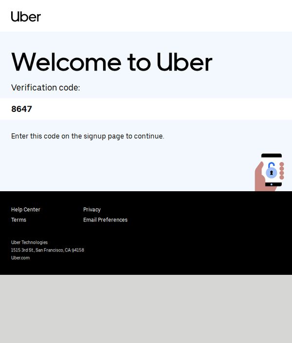
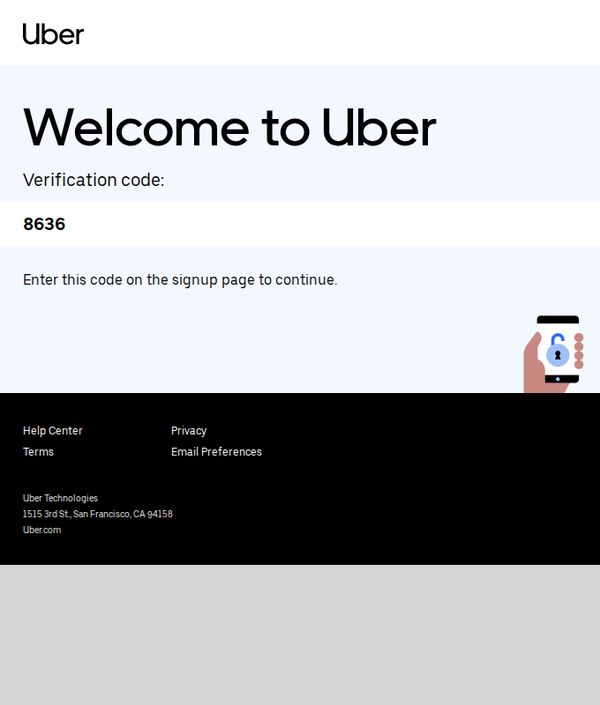
This email aims to guide new users through account verification by delivering a one-time code, ensuring secure onboarding while reinforcing brand trust with minimal friction. It prioritizes clarity and actionability to convert signups into active users.
Why this works
The email cuts through noise by placing the verification code front and center with bold typography, eliminating guesswork and reducing cognitive load for users who need to act quickly during onboarding.
How to implement
By pairing the code with a clear instruction and a simple visual of a phone with a lock icon, the email subtly reassures users about security without cluttering the message or slowing down the conversion path.
Pro Tip
Add a secondary CTA button or link labeled 'Resend Code' near the verification number to reduce friction for users who may have missed or mistyped the code, improving completion rates without adding visual clutter. • Include a brief, friendly micro-copy line like 'Your ride is just a few taps away!' beneath the code to emotionally reinforce the benefit of completing verification, aligning the functional step with the user’s end goal.
7. FREENOW - UK: Welcome to Freenow, reynal👋
Objective
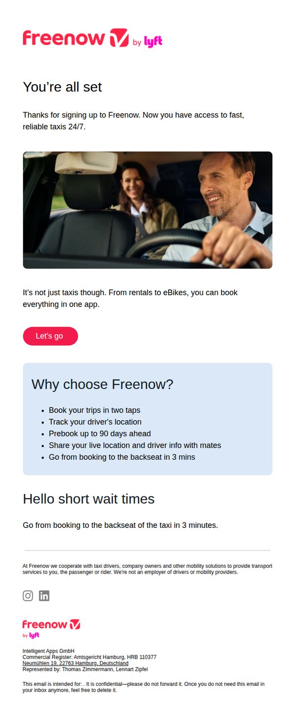
This email welcomes new users to FREENOW and highlights the convenience of booking multiple mobility services, including taxis, rentals, and eBikes, all within one app. It aims to drive immediate engagement by encouraging users to start using the platform right away.
Why this works
The email immediately validates the user’s decision to sign up by affirming access to 24/7 reliable transport, which builds trust and reduces post-signup hesitation before the first ride.
How to implement
By showcasing a smiling driver and passenger in the hero image, the campaign humanizes the service and subtly reassures users about safety, comfort, and the social experience of using the app.
Pro Tip
Add a subtle countdown timer or progress bar near the CTA to create urgency and guide users toward completing their first booking within a recommended window, increasing conversion momentum. • Include a micro-testimonial or user rating snippet under the 'Hello short wait times' section to reinforce credibility and reduce perceived risk for first-time riders.
8. Uber: Welcome to Uber
Objective
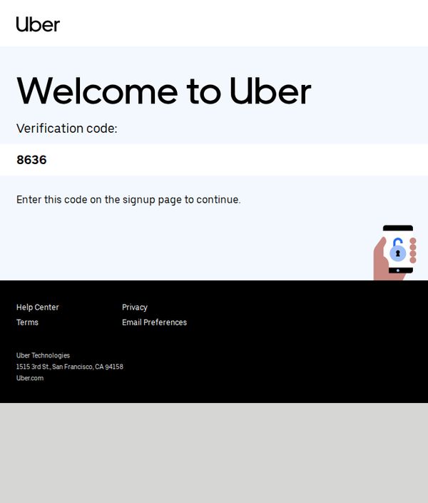
This email aims to guide new users through account verification by delivering a one-time code, ensuring secure onboarding while reinforcing brand trust with minimal friction. It prioritizes clarity and actionability to convert signups into active users.
Why this works
The email cuts through noise by placing the verification code front and center with bold typography, eliminating guesswork and reducing cognitive load for users who need to act quickly during onboarding.
How to implement
By pairing the code with a simple, directive sentence and a visual icon of a phone with a lock, the email subtly reassures users of security without cluttering the message or slowing down the conversion path.
Pro Tip
Add a subtle countdown timer or expiration notice near the code to create urgency and reduce abandonment, since users may delay entering the code without knowing its time sensitivity. • Include a secondary CTA link like 'Resend Code' or 'Having trouble?' directly below the code to reduce friction for users who may have missed or mistyped the verification number.
9. Headway : Welcome back to reality!

Objective
This email aims to re-engage users who may have drifted away during the holiday season by offering a time-sensitive discount on Headway Premium, while reframing post-holiday reality as an opportunity for personal growth and learning.
Why this works
The email brilliantly uses post-holiday emotional resonance to reframe returning to routine as a chance for self-improvement, making the discount feel like a gift to oneself rather than just a sale.
How to implement
By tying the 90% off offer to the idea of shaping your own reality through learning, the campaign transforms a transactional promotion into an empowering personal development narrative that aligns with Headway’s brand mission.
Pro Tip
Add a brief testimonial or user stat (e.g., 'Join 2M+ learners who started their year with Headway') near the CTA to build social proof and reduce perceived risk for new subscribers. • Include a subtle countdown timer or 'Offer expires in 48 hours' beneath the CTA to heighten urgency without disrupting the calm, inspirational tone of the message.
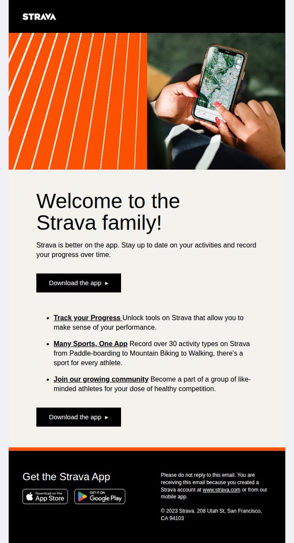
10. Strava: Download Strava and start looking forward to training.
Objective
This email aims to convert new users into active Strava app downloaders by emphasizing community, progress tracking, and multi-sport versatility, turning passive interest into immediate action through clear value propositions and repeated CTAs.
Why this works
Strava brilliantly frames its app not as a tool but as an invitation to join a tribe, using 'Welcome to the Strava family' to trigger emotional belonging, which is far more persuasive than listing features alone.
How to implement
The email strategically repeats the CTA twice, once after the headline and again after the benefits, creating a natural persuasion arc that mirrors the user’s decision journey from curiosity to commitment.
Pro Tip
Add a micro-testimonial or user stat (e.g., 'Join 100M+ athletes') near the first CTA to reinforce social proof before the user scrolls, increasing trust and reducing hesitation at the critical decision point. • Replace the generic 'Download the app' CTA with a benefit-driven variant like 'Start Tracking Your Progress Today' to align the action with the emotional payoff, making the click feel more rewarding and purposeful.