Banking & Finance welcome campaign ideas that work


1. CoinGate : Confirm your email address
Objective
This email aims to verify the user’s email address to complete account registration with CoinGate, ensuring legitimate sign-ups and reducing fraudulent activity while onboarding new users into the platform securely.
Why this works
The email opens with a clear, action-oriented subject line and headline that immediately tells the recipient what to do, reducing friction and increasing the likelihood of prompt confirmation.
How to implement
Including a polite disclaimer that allows users to ignore the email if they didn’t sign up adds trust and reduces support inquiries by preemptively addressing accidental sign-ups.
Pro Tip
Add a secondary CTA or link below the main button (e.g., 'Resend confirmation email') to reduce drop-offs for users who may have missed or deleted the original message. • Include a brief value reminder (e.g., 'Start accepting crypto payments in minutes') near the CTA to reinforce why confirming matters, increasing motivation beyond just compliance.
2. InvestEngine: Want to win £50k?
Objective
This email aims to convert new sign-ups into active investors by incentivizing immediate account funding with a high-value £50,000 prize draw, while also encouraging referrals to expand user acquisition through social sharing.
Why this works
The email brilliantly ties a high-stakes financial reward to a simple, time-bound action, funding £100, making the offer feel urgent, achievable, and emotionally compelling without overwhelming the reader with complexity.
How to implement
By visually simulating a mobile push notification announcing the prize win, the campaign creates an immersive, dopamine-triggering moment that makes the reward feel real and immediate, increasing emotional engagement before the user even acts.
Pro Tip
Add a countdown timer in the hero section to visually reinforce the urgency of the 2 March 2026 deadline, which would heighten FOMO and reduce procrastination among users who may otherwise delay funding. • Include a brief testimonial or social proof near the CTA, such as 'Over 10,000 investors already entered', to reduce perceived risk and build trust by showing others are actively participating in the draw.
3. Wealthsimple: Get up to a 3% match.💸 Win a $3M home.🏡
Objective
This email aims to drive new account registrations and fund transfers by offering a tiered match bonus of up to 3% and a high-value $3M home giveaway, creating urgency and perceived value to convert skeptical investors.
Why this works
The campaign brilliantly leverages cognitive dissonance by calling it 'The (Un)Real Deal,' which disarms skepticism while making the offer feel exclusive and too good to ignore, a psychological hook that boosts credibility through playful honesty.
How to implement
By tying the 3% match to a 5-year commitment, Wealthsimple frames long-term investing as a reward rather than a restriction, transforming a potential barrier into a status symbol for serious, committed clients who want the biggest possible return.
Pro Tip
Add a visual progress bar or countdown timer near the CTA to emphasize the 30-day window for transfers, creating urgency that’s currently buried in small print and reducing the risk of procrastination. • Reposition the 'Register now' CTA after the home giveaway image, not just below the match tiers, to capitalize on emotional peak momentum and reduce friction between desire and action.
4. CoinGate : Welcome to CoinGate
Objective
This email welcomes new users to CoinGate and confirms their account is active, guiding them to access their dashboard while offering onboarding resources and support to reduce friction during initial platform use.
Why this works
The email immediately validates the user’s action with a clear success state, a checkmark icon and confirmation message, which reduces anxiety and builds trust right at the start of the onboarding journey.
How to implement
By embedding a direct, high-contrast CTA button labeled 'Access dashboard' immediately after the welcome message, the email removes decision fatigue and funnels users straight into the platform’s core experience without distraction.
Pro Tip
Add a brief visual preview or annotated screenshot of the dashboard below the CTA to reduce uncertainty for first-time users and increase click-through confidence by showing what they’ll see next. • Include a personalized greeting (e.g., 'Hi [First Name]') at the top to strengthen emotional connection and reinforce that this is a tailored onboarding experience, not a generic system message.
5. InvestEngine: Complete registration to start investing
Objective
This email aims to convert newly signed-up users into active investors by guiding them to complete registration and log in to create their first portfolio, while also incentivizing referrals and showcasing account options and social proof to build trust and urgency.
Why this works
The email frames registration not as a chore but as a gateway to empowerment, positioning the user as someone already on the path to financial growth, which reduces friction and increases emotional buy-in.
How to implement
By immediately offering a referral bonus of up to £100, the campaign turns new users into advocates before they’ve even invested, leveraging social proof and mutual benefit to accelerate virality and account activation.
Pro Tip
Add a subtle progress indicator or checklist near the CTA to visually reinforce how close the user is to completing registration, this reduces perceived effort and increases conversion likelihood. • Reposition the ‘Refer a friend’ CTA higher or make it visually distinct from the primary ‘Finish registration’ button to avoid diluting focus, users should complete onboarding before being asked to recruit others.
6. Wealthsimple: 📺 Welcome to the cheap-TV economy

Objective
This email aims to engage readers with a compelling, data-driven story about the paradox of falling tech prices versus rising service costs, while subtly positioning Wealthsimple as a smart financial partner for navigating economic uncertainty. It concludes with a direct, time-sensitive offer to incentivize account funding.
Why this works
The email masterfully uses relatable, everyday comparisons, like TVs versus chicken dinners, to make complex economic trends feel personal and urgent, turning abstract inflation data into a visceral, memorable narrative that sticks with the reader long after they’ve scrolled.
How to implement
By anchoring the entire piece in a single, provocative question, why are some things getting cheaper while others skyrocket?, the campaign creates a natural curiosity loop that pulls readers through dense data and analysis, making financial education feel like solving a mystery rather than enduring a lecture.
Pro Tip
The CTA 'Register now' is buried at the bottom of a long, dense newsletter and lacks urgency or benefit reinforcement; adding a sticky CTA bar or repeating the offer with a countdown timer (e.g., 'Bonus ends March 31') above the fold would significantly boost conversion. • The 'FOMO Index' section, while entertaining, dilutes the core economic message and distracts from the sponsor CTA; replacing it with a short, data-backed testimonial or a 'What This Means for Your Portfolio' summary would strengthen the financial relevance and drive action.
7. ForumPay: Dainis from ForumPay - Here to Help Get Started

Objective
This email aims to warmly welcome new users to ForumPay and guide them through the initial onboarding steps, emphasizing ease of use and personalized support to accelerate activation and reduce friction in starting crypto payment processing.
Why this works
The email opens with a personalized greeting and immediately reinforces the brand’s value proposition by listing three clear, benefit-driven bullet points that answer the user’s unspoken question: 'What’s in it for me?'
How to implement
Including a direct, human touchpoint, naming the sender, their title, and offering to reply personally, builds trust and lowers the psychological barrier to taking action, making the onboarding feel supported rather than automated.
Pro Tip
Add a visual element like a screenshot of the dashboard or a short explainer video thumbnail to illustrate the 'one dashboard' benefit, this would reduce cognitive load and increase confidence in the platform’s simplicity. • Include a time-sensitive incentive or milestone (e.g., 'Complete KYC in 24 hours to unlock priority support') to create urgency and encourage immediate action, especially since the email targets new users who may delay onboarding.
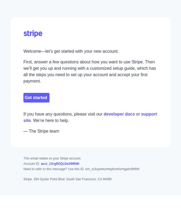
8. Stripe : Start setting up your Stripe account
Objective
This email aims to guide new users through the initial setup of their Stripe account by prompting them to answer a few questions that will generate a personalized onboarding guide, helping them accept their first payment quickly and confidently.
Why this works
The email immediately reduces friction by framing onboarding as a simple Q&A session that leads to a customized setup guide, making the process feel personal and manageable rather than overwhelming.
How to implement
By positioning the CTA as 'Get started' instead of a generic 'Sign up' or 'Continue,' the email reinforces momentum and implies the user is already partway through a journey, not at the beginning of a chore.
Pro Tip
Add a progress indicator or checklist after the CTA to visually reinforce what steps remain in setup, reducing uncertainty and increasing completion rates by making the journey feel structured and finite. • Include a brief social proof element, like '92% of new users complete setup in under 5 minutes', near the CTA to reduce perceived effort and increase conversion through behavioral momentum.
9. xMoney: xMoney Account Confirmation

Objective
This email aims to guide new users through the critical first step of verifying their email address to unlock access to their xMoney dashboards and begin the business verification process, while reassuring them support is available if needed.
Why this works
The email brilliantly frames email validation not as a chore but as the essential gateway to accessing powerful business tools, making compliance feel like progress rather than paperwork.
How to implement
By immediately following the CTA with a clear explanation of what happens next, starting business verification and setting up the account, the email reduces friction and builds anticipation for the user’s next steps.
Pro Tip
Add a secondary, smaller CTA beneath the main button offering 'Need Help? Contact Support' to reduce drop-off for users who feel uncertain before validating. • Incorporate a brief visual indicator, like a progress bar or checklist icon, next to the text explaining what happens after validation, to visually reinforce forward momentum and reduce cognitive load.
10. Investopedia: Major Indexes End Sharply Lower as Risk-Off Sentiment Grips Markets; Dow Sheds 600 Points

Objective
This email aims to inform subscribers of the day’s most critical financial market movements and business news, encouraging them to click through for deeper analysis while reinforcing Investopedia’s role as a trusted daily source for market intelligence.
Why this works
The email leads with the most urgent market-moving headline, Dow down 600 points, to immediately signal relevance and urgency, which is critical for financial audiences who need to triage news quickly and act on volatility.
How to implement
Each article teaser pairs a provocative, emotionally resonant headline with a high-contrast image and a consistent 'READ MORE' CTA, creating a scannable, visually rhythmic experience that reduces cognitive load while maximizing click-through potential.
Pro Tip
Add a brief one-sentence market summary or key takeaway beneath the main headline to reduce friction for readers who want immediate context before deciding to click, increasing perceived value and engagement. • Introduce a visual hierarchy by bolding or color-highlighting the top 2–3 most impactful stories (e.g., Dow drop, Bitcoin plunge) to guide attention and reflect true market priority, rather than treating all stories equally.