Proven Personal Care welcome email designs you can use
1. Amp Human / Momentous: Our Goal Is Your Best
Objective
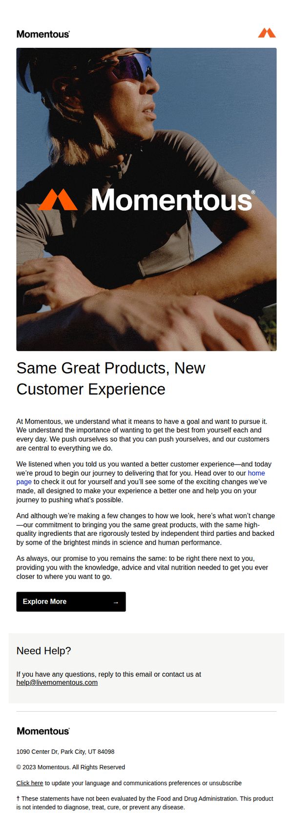
The email aims to reassure existing customers that despite a rebrand or redesign, the core product quality and customer commitment remain unchanged, while inviting them to explore the improved experience on the new website.
Why this works
The email opens with a strong emotional hook, tying the brand’s mission directly to the customer’s personal goals, which creates immediate resonance and positions the brand as a partner in their journey, not just a vendor.
How to implement
By explicitly acknowledging customer feedback and framing the redesign as a direct response to their needs, the message builds trust and validates the audience’s voice, making the transition feel collaborative rather than imposed.
Pro Tip
Add a subtle visual indicator, like a before/after slider or annotated screenshot, near the 'Explore More' CTA to show concrete examples of the improved customer experience, reducing ambiguity and increasing click-through motivation. • Include a short, bold testimonial or customer quote within the body copy that speaks to the ‘better experience’ mentioned, to provide social proof and make the promise feel more tangible and trustworthy.
2. Lush - EN: Right to Foam 🫧
Objective
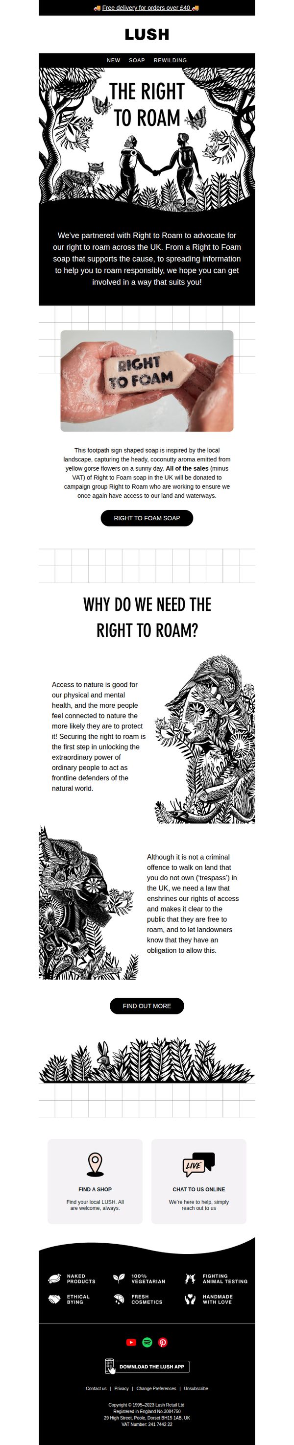
This email aims to raise awareness and drive support for the 'Right to Roam' campaign in the UK by introducing a limited-edition soap that symbolizes the cause, while encouraging customers to purchase it and learn more about land access rights. It blends activism with product storytelling to deepen brand purpose and customer engagement.
Why this works
Lush masterfully turns a product into a protest tool by designing a soap shaped like a footpath sign, a visual metaphor that instantly communicates the campaign’s mission while making the purchase feel like an act of advocacy, not just consumption.
How to implement
The email doesn’t just sell soap, it educates with emotional storytelling, explaining why land access matters for mental health and civic responsibility, which transforms a simple product page into a movement-building moment that resonates beyond the cart.
Pro Tip
Add a countdown timer or limited-edition badge near the CTA to create urgency around the soap’s availability, since the campaign’s impact and product’s symbolic value are time-sensitive and benefit from scarcity messaging. • Include a short customer testimonial or quote from someone who’s used the soap to support the cause, this would humanize the campaign further and provide social proof that purchasing the soap leads to real-world participation.
3. RadiantXO: New Year, New Price: RadiantXO is now $359.99
Objective
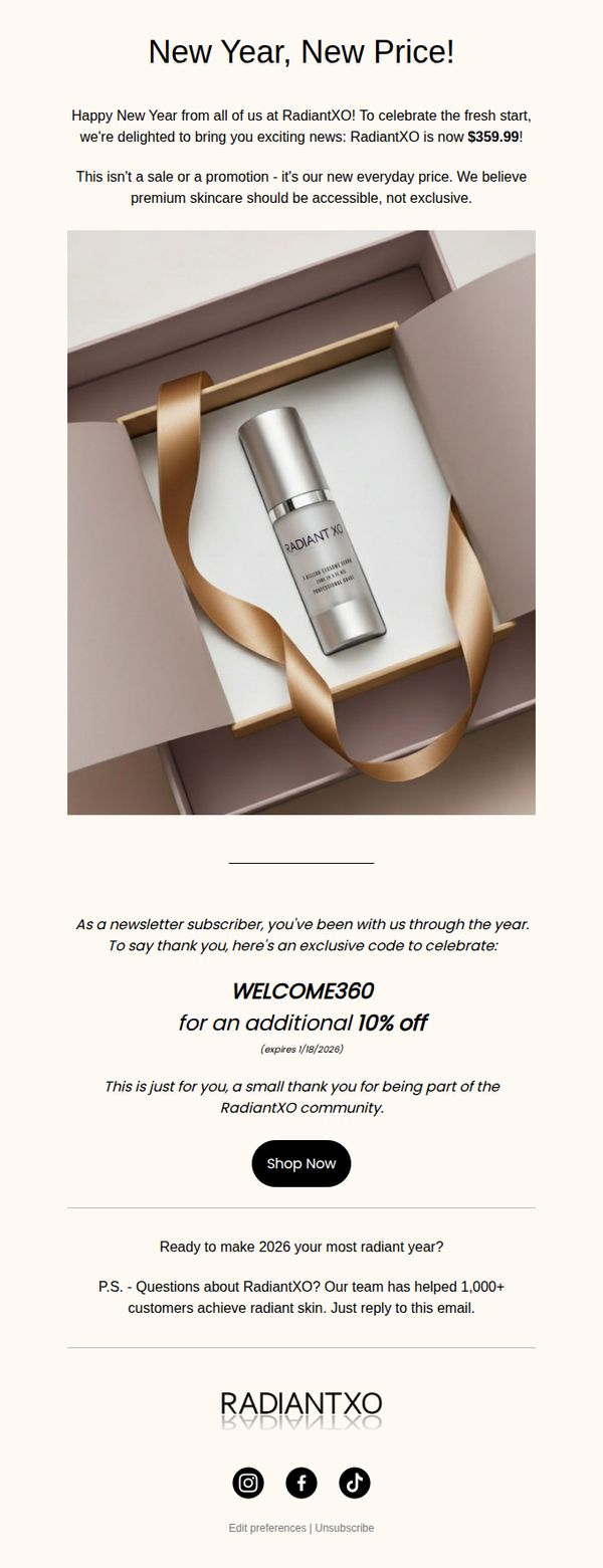
To announce RadiantXO’s permanent price reduction to $359.99 and reward loyal subscribers with an exclusive 10% discount code, reinforcing brand accessibility while driving immediate purchases through personalized appreciation.
Why this works
The email brilliantly reframes a price drop not as a temporary sale but as a permanent value upgrade, which builds long-term trust by positioning premium skincare as accessible rather than exclusive.
How to implement
By personalizing the discount with a subscriber-exclusive code and tying it to community appreciation, the brand transforms a transactional offer into an emotional gesture that deepens customer loyalty and urgency.
Pro Tip
Add a small countdown timer beneath the exclusive code to visually reinforce urgency and prevent procrastination, since the code expires on 1/18/2026 and could benefit from a more prominent time-sensitive cue. • Include a brief bullet-point list under the product image highlighting 2–3 key benefits or ingredients to help subscribers quickly understand why RadiantXO justifies its premium positioning despite the lower price.
4. Parfums de Marly - US : Welcome the Lunar New Year
Objective
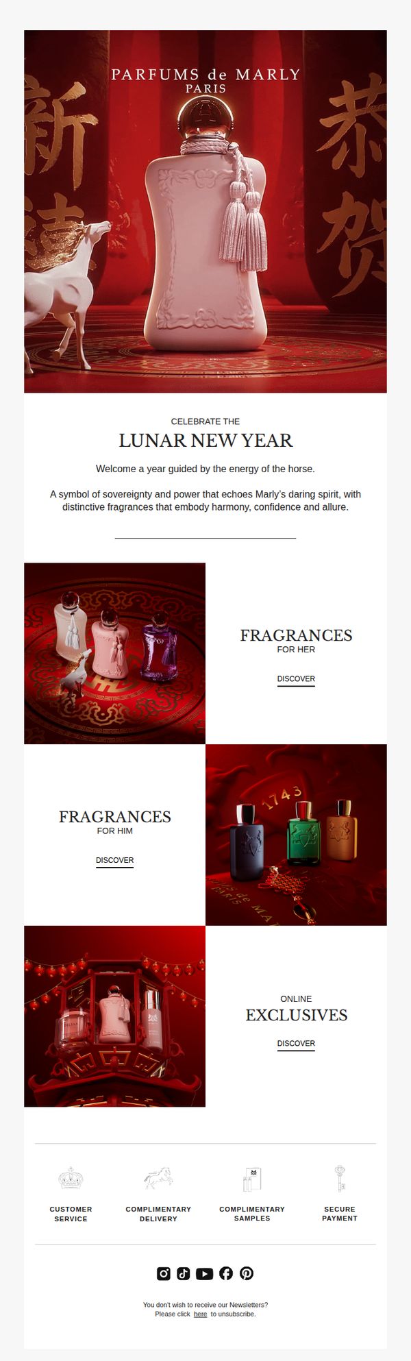
This email aims to welcome subscribers to the Lunar New Year by aligning Parfums de Marly’s luxury identity with the symbolic energy of the horse, while guiding recipients toward gender-specific fragrance collections and online exclusives to drive engagement and conversion.
Why this works
The email brilliantly ties the Lunar New Year’s horse symbolism to the brand’s heritage of daring spirit and luxury, creating an emotionally resonant narrative that elevates the fragrance offering beyond scent into cultural storytelling.
How to implement
By segmenting product discovery into 'For Her,' 'For Him,' and 'Online Exclusives,' the campaign respects audience intent while subtly guiding users toward personalized paths, a smart segmentation tactic that reduces decision fatigue and increases conversion likelihood.
Pro Tip
Add a subtle countdown timer or limited-edition badge near the 'Online Exclusives' section to create urgency, since Lunar New Year campaigns thrive on temporal scarcity, this would nudge hesitant shoppers toward immediate action. • Replace the generic 'DISCOVER' CTA with more benefit-driven language like 'Find Your Lunar Signature Scent' or 'Unwrap His Perfect Fragrance' to better align with the emotional and gifting context of the holiday.
5. Nuud: You’re welcome - your first 50 Happy Points!
Objective
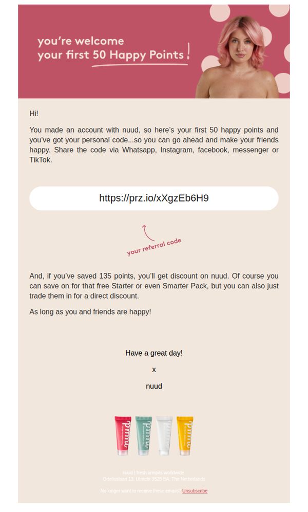
This email aims to welcome new Nuud customers by rewarding them with 50 Happy Points and encouraging social sharing through a personal referral code, while subtly promoting future savings and product engagement.
Why this works
The email brilliantly turns a simple welcome into a social growth engine by giving users a personal referral code right away, making sharing feel rewarding rather than transactional.
How to implement
By framing points as 'Happy Points' and tying them to emotional outcomes like 'making your friends happy,' the brand humanizes its loyalty program and deepens emotional connection with the customer.
Pro Tip
Add a visual highlight or icon next to the referral link to draw attention to it, currently, it blends into the body text and may be overlooked despite being the primary action. • Include a small visual cue or micro-copy near the point-saving threshold (135 points) to clarify how close the user is to unlocking the discount, increasing motivation to engage further.
6. Gussi: Gussi Rewards is HERE!! Join to unlock exclusive benefits ✨
Objective
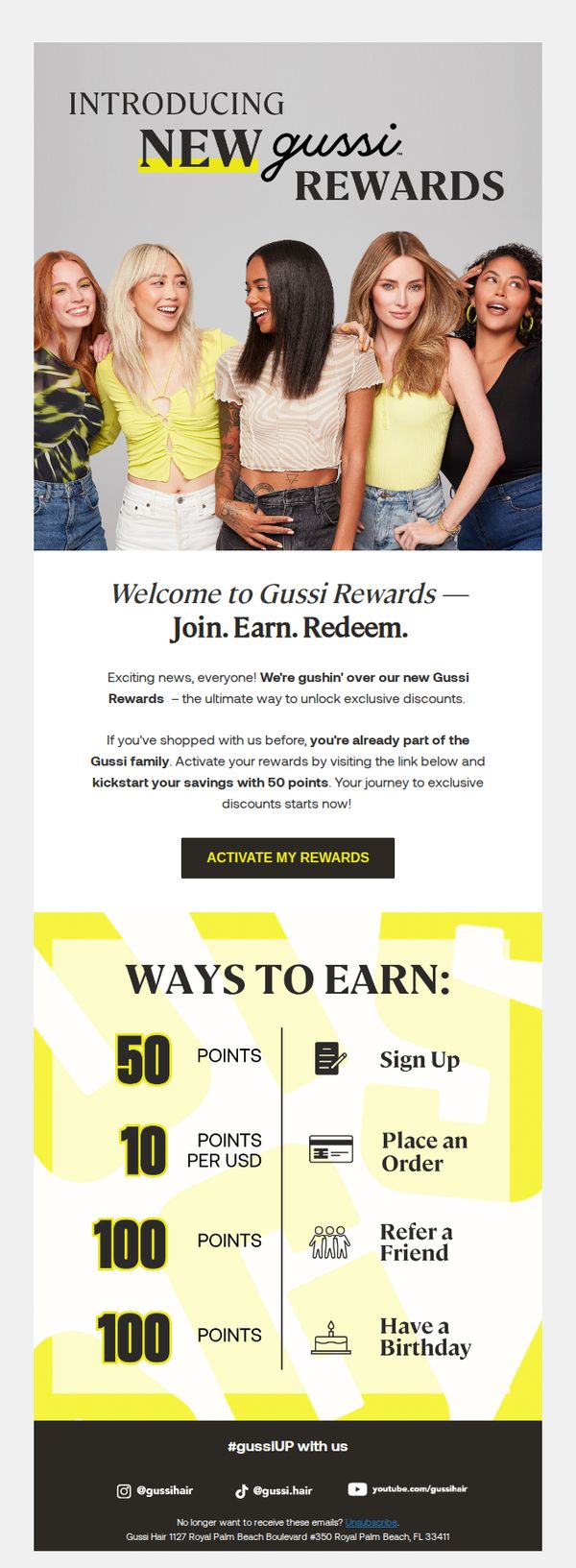
This email aims to introduce and drive sign-ups for Gussi’s new loyalty program, Gussi Rewards, by highlighting immediate benefits like 50 bonus points and clear earning mechanics to convert existing customers into active members.
Why this works
The email immediately rewards existing customers with 50 points upon activation, turning passive shoppers into engaged members by validating their past loyalty while incentivizing future behavior with zero friction.
How to implement
By visually breaking down point earning into four simple, icon-supported actions, sign up, spend, refer, and celebrate birthdays, the program feels accessible and gamified, making loyalty feel effortless and rewarding rather than transactional.
Pro Tip
Add a countdown timer or urgency cue near the CTA to encourage immediate activation, since the 50-point bonus is a time-sensitive hook that could be amplified with visual scarcity to boost conversion rates. • Include a mini testimonial or social proof snippet, like '92% of members redeemed their first reward within 7 days', to reduce perceived risk and reinforce that joining is a popular, rewarding choice.
7. Vichy - US: A Bright Lunar New Year Starts With Self Care Savings✨
Objective
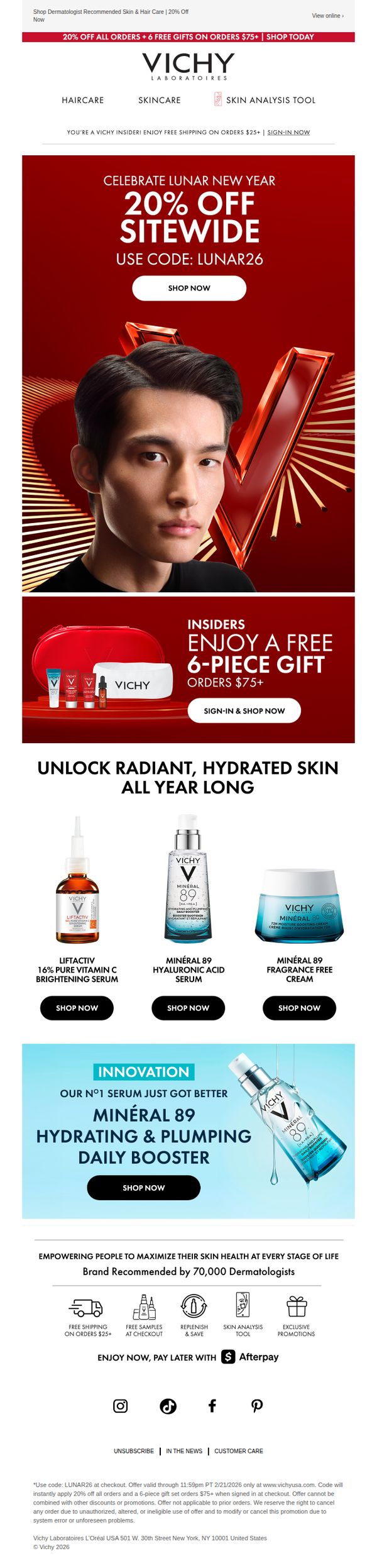
This email aims to drive immediate sales by promoting a Lunar New Year discount while encouraging customer loyalty through exclusive insider perks and free gifts. It positions Vichy as a dermatologist-recommended brand that supports year-round skin health with targeted product solutions.
Why this works
The email brilliantly ties a cultural celebration to self-care, transforming Lunar New Year into a personal wellness milestone that justifies immediate spending through emotional resonance and seasonal urgency.
How to implement
By featuring a bold hero image with a confident model and a striking red V logo, the brand reinforces identity while anchoring the promotion in visual luxury, making the discount feel premium, not desperate.
Pro Tip
Add a countdown timer beneath the promo code to heighten urgency, especially since the offer expires soon, this would visually reinforce scarcity and encourage faster decision-making. • Include a brief testimonial or dermatologist quote near the product grid to strengthen social proof, especially since the brand highlights being 'recommended by 70,000 dermatologists' but doesn’t visually support it in the product section.
8. Lush - EN: Mischief Reigns 👑

Objective
This email aims to drive excitement and engagement around Lush’s Halloween-themed 'Lord of Misrule' collection by using a playful, cosmic mischief narrative to encourage product exploration and purchase. It seeks to convert curiosity into action through immersive storytelling and clear product highlights.
Why this works
Lush masterfully blends fantasy storytelling with product promotion by casting its Halloween collection as a cosmic mischief adventure, making the campaign feel immersive and emotionally engaging rather than purely transactional.
How to implement
The email uses bold, high-contrast color blocking and dynamic visual hierarchy to guide the eye through the narrative while spotlighting key products, a technique that balances creativity with conversion-focused design.
Pro Tip
Add a limited-time urgency element (e.g., 'Only 72 hours left to unleash the mischief') near the primary CTA to nudge hesitant shoppers toward immediate action without disrupting the playful tone. • Include a small customer testimonial or social proof snippet under the 'Lord of Misrule' product grid to reinforce trust and validate the collection’s popularity, especially for first-time buyers.
9. Kylie Cosmetics: Welcome to Kylie Cosmetics! 💋

Objective
This welcome email aims to onboard new subscribers by offering an immediate 15% discount to incentivize their first purchase, while introducing them to the brand’s full product ecosystem through curated category highlights.
Why this works
The email immediately rewards new subscribers with a personalized discount code, creating urgency and reducing friction for the first purchase while reinforcing brand loyalty from the very first interaction.
How to implement
By organizing products into visually distinct category tiles, like ‘New,’ ‘Best Sellers,’ and ‘Skin’, the email guides users intuitively through the brand’s diverse offerings without overwhelming them with choice.
Pro Tip
Add a subtle countdown timer next to the discount code to create urgency and encourage immediate action, since the offer is time-sensitive and currently lacks any temporal pressure. • Include a short customer testimonial or social proof beneath the discount offer to build trust and validate the value of the 15% savings, especially for first-time buyers unfamiliar with the brand.
10. Crabtree & Evelyn: Customer account confirmation
Objective
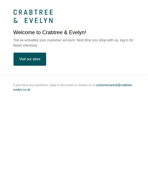
This email confirms successful account activation and encourages the new customer to return to the store by highlighting the benefit of faster checkout upon login, reinforcing brand welcome and next-step engagement.
Why this works
The email immediately reassures the user that their account is active and frames the benefit of logging in as a time-saving convenience, which reduces friction and encourages return visits without overwhelming the new customer.
How to implement
By using a clean, minimalist layout with ample white space and a single, prominent CTA button, the design directs attention exactly where it needs to go, toward the store, without distraction or clutter.
Pro Tip
Add a personalized welcome message using the customer’s first name to strengthen emotional connection and make the confirmation feel more human and less transactional. • Include a small visual element, such as a product image or brand icon, near the CTA to subtly reinforce brand identity and entice curiosity about what’s available in the store.