Transport welcome campaign ideas that work
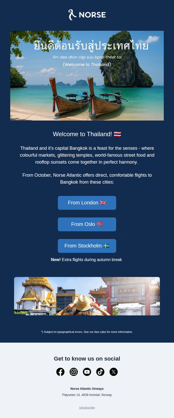

1. Norse Atlantic Airways - FR : Thailand this autumn? Yes, please. 😀
Objective
This email aims to drive bookings for Norse Atlantic Airways’ new direct flights to Bangkok this autumn by highlighting Thailand’s sensory appeal and convenient departure cities. It targets travelers seeking exotic getaways during the autumn break with a visually rich, emotionally engaging invitation.
Why this works
The email opens with a stunning hero image of Thailand’s coastline paired with a warm, multilingual welcome message that instantly transports the reader, a powerful emotional hook that primes them for wanderlust before any offer is mentioned.
How to implement
Instead of leading with price or schedule, the campaign leads with sensory storytelling, markets, temples, street food, sunsets, which positions the destination as an experience, not just a flight, making the offer feel more valuable and emotionally resonant.
Pro Tip
Add a visible countdown timer or limited-seat indicator near the CTA buttons to amplify urgency, since the ‘New! Extra flights’ note is buried and doesn’t create immediate FOMO for time-sensitive travelers. • Include a small ‘From [Price]’ tag under each city button to reduce friction, readers currently must click through to discover pricing, which may cause drop-off for price-sensitive autumn break planners.
2. easyJet: Get summer sorted with just a £60pp deposit ☀️
Objective
This email aims to drive immediate bookings for summer holidays by emphasizing the affordability and flexibility of a £60 per person deposit, encouraging recipients to lock in travel plans early while spreading payments interest-free.
Why this works
The email brilliantly reframes the emotional pain of February’s gloom into a compelling reason to act now, turning seasonal dread into a powerful motivator for booking summer escapes with minimal upfront cost.
How to implement
By anchoring the entire campaign around a single, memorable deposit amount (£60pp), the email creates instant clarity and reduces decision fatigue, making the offer feel accessible and low-risk to hesitant travelers.
Pro Tip
Add a countdown timer near the 'Up to £500 off' offer to create urgency, since the promo expires 3/3/26, this would leverage FOMO and align with the 'Too good to miss' headline. • Reposition the 'Book flights now' CTA under the 'Flights from £28' tile to match user intent, currently, it’s buried below both offers, which may dilute conversion for flight-only customers.
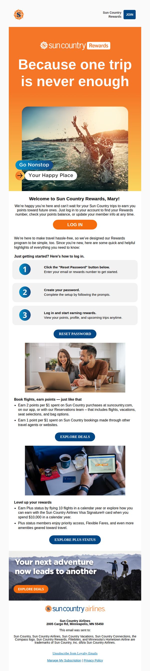
3. Sun Country Airlines: Welcome to Sun Country Rewards
Objective
This email welcomes new Sun Country Rewards members and guides them through account setup while highlighting the benefits of earning points and achieving Plus status. It aims to activate engagement by simplifying the onboarding process and encouraging immediate exploration of travel deals.
Why this works
The email opens with an emotionally resonant hero image and tagline, 'Because one trip is never enough', that immediately connects with travelers’ desire for adventure, making the rewards program feel like a gateway to joy, not just points.
How to implement
It breaks down the onboarding process into three clear, numbered steps with visual cues, reducing friction for new members by transforming a potentially confusing setup into a simple, guided journey that builds confidence and momentum.
Pro Tip
Add a visual progress bar or checklist after the login instructions to show users how close they are to completing onboarding, this increases completion rates by creating a sense of momentum and accomplishment. • Include a time-sensitive incentive, like 'Earn 500 bonus points on your first booking within 7 days,' to create urgency and drive immediate action rather than passive reading.
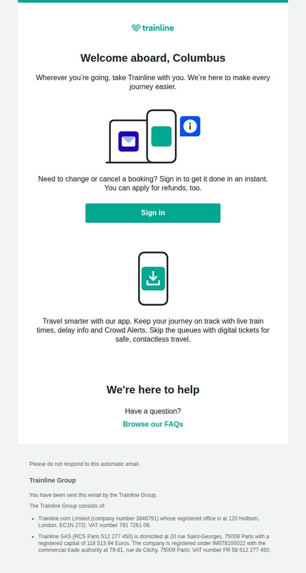
4. Trainline - UK: Welcome to Trainline
Objective
This welcome email aims to onboard new users by introducing Trainline’s core value proposition, simplifying train travel, and encouraging immediate engagement through sign-in and app adoption. It reassures users they can manage bookings and access support effortlessly.
Why this works
The email opens with a personalized greeting and immediately reinforces brand purpose by promising to make every journey easier, creating emotional alignment before asking for action.
How to implement
It strategically positions the sign-in CTA between two high-value user benefits, booking flexibility and app convenience, making the action feel like a natural next step rather than a demand.
Pro Tip
Add a secondary CTA beneath the app download icon encouraging users to 'Download the App for Live Alerts & Digital Tickets' to increase app installs without diluting the primary sign-in goal. • Include a brief testimonial or social proof near the hero section, such as 'Join 10M+ travelers who save time with Trainline', to strengthen credibility and reduce new-user hesitation.
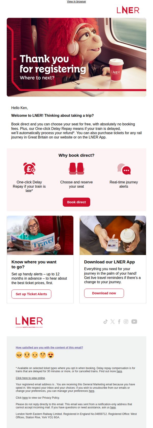
5. London North Eastern Railway: Ken, thanks for registering! Where to next?
Objective
This email aims to welcome new registrants by reinforcing the value of booking directly with LNER, highlighting key benefits like fee-free booking and automatic delay repay, while encouraging immediate action through app downloads and ticket alerts.
Why this works
The email opens with a warm, personalized welcome that immediately ties the user’s registration to a clear next step, planning a trip, making the transition from sign-up to engagement feel natural and inviting.
How to implement
By visually breaking down the top three booking benefits with simple icons and concise copy, the email reduces cognitive load and makes value propositions instantly scannable, increasing the likelihood of conversion without overwhelming the reader.
Pro Tip
Add a subtle countdown or urgency cue near the 'Book direct' CTA, such as 'Limited seats at this price', to nudge immediate action, since the current design lacks temporal motivation despite promoting time-sensitive benefits like delay repay. • Reposition the 'Download our LNER App' section higher in the flow or visually equalize its prominence with the 'Set up Ticket Alerts' section, as the app offers deeper engagement and retention value that should be prioritized over passive alerts.
6. Ikon Pass: Find out what joy is all about
Objective
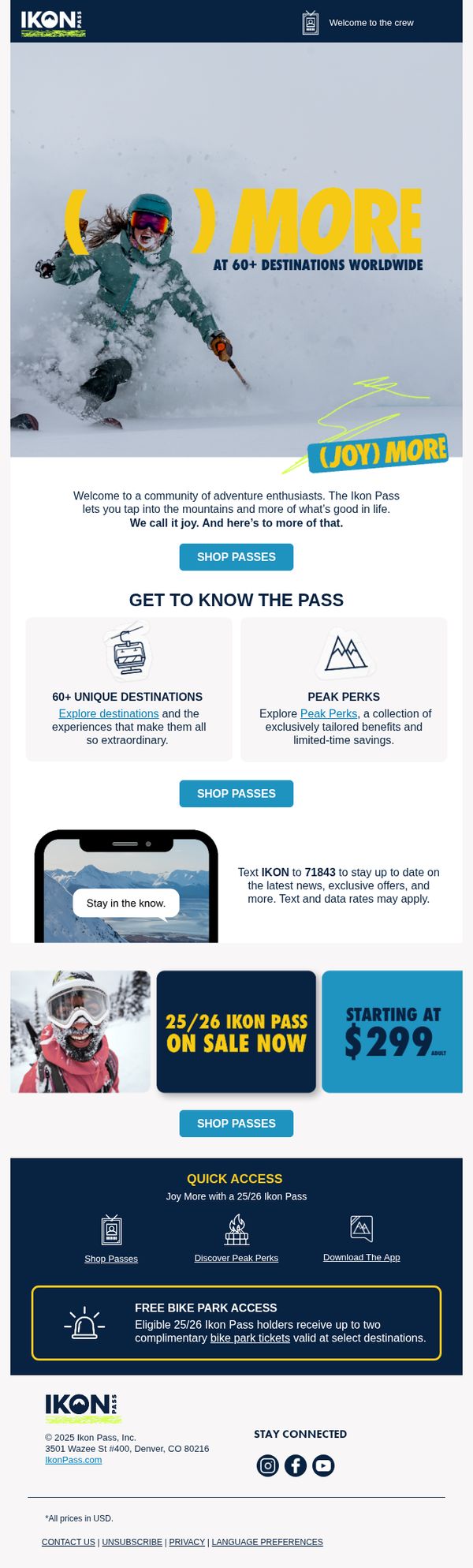
The email aims to convert adventure seekers into Ikon Pass holders by highlighting the emotional reward of mountain experiences and the tangible value of access to 60+ global destinations, while driving immediate action through a limited-time offer starting at $299.
Why this works
The email brilliantly ties emotional payoff, 'joy', to the product by showing a skier mid-action, making the pass feel less like a transaction and more like an invitation to live a fuller, more exhilarating life.
How to implement
By breaking down the pass’s value into digestible, icon-driven sections like '60+ Unique Destinations' and 'Peak Perks,' the email reduces cognitive load and helps prospects quickly grasp the breadth of benefits without feeling overwhelmed.
Pro Tip
Add a countdown timer near the '25/26 Ikon Pass on Sale Now' section to create urgency and reduce decision latency, especially since the price point is a key conversion lever. • Reposition the 'FREE BIKE PARK ACCESS' benefit higher in the flow, perhaps right after the hero, to immediately showcase cross-season value, which could appeal to non-winter sports enthusiasts and broaden the target audience.
7. Sun Country Airlines: Welcome to Sun Country Airlines!
Objective
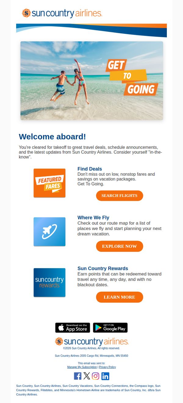
This welcome email aims to onboard new subscribers by introducing them to Sun Country Airlines’ key offerings, deals, destinations, and rewards, while encouraging immediate engagement through clear CTAs. It positions the brand as a friendly, value-driven travel partner ready to help users start planning their next trip.
Why this works
The email opens with a joyful, aspirational hero image of travelers jumping on a beach, instantly evoking emotion and tying the brand to memorable experiences rather than just transactions, which builds immediate connection with new subscribers.
How to implement
Each core offering, deals, destinations, and rewards, is presented with a distinct icon, concise benefit-driven copy, and a dedicated CTA button, making it effortless for users to self-select their next step without feeling overwhelmed or confused.
Pro Tip
Add a personalized greeting (e.g., 'Hi [First Name]') at the top to strengthen the welcome feeling and increase perceived relevance, which can boost engagement and reduce the generic tone of the current opening. • Include a small social proof element, like a customer testimonial or star rating, near the 'Featured Fares' section to build trust and reduce hesitation for first-time users considering booking a flight.
8. Virgin Atlantic: Your verification code is 495007
Objective
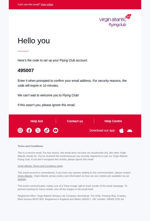
This email aims to securely verify a new user’s email address during Flying Club account setup by delivering a time-sensitive verification code, while also reinforcing brand trust and providing immediate support options if the recipient didn’t initiate the request.
Why this works
The email immediately delivers the critical verification code in large, bold typography, reducing cognitive load and ensuring users can act quickly without scanning for key information.
How to implement
By clearly stating the code expires in 10 minutes and offering a safety note for unintended recipients, the message balances urgency with user security, building trust through transparency.
Pro Tip
Add a visual countdown timer or bold expiration warning near the code to reinforce urgency and reduce user error from delayed action. • Include a brief, friendly sentence after the code like 'You’re one step closer to earning miles and unlocking exclusive perks!' to emotionally connect the action to the reward.
9. Ukprefulfillment: About Your Membership Request! 📨
Objective
This email aims to confirm the successful approval of a new member’s request and warmly welcome them into the UKprefulfillment community, reinforcing trust and setting the stage for future engagement.
Why this works
The email opens with an immediate emotional hook, 'Congratulations!', which transforms a routine approval notice into a celebratory moment, making the recipient feel personally valued from the first line.
How to implement
By referring to the brand as a 'family,' the message builds emotional loyalty early, subtly encouraging long-term retention and community participation rather than treating the user as just another account.
Pro Tip
Add a secondary CTA button or link (e.g., 'Get Started Now' or 'Explore Your Dashboard') to guide the new member toward their first action, reducing drop-off after the welcome message. • Include a brief onboarding tip or next-step guide in the body, such as 'Log in to set up your first order', to bridge the gap between approval and active usage, increasing early engagement.
10. Virgin Atlantic: Welcome to Flying Club
Objective
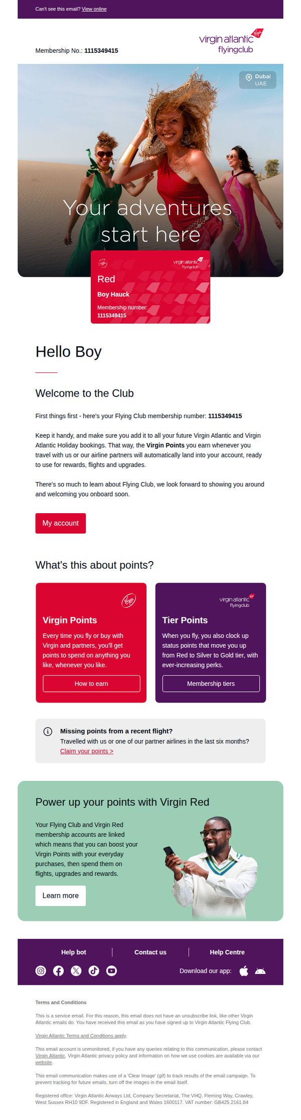
This email welcomes new Flying Club members by confirming their membership, explaining how Virgin Points and Tier Points work, and encouraging immediate engagement through account access and point claiming. It aims to onboard users smoothly while setting the stage for future loyalty and spending.
Why this works
The email immediately personalizes the experience by addressing the member by name and displaying their unique membership number, creating a sense of official recognition and belonging from the very first glance.
How to implement
It smartly separates Virgin Points and Tier Points into distinct, color-coded blocks with clear CTAs, helping new members instantly grasp the dual-value system without feeling overwhelmed by jargon or complexity.
Pro Tip
Add a visual progress bar or tier status indicator next to the membership number to immediately show where the user stands in their journey toward Silver or Gold, increasing motivation to earn more points. • Include a short video or animated GIF in the 'Power up your points with Virgin Red' section to demonstrate how linking accounts works, reducing friction for users unfamiliar with the integration process.