Deliverect email gallery from real brands
1. Hey dirk, Here is Deliverect's monthly special 🗞️🌶️
Objective
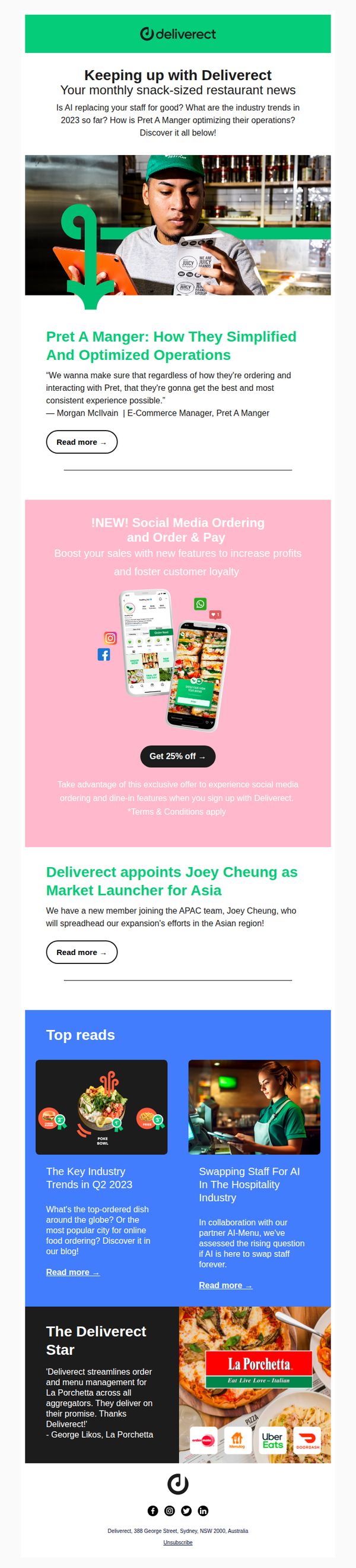
This email aims to engage restaurant operators by delivering curated industry insights, product updates, and customer success stories, all while subtly promoting Deliverect’s new Social Media Ordering feature with a limited-time discount to drive sign-ups.
Why this works
The email opens with a personalized, snack-sized news format that feels conversational and time-efficient, perfect for busy restaurant owners who skim content but still crave industry relevance and brand connection.
How to implement
By anchoring the promotional offer to a real customer story (Pret A Manger), Deliverect builds credibility and context, making the 25% discount feel like a strategic upgrade rather than a generic sales pitch.
Pro Tip
The CTA 'Get 25% off →' is buried in the middle of the email and lacks urgency, adding a countdown timer or visual badge like 'Limited Time Offer' above the button would significantly boost conversion intent. • The 'Deliverect Star' testimonial section feels disconnected from the main offer; integrating a short quote from La Porchetta about how Social Media Ordering increased their sales would create a stronger narrative bridge to the CTA.
2. 👋 Welcome to Deliverect!
Objective
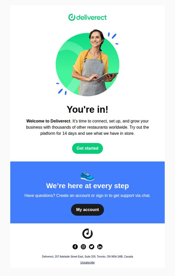
This email welcomes new users to Deliverect and encourages them to begin exploring the platform’s features during a 14-day trial period, with the goal of converting them into active, engaged customers by highlighting global restaurant community benefits.
Why this works
The email opens with a warm, human-centered visual and headline that instantly validates the user’s decision to join, reducing early friction and building emotional momentum toward onboarding.
How to implement
By anchoring the offer in a 14-day trial framed as an exploratory experience rather than a sales pitch, the message lowers perceived risk and invites curiosity-driven engagement without pressure.
Pro Tip
Add a subtle visual cue or micro-animation near the 'Get started' button to draw attention and guide the user’s eye toward the primary action, improving click-through rates without disrupting simplicity. • Include a brief, bulleted list of 2–3 key features or outcomes users can expect during the 14-day trial to clarify value and reduce ambiguity about what 'see what we have in store' actually means.
3. 👋 Help us humanize words we use in our product
Objective
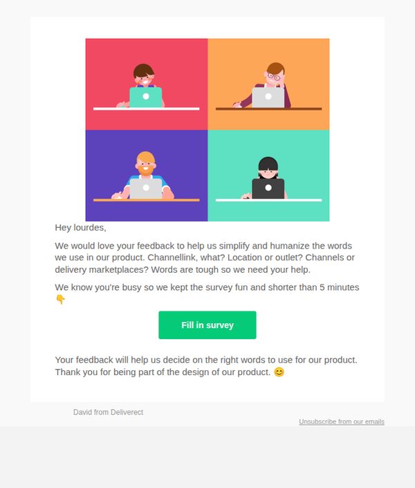
Deliverect aims to gather user feedback to simplify and humanize terminology used in their product, making it more intuitive and user-friendly by involving customers in the design process.
Why this works
By framing the survey as a collaborative design effort, Deliverect positions the user as a co-creator, which increases emotional investment and willingness to participate despite time constraints.
How to implement
The playful tone and emoji use, like the waving hand in the subject line and the smiling face at the end, soften the request, making it feel friendly and low-pressure rather than transactional or demanding.
Pro Tip
Add a progress indicator or visual cue (e.g., 'Step 1 of 3') within the survey link to reinforce the 'under 5 minutes' promise and reduce drop-off by setting clear expectations. • Include a brief example of the terminology being reviewed (e.g., 'Should we say “Outlet” or “Location”?') to immediately ground users in the context and reduce confusion before they click through.