Proven Services drive to store email designs you can use
1. Shop Solar Kits: 🚨Don't Miss One of the Biggest Sales of the Year!💸
Objective
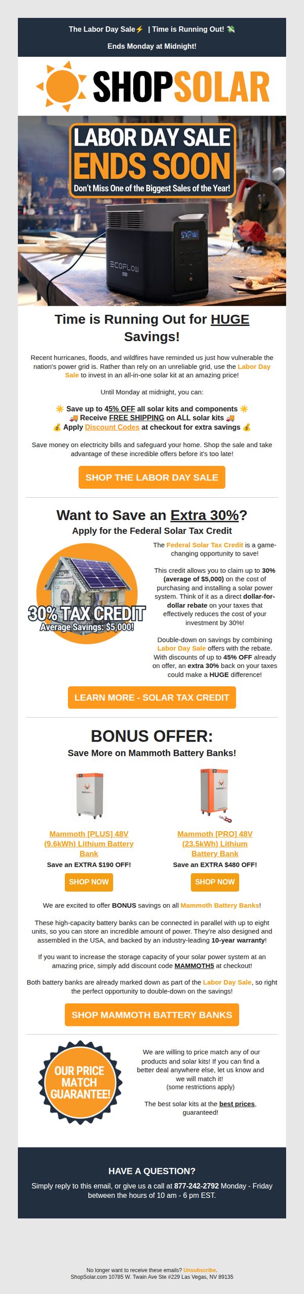
This email aims to drive immediate purchases by highlighting a time-sensitive Labor Day sale with deep discounts on solar kits and components, while also educating customers on stacking savings through the Federal Solar Tax Credit and bonus battery bank offers.
Why this works
The email brilliantly frames urgency with a countdown to midnight and pairs it with emotional triggers like recent natural disasters, making the solar investment feel both timely and essential for household resilience.
How to implement
By visually separating the Federal Solar Tax Credit as a standalone benefit with a dollar-value illustration, the campaign transforms a complex tax incentive into a tangible, easy-to-grasp savings opportunity that doubles down on the sale’s value.
Pro Tip
Add a countdown timer beneath the 'Ends Monday at Midnight!' banner to visually reinforce urgency and reduce cognitive load for time-sensitive decision-making. • Include a short customer testimonial or trust badge near the price match guarantee to strengthen credibility and reduce perceived risk for first-time buyers.
2. Ankorstore UK: Welcome to Ankorstore 2.0!
Objective
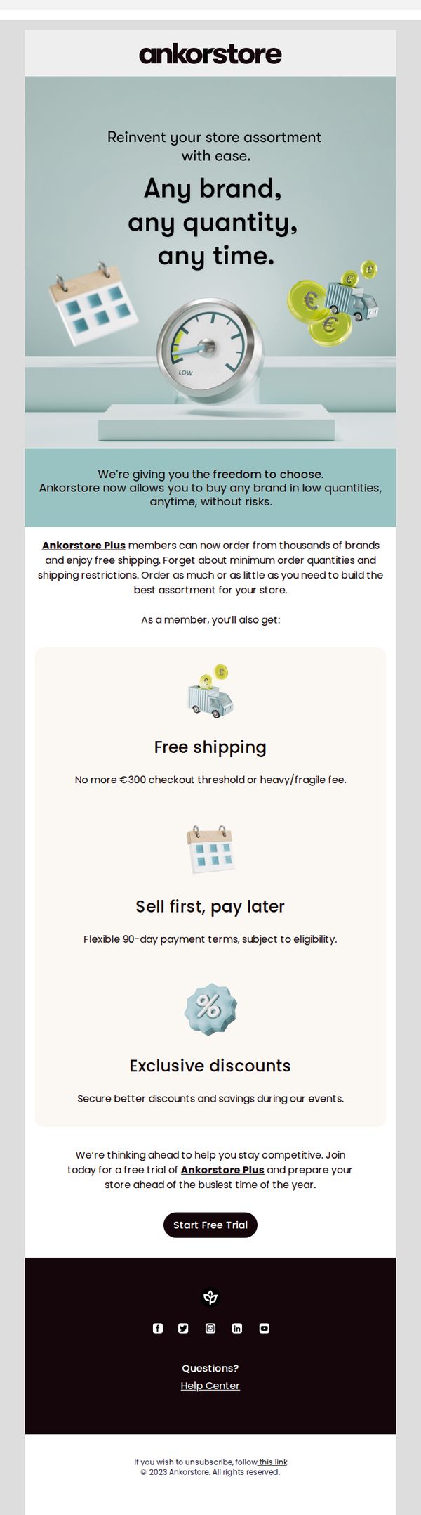
This email aims to introduce new users to Ankorstore 2.0 by highlighting the flexibility and freedom of ordering any brand in any quantity, while encouraging sign-ups for the Ankorstore Plus membership through compelling benefits like free shipping and flexible payment terms.
Why this works
The email brilliantly frames the core value proposition as freedom, 'any brand, any quantity, any time', which immediately resonates with retailers tired of rigid minimums and shipping constraints, making the offer feel empowering rather than transactional.
How to implement
By leading with a bold visual metaphor, a speedometer pointing to 'Low' alongside coins and a delivery truck, the email instantly communicates cost efficiency and flexibility without needing to explain, creating an intuitive emotional hook before the user even reads the copy.
Pro Tip
Add a subtle countdown timer or urgency indicator near the 'Start Free Trial' CTA to nudge procrastinators, especially since the email references preparing for 'the busiest time of the year', this would reinforce time-sensitive relevance without being pushy. • Include a micro-testimonial or social proof badge near the CTA (e.g., 'Join 12,000+ retailers who reordered within 7 days') to reduce perceived risk and increase conversion by validating the offer’s real-world success before the user commits.
3. Keen: Monday’s headlines for the heart 🗞️♥️
Objective
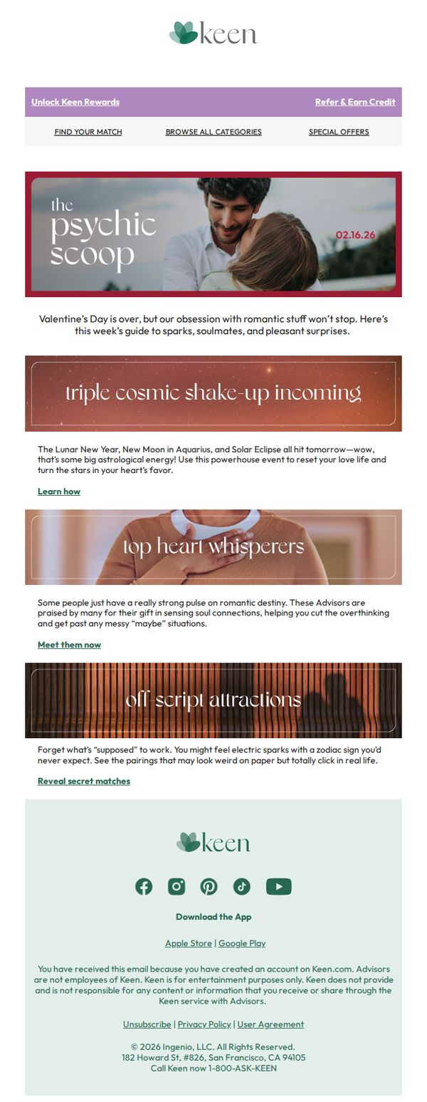
This email aims to keep users engaged post-Valentine’s Day by reframing romance as an ongoing, mystical journey, leveraging astrology and personality insights to encourage continued app usage and advisor bookings.
Why this works
By pivoting from Valentine’s Day to cosmic romance trends, the email transforms a post-holiday lull into a narrative-driven engagement opportunity that feels timely, not transactional.
How to implement
The use of mystical, astrology-themed section headers like 'triple cosmic shake-up incoming' creates emotional intrigue and positions the brand as a guide to love’s unpredictable magic, not just a matchmaker.
Pro Tip
Add a visual countdown or date badge near the 'triple cosmic shake-up' section to heighten urgency around the astrological event, making the timing feel more actionable rather than just informational. • Include a mini testimonial or user quote under 'top heart whisperers' to build social proof, currently, the section feels promotional without real-user validation to reinforce advisor credibility.
4. Ankorstore UK: Re-Discover Ankorstore
Objective
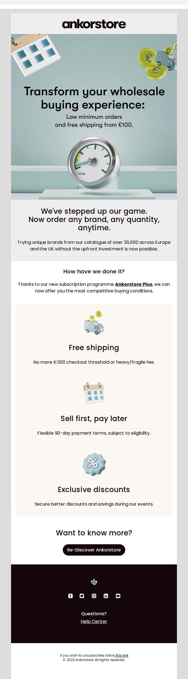
This email aims to re-engage past or inactive buyers by highlighting Ankorstore’s upgraded wholesale experience, emphasizing flexibility, lower barriers to entry, and financial benefits through its new Plus subscription model. It seeks to drive immediate rediscovery and reactivation of user accounts.
Why this works
The email brilliantly reframes the value proposition around removing friction, low minimums, free shipping, and flexible payment, making wholesale feel accessible and risk-free for retailers who may have previously hesitated due to cost or commitment.
How to implement
By anchoring the message in a bold transformation, 'We’ve stepped up our game', the campaign creates urgency and positions the brand as evolving with its customers, which builds trust and encourages users to revisit the platform with fresh eyes.
Pro Tip
Add a brief testimonial or social proof near the offer section to validate the 'stepped up our game' claim, even one short quote from a retailer who benefited from Ankorstore Plus would strengthen credibility and reduce perceived risk. • Include a subtle countdown or time-sensitive language near the CTA to create urgency, for example, 'Join Ankorstore Plus before [date] to lock in your first 90-day payment terms', to nudge procrastinators into action.
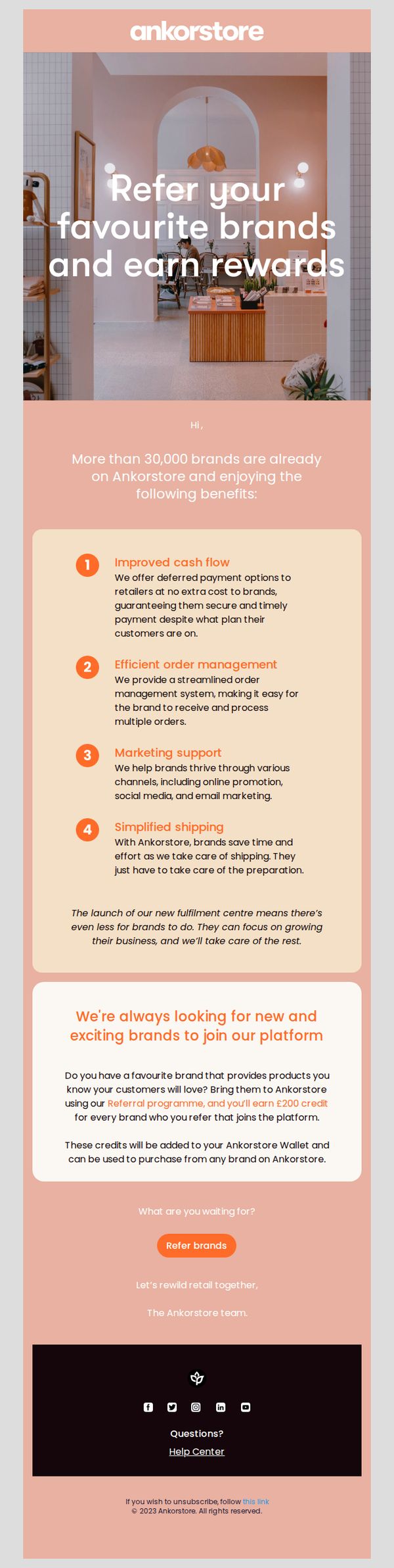
5. Ankorstore UK: Find out why brands partner with Ankorstore
Objective
This email aims to encourage existing Ankorstore retailers to refer new brands to the platform by highlighting the benefits brands receive and incentivizing referrals with a £200 credit reward. It positions the retailer as a valuable partner in growing the ecosystem.
Why this works
The email smartly flips the script by making the retailer the hero, not just a buyer, but a gatekeeper who unlocks value for brands, which taps into their sense of influence and community contribution.
How to implement
By listing four concrete, outcome-driven benefits for brands, like improved cash flow and simplified shipping, the email removes ambiguity and builds trust through specificity, making the referral feel like a genuinely helpful act.
Pro Tip
Add a subtle visual cue or icon next to each of the four brand benefits to improve scannability and reinforce the value points without increasing text density. • Include a short testimonial or quote from a retailer who successfully referred a brand, to add social proof and reduce perceived risk for those hesitant to start referring.
6. Modular Closets: Customer account activation
Objective
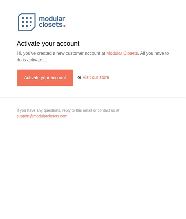
This email aims to guide new customers through the final step of activating their account with Modular Closets, ensuring they can access their personalized dashboard and begin exploring custom closet solutions. It also gently encourages immediate engagement by offering an alternative path to browse the store.
Why this works
The email opens with a warm, personal tone that acknowledges the user’s action, creating an account, which builds immediate rapport and reduces friction in the onboarding process.
How to implement
By offering a secondary option to 'Visit our store' alongside the primary CTA, the email accommodates users who may not be ready to activate but still want to explore, reducing drop-off and nurturing interest.
Pro Tip
Add a brief benefit statement under the CTA, such as 'Activate to save your designs and get personalized recommendations,' to clarify the value of completing the step and increase conversion. • Include a small visual cue, like a checkmark icon or progress bar, next to the activation prompt to visually reinforce that this is a simple, one-step process, reducing perceived effort.
7. Rakuten : Hot Deal for you at Dermstore: The Beauty Refresh Sale: Shop up to 20% off.
Objective
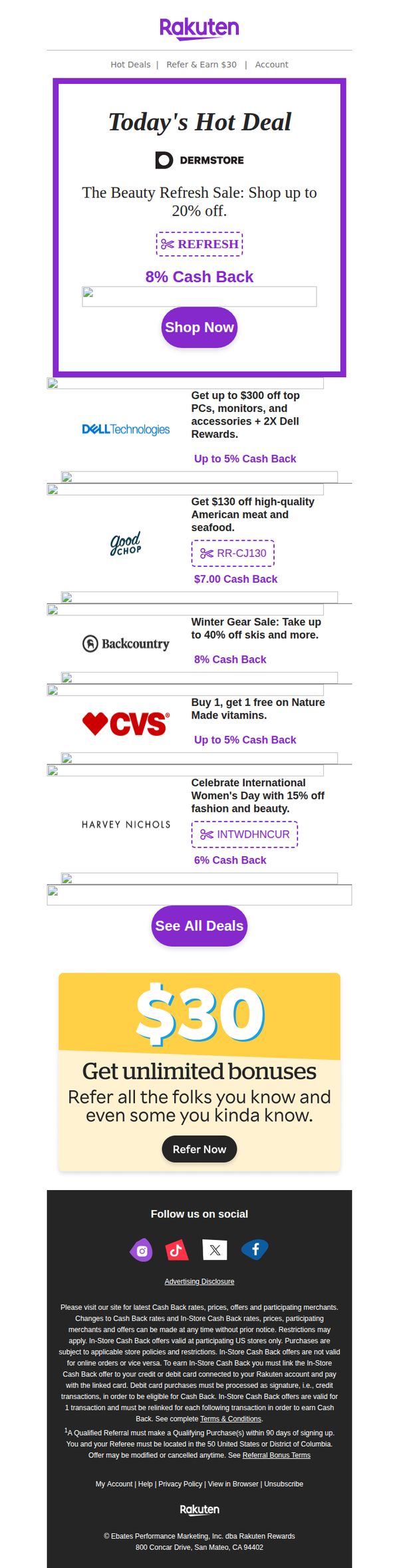
This email aims to drive immediate clicks and purchases by highlighting time-sensitive, high-value deals from partner retailers, while also encouraging user referrals to expand the Rakuten user base through a compelling $30 bonus incentive.
Why this works
The email leads with a bold, branded 'Today’s Hot Deal' section that immediately grabs attention by combining a recognizable retailer logo, a clear discount message, and a prominent CTA button, all designed to reduce decision fatigue and drive instant action.
How to implement
Each deal is visually separated with consistent spacing and includes a branded coupon code or cash back percentage, which builds trust and makes the value proposition instantly scannable for users who are comparing multiple offers in a single glance.
Pro Tip
Add a subtle countdown timer or 'limited-time' badge to the Dermstore hero section to create urgency, since the current design lacks any temporal pressure that could nudge hesitant shoppers toward immediate action. • Include a short testimonial or star rating beneath the top 1–2 deals (e.g., Dermstore or Dell) to build social proof, especially since cash back offers alone may not be enough to overcome trust barriers for new users unfamiliar with the retailers.
8. Ankorstore UK: EZE, discover your curated brand selection
Objective
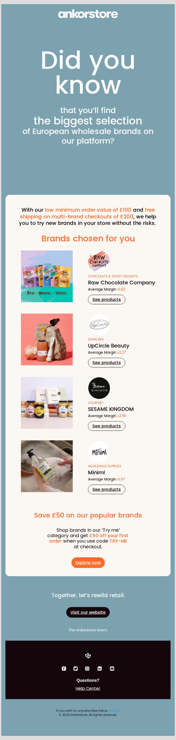
This email aims to introduce new or inactive retailers to Ankorstore UK’s curated selection of European wholesale brands, encouraging them to explore and place their first order by highlighting low-risk entry points and a £50 discount incentive.
Why this works
The email smartly reduces perceived risk for new buyers by emphasizing a low £100 minimum order and free shipping on multi-brand orders over £300, making experimentation feel safe and financially sensible.
How to implement
Curating brands by category with clear visuals, margin multipliers, and direct 'See products' CTAs transforms a generic list into a personalized, shoppable experience that speaks directly to retail buyers’ profit motives.
Pro Tip
Add a subtle countdown timer or 'Limited Time Offer' badge near the £50 discount section to increase urgency and prevent the incentive from feeling evergreen or low-priority. • Include a short testimonial or social proof snippet from a UK retailer who successfully used the 'Try me' category to source profitable brands, adding credibility to the offer.
9. Ankorstore UK: Welcome to Ankorstore
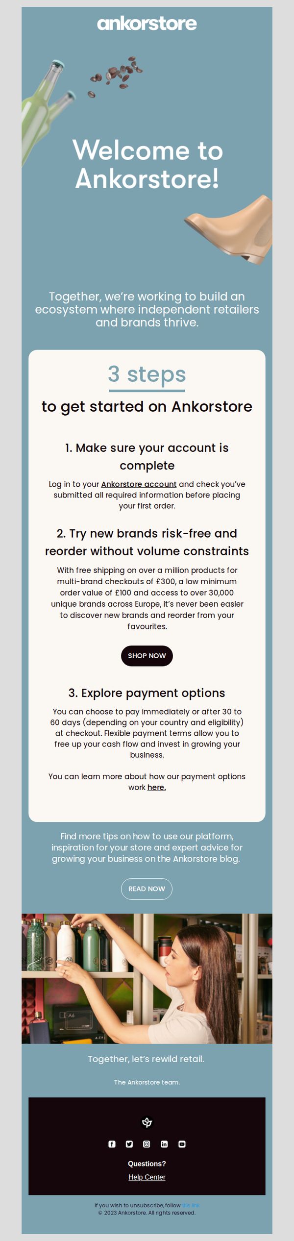
Objective
This email aims to onboard new independent retailers by clearly guiding them through their first steps on Ankorstore, while reinforcing the platform’s value in helping them discover brands and manage cash flow with flexible payment terms.
Why this works
The email brilliantly frames onboarding as a three-step journey, reducing overwhelm for new users by breaking down complex platform adoption into simple, actionable milestones that feel achievable and purposeful.
How to implement
By highlighting risk-free brand discovery with concrete numbers, like free shipping on £300+ multi-brand orders and access to 30,000+ European brands, it turns abstract platform benefits into tangible, trust-building incentives for retailers.
Pro Tip
The 'SHOP NOW' CTA appears after step 2 but doesn’t visually stand out enough against the white card; consider increasing contrast or adding a subtle hover effect to draw attention and reduce friction for users ready to act. • The hero section’s background image includes product visuals (bottles, boots) that don’t clearly relate to the platform’s B2B retail focus; replacing them with imagery of curated retail shelves or brand catalogs would better align with the target audience’s identity.
10. Ankorstore UK: Four ways to make the most of Ankorstore
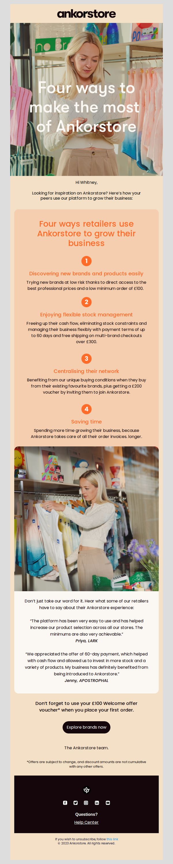
Objective
This email aims to inspire new and existing retailers by showcasing practical, peer-validated ways to grow their business using Ankorstore’s platform, while gently nudging them toward their first purchase with a welcome voucher.
Why this works
The email effectively builds credibility by framing value through peer behavior, showing how real retailers succeed with Ankorstore, which makes the platform feel trusted and proven rather than just promoted.
How to implement
It smartly ties each benefit to a tangible business outcome, like cash flow, time savings, or network growth, helping retailers visualize ROI instead of just features, which increases perceived value and urgency.
Pro Tip
Add a subtle countdown timer or urgency indicator near the CTA to reinforce the limited-time nature of the £100 voucher, which could nudge procrastinators into immediate action without altering the email’s tone. • Include a micro-visual cue (like a small icon or badge) next to each of the four benefits to enhance scannability and reinforce the value proposition visually, helping busy retailers absorb key points faster.