Modular Closets emails worth copying
1. Customer account activation
Objective
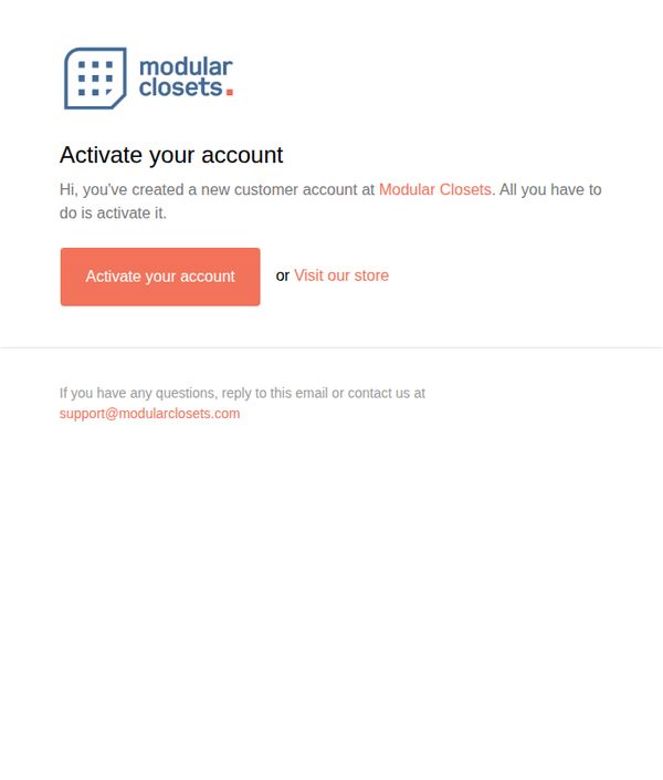
This email aims to guide new customers through the final step of activating their account with Modular Closets, ensuring they can access their personalized dashboard and begin exploring custom closet solutions. It also gently encourages immediate engagement by offering an alternative path to browse the store.
Why this works
The email opens with a warm, personal tone that acknowledges the user’s action, creating an account, which builds immediate rapport and reduces friction in the onboarding process.
How to implement
By offering a secondary option to 'Visit our store' alongside the primary CTA, the email accommodates users who may not be ready to activate but still want to explore, reducing drop-off and nurturing interest.
Pro Tip
Add a brief benefit statement under the CTA, such as 'Activate to save your designs and get personalized recommendations,' to clarify the value of completing the step and increase conversion. • Include a small visual cue, like a checkmark icon or progress bar, next to the activation prompt to visually reinforce that this is a simple, one-step process, reducing perceived effort.
2. Confirm Your Subscription
Objective
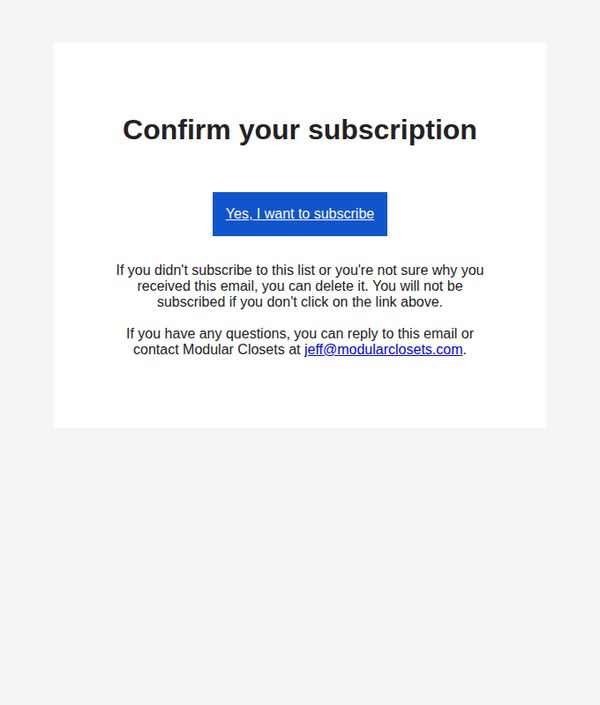
This email aims to verify new subscribers by prompting them to confirm their interest in receiving communications from Modular Closets, ensuring list accuracy and compliance with email marketing standards.
Why this works
The email clearly states the purpose upfront with a bold, centered headline that eliminates confusion and sets immediate expectations for the recipient’s next action.
How to implement
It reassures hesitant subscribers by explicitly stating they won’t be added unless they click, reducing anxiety and increasing trust in the brand’s permission-based approach.
Pro Tip
Add a brief value proposition beneath the headline, such as 'Get exclusive closet organization tips and early access to sales', to motivate confirmation by clarifying what subscribers gain. • Replace the generic blue CTA button with a branded color that matches Modular Closets’ visual identity to strengthen brand recognition and visual cohesion.
3. Confirm Your Subscription
Objective
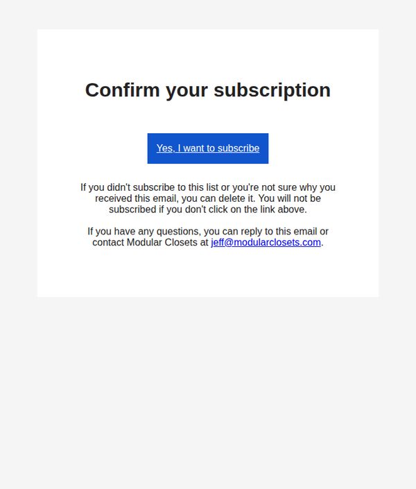
This email aims to confirm the recipient’s intent to subscribe to Modular Closets’ mailing list by prompting a clear affirmative action, while also reducing accidental subscriptions by offering an easy opt-out and direct customer support contact.
Why this works
The email uses a minimalist, high-contrast design to eliminate distractions and focus the reader’s attention squarely on the single most important action: confirming subscription with a bold, centered CTA button that stands out visually and functionally.
How to implement
It thoughtfully includes a gentle reassurance that non-action equals non-subscription, reducing anxiety for uncertain recipients and lowering the perceived risk of engagement, which can increase conversion rates for permission-based marketing.
Pro Tip
Add a brief value proposition above the CTA (e.g., 'Get exclusive closet design tips and early access to sales') to remind users why they subscribed, increasing confirmation rates by reinforcing perceived benefit. • Include a small brand logo or visual element near the header to strengthen brand recognition and reduce the email’s generic appearance, making it feel more personalized and trustworthy.
4. Customer account confirmation
Objective
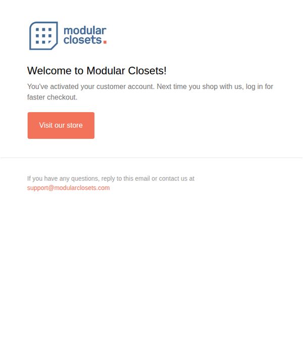
To confirm the customer’s account activation and encourage immediate engagement by directing them back to the store for a faster checkout experience on their next visit.
Why this works
The email immediately reassures the customer that their account is active, reducing friction and building trust by clearly stating the benefit, faster checkout on future visits, right in the opening line.
How to implement
The primary CTA is bold, action-oriented, and color-contrasted against the background, making it impossible to miss while aligning perfectly with the goal of driving traffic back to the store for immediate conversion.
Pro Tip
Add a brief personalized welcome message using the customer’s first name to increase emotional connection and make the confirmation feel more tailored rather than transactional. • Include a small visual cue or icon next to the CTA button, such as a shopping bag or arrow, to reinforce the action and improve visual scanning for users on mobile devices.