How Services brands do educational email campaigns

1. Interactive Brokers: IBKR Traders' Insight Newsletter February 27, 2026
Objective
To deliver timely, high-value market insights and educational content to active traders, positioning Interactive Brokers as a thought leader while driving engagement through article reads, podcast listens, and webinar registrations.
Why this works
The email opens with a provocative, data-driven headline that immediately taps into trader psychology by framing market conditions as an actionable opportunity rather than just information, which increases click-through intent.
How to implement
Each article preview is paired with a credible contributor and a branded visual, which builds authority and consistency while subtly reinforcing the platform’s ecosystem of expert partnerships and proprietary content.
Pro Tip
Add a visual countdown timer or urgency indicator next to webinar registration CTAs to leverage scarcity and boost registration rates, especially for events occurring within 48 hours. • Include a brief 'Why This Matters' one-liner beneath each article headline to clarify the immediate relevance to the trader’s portfolio or strategy, reducing cognitive load and increasing perceived value.
2. Shop Solar Kits: Still thinking about solar?
Objective
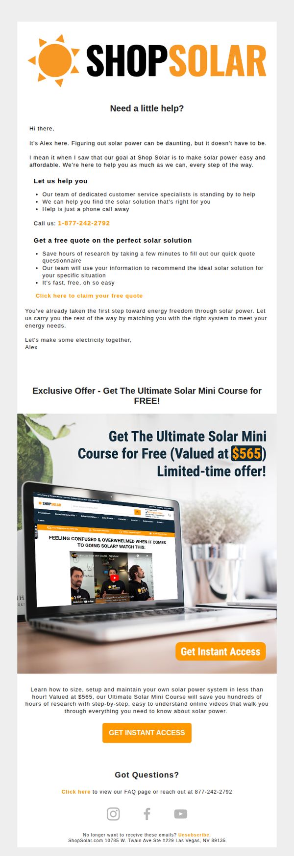
This email aims to re-engage prospects who are still considering solar by offering personalized support and a high-value free educational course to reduce decision fatigue and build trust. It positions Shop Solar Kits as a helpful guide rather than a pushy seller.
Why this works
The email opens with a warm, empathetic tone from a named representative, which immediately humanizes the brand and reduces the intimidation factor often associated with solar adoption, making the reader feel supported rather than sold to.
How to implement
By offering a free, high-perceived-value course instead of a discount, the campaign positions itself as an educational partner, which builds long-term trust and subtly primes the prospect for future purchases by increasing their confidence in solar solutions.
Pro Tip
Add a countdown timer or urgency indicator under the course offer to reinforce the 'limited-time' claim visually, which would increase perceived scarcity and motivate faster action without altering the helpful tone. • Include a short testimonial or social proof near the course CTA, such as 'Over 2,000 homeowners have used this course to go solar confidently', to validate the offer’s value and reduce hesitation from undecided prospects.
3. Northern Trust: AI Market Disruptions
Objective
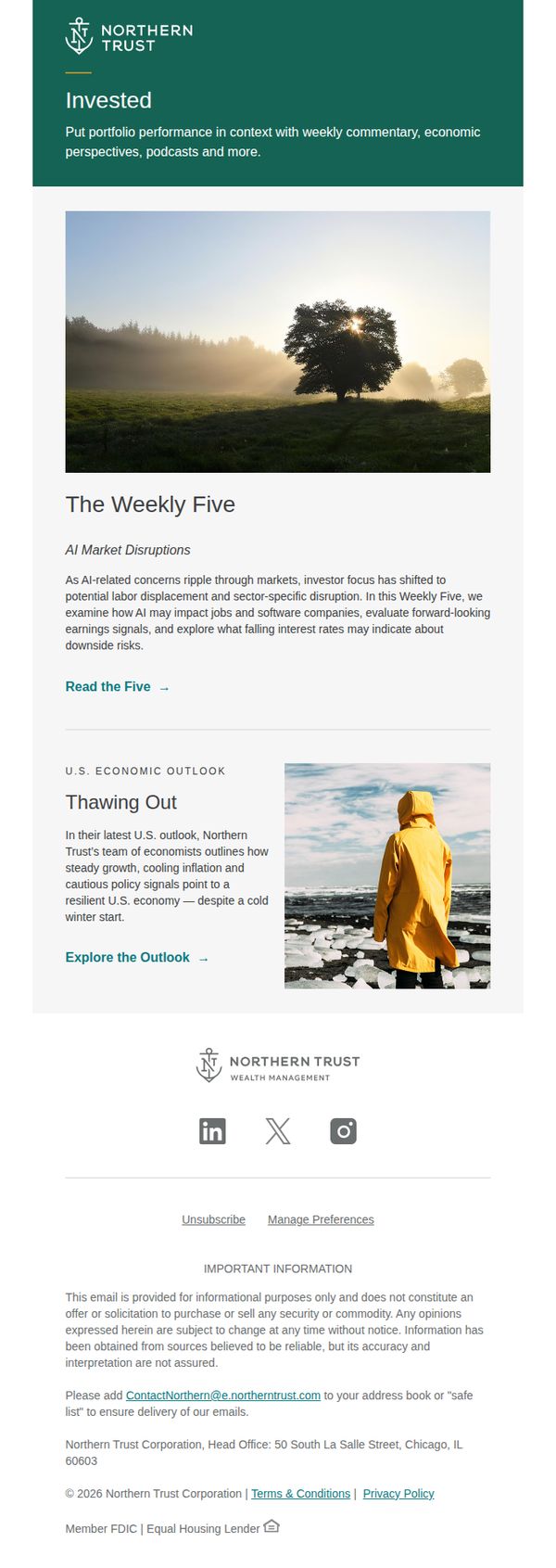
To position Northern Trust as a thought leader in wealth management by delivering timely, context-rich market insights that help investors understand AI-driven disruptions and economic trends, encouraging ongoing engagement with their content ecosystem.
Why this works
The email opens with a strong brand identity and clear value proposition, immediately signaling to high-net-worth readers that this isn’t generic market noise but curated, institutional-grade insight tailored for sophisticated investors.
How to implement
By anchoring the content around a recurring feature, 'The Weekly Five', Northern Trust builds anticipation and habit, turning episodic readers into loyal subscribers who return weekly for digestible, high-impact market analysis.
Pro Tip
Add a secondary CTA beneath the 'U.S. Economic Outlook' section, such as 'Download the Full Report', to convert interested readers into lead gen prospects, leveraging the credibility of their economist team. • Introduce a brief personalization tagline in the header (e.g., 'For Investors Watching AI Shift Markets') to immediately resonate with the recipient’s specific concerns and increase perceived relevance.
4. Shop Solar Kits: Making an order with Shop Solar couldn't be easier
Objective
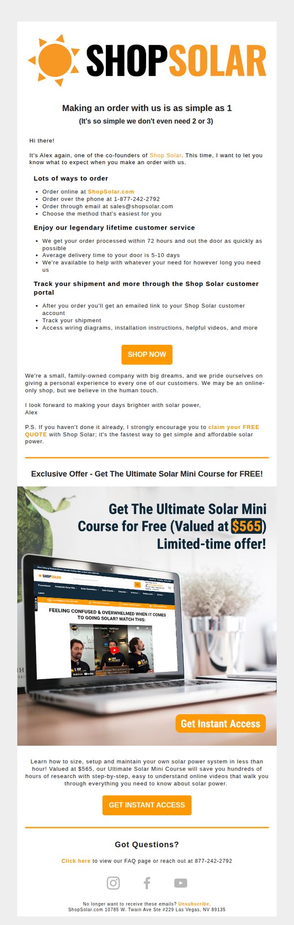
This email aims to reassure potential customers that ordering solar kits from Shop Solar is simple, fast, and supported by personalized service, while encouraging immediate action through a free educational course offer to reduce purchase hesitation.
Why this works
The email brilliantly reduces friction by framing the ordering process as 'as simple as 1', a clever psychological nudge that positions complexity as unnecessary and reassures hesitant buyers with clear, multiple contact options.
How to implement
By embedding a high-value free course (valued at $565) as the core offer, the campaign transforms a sales pitch into an educational gateway, building trust and authority while subtly guiding prospects toward product consideration without aggressive selling.
Pro Tip
The CTA 'SHOP NOW' appears too early and lacks context, reposition it after the free course offer to align with the user’s journey from education to purchase, increasing conversion likelihood. • The email lacks urgency cues beyond 'limited-time offer', adding a visible countdown timer or progress bar next to the course offer would heighten FOMO and drive faster action.
5. Bread Financial : One more step to better savings
Objective
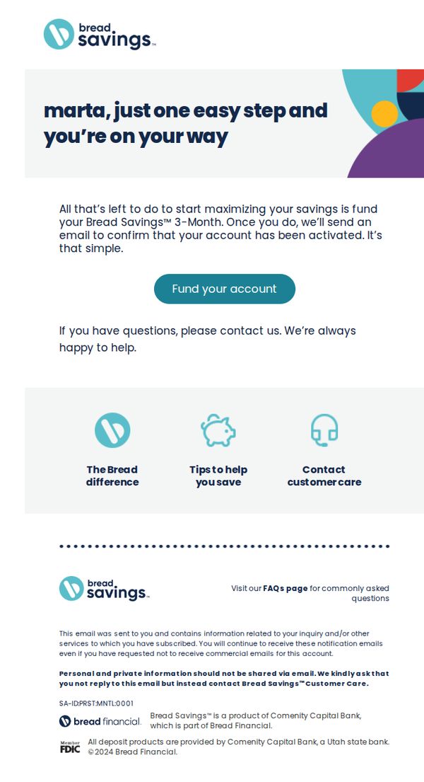
This email aims to guide the recipient, Marta, to complete the final step in activating her Bread Savings account by funding it, thereby transitioning from sign-up to active usage and unlocking the 3-Month savings benefit.
Why this works
The email personalizes the recipient’s name upfront and frames the required action as 'one easy step,' reducing perceived friction and making account activation feel approachable rather than burdensome.
How to implement
It clearly ties the CTA to a tangible benefit, activating the 3-Month savings feature, which transforms a generic funding request into a value-driven milestone the user wants to achieve.
Pro Tip
Add a visual progress indicator or checklist above the CTA showing 'Step 3 of 3: Fund Your Account' to reinforce completion momentum and reduce abandonment by making the user feel closer to their goal. • Include a brief, bolded benefit statement directly under the CTA button, such as 'Start earning up to 5.00% APY today', to re-anchor the user’s motivation at the point of decision.
6. Qonto: Your credentials have been created ✅
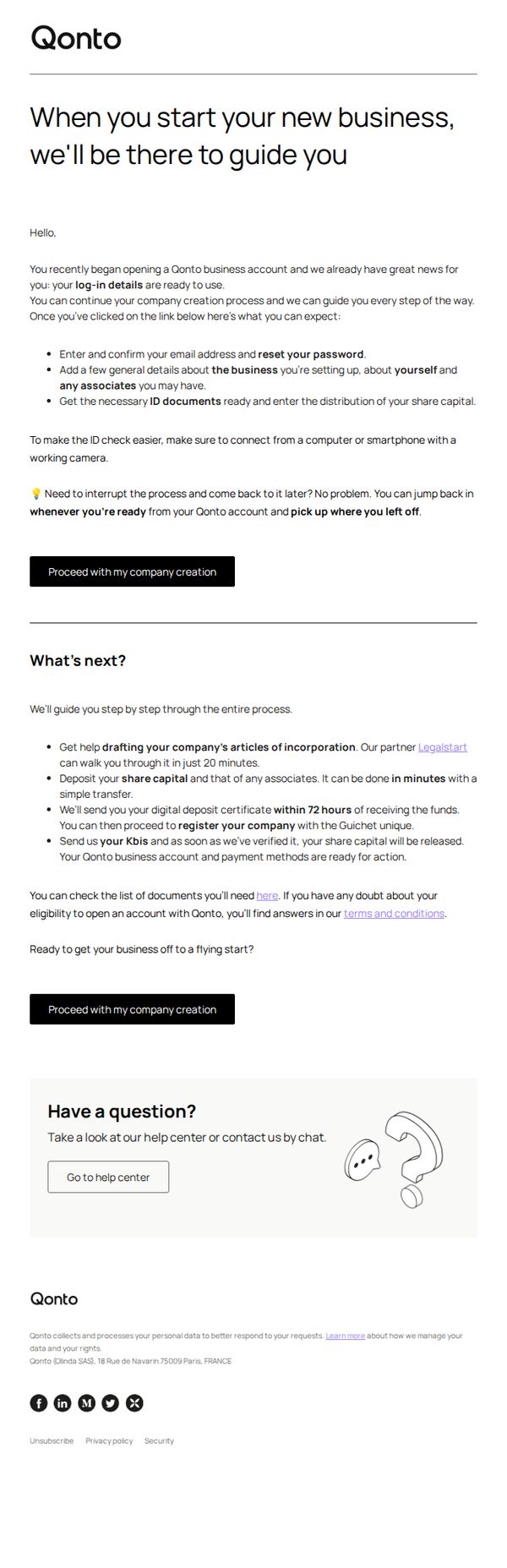
Objective
This email aims to reassure new users that their Qonto business account setup is underway and guide them through the next critical steps, reducing friction by clearly outlining what to expect and offering flexible re-entry points to complete onboarding at their own pace.
Why this works
The email opens with a warm, reassuring tone that positions Qonto as a supportive partner from day one, which builds trust and reduces anxiety for users navigating complex business setup processes.
How to implement
By breaking down next steps into clear, time-bound actions, like drafting articles of incorporation in 20 minutes or receiving a digital deposit certificate within 72 hours, the email makes onboarding feel manageable and predictable.
Pro Tip
Add a visual progress bar or checklist under 'What’s next?' to help users track completion status, increasing motivation and reducing cognitive load during onboarding. • Include a brief testimonial or social proof near the CTA from a similar business owner who successfully completed onboarding, to reinforce credibility and reduce perceived risk.
7. Sage Traveling: ♿ Final Call: Join Our Mediterranean Cruise Before March 31st!

Objective
This email aims to drive immediate bookings for Sage Traveling’s exclusive Mediterranean cruise by emphasizing a time-sensitive St. Patrick’s Day discount and reinforcing trust through client testimonials and accessible travel expertise. It also seeks to nurture long-term engagement by sharing educational content and other trip opportunities.
Why this works
The email brilliantly leverages urgency with a dual-layered discount, combining a holiday-themed bonus with an extended deadline, making the offer feel both exclusive and time-sensitive without overwhelming the reader.
How to implement
By embedding real client testimonials with vivid, personal stories and location-specific photos, the campaign builds authentic social proof that directly addresses accessibility concerns while humanizing the brand’s expertise.
Pro Tip
The primary CTA 'Learn More' is too generic for a time-sensitive offer; replacing it with action-oriented text like 'Claim Your $700 Savings Before March 31' would better align with the urgency and increase conversion intent. • The layout buries the Mediterranean cruise offer beneath introductory text; moving the 'Featured Tour' section immediately after the header would prioritize the highest-converting offer and reduce scroll friction for decision-ready travelers.
8. Motorway : How to maximise your Audi's value?
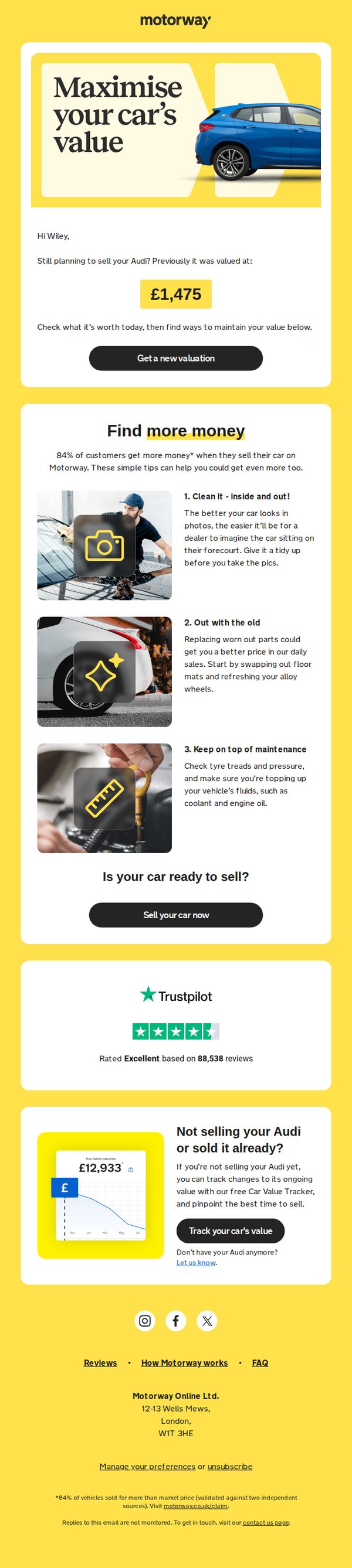
Objective
This email aims to re-engage a user who previously valued their Audi with Motorway, encouraging them to get a new, potentially higher valuation by following simple car preparation tips. It also offers value-tracking tools for users not yet ready to sell.
Why this works
The email personalizes the message by referencing the user’s past valuation, creating a sense of continuity and urgency to act before the car’s value declines further.
How to implement
It transforms a simple valuation tool into a value-maximizing experience by offering three practical, visual tips that empower the user to take immediate action before listing their car.
Pro Tip
Add a countdown timer or urgency cue near the CTA to encourage immediate action, since the email implies the car’s value may decrease over time, reinforcing the need to act now. • Include a short video or animated GIF in the education section showing one of the tips in action, such as cleaning the car or checking tire pressure, to increase engagement and perceived value.
9. Interactive Brokers: IBKR Traders' Insight Newsletter January 6, 2026

Objective
This email aims to position Interactive Brokers as a trusted source of timely, high-impact market intelligence for active traders by delivering curated geopolitical, technical, and macroeconomic analysis alongside educational content and event invitations to drive engagement and platform loyalty.
Why this works
The email opens with a bold geopolitical headline and a visually arresting image of cracked flags to immediately signal high-stakes market-moving content, which grabs trader attention and frames the newsletter as essential reading for those tracking global risk catalysts.
How to implement
Each article and podcast is clearly attributed to a named contributor or reputable partner, which builds credibility and authority by signaling that the insights come from real experts rather than generic editorial staff, making the content feel more trustworthy and actionable for sophisticated traders.
Pro Tip
The primary CTA 'READ MORE' is visually repetitive and lacks urgency or differentiation; replacing it with context-specific CTAs like 'Analyze the Risk' or 'Watch the Podcast' would better align with each section’s intent and improve click-through relevance. • The webinar section lists events with dates but no countdown timers or time-zone converters, which reduces urgency and increases friction for global traders; adding a dynamic countdown and auto-detected local time would significantly boost registration conversion.
10. Graphic Art Mart: Worth the Click: This Week at GAM

Objective
To engage existing customers and prospects by showcasing behind-the-scenes product builds, educational tutorials, and upcoming training events, ultimately driving video views, event registrations, and product interest through compelling visual storytelling and timely offers.
Why this works
The email masterfully blends product storytelling with educational value by featuring a behind-the-scenes build video, which not only demonstrates product quality but also humanizes the brand through the technician’s expertise and passion.
How to implement
By tying the Lunar New Year theme to a relevant product tutorial using Siser PureHT, the campaign creates cultural relevance and emotional resonance, turning a seasonal moment into a compelling reason to engage with the brand’s creative solutions.
Pro Tip
The CTA 'REGISTER NOW' appears below dense text, reposition it immediately under the event headline with a contrasting background to increase visibility and reduce friction for users ready to act. • The demo equipment sale banner lacks a direct CTA button; adding a 'Shop Now' or 'View Deals' button with clear visual hierarchy would convert passive viewers into active shoppers without requiring extra scrolling.