Flipdish email campaign ideas that work
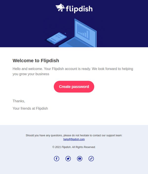
1. [Flipdish] Your new Flipdish Portal account
Objective
This email aims to welcome new users to their Flipdish Portal account and guide them to set up their password, establishing the first step in onboarding while reinforcing brand support and trust.
Why this works
The email opens with a warm, personalized welcome that immediately reassures new users their account is active and ready, reducing friction and building confidence in the onboarding process.
How to implement
A bold, contrasting CTA button labeled 'Create password' stands out visually and functionally, making the next step unmistakable and reducing cognitive load for the user.
Pro Tip
Add a brief bullet-point list under the welcome message outlining what users can do after setting their password, such as managing orders, viewing analytics, or customizing menus, to increase perceived value and motivation to complete setup. • Include a small visual cue or progress indicator near the CTA (e.g., 'Step 1 of 3: Set your password') to frame the action within a larger onboarding journey, reducing drop-off and increasing completion rates.
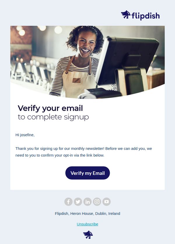
2. ✉️ One more step.. verify your email address
Objective
This email aims to prompt the recipient to verify their email address to complete their signup for Flipdish’s monthly newsletter, ensuring list hygiene and compliance while reinforcing brand welcome messaging.
Why this works
The email uses a warm, personalized greeting combined with a clear, single-purpose CTA to reduce friction and guide users toward completing a critical onboarding step without overwhelming them with options.
How to implement
By framing email verification as a necessary step to unlock the value of the monthly newsletter, the message positions the action as beneficial rather than bureaucratic, increasing perceived relevance and compliance.
Pro Tip
Add a secondary CTA or reminder text below the main button (e.g., 'Didn’t receive the link? Resend verification') to reduce drop-off for users who may have missed or deleted the initial confirmation email. • Include a brief value reminder above the CTA, such as 'Get exclusive tips on boosting restaurant sales every month', to reinforce why verification is worth the user’s time and strengthen conversion intent.
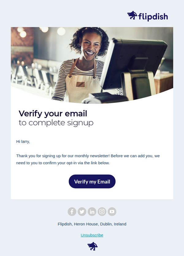
3. ✉️ One more step.. verify your email address
Objective
This email aims to prompt the recipient to verify their email address to complete their signup for Flipdish’s monthly newsletter, ensuring list hygiene and user consent before onboarding them into ongoing communications.
Why this works
The email opens with a warm, personalized greeting that immediately establishes rapport, making the recipient feel recognized rather than just another subscriber in a database.
How to implement
By framing verification as the final step to unlock a valuable benefit, the monthly newsletter, the email transforms a technical requirement into a rewarding milestone, increasing completion rates.
Pro Tip
Add a brief, reassuring note near the CTA explaining what happens after verification, e.g., 'You’ll receive your first newsletter next Tuesday with exclusive restaurant growth tips', to reinforce value and reduce hesitation. • Include a secondary, low-friction option like 'Resend verification link' or a support contact directly below the CTA to accommodate users who may have missed or deleted the original email.