How NorthStar Bets - CA does promotional email campaigns
1. Welcome to NorthStar Bets tamiko!
Objective
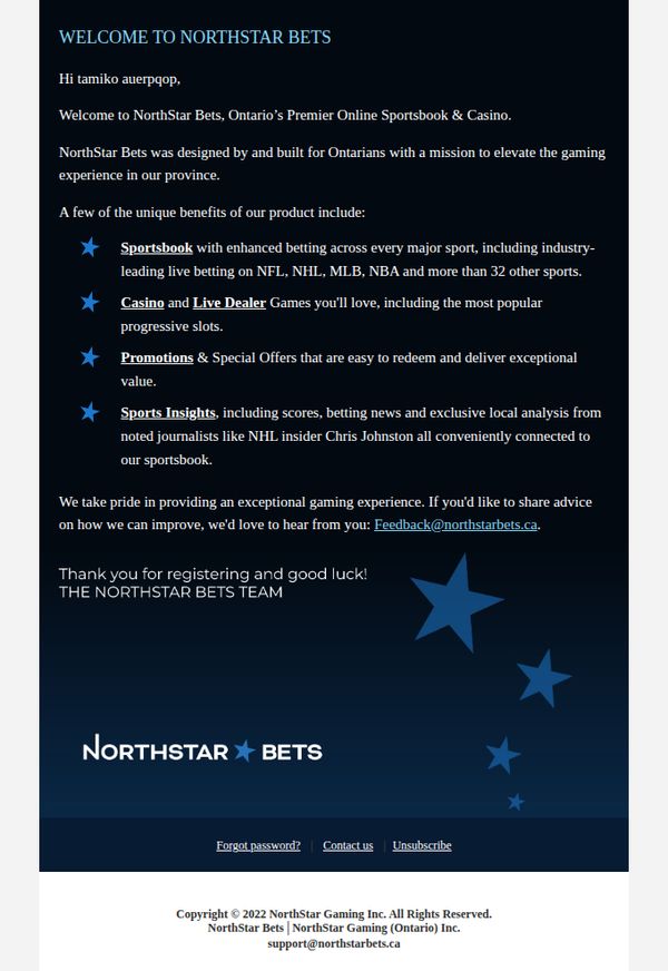
This welcome email introduces new user tamiko to NorthStar Bets, highlighting its Ontario-focused sportsbook and casino offerings while reinforcing brand trust and encouraging engagement through personalized value propositions and a feedback invitation.
Why this works
The email effectively personalizes the onboarding experience by addressing the user by name and immediately anchoring the brand’s value to local Ontario gamers, which builds relevance and trust from the first sentence.
How to implement
By listing four distinct product pillars, Sportsbook, Casino, Promotions, and Sports Insights, the email creates a clear, scannable value map that helps new users understand the breadth of offerings without overwhelming them with detail.
Pro Tip
Add a primary CTA button like 'Start Betting Now' or 'Explore Casino Games' above the footer to drive immediate action, since the current feedback link lacks conversion intent and may confuse new users about next steps. • Incorporate a visual element, such as icons or small product thumbnails, next to each of the four benefit bullets to improve scannability and emotional engagement, especially since the current layout relies entirely on text and stars.
2. Welcome to NorthStar Bets bethany!
Objective
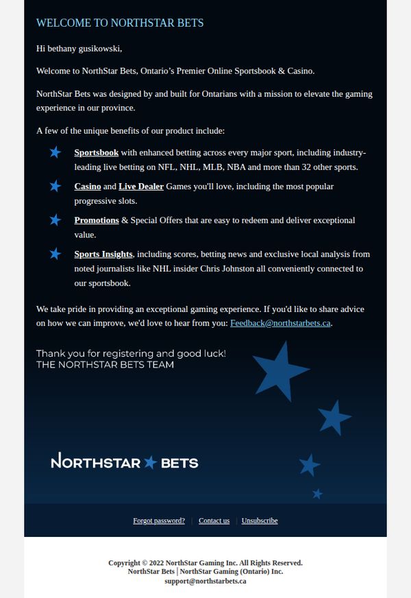
This email aims to warmly welcome new user Bethany to NorthStar Bets by introducing the platform’s core offerings and reinforcing its Ontario-focused mission, while encouraging engagement through feedback and future use.
Why this works
The email effectively personalizes the welcome by using the user’s full name and immediately anchoring the brand’s identity to Ontario, creating instant local relevance and trust for new registrants.
How to implement
By listing key features as bullet points with bolded category headers, the email makes complex offerings digestible and scannable, helping users quickly grasp value without overwhelming them with text.
Pro Tip
Add a primary CTA button like 'Start Betting Now' or 'Explore Sportsbook' above the footer to drive immediate action instead of relying solely on a passive email link for feedback. • Incorporate a visual element, such as a small screenshot or icon grid, next to each feature bullet point to enhance visual engagement and break up text-heavy content.
3. ★ You’re almost there!
Objective
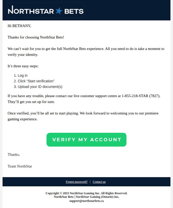
This email aims to guide new users through the final steps of account verification to unlock full access to NorthStar Bets’ gaming platform, reducing friction by simplifying the process into three clear actions while reinforcing support availability.
Why this works
The email opens with a warm, personalized greeting and immediate appreciation, making the user feel valued right away, a subtle but powerful trust-building tactic that reduces drop-off during onboarding.
How to implement
Breaking down verification into three numbered, bite-sized steps transforms a potentially intimidating process into something approachable and actionable, which significantly lowers psychological resistance to completing the task.
Pro Tip
Add a visual progress indicator or checklist next to the three steps to give users a sense of momentum and completion, which can increase conversion by making the process feel more tangible and rewarding. • Reposition the CTA button higher in the email or repeat it after the support line to ensure users don’t miss it, currently, it’s buried below text that some may skip, especially on mobile.
4. ★ You’re almost there!
Objective
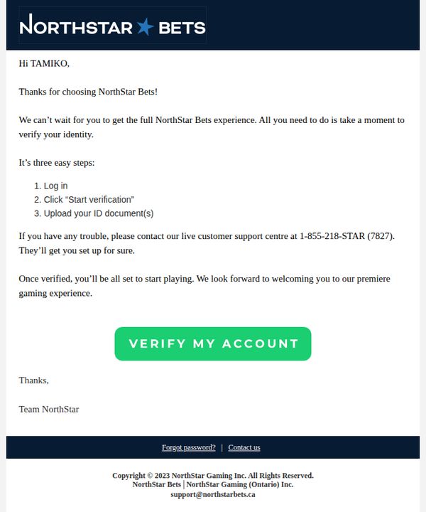
This email aims to guide new users through the final steps of account verification to unlock full access to NorthStar Bets’ gaming platform, reducing friction by simplifying the process into three clear actions while reinforcing support availability.
Why this works
The email opens with a personalized greeting and immediate appreciation, making the user feel valued right away, a subtle but powerful trust-building tactic that increases compliance with verification steps.
How to implement
Breaking down the verification process into three numbered, bite-sized actions reduces cognitive load and makes an otherwise intimidating task feel manageable, increasing the likelihood of completion.
Pro Tip
Add a visual progress indicator or checklist next to the three steps to give users a sense of momentum and accomplishment as they complete each task, increasing motivation to finish verification. • Include a brief, reassuring sentence about data security or privacy compliance near the ID upload step to alleviate user concerns about sharing sensitive documents, which can reduce drop-offs.