The complete software NPS email collection

1. Café: Get our mobile app 📲
Objective
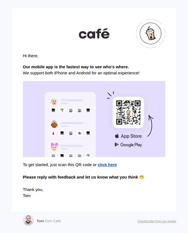
The email aims to drive mobile app downloads by positioning the app as the fastest way to stay connected with the brand’s community, while encouraging user feedback to foster engagement and improve the experience.
Why this works
The email frames the app not just as a utility but as a social connector, 'the fastest way to see who’s where', which taps into FOMO and community belonging, making the download feel socially rewarding rather than transactional.
How to implement
Including both QR code and hyperlink options removes friction for different user preferences, while the visual arrow guiding the eye to the QR code subtly trains users to scan rather than click, increasing conversion likelihood.
Pro Tip
Add a brief social proof element, such as 'Join 50,000+ members already using the app', near the QR code to reduce hesitation and reinforce credibility before the user commits to downloading. • Replace the generic 'click here' CTA with a benefit-driven phrase like 'Get instant access to your favorite café spots' to clarify value and increase click-through motivation.
2. Deliverect: 👋 Help us humanize words we use in our product
Objective
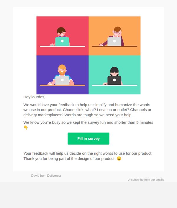
Deliverect aims to gather user feedback to simplify and humanize terminology used in their product, making it more intuitive and user-friendly by involving customers in the design process.
Why this works
By framing the survey as a collaborative design effort, Deliverect positions the user as a co-creator, which increases emotional investment and willingness to participate despite time constraints.
How to implement
The playful tone and emoji use, like the waving hand in the subject line and the smiling face at the end, soften the request, making it feel friendly and low-pressure rather than transactional or demanding.
Pro Tip
Add a progress indicator or visual cue (e.g., 'Step 1 of 3') within the survey link to reinforce the 'under 5 minutes' promise and reduce drop-off by setting clear expectations. • Include a brief example of the terminology being reviewed (e.g., 'Should we say “Outlet” or “Location”?') to immediately ground users in the context and reduce confusion before they click through.
3. Thareja: Apple Makes Its Second-Largest Acquisition Ever With Q.Ai To Advance “Silent Speech” Ai Technology
Objective
This email aims to engage AI enthusiasts by delivering timely, high-value industry news and insights while subtly promoting Thareja AI’s platform through educational content and a targeted subscription offer. It seeks to position Thareja as a thought leader and drive conversions via a limited-time bundle deal.
Why this works
The email brilliantly blends breaking industry news with practical AI education, making complex topics like procedural generation accessible through relatable examples like cooking recipes, which keeps readers engaged while subtly showcasing the platform’s capabilities.
How to implement
By embedding a time-sensitive, value-driven offer within a content-rich newsletter, the campaign avoids sounding salesy and instead positions the product as a natural next step for readers already invested in the educational journey, increasing conversion likelihood without disrupting the experience.
Pro Tip
The CTA 'Try Thareja AI Chat' appears multiple times but lacks visual hierarchy, consider using a contrasting color or larger button size in the offer section to make it stand out more prominently against the white background and increase click-through rates. • The 'AI Training: AI Tutorial of the Day' section is rich in detail but could benefit from a short video or animated GIF demonstrating the recipe-to-algorithm transformation, which would reduce cognitive load and increase engagement for visual learners.
4. Power My Analytics: What's new at PMA this month — Your Data.. Your Region, TikTok Shop + more
Objective
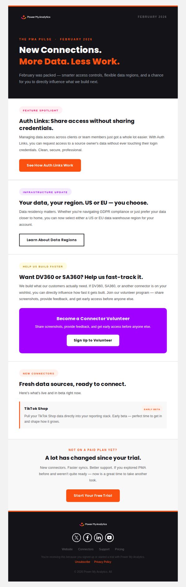
To inform existing and potential users about new product features and updates from Power My Analytics, while encouraging trial sign-ups and community participation through connector volunteering. The email aims to reinforce trust by highlighting data control, regional compliance, and customer-driven development.
Why this works
The email brilliantly positions new features as customer-driven solutions, like Auth Links and regional data control, making users feel heard and valued, which builds deeper trust and reduces perceived friction around data security.
How to implement
By spotlighting TikTok Shop as an 'early beta' connector, the campaign creates urgency and exclusivity, turning a technical update into a compelling invitation for early adopters to shape the product’s future and gain competitive advantage.
Pro Tip
The CTA 'Start Your Free Trial' appears only once at the bottom, buried after multiple sections, placing a secondary, sticky CTA button after the 'New Connectors' section would capture intent earlier and reduce drop-off for users already convinced. • The 'Help Us Build Faster' section uses a purple button that visually competes with the orange primary CTA, standardizing button colors to orange for all conversion-focused actions would strengthen visual hierarchy and reduce cognitive friction.
5. Square: Answers to all of your Square questions
Objective
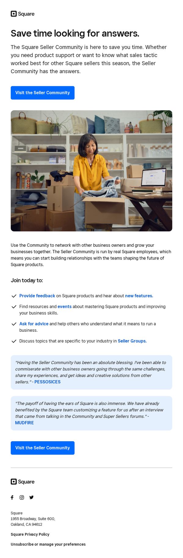
This email aims to drive engagement with Square’s Seller Community by positioning it as a time-saving, peer-supported resource for product help and sales strategy insights, encouraging sellers to join and contribute to a collaborative ecosystem.
Why this works
The email brilliantly frames the Seller Community not just as a support channel but as a peer-driven growth engine, making users feel they’re joining a movement rather than just accessing help, which increases emotional buy-in and participation.
How to implement
By featuring real testimonials from recognizable business names like PESSOSICES and MUDFIRE, the email builds instant credibility and social proof, showing tangible outcomes that motivate sellers to believe their own challenges can be solved through community engagement.
Pro Tip
Add a subtle countdown or urgency cue near the CTA, such as 'Join 10,000+ sellers this month,' to nudge procrastinators and reinforce the community’s active, growing nature. • Include a brief visual icon or mini-illustration next to each bullet point (e.g., a speech bubble for 'Ask for advice') to improve scannability and reinforce each benefit with intuitive visual cues.
6. Café: 🆕 Join a community in Café 👋
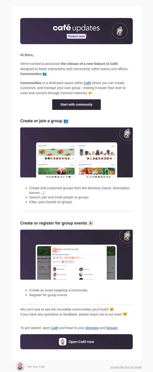
Objective
This email aims to introduce and drive adoption of Café’s new 'Communities' feature by highlighting its value for team connectivity and group interaction, encouraging immediate user engagement through clear next steps and visual examples.
Why this works
The email opens with warm, conversational tone and emoji-enhanced copy to instantly humanize the product update, making technical features feel inviting and socially relevant rather than corporate or overwhelming.
How to implement
It strategically breaks down complex functionality into digestible, benefit-driven sections, like group creation and event registration, each paired with real UI screenshots to reduce cognitive load and build user confidence.
Pro Tip
Add a subtle countdown or urgency cue near the CTA, such as 'First 100 groups get custom banners', to nudge procrastinators and increase conversion without compromising the friendly tone. • Include a short testimonial or quote from an early adopter within the education section to reinforce social proof and demonstrate real-world value beyond feature descriptions.
7. Competitors App : Asuncionkutch, your free trial has ended. Don't say it's over! 💔

Objective
This email aims to convert a trial user into a paying customer by reminding them their free access has ended and highlighting the ongoing value they’ll miss without a premium subscription. It uses emotional appeal and a personal sign-off to encourage immediate action.
Why this works
The email opens with a personalized, emotionally resonant subject line that frames the trial’s end as a breakup, instantly creating urgency and emotional investment rather than just a transactional reminder.
How to implement
It clearly lists the specific, high-value actions users can no longer access, like monitoring competitor ads or content, turning abstract features into tangible losses that motivate conversion.
Pro Tip
Add a secondary CTA above the image, such as 'Extend my trial for 3 more days', to reduce friction for hesitant users and give them a low-commitment next step before viewing pricing. • Include a small testimonial or social proof snippet near the CTA, like '92% of trial users upgrade because they can’t miss real-time competitor alerts', to reinforce value and reduce perceived risk.
8. Competitors App : ⌛️Asuncionkutch, your trial ends tomorrow ...

Objective
This email aims to convert a trial user into a paying customer by creating urgency around the trial expiration and offering personalized support to overcome adoption barriers, while also gathering feedback to improve retention.
Why this works
The email opens with a personalized, time-sensitive subject line that leverages FOMO by highlighting the trial’s imminent end, immediately capturing attention and signaling relevance to the recipient’s current status.
How to implement
By embedding a direct, empathetic offer to help users who didn’t fully explore the tool, the message shifts from a sales pitch to a customer-centric support gesture, building trust and reducing perceived friction to conversion.
Pro Tip
Add a secondary CTA below the main button offering a 'Schedule a 10-minute onboarding call' to reduce friction for users who feel overwhelmed or unsure how to proceed. • Include a brief, bolded bullet list of 2–3 key features or results the user missed during trial to remind them of the value they’re about to lose, reinforcing urgency with concrete benefits.
9. Competitors App : Your trial is over 😭 . Competitors are not being monitored.

Objective
The email aims to convert trial users into paying customers by highlighting the loss of competitor monitoring and offering an extended trial in exchange for feedback, creating urgency and personal connection.
Why this works
The email opens with emotional urgency by using a sad emoji and stating monitoring has stopped, immediately triggering FOMO and making the reader feel the tangible cost of inaction.
How to implement
Instead of pushing a hard sell, it offers extra trial days in exchange for feedback, which positions the brand as helpful and customer-centric, lowering resistance and building trust before asking for payment.
Pro Tip
Add a visual progress bar or countdown timer showing how many extra trial days remain after the user replies, creating time-sensitive motivation to act immediately rather than delay feedback. • Include a short bullet list of 2–3 key features the user missed during trial (e.g., 'Real-time price alerts', 'Shareable competitor reports') to remind them of the tool’s value before presenting the pricing link.
10. Café: Slack and Teams apps 🔌
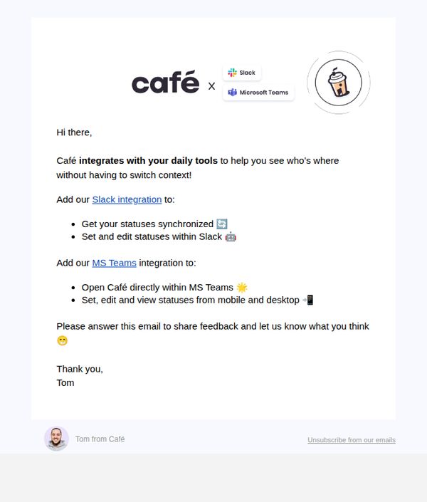
Objective
This email aims to drive adoption of Café’s new Slack and Microsoft Teams integrations by highlighting their convenience and seamless workflow benefits, while also inviting user feedback to improve the experience.
Why this works
The email immediately establishes value by framing the integrations as context-saving tools, which speaks directly to productivity-focused users who hate switching between apps during their workday.
How to implement
By listing specific, tangible benefits for each platform, like syncing statuses in Slack or launching Café inside Teams, the message turns abstract features into concrete, relatable wins that reduce perceived friction.
Pro Tip
Add a visual screenshot or GIF showing the integration in action within Slack or Teams to reduce cognitive load and help users instantly visualize the benefit. • Include a secondary CTA button or link for the MS Teams integration to avoid forcing users to scroll or click through text links, improving conversion equity across both platforms.