How ecommerce brands do Product Highlight welcome emails
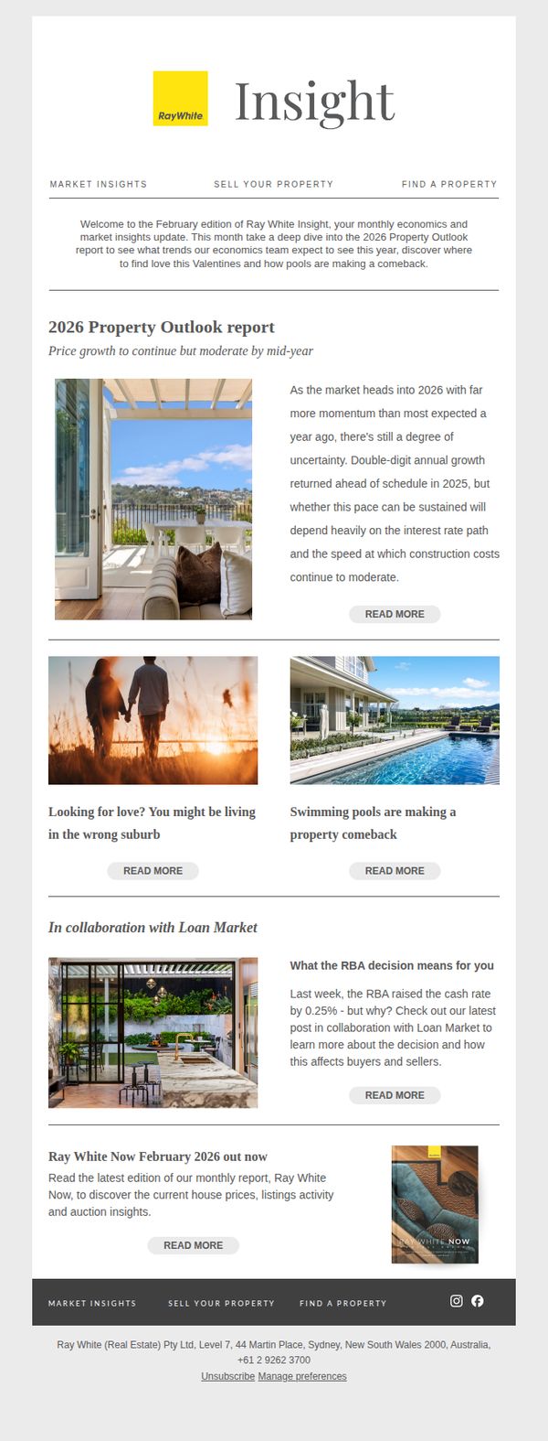
1. Ray White : The lifestyle feature making a comeback
Objective
This email aims to engage property buyers and sellers by delivering timely market insights while subtly promoting Ray White’s expertise and services through curated content that ties real estate trends to lifestyle and economic factors.
Why this works
The email brilliantly ties real estate trends to emotional lifestyle moments, like Valentine’s Day and poolside living, to make market data feel personal and relatable, which increases reader investment in the content.
How to implement
By collaborating with Loan Market to explain the RBA rate decision, the email builds credibility through third-party expertise while positioning Ray White as a trusted guide in complex financial territory affecting property decisions.
Pro Tip
Add a subtle countdown or urgency cue near the 'READ MORE' buttons for time-sensitive content like the 2026 Outlook, to nudge readers toward immediate action instead of passive scrolling. • Include a personalized subject line or dynamic content placeholder (e.g., 'In your area: [Suburb Name] property trends') to increase relevance and open rates by anchoring insights to the recipient’s local market.
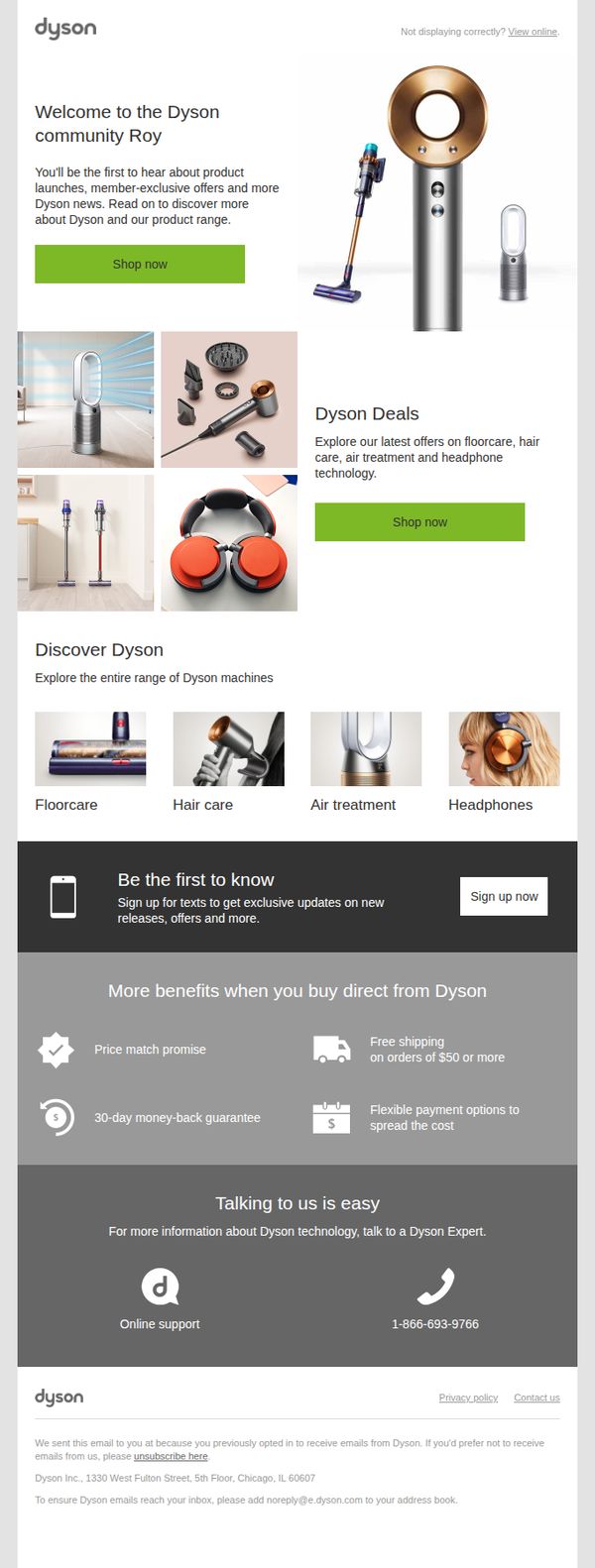
2. Dyson: Welcome to the Dyson community Roy
Objective
This email aims to welcome new subscribers to the Dyson community by introducing them to the brand’s product range and exclusive member benefits, while encouraging immediate engagement through shopping and text sign-up.
Why this works
Dyson smartly personalizes the welcome by name and immediately positions the subscriber as part of an exclusive community, creating emotional ownership and early brand loyalty before any product pitch.
How to implement
The email strategically groups products into intuitive categories with clean visuals and labels, making it effortless for new customers to explore Dyson’s diverse tech ecosystem without feeling overwhelmed or lost.
Pro Tip
Add a countdown timer or limited-time badge near the 'Dyson Deals' CTA to create urgency and increase click-through, since the current static 'Shop now' lacks temporal motivation for immediate action. • Include a short customer testimonial or star rating under the 'Discover Dyson' product grid to build social proof and credibility, especially for new subscribers unfamiliar with product performance.
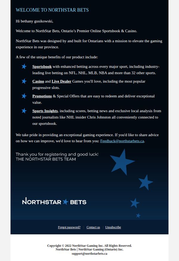
3. NorthStar Bets - CA: Welcome to NorthStar Bets bethany!
Objective
This email aims to warmly welcome new user Bethany to NorthStar Bets by introducing the platform’s core offerings and reinforcing its Ontario-focused mission, while encouraging engagement through feedback and future use.
Why this works
The email effectively personalizes the welcome by using the user’s full name and immediately anchoring the brand’s identity to Ontario, creating instant local relevance and trust for new registrants.
How to implement
By listing key features as bullet points with bolded category headers, the email makes complex offerings digestible and scannable, helping users quickly grasp value without overwhelming them with text.
Pro Tip
Add a primary CTA button like 'Start Betting Now' or 'Explore Sportsbook' above the footer to drive immediate action instead of relying solely on a passive email link for feedback. • Incorporate a visual element, such as a small screenshot or icon grid, next to each feature bullet point to enhance visual engagement and break up text-heavy content.
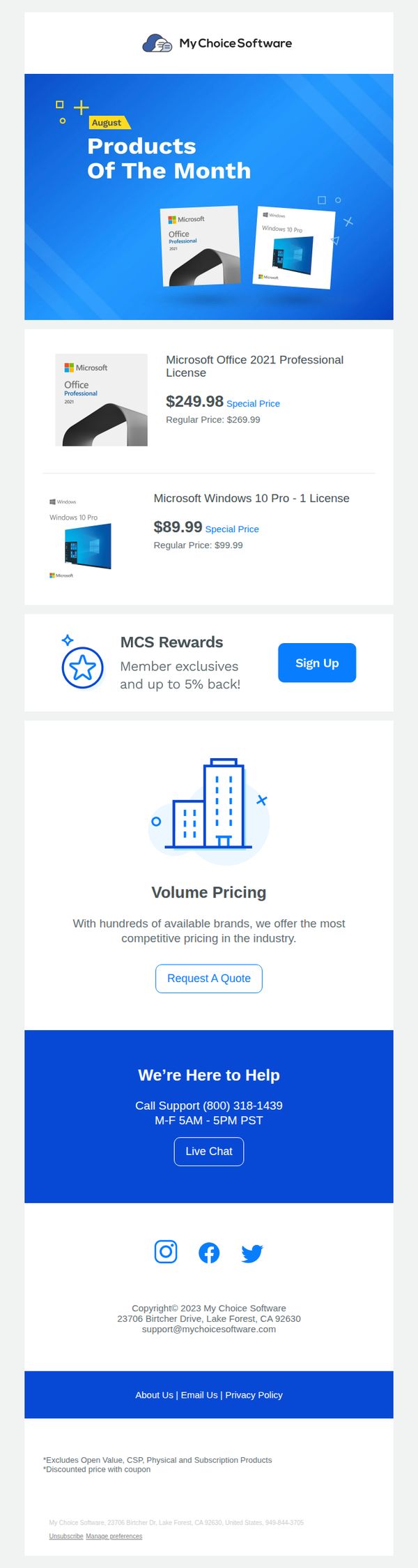
4. My Choice Software: 😎 Welcome, August Products Of The Month!
Objective
This email aims to drive immediate sales by spotlighting August’s featured Microsoft software products with discounted pricing, while also encouraging new member sign-ups through a rewards program to build long-term customer loyalty.
Why this works
The email immediately grabs attention by using a bold hero section with a clear 'Products of the Month' headline and visual product mockups, making the offer instantly recognizable and reducing cognitive load for the reader.
How to implement
By displaying both the special price and regular price side-by-side for each product, the campaign creates a strong perception of value and urgency, which can significantly boost conversion rates among price-sensitive software buyers.
Pro Tip
Add a countdown timer or 'Limited Stock' indicator near the product prices to create urgency and prevent procrastination, especially since software licenses are often purchased on impulse when perceived as scarce or time-sensitive. • Include a short customer testimonial or star rating next to each product to build trust and reduce perceived risk, especially important for digital software purchases where users can’t physically inspect the product before buying.
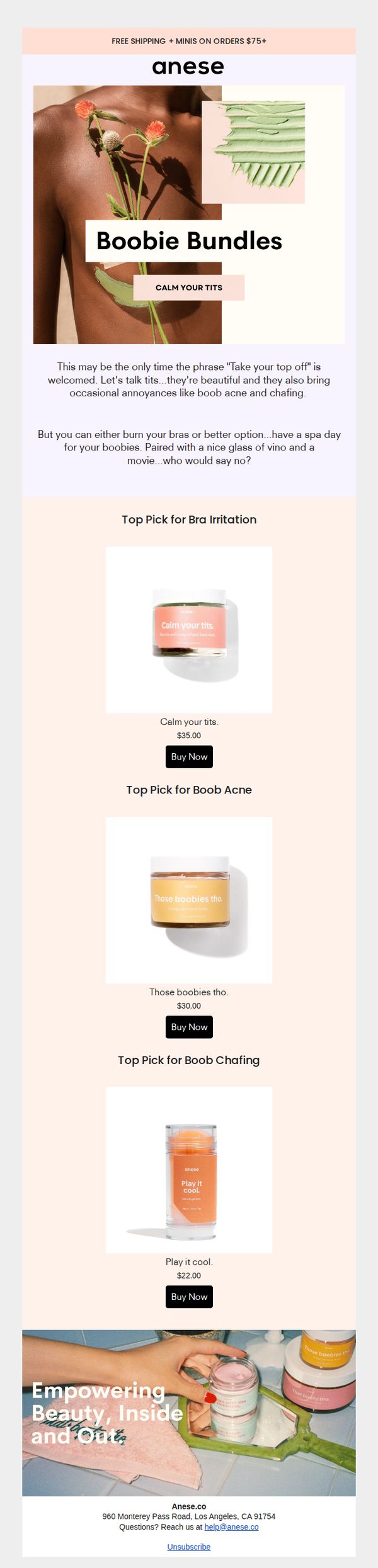
5. Anese: Boobie Bundles!
Objective
This email aims to drive sales of Anese’s targeted breast care products by humorously addressing common discomforts while positioning them as self-care essentials. It encourages immediate purchase through playful copy and clear product categorization.
Why this works
The email brilliantly reframes a sensitive topic into a lighthearted, empowering experience by using cheeky phrases like 'Calm Your Tits', making the product feel like a fun, guilt-free self-care ritual rather than a medical necessity.
How to implement
By organizing products into specific problem-solving categories, Bra Irritation, Boob Acne, Chafing, the email speaks directly to real pain points, helping customers instantly identify which solution fits their need without overwhelming them with choices.
Pro Tip
Add a visual progress bar or countdown timer near the CTA to create urgency around the $75+ free shipping offer, encouraging larger cart values and reducing hesitation at checkout. • Include a short customer testimonial or review snippet under each product to reinforce social proof, especially since the humor might overshadow perceived efficacy, real user validation can bridge that trust gap.
6. Klaviyo: Take a look inside—your growth tools are waiting
Objective
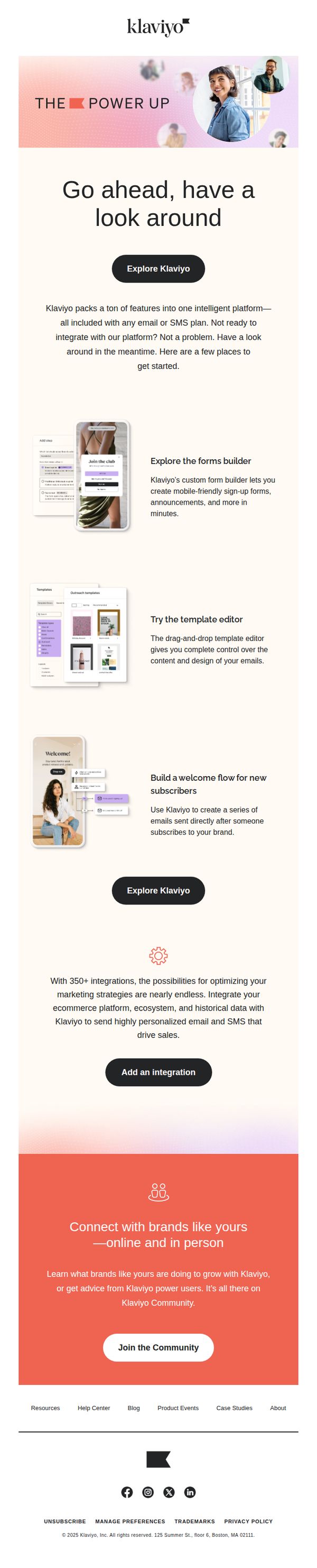
This email aims to onboard potential users by showcasing Klaviyo’s key features and integrations, encouraging exploration even before full platform adoption. It positions Klaviyo as an accessible, feature-rich growth tool for brands ready to optimize marketing with email and SMS.
Why this works
By inviting users to 'have a look around' without pressure to commit, Klaviyo lowers the barrier to entry and positions itself as a helpful, exploratory resource rather than a sales-driven platform, building trust through accessibility.
How to implement
The email strategically highlights three core tools, forms builder, template editor, and welcome flows, with concise, benefit-driven descriptions that immediately answer 'What’s in it for me?' and demonstrate tangible value without overwhelming the reader.
Pro Tip
Add a visual progress indicator or checklist (e.g., '3 Tools You Can Try in 5 Minutes') to guide users through the featured sections, creating a sense of momentum and reducing cognitive load during exploration. • Reposition the 'Add an integration' CTA to appear immediately after the integrations paragraph, rather than below it, to capitalize on the persuasive momentum of mentioning 350+ integrations and reduce scroll friction for high-intent users.
7. Architectural Digest: OPEN DOOR ALERT: Inside Jon Batiste and Suleika Jaouad’s Brooklyn Town House
Objective
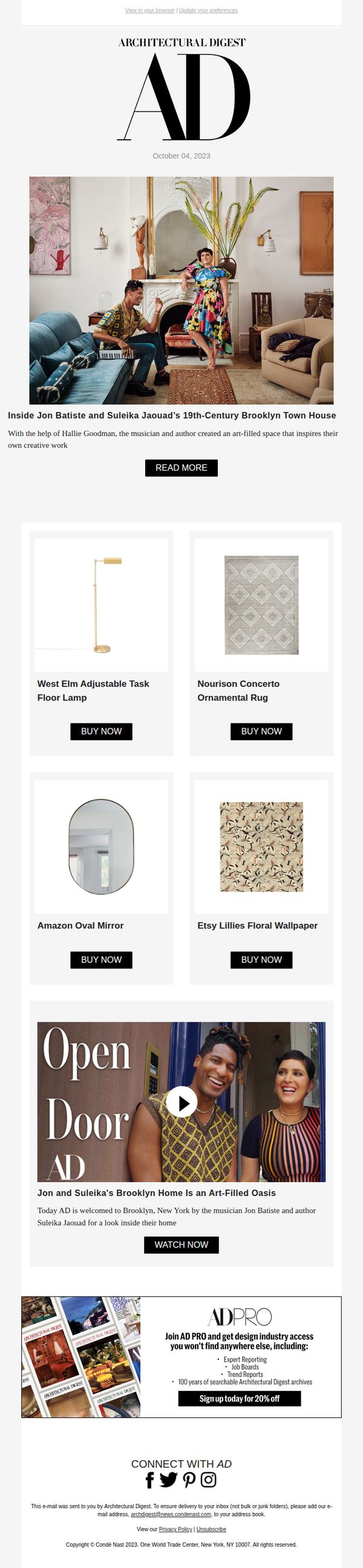
To drive engagement with Architectural Digest’s exclusive home tour of Jon Batiste and Suleika Jaouad’s Brooklyn townhouse while promoting shoppable interior products and encouraging AD PRO membership sign-ups with a limited-time discount.
Why this works
The email brilliantly leverages celebrity storytelling to create emotional resonance, positioning the home tour not just as decor inspiration but as a narrative of creativity and partnership that readers want to step into.
How to implement
By embedding shoppable product tiles directly beneath the hero image, the campaign turns passive admiration into immediate purchasing intent, seamlessly blending editorial content with e-commerce in a way that feels organic and aspirational.
Pro Tip
The 'READ MORE' CTA is visually underwhelming and buried beneath the hero image; repositioning it as a larger, color-contrasted button directly over the hero photo would significantly boost click-through rates. • The AD PRO offer at the bottom feels disconnected from the main narrative; integrating a subtle teaser like 'Want more behind-the-scenes access? AD PRO members get exclusive tours like this first' would strengthen relevance and conversion intent.
8. Kit: Kit Product Updates: February 2026

Objective
This email aims to inform Kit users about new product features and integrations released in February 2026, encouraging adoption through clear CTAs while reinforcing brand value by showcasing strategic partnerships and educational opportunities.
Why this works
The email leads with a high-impact integration, Kajabi, that solves a real pain point for course creators, immediately signaling value by showing how automation reduces manual work while increasing student engagement and revenue potential.
How to implement
Each new feature is presented with a clean visual icon, a benefit-driven headline, and a direct CTA, making it effortless for users to understand what’s new and take action without scrolling or searching for next steps.
Pro Tip
The 'Save your seat' CTA for the webinar is visually underwhelming compared to the primary 'Connect Kajabi to Kit' button; increasing its size or using a contrasting color would better reflect its strategic importance in driving user education and platform stickiness. • The feedback section at the bottom uses radio buttons without a submit button, which may confuse users; adding a clear 'Submit Feedback' CTA or converting it to a one-click rating system would improve completion rates and data quality.
9. Norse Atlantic Airways - FR : Thailand this autumn? Yes, please. 😀
Objective
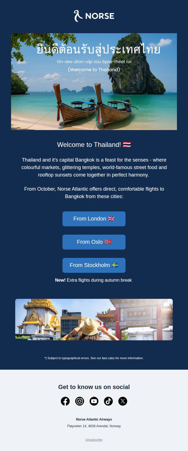
This email aims to drive bookings for Norse Atlantic Airways’ new direct flights to Bangkok this autumn by highlighting Thailand’s sensory appeal and convenient departure cities. It targets travelers seeking exotic getaways during the autumn break with a visually rich, emotionally engaging invitation.
Why this works
The email opens with a stunning hero image of Thailand’s coastline paired with a warm, multilingual welcome message that instantly transports the reader, a powerful emotional hook that primes them for wanderlust before any offer is mentioned.
How to implement
Instead of leading with price or schedule, the campaign leads with sensory storytelling, markets, temples, street food, sunsets, which positions the destination as an experience, not just a flight, making the offer feel more valuable and emotionally resonant.
Pro Tip
Add a visible countdown timer or limited-seat indicator near the CTA buttons to amplify urgency, since the ‘New! Extra flights’ note is buried and doesn’t create immediate FOMO for time-sensitive travelers. • Include a small ‘From [Price]’ tag under each city button to reduce friction, readers currently must click through to discover pricing, which may cause drop-off for price-sensitive autumn break planners.
10. RealTruck: Welcome to RealTruck
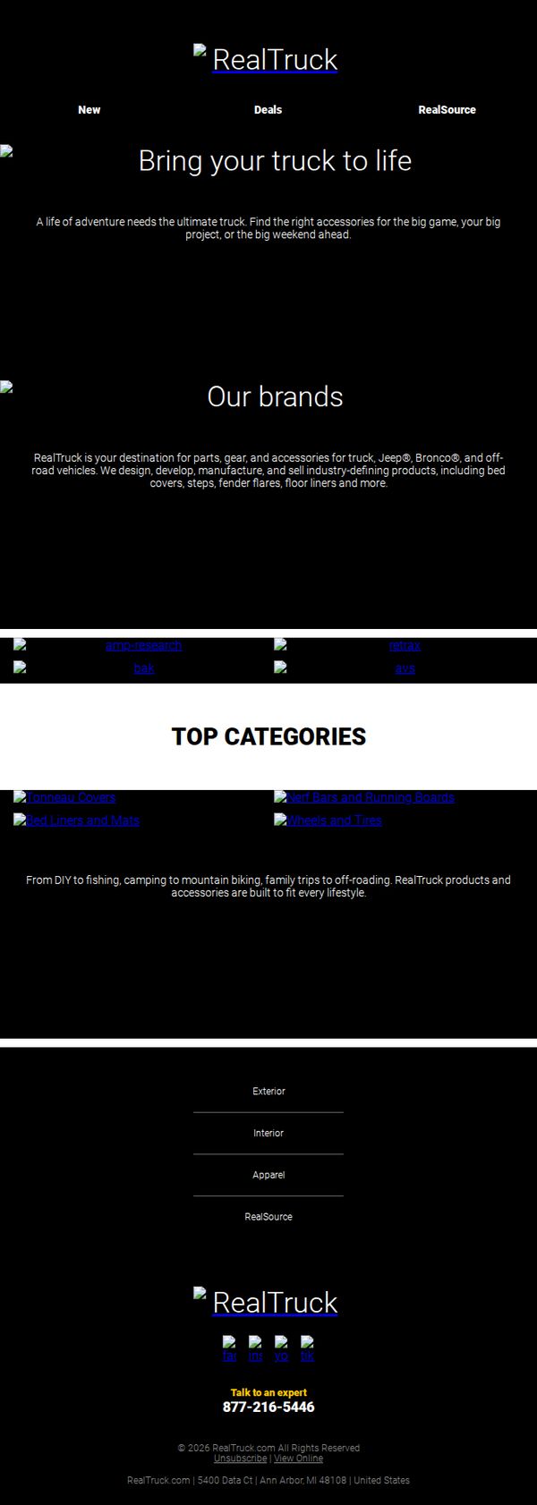
Objective
This welcome email aims to introduce new subscribers to RealTruck as their go-to source for truck, Jeep, and off-road vehicle accessories, while encouraging exploration of top product categories and brand partnerships to drive early engagement and future purchases.
Why this works
The email immediately establishes brand authority by positioning RealTruck as the ultimate destination for truck and off-road accessories, subtly implying that no other retailer offers the same depth or expertise across Jeep, Bronco, and custom builds.
How to implement
By showcasing top categories with lifestyle-driven imagery and concise benefit-driven copy, the email connects product functionality to real-world adventures, from family trips to off-roading, making the accessories feel essential rather than optional upgrades.
Pro Tip
Add a personalized welcome message using the subscriber’s name and a tailored product suggestion based on their sign-up source or vehicle type to increase relevance and reduce generic onboarding friction. • Integrate a subtle visual hierarchy or animated arrow pointing toward the 'Talk to an expert' CTA to guide the eye and increase conversion, especially since the footer placement may cause it to be overlooked in longer emails.