Proven Spruce email designs you can use
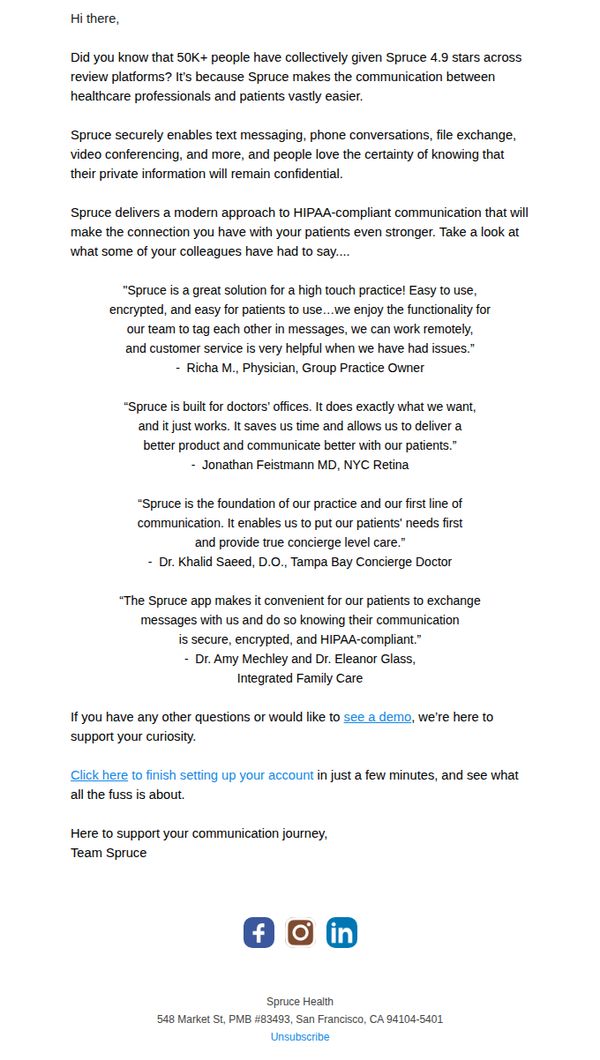
1. Spruce - trusted by 50K+ users. Demo & trial offer stand.
Objective
To convert healthcare professionals into users by highlighting Spruce’s trusted reputation, HIPAA-compliant features, and peer testimonials, ultimately driving them to start a free trial or request a demo.
Why this works
Spruce leverages social proof powerfully by front-loading its 4.9-star rating from 50K+ users, immediately establishing credibility and reducing skepticism among healthcare professionals evaluating new tools.
How to implement
The email strategically uses real testimonials from diverse medical roles, physicians, retina specialists, concierge doctors, to show broad applicability and build trust through peer validation rather than generic marketing claims.
Pro Tip
Add a visual hierarchy to the testimonials, perhaps with headshots or role badges, to make them feel more personal and credible, increasing emotional engagement and reducing cognitive load for busy readers. • Include a secondary CTA above the main one, such as 'Watch a 2-minute demo' or 'See how it works for your specialty,' to accommodate users who aren’t ready to sign up but want to explore further.
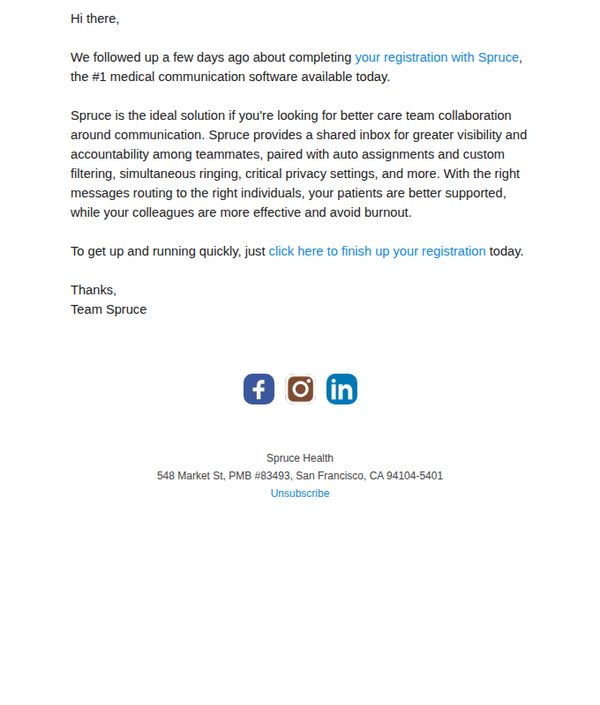
2. Still interested in Spruce Health? Free trial offer inside!
Objective
This email aims to re-engage users who started but didn’t complete their Spruce Health registration, by reminding them of the platform’s value and encouraging immediate action through a personalized, low-friction CTA.
Why this works
Spruce frames its software not as a tool but as a solution to a critical pain point, fragmented care team communication, making the value proposition instantly relatable to medical professionals overwhelmed by coordination gaps.
How to implement
The email leverages psychological urgency by referencing a prior follow-up, subtly implying the recipient is already part of an ongoing conversation, which increases perceived relevance and reduces the likelihood of being ignored as generic spam.
Pro Tip
Add a visual element like a screenshot or icon near the CTA to break up text density and visually anchor the registration action, improving click-through rates by reducing cognitive load. • Include a brief testimonial or stat (e.g., 'Used by 10,000+ clinicians') to reinforce credibility and social proof, especially since the email targets professionals who value peer validation before committing.
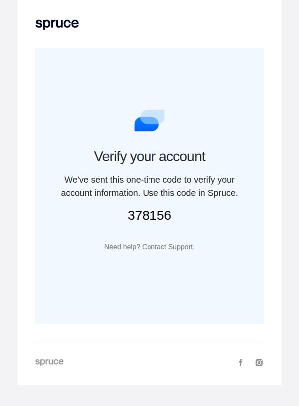
3. Verification Code: 378156
Objective
This email aims to securely verify the user’s identity by delivering a one-time code required to complete account setup or authentication within the Spruce platform. It prioritizes clarity and trust to ensure the user enters the code without confusion or delay.
Why this works
The email immediately establishes purpose with a bold, centered headline and a clean layout that eliminates distractions, ensuring the user’s attention locks onto the verification code without delay or cognitive load.
How to implement
By placing the six-digit code in a large, isolated font beneath explanatory text, the design leverages visual hierarchy to guide the user’s eye exactly where it needs to go, reducing friction and minimizing input errors.
Pro Tip
Add a visual countdown timer or expiration notice (e.g., 'Code expires in 10 minutes') near the code to create urgency and reduce support tickets from expired attempts. • Include a direct 'Copy Code' button next to the number to reduce manual entry errors and improve mobile usability, especially since users often switch between email and app.