Stake - US campaign emails worth copying
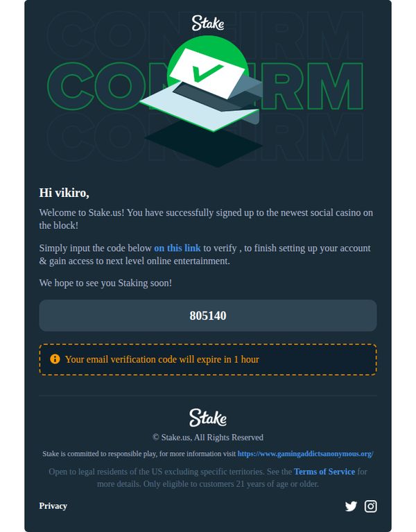
1. vikiro, welcome to Stake.us!
Objective
This email aims to guide the new user, vikiro, through the final step of account verification by delivering a time-sensitive code and reinforcing excitement about joining Stake.us, the newest social casino platform. It seeks to convert sign-up into active engagement by emphasizing immediate access to online entertainment.
Why this works
The email personalizes the welcome with the user’s name and frames the platform as the 'newest social casino on the block,' creating instant FOMO and positioning the brand as innovative and exclusive to early adopters.
How to implement
By embedding the verification code directly in the body with a clear expiration warning, the email reduces friction and urgency without requiring the user to hunt for a separate message or navigate away from the email.
Pro Tip
The primary CTA 'on this link' is underwhelming and lacks action-oriented language; replacing it with 'Verify Now to Unlock Your Casino Access' would better align with the excitement of the welcome message and drive higher click-through rates. • The email lacks a visual hierarchy that draws the eye to the verification code, adding a bold border, contrasting background, or icon next to the code would make it instantly scannable and reduce user error or abandonment.
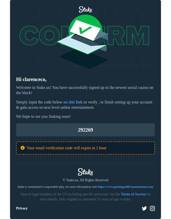
2. clarenceco, welcome to Stake.us!
Objective
This email aims to guide the new user, clarenceco, through the final step of account verification by delivering a time-sensitive code and reinforcing excitement about joining Stake.us, the newest social casino platform. It seeks to convert sign-up into active engagement by emphasizing urgency and next-level entertainment.
Why this works
The email leverages personalized greeting and a bold, time-sensitive verification code to create immediate action urgency while subtly reinforcing brand excitement with phrases like 'next level online entertainment' to emotionally anchor the user to the platform’s value proposition.
How to implement
By embedding the verification code in a prominent, visually distinct box and pairing it with a warning icon and expiration notice, the design reduces friction and cognitive load, making the critical action unmistakable and reducing the chance of user drop-off during onboarding.
Pro Tip
The primary CTA 'on this link' is underwhelming and buried in body text; it should be a bold, button-style element with action-oriented copy like 'Verify My Account Now' to increase click-through and reduce ambiguity about the next step. • The hero section lacks visual hierarchy, the verification code and expiration warning are important but visually compete with the brand logo and header; repositioning the code into a centered, bordered card with a countdown timer would elevate urgency and improve scannability.
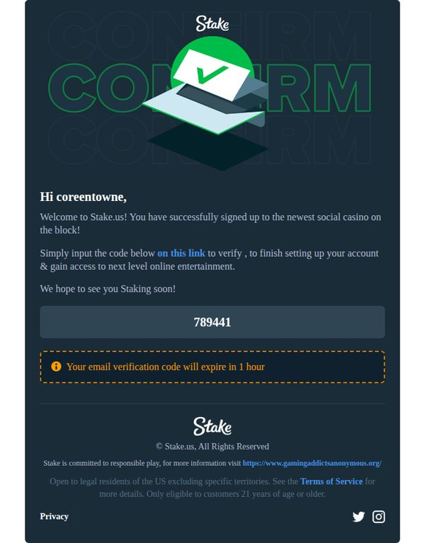
3. coreentowne, welcome to Stake.us!
Objective
This email aims to guide the new user through account verification by delivering a time-sensitive code and reinforcing excitement about joining Stake.us, the newest social casino platform. It also subtly encourages immediate action to unlock full access.
Why this works
The email leverages urgency with a clear, visually distinct expiration notice for the verification code, which drives immediate action without feeling pushy, a smart balance for onboarding new users in a regulated industry.
How to implement
By calling Stake.us the 'newest social casino on the block,' the message taps into FOMO and novelty appeal, positioning the brand as fresh and exciting rather than just another gambling platform, which helps differentiate it in a crowded market.
Pro Tip
The CTA 'on this link' is vague and underwhelming, it should be rewritten as a clear, action-oriented button like 'Verify My Account Now' to reduce friction and increase click-through rates during onboarding. • The hero graphic uses a generic checkmark icon that doesn’t reflect Stake.us’s brand personality, replacing it with a branded illustration or mascot would strengthen recognition and emotional connection with the new user.